An artists journey

Category: Craft

  • Diffraction

    Diffraction

    Today I would like to try to help us understand a little about what diffraction is. Not getting too deep in the theory. Just enough to demystify it a bit.

    Scary

    Diffraction is probably a scary word to most of us. Even if we don’t know what it really means, we have heard of it and have been taught that it is a “bad thing”.

    Have you been taught to avoid using apertures smaller than f/11? Note that when I say a “small” aperture I am referring to the physical size. Remember that as the aperture numbers get bigger the actual opening in the lens gets smaller. This simple graphic illustrates that:

    Progression of physical f-stop sizes

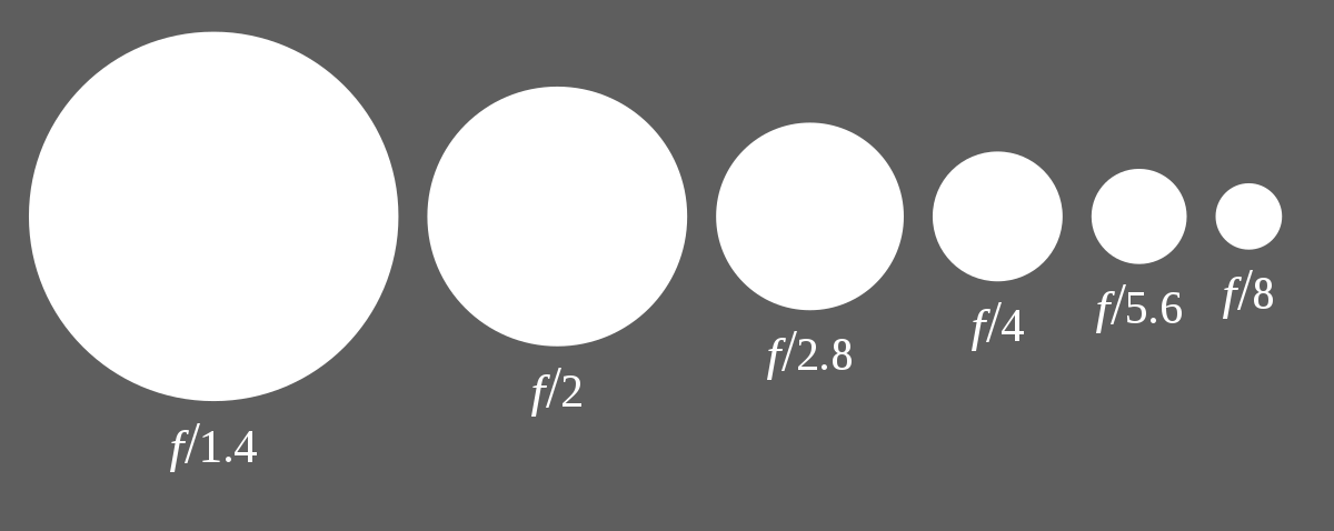
    The lore is that very small apertures (large f-numbers, like f/22) make an image too blurry to be useful. Don’t believe everything you hear without testing it.

    Light theory

    I’m going very light on theory (yes, pun intended). We’re just going to graze the surface without taking a deep dive in. (Here is a source to start at if you want to go deeper. Abandon all hope ye who enter…)

    Light behaves as waves (most of the time). Actually, a number of things are waves: light, water waves, sound waves, gravity waves. Quantum mechanics theorizes that even matter is waves. Too deep for me.

    We tend to visualize light going through our lens as rays. That is, straight lines. Yes and no. That is one useful model of looking at it. But light also behaves as waves. An interesting and important property of waves is that every point on a wave is a wave. So if the wave is blocked by a small opening, the wave spreads on the other side of the opening.

    This picture by Verbcatcher does a marvelous job of illustrating that for waves in water:

    Diffraction in water waves

    See how the waves spread after going through the small opening to the sea? The smaller the opening (aperture) the more pronounced the effect. That is, a small aperture opening causes waves to spread out more.

    What does it really mean

    This is the basis of the recommendation to use physically large apertures (small f-numbers). Apertures that are large relative to the wavelengths of light do not cause much “bend” of the waves. Small apertures (large f-numbers) “bend” the light more.

    What we can actually see in practice is that using small apertures causes our images to have a mildly “fuzzy” look. Because the waves spread more after going through a small aperture, the individual waves cover a larger pixel area. This slight spreading of the light causes the image to appear less sharp.

    The best discussion of diffraction for photographers I have found is from this article by Spencer Cox. But even this gets too deep into theory.

    I borrowed this image from it to illustrate the practical effects of diffraction as we change aperture:

    Effects of diffraction with aperture

    See how the larger apertures (small f-numbers) are sharper than the smaller ones?

    This illustration below, also from Spencer Cox) gives a great conceptual representation of what is happening. Take that the grid represents pixels in your sensor. At f/4, the point of light only strikes one pixel. It will be seen as very sharp. But at small apertures, the waves spread some onto adjacent pixels and create a kind of fog.

    Should you fear it?

    Should you fear it and always shun small apertures? No, it is just a reality of physics. It is no more to be feared than gravity. As one of my sons would say, it is what it is. Be aware of what is going to happen and consciously decide how far you need to go.

    All of the exposure determinations we make daily are tradeoffs. How much to stop motion? How much depth of field do we need? Is there enough light for a good exposure? What ISO setting should I use? All of these things and more have to be balanced in the moment of shooting, besides composition and esthetic issues.

    Each setting costs something. As experienced photographers we must understand the tradeoffs and be able to judge what is right for us at the moment.

    Diffraction is one of those tradeoffs. Know what it is going to do and how to use it or avoid it.

    Sometimes you need more

    But why would we ever intentionally make our image less sharp? We seldom actually choose to make it less sharp, but sometimes we need other things. I can give 2 easy examples.

    The first and most common one is to increase depth of field (DOF). It is counter intuitive, but making the aperture smaller increases the perceived depth of field. So on the one hand we are making the image less sharp, but on the other hand we are making it appear sharper throughout. When we need to make a certain range of the field of view acceptably sharp we stop down the aperture until we achieve our goal. A tradeoff.

    Depth of field with small aperture© Ed Schlotzhauer

    The second case that comes to mind is to reduce the shutter speed. I often intentionally shoot motion blur. But I usually forget to bring a neutral density filter for the lens I am using at the time. I can generally achieve the effect I want by using my polarizer, reducing the ISO to the lowest setting, and cranking the aperture down to the smallest possible one. This will probably give me a shutter speed in the range I want to use. Yes, the small aperture increases diffraction and makes the image less sharp. But it is handheld at a long shutter speed. It is already intentionally blurred.

    Intentional blurring based on small aperture.© Ed Schlotzhauer

    But maybe more importantly, in a great video on Lumminous Landscape, Charles Cramer said “sharpness is something we have to get over.” He explained that if we take a picture just because it is sharp, it probably won’t be very interesting. We have to forget about how sharp is it and instead react to the scene before us on an emotional level.

    Shoot the picture

    Diffraction is a side effect of physics and our photographic technology. Don’t be afraid of it. Don’t blindly follow some rule you learned in the past about what you can or can’t do. Understand enough about it to recognize it and know how to use it to your advantage.

    Look at the image above of the woman’s face. Even at f/32 – an extreme case – it is acceptable. Extra sharpening can be applied in your editing tool to compensate for it.

    So diffraction is just there. Allow it to happen if that is the tradeoff you need to make. Just like using a high ISO adds noise, that is acceptable most of the time and better than missing the shot.

    I know many of us don’t want to deal with what we perceive as increased complexity or too much technical detail. We just want to go take great pictures. My hope is that topics like this will actually make your photography life simpler by providing some grounding for information you may have heard in the past. Rather than trying to remember rules for how to use your equipment, you now have a model for what diffraction is doing and how strong its effect is. I hope you will be able to stop fearing it and accept it is just part of the tradeoffs of the technology.

    Today’s image

    This is a great old WWII era truck I found in my town. It is a Coleman. This was actually a Colorado company. It was designed and manufactured in the Denver area.

    I needed enough depth of field to span from the great rust and paint patterns on the near outside through most of the cab. So it is shot at f/22. Diffraction? Works for me.

    What do you think?

  • It Doesn’t Have To Be a Portfolio Shot

    It Doesn’t Have To Be a Portfolio Shot

    Of course we want to build a great portfolio, but don’t stress too much. Sometimes it is best to just go shoot and see what happens. In other words, not every shot has to be a portfolio shot.

    A portfolio shot?

    We all probably have one or more “portfolios” we maintain. Maybe you don’t formally build a physical portfolio box or book. Now days it is probably one or more Lightroom collections (or albums, depending on which flavor you use). That is a separate discussion.

    The portfolio represents our best work. Typically there will be multiple ones for categories like landscapes or portraits or street photography, etc.

    It should be a very limited set. A maximum of 20 works well. If you have 200, either you are a truly exceptional artist or you haven’t edited enough yet. Editing hurts. It is painful to take out a favorite. But the reality is that every one removed makes the remaining set stronger. It is healthy to constantly challenge our portfolio. Test to see if new images are better than existing ones. If they are, replace the old one.

    So my point here is that it is easy to get in our head and not take a picture of a scene unless we are sure it is superior to anything already in our portfolio. This freezes us into fear and indecision.

    Be mindful

    Photography should be a process of mindfulness. We should be present and open wherever we are. This helps us to actually see the possibilities in what is around us at the moment. Being there and being in the moment lets us make the most of whatever situation we find.

    Self-censoring fights against mindfulness. When we pass opportunities because they will probably not make portfolio images, we are building a mental wall to exclude things. It constricts our thinking and leads us to miss great shots that come unexpectedly.

    Practice the craft

    If you are a musician you practice hours a day. Even simple scales train the musical senses. If you are a gymnast you practice hours a day. Strength and flexibility exercise is as important as working on routines.

    Why should it be different in the arts? Our art is part craft. Practice makes us better. We need to be very fluid in handling our equipment. Exposure decisions should be quick. Composition should be almost automatic because we have built such a large base of experience.

    So we need to spend a lot of time just taking pictures. For the practice, if nothing else, even if we discard most of them. It makes us a more virtuoso photographer. The great majority of this practice does not produce portfolio shots. But it sets us up to skillfully make the great shot when we find it.

    Get in the flow

    A lot gets written about flow states. here are reasons for this. One is that it is a simple concept most of us can relate to. Another is that it is a powerful and compelling experience. Everybody seems to understand the basic concept, so I will not define it.

    It is hard to force a flow state. You kind of fall into it and don’t realize it until later. To get there you have to be working – hard. Not working on getting into a flow. Working hard on our craft. That means being out doing it. Not just dabbling in it, but spending significant time and attention. As we immerse ourselves in it for an extended time we may find that we have hit a groove. Time seems to stand still. The stars align, so to speak, and everything seems to work better; ideas come freely; we are on a creative high. We feel good about what we are doing and the results are above normal. It seems to flow.

    Looking back on it with a warm glow we may realize we were in a flow. It is important to realize that the flow is not the goal. The experience we feel and the work we produce is. Flow helps enable that.

    Be surprised

    And by being out and shooting freely with less self-censoring, I often am surprised by what I get. Maybe it is from being more mindful. Perhaps it is when I am in a flow. But regardless of why, I am frequently pleased with images that I thought at the time would be boring. And I am glad I shot them.

    The famous Wayne Gretsky said “You miss 100% of the shots you don’t take.” I think there is application to our photography. Just thinking about a shot does not create an image. Thinking about a shot and deciding not to take it means no image. But when something tickles your subconscious and you go ahead and grab the shot, you might find gold. Even when you are relatively sure it will not make it into your portfolio, it might trigger another thought. Which might trigger another thought. And so on. It can bring you to a better way to see the subject. We can surprise ourselves.

    So don’t be quite so picky. Be very picky in the excellence we demand in our craft. But be careful in prejudging our shots. Do your best with what is there and see where it leads. It could be that it is not a weak subject that is at fault. It could be that we aren’t letting our self think about it very well.

    Today’s image

    I’m a sucker for these. I love shooting them. You never know precisely what you will get, but the surprise can be fun. I really like this one. It is also a great exercise for working on timing. Being able to recognize a shot and execute it. It fascinates me that a few tenths of a second or a slight movement of the frame can make all the difference.

  • The Histogram is Just Data

    The Histogram is Just Data

    I don’t mean to be insulting, but I cannot understand when people look at histograms as some magical, mysterious, and intimidating technical artifact. It is not. It is just data about what our sensor is seeing. The histogram is just data, and it is useful. Use it. Do not be afraid of it.

    Trigger

    A newsletter I received today triggered this semi-rant. But looking back, I see it has been over 3 years since I wrote about histograms, so it is probably time to revisit the subject. This actually is a subject I feel some passion for and believe it needs to be better understood by photographers.

    The newsletter author declared that our histograms lie. I realize that click-bait is commonly used to try to get people to read articles, but I still feel it is being somewhat underhanded. Now, in fairness, the newsletter author made some valid points – except for the part about histograms lying.

    What is a histogram?

    We see this graph of some data and maybe it does look complex and mysterious if you are not used to working with data and don’t know where the data comes from. Let’s get over that by understanding how simple but effective it is.

    By convention we play like our cameras measure light in a range of 0 to 255. There are no units: 0 represents black and 255 is pure white. The convention came from the history of early digital cameras. It is obsolete today, but still used. That is a topic for another day.

    So there are 256 possible values of brightness (0-255). If we go through and count the number of pixels of each value – the number of pixels in the image that have value 0, the number of pixels in the image that have value 1, etc. – and put them on a graph, we have a histogram.

    Here is a simple example:

    Again, black is on the left going to white on the right. Even without me showing the actual image, we can see that there is a “bump” of dark values on the left and a larger hill of bright values on the right. In between is a relatively low and even count.

    What can we learn from this? It is a black & white image, because there is no separate data for red, green and blue. There is high contrast because of the hills at the dark and bright ends. It is bright but not overexposed. There are deep blacks, but not enough to have lost important information. So, even without seeing the image, we can tell a lot about it. Is the image exposed “correctly”? Ah, that is the question my rant is based on.

    This is why histograms are useful. They are useful data about our image. It gives simple information to help us understand our exposure better.

    Benefit

    Today’s mirrorless cameras bring us the amazing benefit of real-time histograms. We can select to see the histogram live in our viewfinder or on the display on the back.

    What is the benefit? We see an immediate graphical view of the exposure the camera is determining. In the example above, we can see that the light tones are very bright, but not overexposed.

    I routinely use it to watch for “clipping” of brights or darks. If there is a large hump of data jammed up against the left or right edge, that is probably a problem. I will often choose to override the camera’s exposure determination to avoid these peaks.

    Again using the example above and knowing that my camera was in aperture priority mode, we see that it chose 1/750 second as the shutter speed. That works OK in this case, but if I did not agree, I would have easily used the exposure compensation dial to adjust the exposure. I do this a lot.

    So the histogram is a quick and easy to get a feeling for the “shape” of the exposure.

    They don’t lie

    Now coming to the basis of my rant: histograms do not lie (actually, they do; I will say how later and why it doesn’t matter).

    The newsletter author gave the example of a picture of some fruit on a dark table with a black background. She said the histogram lied because the camera did not give the exposure she wanted. It tried to make the whole image evenly exposed.

    No, the histogram is just a straightforward measurement of the data. If you take your temperature but don’t like the reading you get, it is silly to say the thermometer lied.

    What the author was describing was that she wanted to expose to have the same look as the scene she saw. This was a case of disagreeing with the camera’s matrix metering calculation. It was doing it’s job of trying to capture all the data that was there and preventing blown out blacks. But she decided to use exposure compensation to force the camera to expose the scene the way she wanted.

    The histogram did not lie. As a matter of fact, she relied on it to do her exposure compensation values. She used the histogram to determine how to override the camera exposure calculation.

    Actually, I would have used the camera’s original exposure determination. I like to have all the data available to work with. This is called exposing to the right. Bringing the brightness down in post processing to the level she wanted is simple, non-destructive, and does not add noise. Capturing the compensated image the way she wanted irreversibly crunches the blacks.

    They lie

    I said they don’t lie, but they do a little. For speed and efficiency the histogram is derived from the jpg preview of the image. Same as the preview shown in the viewfinder or camera back. If you study jpg processing you will see that it alters and discards a lot of information to give a good perceptual result.

    So the histogram is not actually looking directly at the literal RAW data from the sensor. But there is little observable discrepancy. On my camera, I find that it exaggerates the highlight values very slightly. Still, I typically back the exposure off to avoid highlight clipping, so it adds a little conservatism into the process.

    Trust the data you see. It is good enough.

    They’re not the photographer

    The histogram gives you data. It does not determine exposure. People talk about “good” or “bad” histograms. This is a misunderstanding. There are no absolute good or bad ones. What counts is did you get the exposure you wanted.

    There are valid artistic reasons for shooting what some people would consider bad histograms. If it is what the artist wants, it is correct.

    Histograms give us a reading of the exposure. They do not determine what is right. It gives some insight on what the automatic exposure calculation in the camera is trying to do.

    Use it

    The histogram is a brilliantly simple and wonderfully useful tool. We are lucky to have real-time histograms available to us now. It is a game changer. But it is just data. Do not be afraid of it.

    The histogram does not lie. But it does not automatically ensure that the exposure is exactly what you want. You have to sometimes take change and override the camera settings. When you do, the histogram is there showing you the result of your decisions.

    It is not magical or mysterious. It is a great tool. Use it. A craftsman know how to use his tools.

  • Buy My Presets, Make Work Just Like Me!

    Buy My Presets, Make Work Just Like Me!

    Maybe I’ve just gotten on some bad mailing lists, but it seems I am being bombarded by offers to get the “secret sauce” of many photographers. Promises that if I will just take and use their presets I will now have all I need to be just like them. No sweat; no learning, just buy my presets, make work just like me.

    Plugins and presets can be good

    I use plugins, presets, profiles, Photoshop actions, and whatever else I can use productively. There is nothing inherently wrong with any of them. They can be great productivity tools and they are getting more capable all the time.

    Lightroom Classic’s latest technology allowing us to include “AI” masks in a preset – adaptive presets – that can be a great help. This is one reason a larger preset market is appearing. Including the automatic masks makes the presets more general.

    Adobe includes quite a few presets and profiles in Lightroom Classic. Many of them are useful. If you include all of them in your lists you will be wading through hundreds of choices. That’s before buying sets of them from other photographers.

    Maybe it’s just me, but I find too many choices overwhelming. If you are exploring a look for an image, are you really going to try out hundreds of options? Maybe once every few months just to stimulate ideas. But routinely doing that would waste lots of time.

    That is why I carefully curate a small set of presets and profiles that are important to me and that I may actually use. This gets into the next topic.

    If you didn’t make it, you probably won’t know when to use it

    I have tried downloading a couple of sets of presets from well known photographers. What I find is that the presets represent their thinking and choice sets. They had dozens or hundreds of minor variations of some basic edits. E.g. make the sky a little more blue, make the sky even more blue, make it real blue, make the foreground a little warmer, make the foreground even more warm, etc.

    But there was little there I could not do as well and faster by myself, since i know how to edit in Lightroom Classic. If I want to make the sky more blue, that is some simple, almost automatic edits that I can do in a few seconds with little thought. Doing it myself is much faster than searching through hundreds of presets someone else made and that have confusing names.

    I removed all the ones I downloaded.

    What I find is that if I want to repeat something fairly consistently, I make a custom preset for it. Then I can find it easily, because it is in my User Preset list and I know what I called it and why I made it. Even though it is probably duplicating what many others offer in their preset sets, I will never find theirs and I would not recognize the strange name they called it.

    But if I make it, I know what it does and where to find it. Besides, the adjustments reflect my vision, not someone else’s.

    Profiles

    Profiles are another rich area in Lightroom Classic. They have gotten very powerful in recent releases. If I am doing a B&W conversion in Lightroom, I will usually run through a short list of my favorite B&W profiles to get a starting point.

    In some ways profiles are more powerful than presets, but also more mysterious. Presets do their work by changing the normal settings we can see. It is easy to apply a preset then go look at the settings and modify them to our preferences. A profile’s work is hidden in the internals of Lightroom. You can’t really see how it did what it did.

    This is a problem for me. Maybe I am too much of a control freak, but I take the responsibility for knowing how to create the image I produce. Besides, vintage photography looks and “modern” color styles are not very appealing to me. That seems to be the main application of many profiles.

    Craftsmanship

    I would never say we have to suffer for our art, but I do believe we have to be a good enough craftsman to be able to realize our vision. That is an argument for doing the work ourselves. This is one of the arguments against AI generated “art”. For me, there is a serious question of authorship if we are unable to create the work entirely our self.

    I will capture my own image, not download something someone else shot. My image curating will be done by me. I feel I need to be able to edit and craft my work to the point of being a final image. I will also print it, to the limits of my small printer. That whole cycle is important to me. I feel it defines a lot of me as an artist.

    If it actually did it, why would I want it?

    But this is just looking at mechanisms and process. What is going on behind the scenes in the editor. The overarching question for me is why would I use these artist-specific presets?

    Sorry, but I don’t want my work to look like yours. Perhaps I will analyze what appeals to me about some feature of your work and find out how to do some of that on my own. But I do not want a preset that says “make this image look like <_______> did it”.

    How much different is using a “make it look like x did it” preset from telling ChatGPT (or one of it’s cousins) to “create a landscape image of the Grand Tetons in the style of Ansel Adams”?They are not quite the same, but too close for my comfort. I am deadly serious about wanting to follow my personal vision and do work that creatively expresses what I feel.

    No, I will stumble along in my own way, taking my own path, missing out on the ease of being able to simulate various other artists. The risk is not worth the reward for me. I would feel like a fake.

    Thank you for your offer to buy your presets and easily make work that looks just like yours. I will pass.

    Today’s image

    This is taken in a rail yard near my studio. Nothing very special (although if you look at those rails you can wonder, like I do, how a train stays on the track). Maybe it is not a very good image. But it is all mine. I am responsible for every pixel. The original image is mine and no presets or profiles or plugins were used. No attempts to imitate any other photographer’s style. Just like I want it to be.

    Do you use other photographer’s presets or profiles? Let me know. I am curious. No criticism if you do, I just welcome your experience and thought process.

  • Color Perfection

    Color Perfection

    At the risk of sabotaging potential sponsorships from the color matching industry, I suggest some of us obsess too much about color. There is a difference between color perfection and color correction and color as an artistic decision and color as one of the processes we deal with. Know why you are doing it.

    Obsession

    Photographers seem to be obsessive about a lot of things. Color is only one of them. But we have color equipment manufacturers (arms merchants?) and blogs and videos constantly preaching to us that we must have a perfect color matched system from our camera to the final print or our work is amateur.

    This all sounds logical and authoritative, so we buy into it. And it can get expensive.

    So we buy colorimeters and special color corrected monitors. We make sure we have proper profiles for the printer and paper combinations we use. We even buy special systems to color profile our cameras.

    Now we can be confident that our wildflower picture exactly matches the colors of the flowers in the wild.

    Why?

    Why are we going to all this trouble? Does it really matter so much?

    Maybe, maybe not. It depends on your needs and values.

    All the steps to color correct your workflow are generally good. But unless you are doing product photography, it may not matter as much as you have been told. A corporation cares very much that the company logo exactly matches it’s color standards and that their official color pallet is correctly used.

    But if you are shooting landscapes, is it critical that the color of that leaf is the exact match of the leaf you shot? Or is it more important to match your memory and your preferences?

    My attitude

    I am not a purist about this. Actually, I am less and less a purist about anything as I evolve in my style. Any work I do is an artistic interpretation. I have no problem with changing colors if it gives me a more pleasing image. More pleasing means I like it. It has nothing to do with the match to the original scene.

    But I do it deliberately and intelligently. To do that, it is necessary to have control over your color process. And without a controlled color process your results are not repeatable. What comes out of your printer is likely to be wildly different from what you see on your monitor and different from session to session.

    That is chaos. You cannot reliably create your art. It is unprofessional and unsatisfying.

    But you need to have a color managed work flow

    It is important to color manage your workflow. That is not the same thing as obsessing about color perfection.

    Every month I calibrate my monitor with my trusty old obsolete i1 Display Pro colorimeter. And I print using proper profiles for my paper and printer. This gives me pretty repeatable colors. The biggest problem is keeping my monitor brightness low enough to match the prints.

    So far I do not find it necessary to profile my camera. Since I only shoot RAW, I can “re-profile” the images at will. And Lightroom Classic’s Camera Landscape profile is usually a good start for most of my work. Now days there are lots of profiles to try out to get a color starting pointl

    Overall, the biggest problem I have is dealing with printer gamut issues. Some of my work is highly saturated. It is disappointing when these images do not look as good as what I see on my monitor.

    Black & white

    The outlier in many parts of photography is black & white. Is it important to color manage black & white images? It seems wrong, but I would say yes, it is. It may be more important than in images that will stay in color.

    In color images, we look at the color, obviously. We tend to be pretty tolerant in what we accept as reasonable. But in black & white we only see the color indirectly through the tone relationships of the print.

    The colors are mapped to monochrome tones and shades. This makes it important to precisely control the color relationships to give separation of the tones. We may need to distinguish between fine shades of green, for instance, to give body to the b&w print. More than if the print were in color.

    What I do to the color may look strange if you saw it in color, but the important thing is the precise control required. This makes me believe color precision is more important in b&w than in much color work.

    Conclusion

    Have I confused you? I seem to have said color perfections is not important but you have to have a good color balanced workflow. Yes, that is right. Learn to live with ambiguity. 🙂

    My work is art. Everything is an interpretation of what I saw or felt. I usually do not care if the colors are “true”. They often intentionally are not.

    But it is very important to me to control and repeatably achieve the results I want in the final print. This requires understanding how to color balance my process and how to use it to achieve my vision.

    For me, color control is part of a repeatable process, not a commitment to absolutely match a scene.

    Today’s image

    This is Texas wildflowers in the spring. They really are like this, and in great bands over much of the state. Go there in the spring sometime. Spring in Texas wildflower country is about mid March through mid April.

    This is an accurate representation of what you will remember when you are there and see them. Is it totally accurate color? Probably not. Don’t know; don’t care. If you’ve been there, you will say “Yes! That’s what they look like!”.