
I love photography. It is my chosen art form. But photography has a weakness that weakens and cheapens it, in some people’s eye. Can it really be art?
Literal
We point our camera at a scene, press the shutter release, and it is recorded. Everything in the field of view is captured. We didn’t have to arrange it or decide what should be there. It is all scooped up.
Therefore, most photographs are straight views of literal scenes. Little thought and consideration went into it. There is trash and power lines we are expected to overlook. And that telephone pole growing out of the subject’s head: yeah, ignore that.
If we want to document a place or time, that can work. But we wouldn’t call that art.
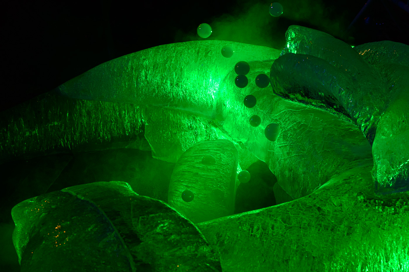 ©Ed Schlotzhauer
Too easy
Along with that is just the fact that taking a photograph is too easy. Anyone with a phone can take a pretty good picture with no thought or effort. An amazing amount of computational science is applied in your phone to make it look good. And just like everyone else’s.
This is clearly seen in the trillions of photographs uploaded to social media and photo sites each year. And by the billions of hours of video uploaded to YouTube and TikTok. Everyone can do it, and they do.
If everyone can do it, it must not be special.
Too mechanical
And photography is criticized for being too mechanical. It seems more technology than art. People don’t need training to do it. Just Point and Shoot.
We capture a photograph in an instant. It can be sent anywhere in the world in milliseconds. We can paste it on social media for the world to see and comment on.
How many people shooting pictures on their phone are spending much time considering the artistic elements of the work? No, there is little to consider. Click the button. If you don’t like it, use the AI editing controls to make it good, or just shoot it again.
It’s just an automatically produced thing. It is no longer a picture; it is a commodity.
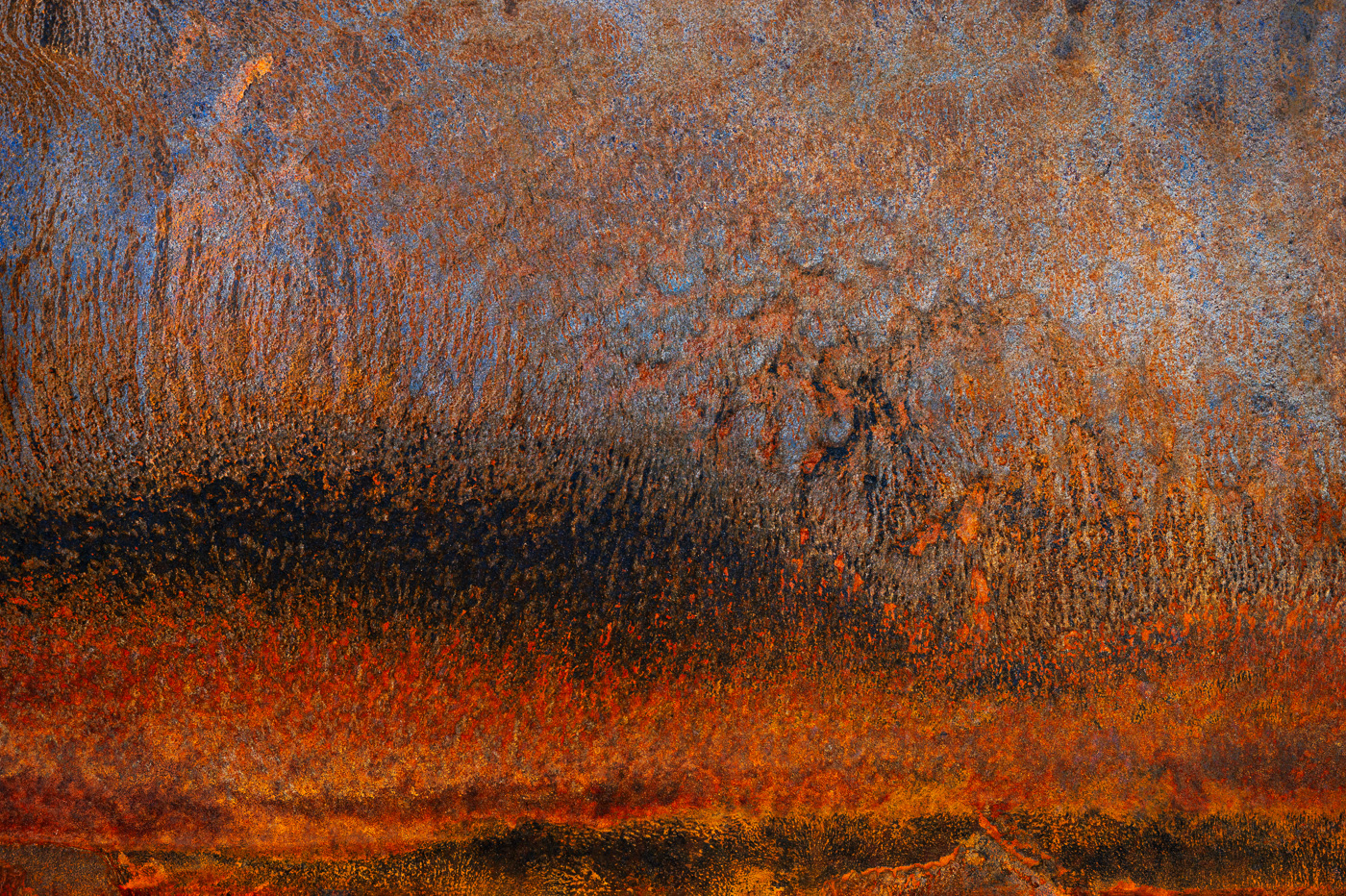 ©Ed Schlotzhauer
Is photography worthless?
To me, who likes photography as art, that sounds very bleak. So, has photography become worthless?
I like to think not.
Photography is an extremely challenging art form that requires intense effort and years of practice. At least for me. And at that, I’m just getting somewhat competent at it. I don’t think I will ever consider that I have mastered it.
That sounds contradictory. Thoughtless image capture that anyone can do or difficult and thoughtful art. Obviously 2 different things. That’s where we go off track in the argument. It is not photography that is art or not, it is our intended purpose and expectation. Are we capturing an image for a utilitarian purpose or creating a piece of art?
The same tools and processes are used for both. That confuses things.
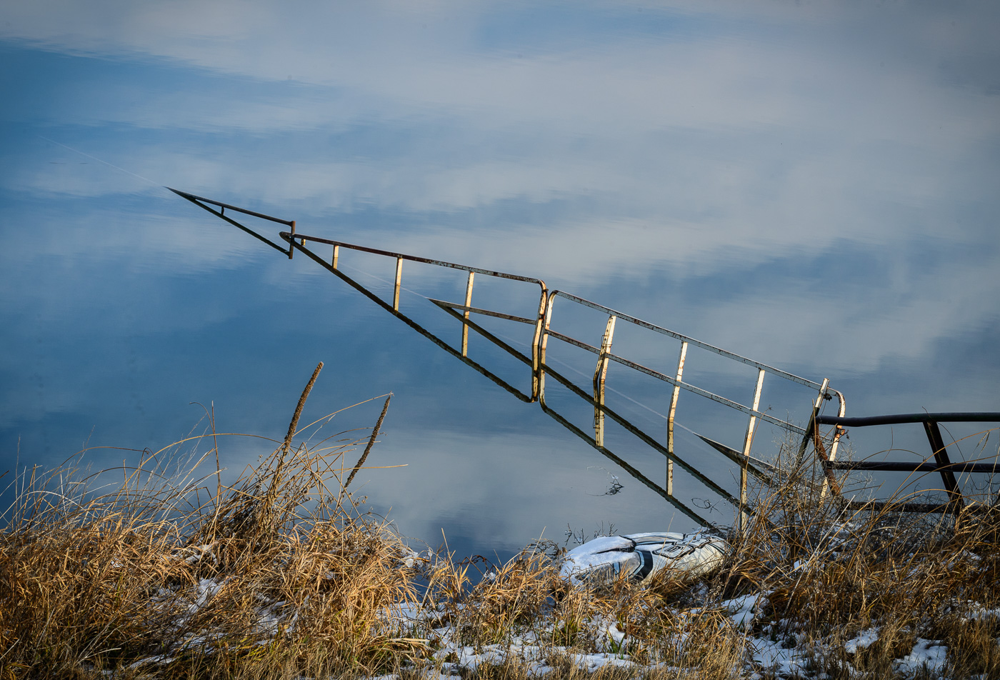
 ©Ed Schlotzhauer
The difference
On the surface, it is hard to tell the difference between photography being done for art vs for utilitarian reasons. The subjects could be the same, the equipment could be the same, the locations could be the same.
If you watched the photographers work you would probably spot some differences, but not always. That is not a reliable indicator.
It may be overly simplistic, but I think the difference is what is going on in the photographer’s head. Their intent and purpose, the feeling and insight they bring to the scene, and their experience. It becomes art because there was an artist present, involved, responding, feeling, creating. This can transform a simple scene into art.
The subject
If we are creating for art, the depth of our involvement must become far more intense than a simple snapshot. One of the traps many people fall into is the consideration of the subject itself. Did you just capture the obvious shallow view of the subject, or does the image say something about our feeling or perception of the subject? Did we delve deeper and try to bring our something that is not obvious on the surface?
A representation of the subject is just that. What you see is what you get. But if we can bring our something different or new or insightful to challenge the viewer, the image could have staying power.
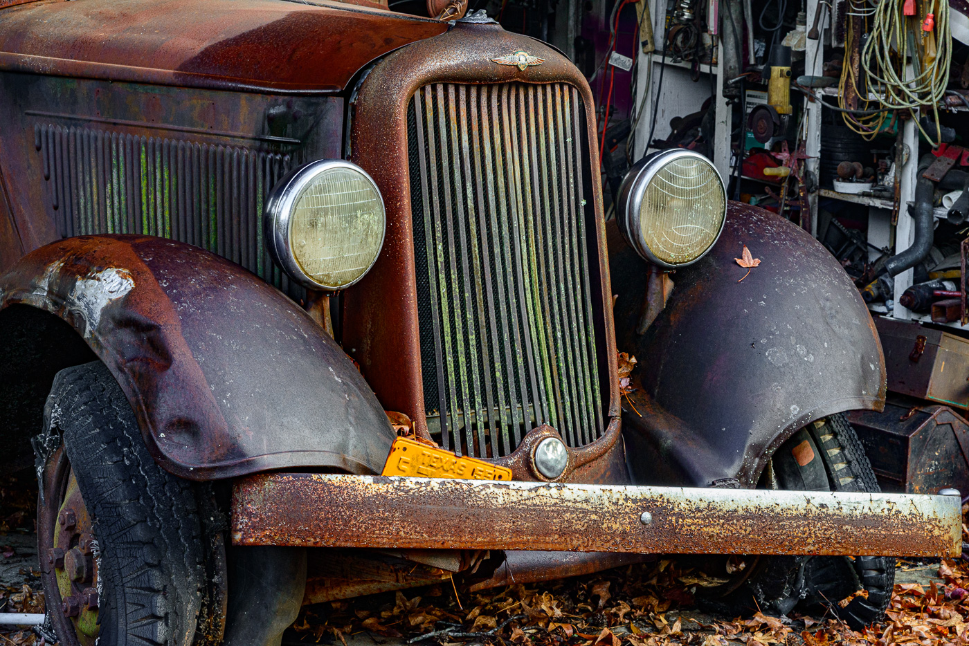
 ©Ed Schlotzhauer
Composition
Most people walk up to a scene and snap it. An artist thinks about composition. About how the parts relate and are perceived. And about what to include and what to leave out.
Often the artist has no ability to re-arrange the scene, but they have freedom to change their position or to zoom in to parts of the whole. Small changes of location or framing can make huge changes in the visual effect.
If we are serious about photography, we know the basic principles of composition: placement on thirds, leading lines, visual weight, etc. How we use them while making an image depends on our personality and experience. I don’t have a checklist of composition rules with me. For me, it is more subconscious recognition of them. As in “there’s a potential leading line; can I exploit it; will it make the composition stronger?”
A well composed image will be seen as designed, intentional, crafted, and more whole.
 ©Ed Schlotzhauer
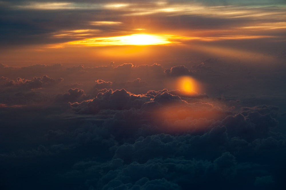
Form
An artist will look at the same scene as anyone else and see interesting shapes and patterns. They are aware of textures and reflections and how the light is playing across the subject.
Sometimes form is the whole purpose of an image. This is especially common in black & white. One of the reasons for producing an image in black & white is to remove extraneous elements like color and immediate subject recognition, leaving the forms and tones as the focus.
Subtleties like this are not usually obvious to the snapshot shooter.
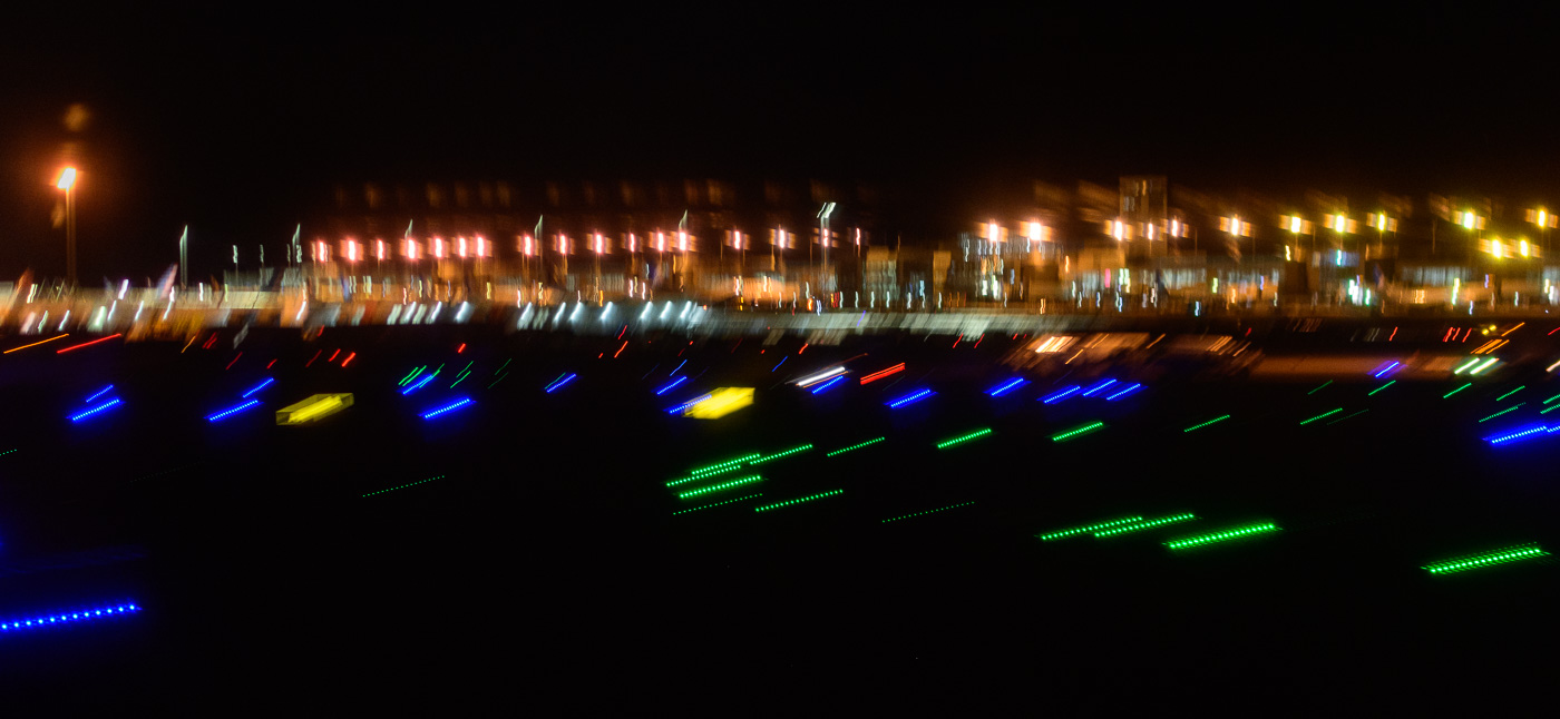
Gesture
This is a favorite of mine. Gesture is not just a certain movement. It is what shows the innate character of something. The great Jay Maisel is a huge proponent of the concept. He goes so far as to say:
It’s light, gesture, and color. It really doesn’t matter what you photograph.
Jay Maisel
That is, the subject is less important than capturing that thing or moment that shows its essence. Discovering the gesture can be hard, but it is worthwhile. We could take a picture of a thing, or we can look for something that shows what the thing does or feels or how it behaves. That gives it life.
Finding and capturing the gesture usually requires intense concentration and attention. You must approach it with the will to find it. But it is a process of the artist looking deeper and with more intent than the snapshot shooter.
 ©Ed Schlotzhauer
Are photography’s problems solvable?
Yes, because it doesn’t actually have a problem. Photography is a wonderful practice and every bit as artistic as any of the other established art forms.
The fact that the vast majority of pictures are taken as snapshots/throwaway/selfies/travel memories does not invalidate that the medium can be used for artistic purposes. That would be like saying most people can’t write well, so writing is not valuable.
I use my phone to grab quick shots all the time: a sign with a name or telephone number I need, a part I need to find at the hardware store, something that amuses me, or my grandson. These serve exactly the purpose I want. Either a throwaway or a memory. Every day I also take my “real” camera with me and occasionally see something to shoot from an artistic viewpoint.
These are 2 different activities with completely different purposes. Neither invalidates the other. Both exist together and do not compete. The same technology is being used for different goals. It’s not the subject or the equipment or the location that separates them. It is the intent and skill of the photographer. And it is the desire of the artist to create.
 ©Ed Schlotzhauer
Is photography as an art going away?
As far as photography as art going away, I would claim the opposite. Since most pictures taken are mediocre, at best, when we come along with an image created with skill and an artistic style, it will get noticed. It will be obvious to most people that this is different and special.
The introduction of photography caused many painters to fear it would replace them. Instead, it freed them from a lot of routine and repetitive work, like basic portrait commissions, and allowed them to create. Impressionism and other artistic directions emerged. I believe we will see some of the same.
As photographers who are trying to lift our work above the base level, we should not be apologetic about photography or feel inferior. Our intent is to produce art. We should not price our work at giveaway prices because many people expect that. Look for a market that appreciates the difference.
You are an artist. You are creating things that are unique and special – aren’t you? If not, you will be swallowed up in the giant flood of ordinary and AI generated images.

 ©Ed Schlotzhauer
 ©Ed Schlotzhauer
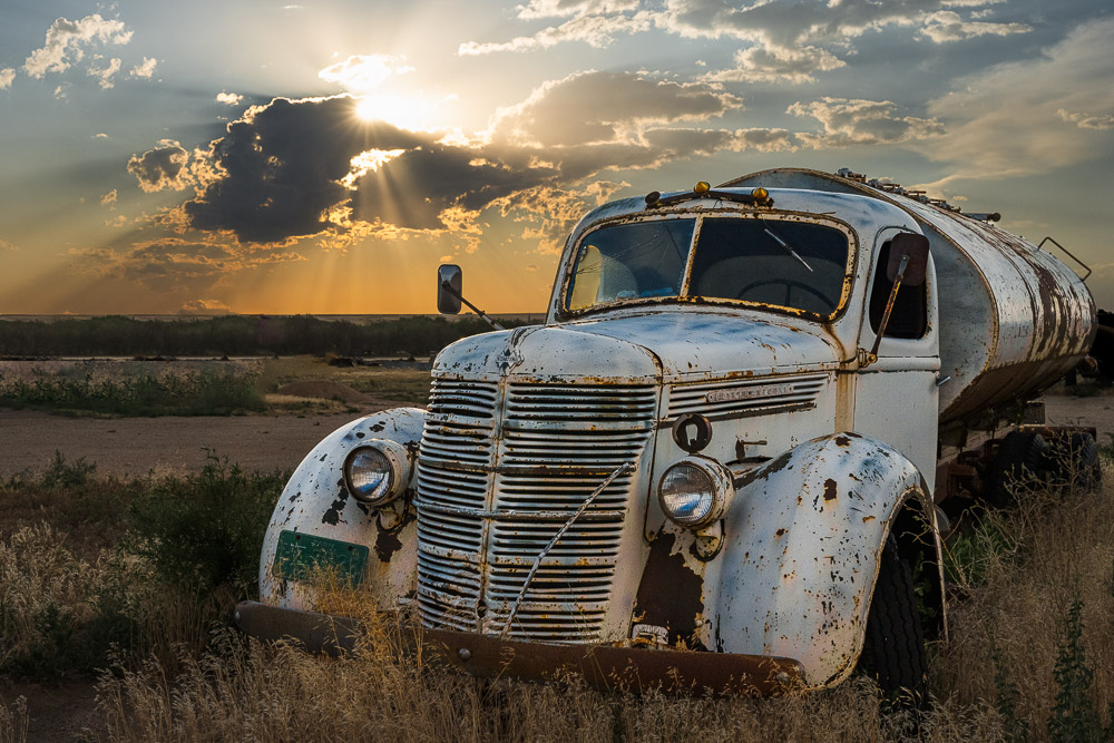 ©Ed Schlotzhauer
 ©Ed Schlotzhauer
 ©Ed Schlotzhauer

 ©Ed Schlotzhauer
 ©Ed Schlotzhauer
 ©Ed Schlotzhauer
 ©Ed Schlotzhauer
 ©Ed Schlotzhauer
 ©Ed Schlotzhauer
 ©Ed Schlotzhauer
 ©Ed Schlotzhauer