An artists journey

Tag: photographic technology

  • They Told You Wrong About ISO

    They Told You Wrong About ISO

    Many of us have a wrong idea about ISO settings. I will just say they told you wrong about ISO. It was a misunderstanding. Whoever “they” are.

    Statement of faith

    It is stated as a “strong suggestion“, especially when we are learning landscape or portrait work. Never shoot with ISO over 100. Maybe it is stated as only shoot at the native ISO setting for your camera. Either way, these are given as rules.

    I hate rules, especially for my art. Rule of thirds. Rules of composition. Never put the subject in the center. Never shoot at midday. Always use a tripod. The list goes on.

    Like with religion, most of the so-called rules are based on good ideas, but over time they are repeated as commands and the underlying reasons are lost. Just do it. (I don’t think that is what Nike meant.) The rules become a statement of blind faith that cannot be challenged.

    What is noise?

    All digital cameras have noise. Noise is randomly generated in the sensor and in the electronics of the signal path until the pixels have been digitized by the analog to digital converter (ADC). The noise is a fundamental property of physics.

    The question is how much noise is there relative to the desired data. This is called signal to noise ratio in engineering. When we amplify a signal by increasing the ISO setting, all the signal including the noise is increased. This is why images shot at high ISO settings tend to look noisy. The image is usually not less sharp, but there is more noise obscuring things.

    It is true for a low cost point and shoot camera or a high end medium format camera. What changes are the relative amounts of noise and the limits the image can be pushed to.

    What is ISO?

    You’re familiar with the exposure triad: the combination of aperture, shutter speed, and ISO that determine exposure. That’s it. Many other things affect the composition and quality of an image, but only those 3 control the exposure.

    Aperture is the size of the diaphragm opening in the lens. It controls, among other things, the amount of light coming in. Shutter speed is the length of time the shutter is open to let light come in. And the ISO setting is kind of like a volume control. It sets the gain or amount of amplification of the sensor data.

    Going way back to early film days, there were no agreed on standards for the measure of how sensitive film was. So a couple of the largest standards organizations (the ASA and DIN scales) came together and created a standards group under the International Organization of Standards. They adopted the acronym of the standards organization (in English) as the name. By the way, officially “ISO” is not an acronym, it is a word, pronounced eye-so.

    Long way around, but now there are defined standards for exposure. For a given combination of aperture and shutter speed, the ISO settings on all cameras give the same exposure.

    Why use higher ISO settings

    OK then, in concept, the ISO setting is a volume control for exposure. Turning it up (increasing the ISO value) amplifies the exposure data. But as I mentioned, it is not free. Amplifying the exposure also amplifies the noise in it.

    It is true that low ISO settings produce less noise in the captured image. Modern sensors are much better than early ones. This is one of the wonders of engineering improvements that happen as a technology matures.

    Then, we should not use high ISO settings, right? Well, everything is a tradeoff. We need to use a minimum shutter speed to avoid camera shake when hand holding or to stop subject movement. We need to use a certain aperture to give the depth of field we want. These decisions must be balanced in the exposure triad, often by increasing the ISO.

    Can’t I just underexpose?

    When you accept that we must use the lowest ISO setting, the logical conclusion is that you could massively underexpose the image and “correct” it in post processing. Unfortunately this doesn’t work well. You are still boosting the noise unacceptably.

    The camera manufacturer knows more about it’s sensors than your image processing software does. The camera’s built-in ISO amplification can take into account it’s characteristics and do a better job. And modern sensors and electronics do a very good job.

    Are you wrong about ISO?

    If you are following a rule dictating you must or can’t do something, yes you are wrong. There are no rules in art. No ISO-like standards body specifies what your image must look like. There are always groups wanting to do this (are you listening camera clubs?), but they have no authority.

    If you are hand holding a shot, it is better to boost the ISO to steady the movement than follow a rule about using low ISO. The noise will be secondary to the reduced shake. Or I sometimes use the lowest ISO setting in my camera to create blur. I enjoy intentional camera movement (ICM) shots and will occasionally force an artificially slow shutter speed.

    If it is night and you want to shoot stars or street scenes, are you not going to do it because you would have to violate a rule by the ISO police?

    Use the ISO setting that lets you express what you want to do. It is your art. There are no rules. Besides, luminance noise looks like film grain. It can be an interesting artistic technique in itself. Do what feels right to you.

    Apology

    I used fairly strong language about this. The reality is that most photography writers have softened their recommendations on ISO. Most of them freely recommend using high ISO. This is healthy.

    But I know many of us were “imprinted” by early mentors who left us feeling there was something dirty about going above 100 ISO. I want to free you if you still have those self-imposed limits. Using even a very high ISO and getting the shot is always better than missing it because you wouldn’t want to chance increased noise.
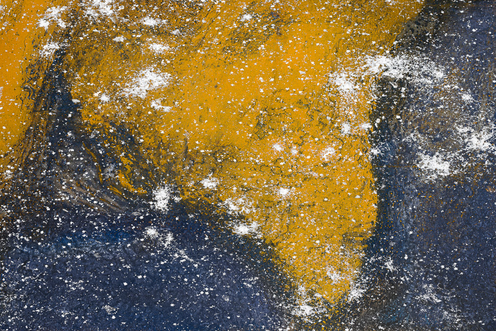
    Today’s image

    Since I’m advocating it, here is an extreme case that I’m happy with. This was shot hand held with an old Nikon D5500 camera – at ISO 22800. I have corrected out some of the luminance and chromance noise and I am perfectly OK with what remains. Getting the shot made me happy, even if the noise is high.

  • The Histogram is Just Data

    The Histogram is Just Data

    I don’t mean to be insulting, but I cannot understand when people look at histograms as some magical, mysterious, and intimidating technical artifact. It is not. It is just data about what our sensor is seeing. The histogram is just data, and it is useful. Use it. Do not be afraid of it.

    Trigger

    A newsletter I received today triggered this semi-rant. But looking back, I see it has been over 3 years since I wrote about histograms, so it is probably time to revisit the subject. This actually is a subject I feel some passion for and believe it needs to be better understood by photographers.

    The newsletter author declared that our histograms lie. I realize that click-bait is commonly used to try to get people to read articles, but I still feel it is being somewhat underhanded. Now, in fairness, the newsletter author made some valid points – except for the part about histograms lying.

    What is a histogram?

    We see this graph of some data and maybe it does look complex and mysterious if you are not used to working with data and don’t know where the data comes from. Let’s get over that by understanding how simple but effective it is.

    By convention we play like our cameras measure light in a range of 0 to 255. There are no units: 0 represents black and 255 is pure white. The convention came from the history of early digital cameras. It is obsolete today, but still used. That is a topic for another day.

    So there are 256 possible values of brightness (0-255). If we go through and count the number of pixels of each value – the number of pixels in the image that have value 0, the number of pixels in the image that have value 1, etc. – and put them on a graph, we have a histogram.

    Here is a simple example:

    Again, black is on the left going to white on the right. Even without me showing the actual image, we can see that there is a “bump” of dark values on the left and a larger hill of bright values on the right. In between is a relatively low and even count.

    What can we learn from this? It is a black & white image, because there is no separate data for red, green and blue. There is high contrast because of the hills at the dark and bright ends. It is bright but not overexposed. There are deep blacks, but not enough to have lost important information. So, even without seeing the image, we can tell a lot about it. Is the image exposed “correctly”? Ah, that is the question my rant is based on.

    This is why histograms are useful. They are useful data about our image. It gives simple information to help us understand our exposure better.

    Benefit

    Today’s mirrorless cameras bring us the amazing benefit of real-time histograms. We can select to see the histogram live in our viewfinder or on the display on the back.

    What is the benefit? We see an immediate graphical view of the exposure the camera is determining. In the example above, we can see that the light tones are very bright, but not overexposed.

    I routinely use it to watch for “clipping” of brights or darks. If there is a large hump of data jammed up against the left or right edge, that is probably a problem. I will often choose to override the camera’s exposure determination to avoid these peaks.

    Again using the example above and knowing that my camera was in aperture priority mode, we see that it chose 1/750 second as the shutter speed. That works OK in this case, but if I did not agree, I would have easily used the exposure compensation dial to adjust the exposure. I do this a lot.

    So the histogram is a quick and easy to get a feeling for the “shape” of the exposure.

    They don’t lie

    Now coming to the basis of my rant: histograms do not lie (actually, they do; I will say how later and why it doesn’t matter).

    The newsletter author gave the example of a picture of some fruit on a dark table with a black background. She said the histogram lied because the camera did not give the exposure she wanted. It tried to make the whole image evenly exposed.

    No, the histogram is just a straightforward measurement of the data. If you take your temperature but don’t like the reading you get, it is silly to say the thermometer lied.

    What the author was describing was that she wanted to expose to have the same look as the scene she saw. This was a case of disagreeing with the camera’s matrix metering calculation. It was doing it’s job of trying to capture all the data that was there and preventing blown out blacks. But she decided to use exposure compensation to force the camera to expose the scene the way she wanted.

    The histogram did not lie. As a matter of fact, she relied on it to do her exposure compensation values. She used the histogram to determine how to override the camera exposure calculation.

    Actually, I would have used the camera’s original exposure determination. I like to have all the data available to work with. This is called exposing to the right. Bringing the brightness down in post processing to the level she wanted is simple, non-destructive, and does not add noise. Capturing the compensated image the way she wanted irreversibly crunches the blacks.

    They lie

    I said they don’t lie, but they do a little. For speed and efficiency the histogram is derived from the jpg preview of the image. Same as the preview shown in the viewfinder or camera back. If you study jpg processing you will see that it alters and discards a lot of information to give a good perceptual result.

    So the histogram is not actually looking directly at the literal RAW data from the sensor. But there is little observable discrepancy. On my camera, I find that it exaggerates the highlight values very slightly. Still, I typically back the exposure off to avoid highlight clipping, so it adds a little conservatism into the process.

    Trust the data you see. It is good enough.

    They’re not the photographer

    The histogram gives you data. It does not determine exposure. People talk about “good” or “bad” histograms. This is a misunderstanding. There are no absolute good or bad ones. What counts is did you get the exposure you wanted.

    There are valid artistic reasons for shooting what some people would consider bad histograms. If it is what the artist wants, it is correct.

    Histograms give us a reading of the exposure. They do not determine what is right. It gives some insight on what the automatic exposure calculation in the camera is trying to do.

    Use it

    The histogram is a brilliantly simple and wonderfully useful tool. We are lucky to have real-time histograms available to us now. It is a game changer. But it is just data. Do not be afraid of it.

    The histogram does not lie. But it does not automatically ensure that the exposure is exactly what you want. You have to sometimes take change and override the camera settings. When you do, the histogram is there showing you the result of your decisions.

    It is not magical or mysterious. It is a great tool. Use it. A craftsman know how to use his tools.

  • Buy My Presets, Make Work Just Like Me!

    Buy My Presets, Make Work Just Like Me!

    Maybe I’ve just gotten on some bad mailing lists, but it seems I am being bombarded by offers to get the “secret sauce” of many photographers. Promises that if I will just take and use their presets I will now have all I need to be just like them. No sweat; no learning, just buy my presets, make work just like me.

    Plugins and presets can be good

    I use plugins, presets, profiles, Photoshop actions, and whatever else I can use productively. There is nothing inherently wrong with any of them. They can be great productivity tools and they are getting more capable all the time.

    Lightroom Classic’s latest technology allowing us to include “AI” masks in a preset – adaptive presets – that can be a great help. This is one reason a larger preset market is appearing. Including the automatic masks makes the presets more general.

    Adobe includes quite a few presets and profiles in Lightroom Classic. Many of them are useful. If you include all of them in your lists you will be wading through hundreds of choices. That’s before buying sets of them from other photographers.

    Maybe it’s just me, but I find too many choices overwhelming. If you are exploring a look for an image, are you really going to try out hundreds of options? Maybe once every few months just to stimulate ideas. But routinely doing that would waste lots of time.

    That is why I carefully curate a small set of presets and profiles that are important to me and that I may actually use. This gets into the next topic.

    If you didn’t make it, you probably won’t know when to use it

    I have tried downloading a couple of sets of presets from well known photographers. What I find is that the presets represent their thinking and choice sets. They had dozens or hundreds of minor variations of some basic edits. E.g. make the sky a little more blue, make the sky even more blue, make it real blue, make the foreground a little warmer, make the foreground even more warm, etc.

    But there was little there I could not do as well and faster by myself, since i know how to edit in Lightroom Classic. If I want to make the sky more blue, that is some simple, almost automatic edits that I can do in a few seconds with little thought. Doing it myself is much faster than searching through hundreds of presets someone else made and that have confusing names.

    I removed all the ones I downloaded.

    What I find is that if I want to repeat something fairly consistently, I make a custom preset for it. Then I can find it easily, because it is in my User Preset list and I know what I called it and why I made it. Even though it is probably duplicating what many others offer in their preset sets, I will never find theirs and I would not recognize the strange name they called it.

    But if I make it, I know what it does and where to find it. Besides, the adjustments reflect my vision, not someone else’s.

    Profiles

    Profiles are another rich area in Lightroom Classic. They have gotten very powerful in recent releases. If I am doing a B&W conversion in Lightroom, I will usually run through a short list of my favorite B&W profiles to get a starting point.

    In some ways profiles are more powerful than presets, but also more mysterious. Presets do their work by changing the normal settings we can see. It is easy to apply a preset then go look at the settings and modify them to our preferences. A profile’s work is hidden in the internals of Lightroom. You can’t really see how it did what it did.

    This is a problem for me. Maybe I am too much of a control freak, but I take the responsibility for knowing how to create the image I produce. Besides, vintage photography looks and “modern” color styles are not very appealing to me. That seems to be the main application of many profiles.

    Craftsmanship

    I would never say we have to suffer for our art, but I do believe we have to be a good enough craftsman to be able to realize our vision. That is an argument for doing the work ourselves. This is one of the arguments against AI generated “art”. For me, there is a serious question of authorship if we are unable to create the work entirely our self.

    I will capture my own image, not download something someone else shot. My image curating will be done by me. I feel I need to be able to edit and craft my work to the point of being a final image. I will also print it, to the limits of my small printer. That whole cycle is important to me. I feel it defines a lot of me as an artist.

    If it actually did it, why would I want it?

    But this is just looking at mechanisms and process. What is going on behind the scenes in the editor. The overarching question for me is why would I use these artist-specific presets?

    Sorry, but I don’t want my work to look like yours. Perhaps I will analyze what appeals to me about some feature of your work and find out how to do some of that on my own. But I do not want a preset that says “make this image look like <_______> did it”.

    How much different is using a “make it look like x did it” preset from telling ChatGPT (or one of it’s cousins) to “create a landscape image of the Grand Tetons in the style of Ansel Adams”?They are not quite the same, but too close for my comfort. I am deadly serious about wanting to follow my personal vision and do work that creatively expresses what I feel.

    No, I will stumble along in my own way, taking my own path, missing out on the ease of being able to simulate various other artists. The risk is not worth the reward for me. I would feel like a fake.

    Thank you for your offer to buy your presets and easily make work that looks just like yours. I will pass.

    Today’s image

    This is taken in a rail yard near my studio. Nothing very special (although if you look at those rails you can wonder, like I do, how a train stays on the track). Maybe it is not a very good image. But it is all mine. I am responsible for every pixel. The original image is mine and no presets or profiles or plugins were used. No attempts to imitate any other photographer’s style. Just like I want it to be.

    Do you use other photographer’s presets or profiles? Let me know. I am curious. No criticism if you do, I just welcome your experience and thought process.

  • Mix a New Image

    Mix a New Image

    Recently I was watching a video series on audio mixing. That is a separate story. But I was struck by some of the similarities between the process of mixing for certain genres of music and image editing and creation for certain types of art. It made me think of the ways we mix a new image.

    Audio mixing

    Producing an audio recording is simple but difficult. Let me take a rock band as an example. The group goes into a studio and the source material is captured, sometimes for the group all together but more often by “tracking” each band member individually. It is fairly typical to start with the drummer, because the percussion is the base beat that everything else fits into. Then guitars and/or other instruments are overlaid. Finally, the vocals are recorded last, because the singer needs to hear everything else.

    Each individual or instrument is recorded on one or more tracks. The drum, for instance, might need 10 or more tracks to capture the full drum kit. And there are multiple takes for each track.

    Then in the studio, the recording engineer works with the performers to create a mix that pleases them and had good production value.

    Digital image creation

    Let me take an example of creating a fine art composite image. It will be built of many layers and elements.

    The artist has a general plan for what will be needed and how it will come together. This helps to ensure that all the pieces are photographed and the individual images are created with consistent lighting and perspective and mood and focal length, etc. The artist shoots each element separately.

    Working in the computer, the elements are brought together and blended to create the final image.

    On the surface, there seem to be certain parallels of structure and process. but let’s go a little deeper.

    What really goes on?

    What I observed in several videos and in first hand experience is that a song is basically re-built from scratch in the mixing phase. Of course, simple problems are fixed. Pops and noise is removed. Parts of tracks may be re-pitched. The best parts of several takes are cut together for each performer or instrument to make the master.

    Then it gets weird. After a good basic master is put together the producer goes on to ‘liven up” the sound. This may involve equalizer changes, to tailor the frequency response of a track. It probably involves effects processing that will add delays and reverberation and echoes to give the sound depth and sound like it is performed in a large venue. Maybe even adding things like claps or new percussive effects.

    And it goes on. The producer then may start to “play”. It may involve intentional distortion in parts. It may introduce new sounds that were not in the original recording. As an example, one trick I saw was playing tracks into a garden hose and recording the weirdly distorted sound and mixing it in subtly. You miight even see them put is a track played backwards! Several other very strange techniques can be used to create strangely distorted effects that you would not directly notice, but that add character to the overall sound mix.

    My learning was that, to the recording producer, the original recordings were just raw material to be used, changed, distorted, added to and anything else that could be thought of to produce a sound they liked.

    Similarities

    Isn’t it about the same with photography sometimes? I used the example of fine art compositing. Brooke Shaden and Renee Robyn are 2 good practitioners I think of.

    All the individual pieces that were shot are just raw material. The artist puts them together to create the basic image, then starts to mold it into a final work of art.

    The finishing may involve distortion, warping, masking, radical color changes, and extreme lighting changes. Then new elements are probably introduced, like textures or patterns. There may be multiple layers of them combined using blending modes. Often subtle and not immediately recognized, but making the image into something different.

    An artist using a non-destructive workflow will end up with dozens of layers to create this final image. The end result may only look a little like the original parts.

    Let go more

    This emboldens me to think I am usually too cautious with my vision of what the final image could be. Being an ex-engineer I have an ingrained tendency to go for realism. The final image must look exactly like the original.

    This is probably a mistake. I am self-limiting my artistic freedom. Long past are the days then the novelty of capturing a scene gave interest to a picture. Now an image needs to be a work of art. It needs to show vision and creativity from the artist. That involves letting go of an absolute realistic goal for the image.

    Have you ever heard a “dry” (unmodified) recording of a famous singer? There are very few of them who are so perfect they would let it be heard. All music is heavily processed. It is coming to be the same with images.

    I do not mean AI. That is a separate issue. I am claiming that, to be well received, many images need to be heavily and artistically processed. We have the tools. Let’s use them well.

    A song is built by getting good tracks recorded. Then the producer takes it apart and builds a final song. In a similar way, we can often do the same with an image. The only thing stopping us is our self-imposed limits.

    I will try to learn to not be afraid to mix a new image. Think like a song producer. The original data is raw material to be created with. Post processing is just another tool we use to achieve our vision or feeling.

    Today’s image

    This is me starting to let go. A little. It seems like a pretty conventional aerial image. But of someplace you don’t recognize. Looks can be deceiving.

    Sometime I may describe what it is.

  • Color Perfection

    Color Perfection

    At the risk of sabotaging potential sponsorships from the color matching industry, I suggest some of us obsess too much about color. There is a difference between color perfection and color correction and color as an artistic decision and color as one of the processes we deal with. Know why you are doing it.

    Obsession

    Photographers seem to be obsessive about a lot of things. Color is only one of them. But we have color equipment manufacturers (arms merchants?) and blogs and videos constantly preaching to us that we must have a perfect color matched system from our camera to the final print or our work is amateur.

    This all sounds logical and authoritative, so we buy into it. And it can get expensive.

    So we buy colorimeters and special color corrected monitors. We make sure we have proper profiles for the printer and paper combinations we use. We even buy special systems to color profile our cameras.

    Now we can be confident that our wildflower picture exactly matches the colors of the flowers in the wild.

    Why?

    Why are we going to all this trouble? Does it really matter so much?

    Maybe, maybe not. It depends on your needs and values.

    All the steps to color correct your workflow are generally good. But unless you are doing product photography, it may not matter as much as you have been told. A corporation cares very much that the company logo exactly matches it’s color standards and that their official color pallet is correctly used.

    But if you are shooting landscapes, is it critical that the color of that leaf is the exact match of the leaf you shot? Or is it more important to match your memory and your preferences?

    My attitude

    I am not a purist about this. Actually, I am less and less a purist about anything as I evolve in my style. Any work I do is an artistic interpretation. I have no problem with changing colors if it gives me a more pleasing image. More pleasing means I like it. It has nothing to do with the match to the original scene.

    But I do it deliberately and intelligently. To do that, it is necessary to have control over your color process. And without a controlled color process your results are not repeatable. What comes out of your printer is likely to be wildly different from what you see on your monitor and different from session to session.

    That is chaos. You cannot reliably create your art. It is unprofessional and unsatisfying.

    But you need to have a color managed work flow

    It is important to color manage your workflow. That is not the same thing as obsessing about color perfection.

    Every month I calibrate my monitor with my trusty old obsolete i1 Display Pro colorimeter. And I print using proper profiles for my paper and printer. This gives me pretty repeatable colors. The biggest problem is keeping my monitor brightness low enough to match the prints.

    So far I do not find it necessary to profile my camera. Since I only shoot RAW, I can “re-profile” the images at will. And Lightroom Classic’s Camera Landscape profile is usually a good start for most of my work. Now days there are lots of profiles to try out to get a color starting pointl

    Overall, the biggest problem I have is dealing with printer gamut issues. Some of my work is highly saturated. It is disappointing when these images do not look as good as what I see on my monitor.

    Black & white

    The outlier in many parts of photography is black & white. Is it important to color manage black & white images? It seems wrong, but I would say yes, it is. It may be more important than in images that will stay in color.

    In color images, we look at the color, obviously. We tend to be pretty tolerant in what we accept as reasonable. But in black & white we only see the color indirectly through the tone relationships of the print.

    The colors are mapped to monochrome tones and shades. This makes it important to precisely control the color relationships to give separation of the tones. We may need to distinguish between fine shades of green, for instance, to give body to the b&w print. More than if the print were in color.

    What I do to the color may look strange if you saw it in color, but the important thing is the precise control required. This makes me believe color precision is more important in b&w than in much color work.

    Conclusion

    Have I confused you? I seem to have said color perfections is not important but you have to have a good color balanced workflow. Yes, that is right. Learn to live with ambiguity. 🙂

    My work is art. Everything is an interpretation of what I saw or felt. I usually do not care if the colors are “true”. They often intentionally are not.

    But it is very important to me to control and repeatably achieve the results I want in the final print. This requires understanding how to color balance my process and how to use it to achieve my vision.

    For me, color control is part of a repeatable process, not a commitment to absolutely match a scene.

    Today’s image

    This is Texas wildflowers in the spring. They really are like this, and in great bands over much of the state. Go there in the spring sometime. Spring in Texas wildflower country is about mid March through mid April.

    This is an accurate representation of what you will remember when you are there and see them. Is it totally accurate color? Probably not. Don’t know; don’t care. If you’ve been there, you will say “Yes! That’s what they look like!”.