Do you ever stop to think about your lenses, besides wanting a shinny new one? There is a magic of the lens that we seldom consider and perhaps do not even understand.
Many constraints
My perception is colored by my background as an engineer. I see a modern lens as serving so many constraints that it is a wonder they do the job as well as they do. We expect high resolving power and “good” bokah. It needs to have a good zoom range but be small. It must be weather sealed and rugged, but inexpensive. And, of course, issues like low chromatic aberration and great edge to edge sharpness and low distortion and minimal light falloff (vignetting) and minimum flare are all givens. Oh and blazing fast auto focus, too.
The poor lens designers are in a tight place. Luckily for them computer design tools have advanced greatly. Also, new materials are available to help overcome some of the design problems of the past.
Still though, we ask a lot of a professional grade lens. Probably more than we realize.
Simple lens
We have an idea in mind of how a lens works. You probably did an experiment in High School Physics with a simple lens. Then you took it out and fried some ants.
What we normally picture is a biconvex lens. Don’t let a fancy word scare you. That just means both sides are thicker in the middle than on the edge. Like this:
 By DrBob at the English-language Wikipedia, CC BY-SA 3.0, https://commons.wikimedia.org/w/index.php?curid=2065907
The rays (red lines) illustrate how the lens focuses on a point. That focusing is what images the outside world sharply onto our sensor.
This is true. It works. But nothing in life is simple anymore.
Reality
The reality is that, because of our high expectations and the piles of constraints to satisfy, real lens design has to be much more complex.
I am going to use the Nikon Z 24-120 f/4 zoom as an example. For two reasons: it is a representative high quality modern design, and I like it – a lot. It is my go-to lens for everyday use.
Lens design has gone far beyond the “simple” lens pictured above. Here is a cutaway of the Nikon lens:
 Photography Life: https://photographylife.com/reviews/nikon-z-24-120mm-f-4-s
We can see that it has many lens elements (a word for a piece of glass in a lens) – 16 of them to be exact. Few of them are simple biconvex elements. Some of them are exotic glass. Things like high refractive index (they bend light more sharply than regular glass) or other properties. Some are aspherical. This means they are quite complex designs to achieve specific results. These are hard to design and manufacture. Usually they are necessary to correct for effects of other things and make the resulting image better.
Zoom
Let’s look at a few specific features. This lens has a 5x zoom range, from 24mm to 120mm. Now you would think that, for the lens to zoom 5x, it would have to get 5 times longer. This would be true for a straightforward design.
However, us users of the lens would not like that. It would have to be very big and bulky to do that. And it would be awkward when zoomed all the way out. It would be long and off balance the camera.
But complex design magic and some of those special lens elements allow them to shortcut physics. it zooms over the 5x range while only extending to less than twice it’s collapsed length. Amazing and very welcome.
Reflections
The real world is not a well behaved bundle of parallel rays coming into the lens, like in the simple lens picture above. Light is coming from everywhere. Most of it is what we want to end up on the sensor. But a lot isn’t. Light coming in from a sharp angle tends to “bounce around” inside the lens and cause a lowering of contrast. Kind of a fog look.
Modern lenses have special coatings on the glass and use some of the special types of glass i mentioned to fight this. These go a long way to canceling the reflections.
It used to be that shooting in the direction of a very bright source, like the sun would always cause unwanted internal reflections that degrade the image. Now it is amazing how little that happens. I really only worry about that if the sun is directly or nearly directly in view.
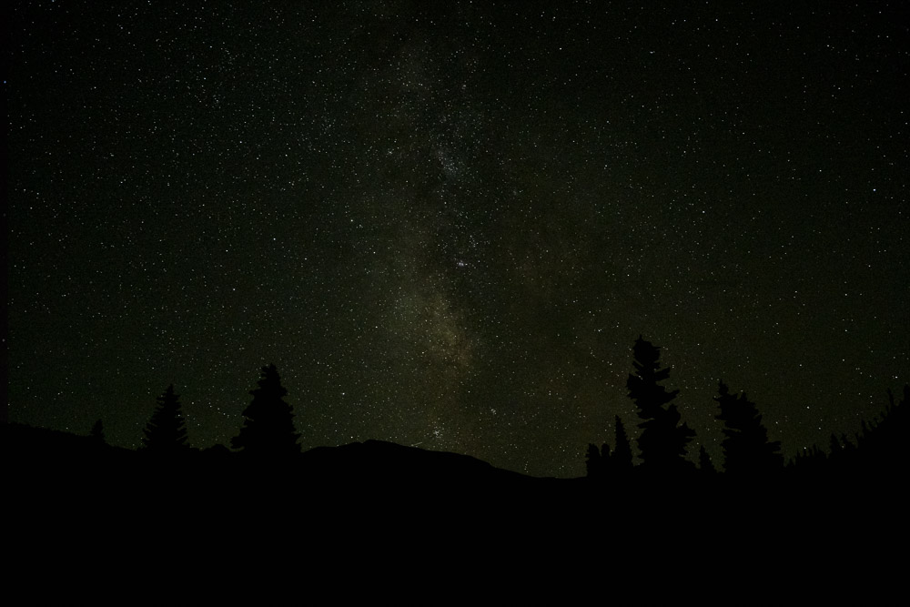
 ©Ed Schlotzhauer
Chromatic aberration
Chromatic aberration is something we seldom consider, except when we are getting down to the last details of a final print. One of the nasty realities of physics is that each “color” of light is a different frequency. The amount of “bend” the lens gives to light is dependent on the color (frequency) of the light. This means not all the colors focus at the same point. That’s bad.
Have you every looked very closely at magnified blowup of a sharp edge in one of your photos? Especially if it is in a high contrast lighting situation. You may see a slight fringe of green or purple around the edge. This is called chromatic aberration. Not all the colors focusing together.
One of the purposes of the exotic glass and all the elements in modern lenses is to minimize this. They do a pretty good job.
But they are not perfect. Luckily it is a simple check box in Lightroom Classic to have the software automatically remove chromatic aberration.
Other considerations
If you ever carry a camera around all day you learn to appreciate light weight. Lens designers would like to design their lenses with a very sturdy metal shell and structure. But we would not like to carry that. Modern plastics and design techniques have allowed the designers to create our lenses at a more user friendly weight while still being sturdy enough to hold up to hard use. Thank you.
Did you know that some lenses make the light come into the sensor is a certain direction to make the sensor receive the photons better? Did you know that most of our zoom lenses, especially, have quite a bit of distortion and vignetting and resolution falloff at the edges? Those are some of the things that are part of the tradeoffs. But one reason they are traded off is there’s a bit of perceptual and software slight of hand.
First, we don’t notice it much. Really. We are not as sensitive to it as you would think. Unless you spend your time photographing test charts. Second, many of us set Lightroom Classic to look at the model of the lens and automatically apply a “correction” to the image we see. Adobe has a database of lenses with mathematical models to correct their distortions. This is a good thing.
As a matter of fact, Nikon has a special deal with Adobe such that the great Z 24-70 f/2.8 lens is automatically corrected in Lightroom Classic, whether or not the user selects that. It is impossible to defeat it. Hardware and software are joining in a symbiotic relationship. Making an image is a blend of both and it will only increase with time.
Almost everything done to solve one problem creates another. This is why designs are so complex and expensive. Everything is a tradeoff. It is all a question of how good can we make this property while not letting that other one get worse than a certain level.
 ©Ed Schlotzhauer
Magic
I am in awe of these brilliant designers. They achieve beautiful balance. Like I said, I regularly use this example lens I have talked about and I am generally very happy with it. But let me emphasize that pure, unexcelled technical perfection is not usually my goal. A lens like this is “good enough” for 99.9% of my needs.
For me, as a user, I take the camera out and start using it. What I see and feel is more important than technology. Sometimes, though, my engineer nature kicks in and makes me marvel at the complexity. But really, I shoot and expect my great gear to capture what I want. And it usually does. Marvelous.
The magic of the. lens. Like most good magic, how it works is invisible to us. But occasionally stop to consider how lucky we are and what an incredible piece of technology we have attached to our camera body.
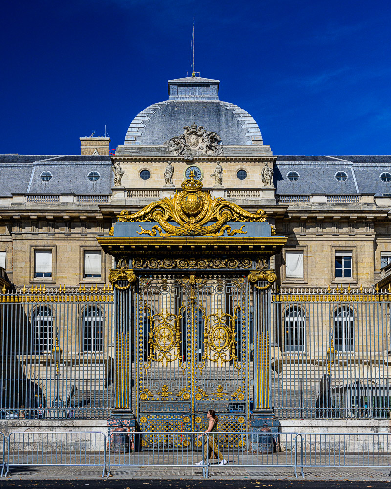
Feature image
The image at the top was shot with this Nikon Z 24-120mm f/4 zoom lens I have been using as an example. This is the Hotel de Ville in Paris – their Town Hall. You can’t really tell in this small jpg, but I am completely happy with the capabilities of this lens. If the opportunity arose I am sure I could make a very good 60″ print of this. Here is a section of it zoomed to 100%.

Let me assure you that I am not affiliated with or sponsored by Nikon. I am just using this nice lens that I use frequently as a representative example of what a modern zoom lens is and is capable of doing.
 From https://digital-photography.com/camera/autofocus-how-it-works.php
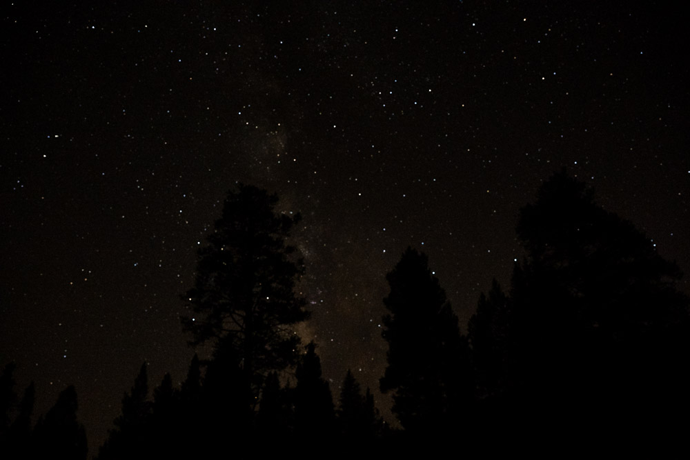 ©Ed Schlotzhauer
 From the White House Collection. Image from Google Art Project
 © Ed Schlotzhauer


 © Ed Schlotzhauer
 © Ed Schlotzhauer