I’m generally very anti-AI, but it is a huge, fast-moving field splintered in lots of directions. Not all are bad. This is a snapshot of how I use AI today.
Traditional argument against AI
The traditional argument against AI is that it takes over our creativity and allows automated generation of scenes. Yes, this is possible and it is being done every day.
For many, it is no longer necessary to locate or create an interesting subject to photograph. Just let the AI agent do it. If you want a purple elephant in that scene, just describe it to your friendly chat bot and it will quickly create several variations to select from. To me, this is fantasy illustration, not photography.
But I’m a photographer. My work is based on reality. Even if I create a fantasy composite, it is built from pieces that actually exist somewhere. Pieces I have found and collected just for this purpose. All of it is my original photography and the combination is my own creative work.
I sincerely believe that AI cannot think or feel. It has no soul. It cannot appreciate what it generates. By my somewhat biased definition, this invalidates it from being art.
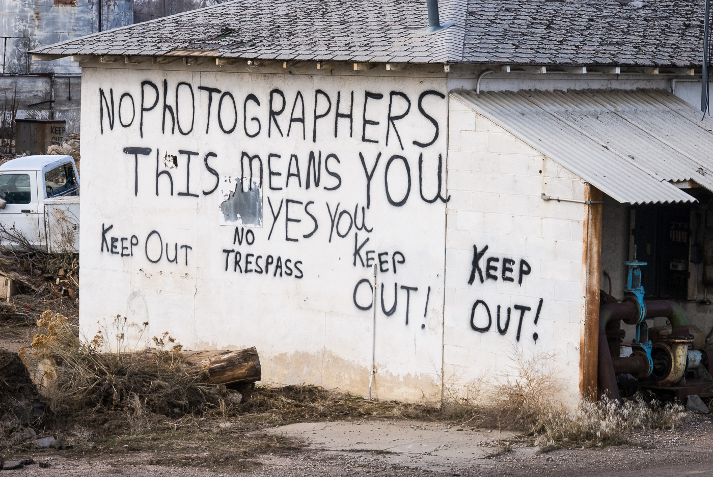
 ©Ed Schlotzhauer
It’s just a technology
But let’s not forget that it is not a living entity and it is not magic. It is just technology. It is software running in a data center. The people who build it don’t understand how it works and why it does some of the things it does, but still, it is technology.
Almost any technology has the potential to help us in some positive way, if it is used appropriately. This is true from the printing press to nuclear energy to AI.
With AI, though, we are in a very immature early phase. Everybody is running around saying “Oh, look at this!”, without considering what it means or where it leads. AI is a large field. It is hard to make blanket statements about it.
The hype told you AI would change everything overnight. The reality is slower, messier, and far more expensive than anyone admitted.
The AI Coder, Medium
Photography technology history
Photography has progressed through several generations of technology changes without being destroyed.
The original hard-core photographers had to mix their chemicals, coat glass plates, expose them in their heavy 8×10 view cameras, then rush to their tent to develop them. You had to really want to do it.
But then coated film was developed. The field opened up to many more people. We could shoot all we wanted – all we could afford, anyway, drop them at the photo store, and get prints back in a few days. Small “walkabout” cameras like Leica exploited the new, smaller film and became hits. The. world was more convenient, film and lenses kept getting better, and things were generally pretty good. We no longer had to suffer to be a photographer.
But then someone (Kodak, as it turns out) came along and created digital cameras. No more film. No more waiting for prints. It started as a crude technology but quickly grew to dominate photography. It is all I use and I wouldn’t go back. I know for sure that I got the image and real-time histograms are something I would not give up. Even film purists would generally agree that digital has surpassed film in resolution. A side effect is that now everyone is a photographer, and photography tends to lose its identity as an art.
At every stage, the old-time purists declared that the new technology would ruin photography. Actually, it just kept getting better. I believe some parts of AI will be like this and some won’t.
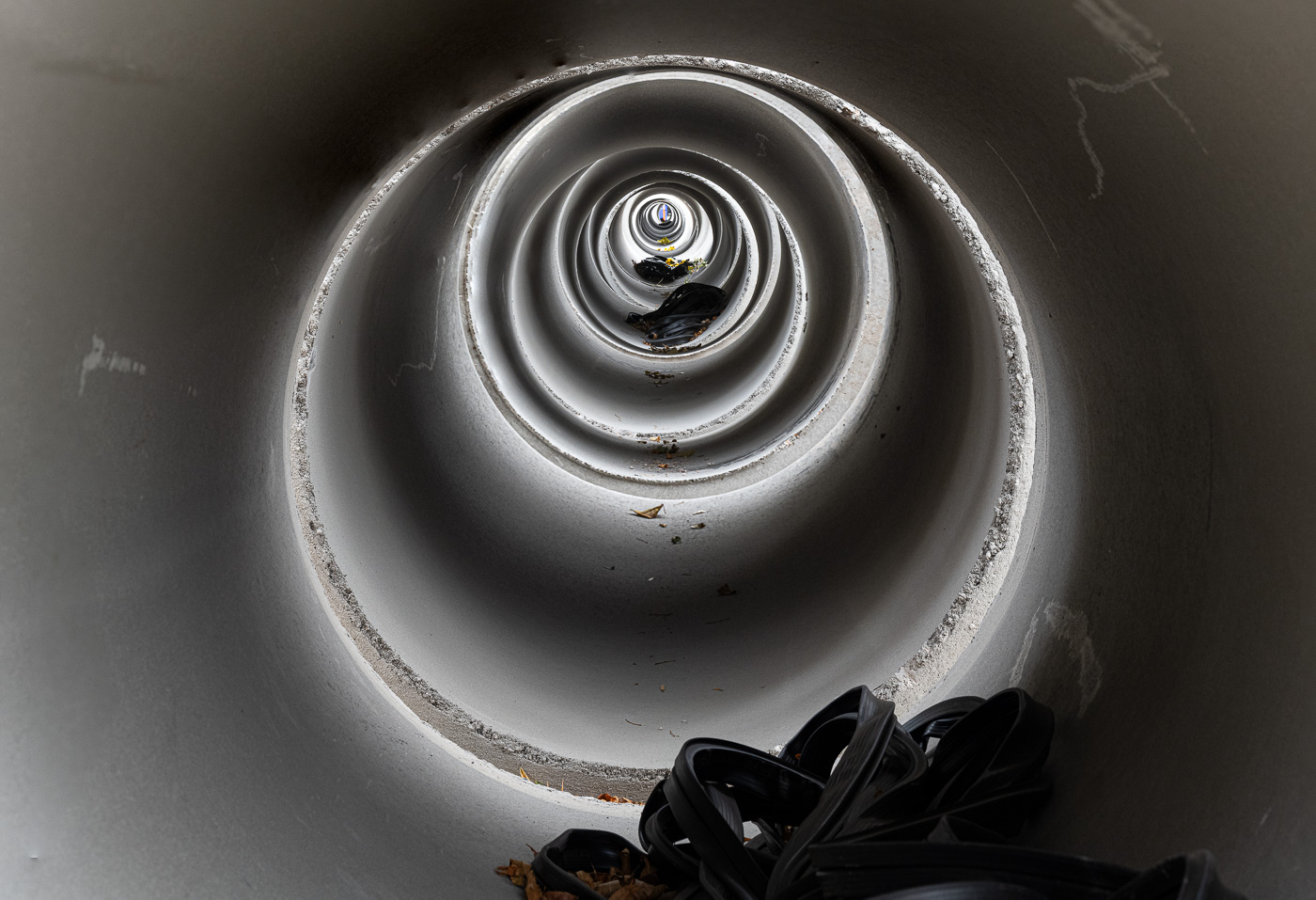 ©Ed Schlotzhauer
In camera
Unless you are shooting a manual camera, there is a lot of “AI-like” technology embedded in your camera. I’m referring to things that can take over creative decisions from the artist. Remember, AI is a large field. There are a lot of small, focused applications of the technology.
Going way back before AI was named, Nikon developed a multi-segment metering system, and its exposure system was “trained” using thousands of properly exposed images taken with the matrix. That is basically the definition of AI. At this point, matrix metering may be based on actual AI technology. I don’t know. It works very well and keeps getting better. I have trusted the Nikon matrix metering system for many years. But I monitor it, and if I disagree, I override it. This is a key.
Or look at the focusing systems in our cameras. They have grown to hundreds of sensors that can work singly or cooperatively together to achieve near perfect focus. I very rarely focus manually. Some of the systems can “look at” the entire scene and decide what the focus point should be. And some recognize eyes and focus on them. And some track moving objects and predict where to focus at the moment the shutter is pressed. These relieve the photographer of some tedious manual control that requires a lot of practice to get right.
I’m not necessarily saying this is literally AI, but that is a matter of definition. It is an example of technology that can automate manual work for us, allowing us to make the creative decisions. This is good technology. But it is important for a photographer to be vigilant and always ready to override the technology when it goes against our creative idea.
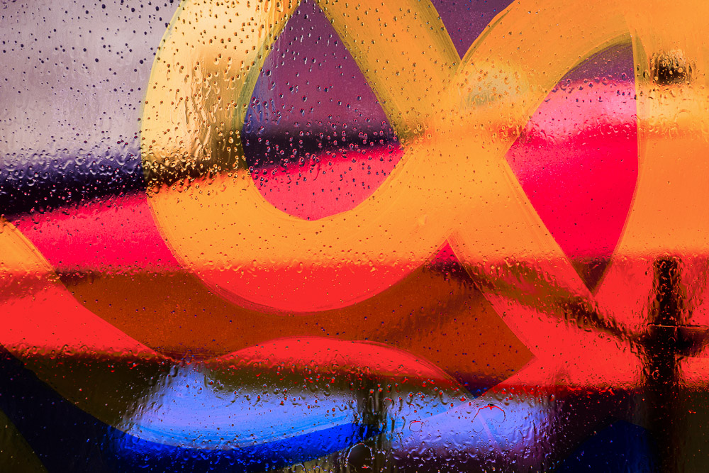
 ©Ed Schlotzhauer
In post-processing
Probably the main area where we would recognize AI being used is in post processing. Lightroom Classic and Photoshop are the main tools I am familiar with so that is all I will discuss. This is not a tutorial on using AI tools, so I will only point out some of the features I use.
One reason Lightroom Classic has almost completely replaced Photoshop for me is the ever more sophisticated masking tools. These allow me to manipulate images more precisely and the AI features save significant time in applying them.
Sky and subject masking have been around quite a while, but their algorithms are getting much better (AI training?). Have you used the new Landscape masking tool? It is a fast way to create several masks isolating various parts of a scene, like foliage or mountains or architecture.
Automatic people masking can be a real aide. It gives specific control to create individual masks for a wide set of features, down to selecting only the whites of the eyes.
Something I fought for a long time but am starting to warm up to is the distraction removal features. It occasionally does a fast and decent job of removing people. The reflection removal is occasionally awesome. And I have been known to take an image into Photoshop just to use its wire and cable removal tool.
I confess to very often using the Auto exposure correction button in Lightroom Classic. It gives a quick starting point. I always change the settings, maybe undo it completely, but I like to see what it thinks should be done. Often it will push the image in the direction I want to go.
Another one I have a love/hate relationship with is Healing. I don’t find that it works well in general, but occasionally it saves a lot of time.
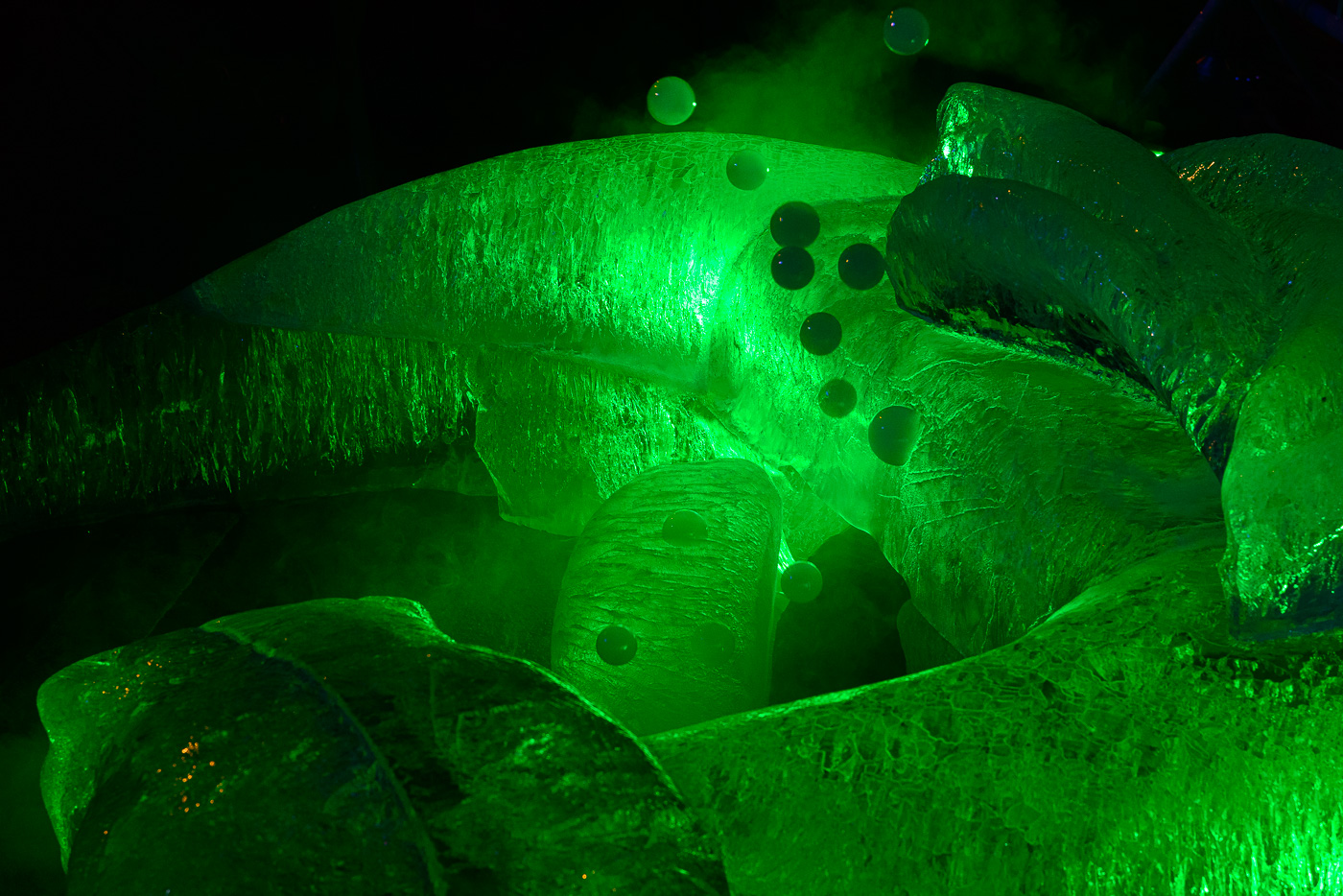
 ©Ed Schlotzhauer
Who is in charge?
Who is in the role of artist? That is the point of all of this. I only use targeted tools that I allow to operate on parts of my image under my supervision. When they work, they are significant time savers. For instance, using the sky selection tool saves me a lot of time consuming, non-creative work. I do not consider that it replaces any of my creative judgment. None of these do anything I could not do myself. They just do it faster, freeing me to spend more time making creative decisions.
Well, the reflection removal is something I probably could not do myself. Maybe that makes it too much AI incursion.
These are examples of the power of AI in post processing. The tool set seems to be getting better all the time, and I appreciate many of them. It is a welcome productivity boost.
But in all cases, I only use AI as a labor-saving device and a multiplier for my creative effort. It does grunt work faster than I can. I do not give it a prompt to create a purple elephant in my image. I will not allow it to create significant imagery itself. If I did not photograph it or create it, I will not use it.
Technology can be good, but it can run out of control. My position now is that AI is good if it can help me get my creative work done easier. But I keep a tight control on who is the creative artist and what is the tool.
The future?
This is a point in time report. The world of AI is large and fast moving. I can’t predict what will happen in a year or 2. Will I break down and start using generative AI, or will I stand my ground, or will photography as we know it disappear?
My guess is I will keep my current arms-length position but will enjoy lots of new AI-powered tools. It will be an interesting ride.

 ©Ed Schlotzhauer
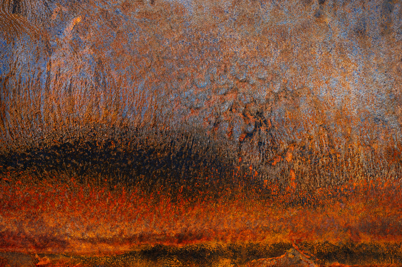 ©Ed Schlotzhauer
 ©Ed Schlotzhauer
 ©Ed Schlotzhauer
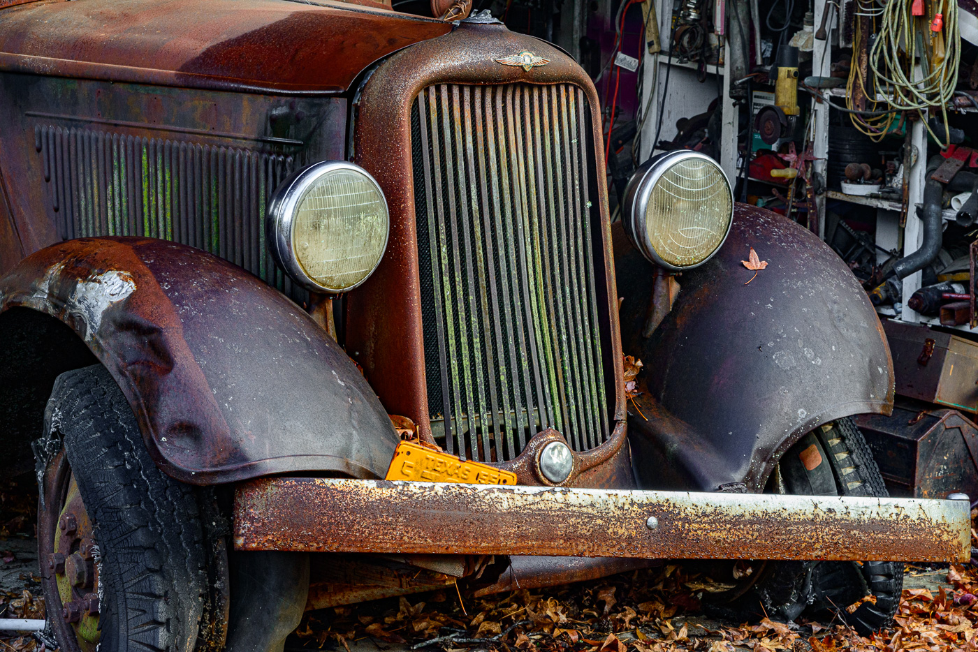 ©Ed Schlotzhauer
 ©Ed Schlotzhauer
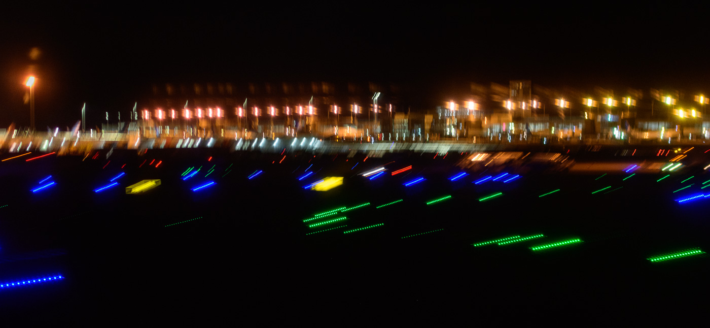 ©Ed Schlotzhauer
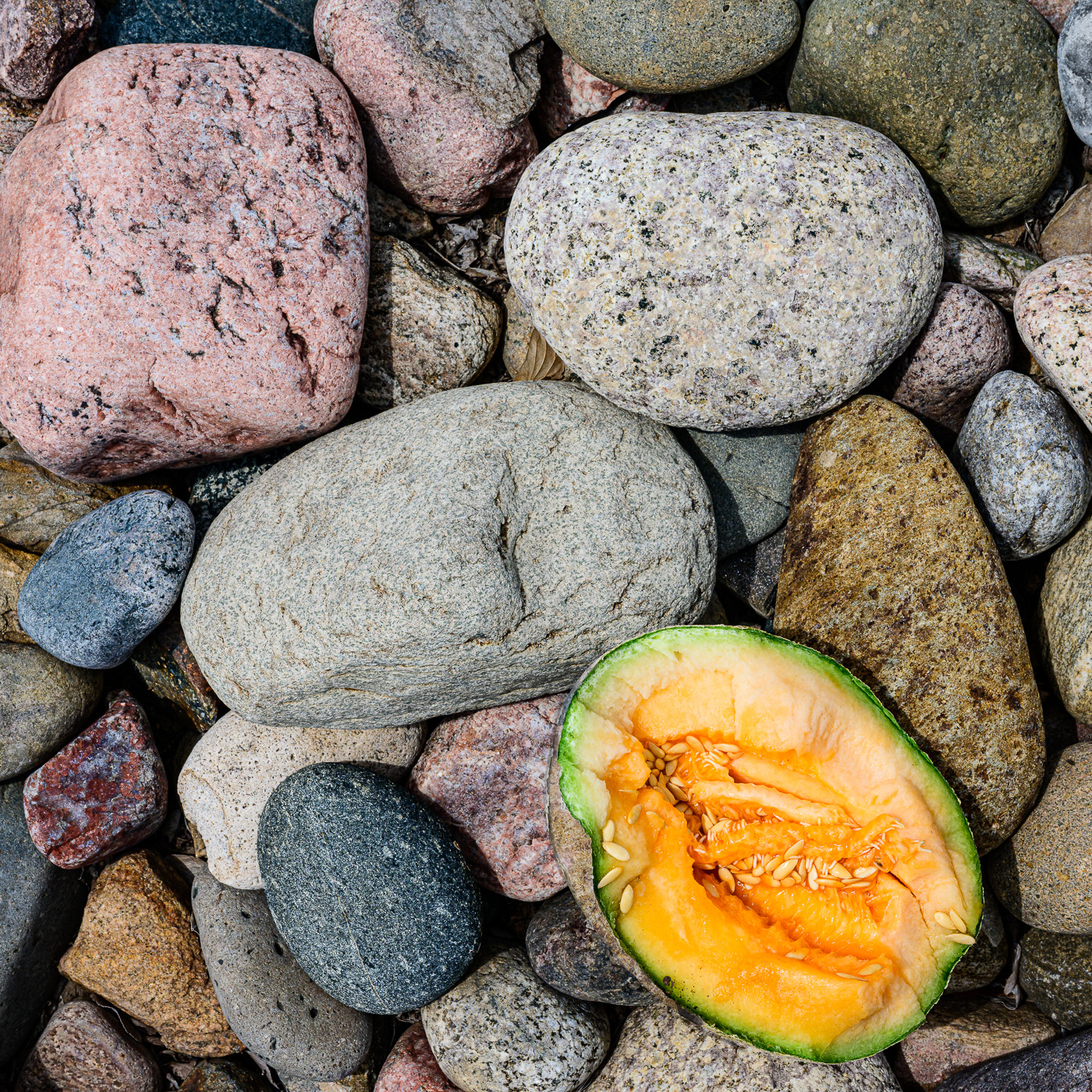
 ©Ed Schlotzhauer
 ©Ed Schlotzhauer
 ©Ed Schlotzhauer
 ©Ed Schlotzhauer
 ©Ed Schlotzhauer
 ©Ed Schlotzhauer
 ©Ed Schlotzhuaer
 ©Ed Schlotzhauer
 ©Ed Schlotzhauer
 ©Ed Schlotzhauer