We can choose to be the 1% of photographers. Those who make prints. A print is a special thing with it’s own life.
The 1%
I’m not talking about that 1% we hear talked about – the richest people in the world or the country. The latest data I could find for the USA says that, on average across the country, to be in the 1% you need a salary of about $600,000 or a net worth of $11 Million. Another article said that 1% of the people in the world own over 50% of the total household wealth.
I am not bringing this up to get into any discussion of income inequality, investing practices, demographics, or anything related to that.
No, I am referring to a group of photographers we can easily choose to join. Peter Eastway speculates that only about 1% of photographers make prints. Why do you think we don’t print more?
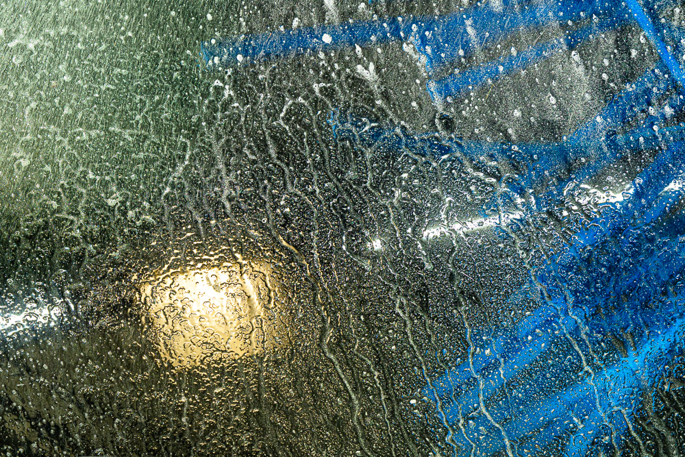
 ©Ed Schlotzhauer
What is a print?
First, what do I mean by a print? This may seem obvious, but I want to make sure we are on the same page, so to speak.
By a print I am referring to an image presented in a physical medium. A print is an object with weight and space and presence. We can hold it and touch it. We perceive it with our physical senses. And it is “permanent”. That is, it persists unchanged over time.
A print is an enduring expression of the artist’s intent at the time. I say at the time, because it is quite possible for my intent to change with time. Today’s print may be quite different from one of the same image file 10 years ago. I can come to see it different. That is natural. I am the artist.
What is a print not? It is not an image on a screen. Not your computer monitor or a iPad or your phone. It is not a fleeting image scrolled by on social media.
Screens are important in the production of our art, but they should not be the goal. Psychologically, we know that what we see on a screen is ephemeral. It has no permanence. We discount it easily.
Why a print?
A print is tangible and persistent. It is an artifact in its own right. That is, it is physical. It is an object. We can hand it off to a client who buys it and it becomes their possession.
By giving the print this life of its own, we are creating a new piece of art. It is no longer under the control of the artist. Kind of like a child growing up and going out on their own. They are your family, but they have their own life now.
As the artist, I can no longer “huddle over it” and protect and explain it. It is on its own. Now it is hanging on a wall. Maybe in someone’s home. Maybe in a gallery. But no matter where, it is now perceived for itself in isolation. It has to explain itself, fend for itself.
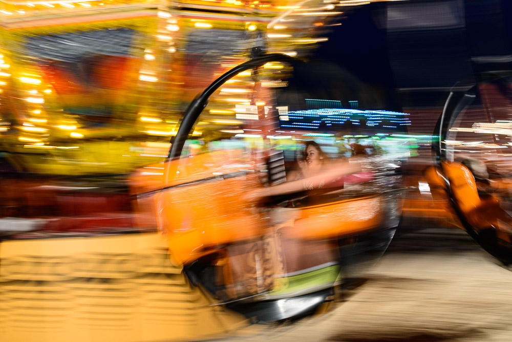
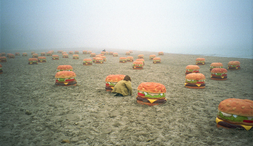
 ©Ed Schlotzhauer
What does it do to our thought process?
Deciding to make a print changes our perception of what we are doing.
For one thing, we have to commit our interpretation of what we see or feel in the image. Once we make the print, we can’t come back next week and change it. If we do, it becomes a different piece of art.
And we will go through a more stringent selection process to pick it. Out of my thousands of good images, why print this one? Does it do a better job of representing my view on the subject? Is it a more perceptive representation of something I feel? Will this give my viewers more insight than the thousands of other images I could have picked? Is this an image I will hand to the world and say “this is me?”
And making a print involves new creative decisions. What size should it be? Some images seem to call to be large while others seem to prefer being small. Should this be a paper print or canvas or metal or acrylic? Will it look best as glossy or matte? Sure, some of the decisions will be dictated by the intended application. But many are purely artistic.
And there are technical considerations that come in now. Can I print it and mount it myself or must I send it out to a service bureau to be done? The selected media imposes constraints on the image itself. If the desired effect is soft and ethereal then a matte finish may be best. But if the image relies on sharp detail a glossy substrate will make that pop more.
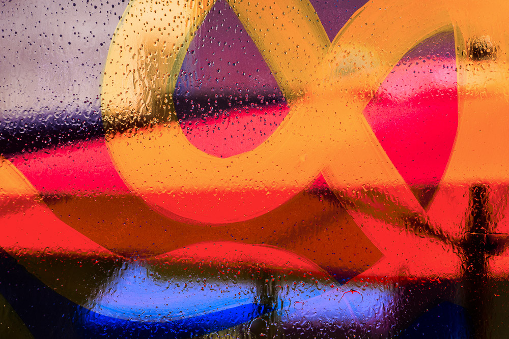
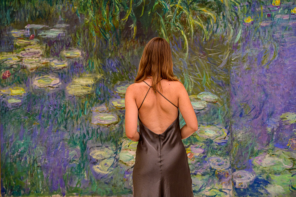
 ©Ed Schlotzhauer
Technical considerations
Creating a good print is a specialized process that requires some detailed knowledge. The fundamental problem is one of basic physics. Screens generate light and emit it. It is an RGB mix and it is additive. That is, red + green makes orange.
We see prints by reflected light. Light hits the surface of the print and what bounces back is what we see. It is a subtractive process. The ink absorbs some colors. We see the reflected light that is not absorbed. To make less red you add cyan. Cyan is the opposite of red. More cyan absorbing red means less red reflected.
This fundamental difference means that a print will never look exactly like the image on screen. How close we can come is one of the challenges. How close we need to come is an artistic judgment.
One barrier I hit a lot is color gamut limitations. Print media generally has a smaller color range than our computer monitors. It probably has a smaller range than the color space we are working in. No physical media can print the whole ProPhoto RGB space, for instance.
Editing the image for printing is a task on it’s own. We load profiles for the media and printer and inks that we are using. A special profiling view is switched on so we see a simulation of what the final print will look like. This is, at best, a fair but not exact model. The reality is it may require several rounds of test prints and re-edits to get to a final print we like.
It can be a lot of work, but it is part of the artistic process. This is work we have to do to “birth” the print as its own entity.
 ©Ed Schlotzhauer
Viewing it
We have gone through all of this work and expense to create a print. Why? Was it worth it?
This is a personal evaluation.
Sometimes you are disappointed with the result. Some images just do not seem to print well. That could mean we did not choose the best medium or size.
But most of the time you will feel the satisfaction of creating something new. Because the print is a new work of art. It is a distinct physical object with a life of its own. It lives in the world and is evaluated by viewers.
We did our best job of composition and subject selection and lighting and a host of other things. We edited it carefully and prepared it for printing. Now it passes into another realm. We have tried to guide the viewers to see what we saw, but now they are on their own to discover it.
The child leaves home and starts its own life. We are proud of it, but we cannot control it. It is not ours anymore. The viewers evaluate it on its own independently.
Something tugged their interest enough to take a look at it. Maybe we can draw them in and take them on a journey they did not anticipate. That is joy for the artist and the viewer.
Take the leap. Be one of the 1% of photographers who make prints. It can change your art. And it can be a legacy.

 ©Ed Schlotzhauer
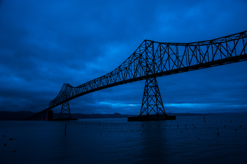 ©Ed Schlotzhauer
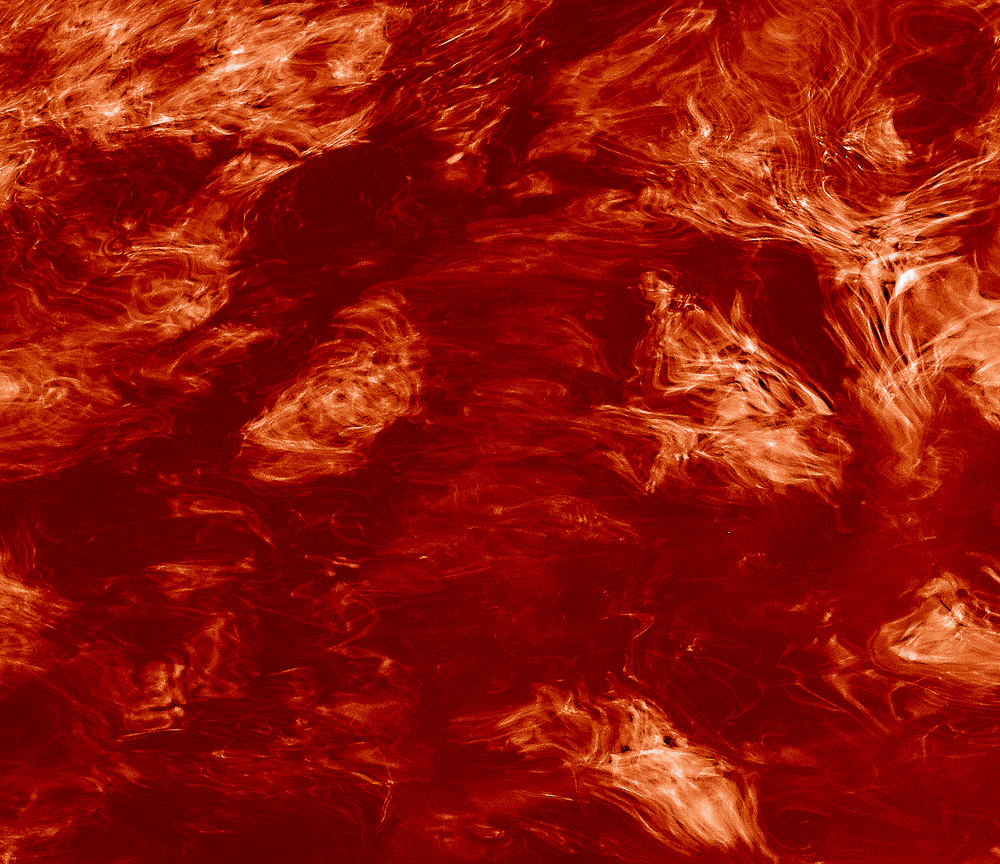 ©Ed Schlotzhauer
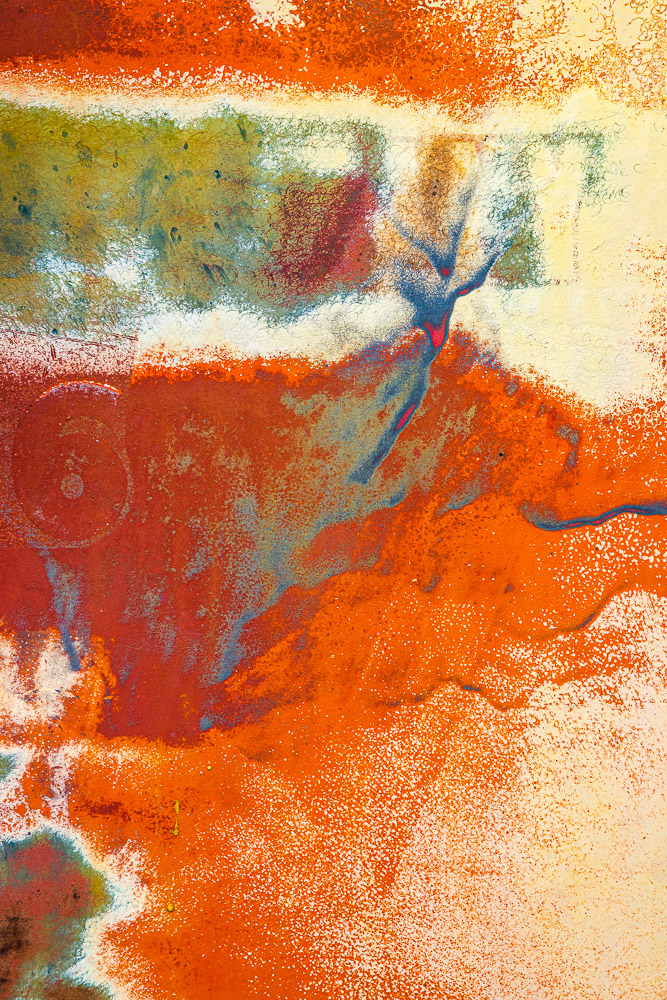 ©Ed Schlotzhauer
 ©Ed Schlotzhauer
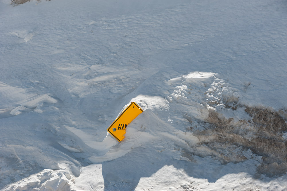 ©Ed Schlotzhauer
 ©Ed Schlotzhauer
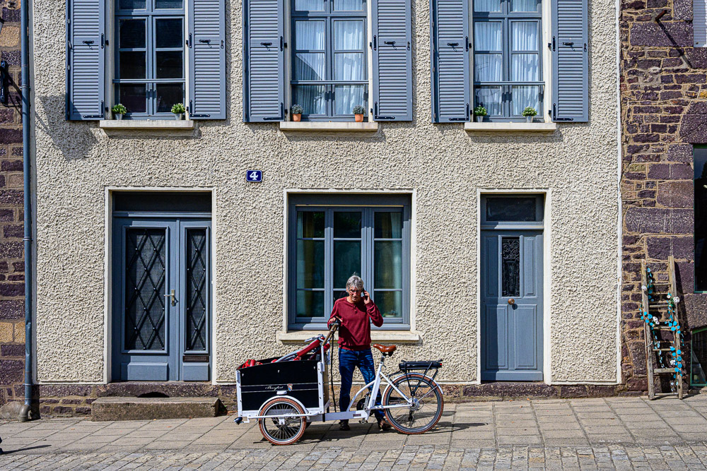
 ©Ed Schlotzhauer
 ©Ed Schlotzhauer
 ©Ed Schlotzhauer
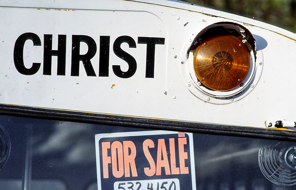 ©Ed Schlotzhauer