Photographing the unseen? That is impossible isn’t it? If you can’t see it, how could you take a picture of it?
Ostranenie
Osranenie is a concept. It is based on showing things in a new way, from a new point of view. I have written on this before and I want to circle back to give some practical applications. No, I still don’t know how to pronounce it.
Central to the concept is that the artist tries to force the reader or viewer outside of their normal state of perception. The goal is to make you break your normal habits and look at things different.
A unique ability of photography
Photography is uniquely suited to help see things outside of our normal perception. Other types of art, like painting, are generative. That is, you start with a blank canvas and what appears is what the artist envisions.
Photography is totally the opposite. It is basically subtractive. The camera captures everything in its field of view. It is up to the artist to be selective in framing and composing to restrict the image to what he wants to present.
That is well understood, but in addition, the camera settings and attachments allow exploration of states that we cannot perceive with our normal sight. Without any special tricks, my camera allows shutter speeds from 1/8000th of a second to 30 seconds. And the long exposures can be extended to any length I desire. I can also change lenses to give different perspectives on a scene.
Photography may be, at heart, a mechanical and technical based art, but that technology allows us to peek into the world in unique ways.
Camera vs eye
As humans, our marvelously designed eyes work in a totally different way than a camera. We constantly scan around and “snapshot” small slivers of our field of view. Our minds seamlessly stitch this constantly changing stream of images together, kind of a real time panorama. We don’t notice it happening. What we think we “see” is actually a model built from these scans and our interpretation of its meaning and our experience with similar subjects.
The camera has no built in biases. It just represents what it gathers in one exposure.
Time extremes
I have mentioned time as a variable of photography. But so what? How can that give us a new perception?
If I adjust my camera to take a frame at 1/8000th of a second, it does it. The result is a frozen slice of an instant that we cannot perceive with our normal vision. A cascade is a classic example. Shooting at a very short shutter speed freezes the motion of all the water and allows us to examine what is truly happening in an instant. All the complexity and the turbulence we cannot perceive.
On the other extreme, if I expose it for seconds, the water will blur into streaks that give an impression of the overall motion going on. We sort of understand that this is what it might look like over time, but we can’t actually see it unless we take a picture.
Here are a couple of (not very good) examples. Actually, I seldom use short shutter speeds on water so I had to go out to the local river and generate an illustration.


In the first case, the water seems crystal-like, frozen. In the second case there is a distinct impression of motion and flow. The point in each case is that this is not what we actually see when we’re looking at the waterfall. Each is a bending of our perception, revealing new views on the world to us.
Space
Our cameras also have the ability to give us different perspectives on the space around us. Our eyes have a fixed focal length that is around 40-50mm equivalent for a 35mm camera. And we see the world in a horizontal format. But we can put a variety of lenses on our cameras to give views from extreme wide angle to extreme telephoto. And we can rotate our camera in different orientations.
We’re used to seeing our “normal” point of view – that’s why 50mm is called a “normal” lens. A wide angle stretches our view, Things converge in unexpected ways. Lines make distinct new compositions. Buildings “bend” in funny ways. It brings together much more width of view than we are used to seeing.
And the opposite, a telephoto lens, compresses our view. It narrows in on a small area, like when we look through binoculars. It gets us closer to something we would not normally be close to, such as a wild animal. And it lets the artist draw our attention to details of small parts of a scene.
Each of these effects is a distortion or exaggeration of our perception. It is not what we actually see, but it allows us to discern the world around us in new ways.
Motion
Our perception of motion is another effect the camera can record but that we perceive much different. Try an experiment: move your head rapidly from side to side. You don’t really notice much as your head is moving. As soon as you stop you have a clear view of the scene before your eyes. Our mind kind of “skips over” the motion.
Or try another experiment: stand beside a road and start straight ahead as cars go by. What do you notice? Something obscures your vision briefly, but we tend to ignore it. It’s more of a distraction to what we are watching.
The camera, though, sees all that passes in front of it. It doesn’t know to ignore some things as immaterial. I often use the technique knows as intentional camera movement (ICM) to achieve reality distortions to show the world in new ways. The image at the top of this article is such a motion capture. You know what the scene is, but you also know that you have never actually seen the world like that. It helps you think of it is a different way.
Color
Another thing we have excellent control of now is color. More or less, change the hue or saturation – it’s easy with our tools. These things could not have happened in early photography.
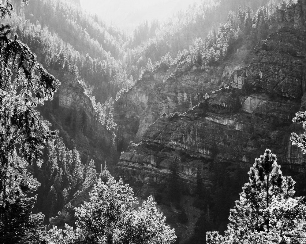
I feel the need to single out one significant category of color manipulation that we are very familiar with. Black & white. This is not the way we see the world. By presenting an image without color information, our perception is changed drastically. It keeps us from getting distracted by color and helps us to really look at the shapes and tones and forms in the scene.
We don’t produce a black & white print now because we are limited by the medium. A black & white print got there by the artist deliberately deciding to remove the color. We may not think of it this way, but black & white images are a deliberate distortion of our perception to help give us a new point of view. It is an alternate reality.
Bending reality
Photography has the ability to bend reality in many ways. That is one of the things I love about it. I am not ashamed of it. It is not cheating or an artifice. It is using our creativity to create art.
I think this quote expresses it well:
In our time it seems entirely appropriate that the widest choice be open to artists. Those using the camera or other photographic means to produce works of artistic merit should seek to exploit their medium in the most adventurous ways … The derogatory use of the term artifice is more often than not a bugaboo. Art is artifice. Its reality is of another nature than that of the purely physical world.
Aaron Scharf
A different perspective
I really appreciate that photography has abilities to give us different perspectives on the world. I am tending to push in these directions more and more in my work. Of course, artists in other media can do most of these things, but they would have to either have an amazing ability to visualize the unseen, or they would likely take a picture to show them the unknown and then paint it. Photographers do it directly.
Maybe it is stretch to call this bending of perception ostranenie, but I don’t think so. I doubt if the term will ever catch on. Probably a good thing, because then I would have to learn to pronounce it.
There are few actually new things in the world. The idea of ostranenie was penned in 1917 – 106 years ago as I write this. But I am happy that photography lets us push the boundaries into new visualizations of reality. It is a uniquely capable art form.
Let’s go out and shoot the unseen and impossible! Keep on bending! Get outside of normal perception.