Digital images are just data, pixels, digital values. Yes, but… That’s like saying paintings are just pigment smeared on canvas. It can become something more.
It’s data
Every digital image is data. I won’t go into film. It is the same but different. But a piece of exposed film is just data, too.
What comes off my sensor is a rectangular array of pixel values, red, green, and blue tuples. Tuple is just a mathematical term for a small set of numbers you keep together and in order. In this case (red value, green value, blue value). This is just numbers. Data.
When this data is brought into my computer it is still data. The manipulations I do on it in Lightroom and/or Photoshop are mathematical operations. Things computers are good at dealing with. An image may be gigabytes in size, but it is still nothing more than data.
Data just is. It doesn’t mean anything.
Interpreted by our minds
When the data is displayed on screen, I can view it and interpret it as something. This is the key. It means nothing until a human interprets it.
A particular set of contrasting tones and colors in a region looks like a tree to me. Even if the computer uses an AI classifier to identify it as a tree, that is just a meaningless label to it. The computer does not know what a tree is. An image of a tree cannot invoke memory or symbolism or meaning in the computer. It can in our minds.
So the data we see on screen, that is just variations of intensity and color, becomes meaningful to us because we are human. The data itself does not encode hope or despair or memories or associations or pain or beauty. That is what we make of the data.
The pen
There is an old expression that says “the pen is mightier than the sword.” This is true, but unpack it a little. A literal pen (do you remember what those are?) is not stronger or more forceful that a literal sword. The expression is metaphorical. The force of words conveyed to people’s minds can do more than the threats of swords can.
This is the case with images. The data making up the image means little. What we interpret from the data when we view it is everything.
I do not get political in this blog, but from a sociological interest, the protests going on in China (as I write this) are fascinating. Censorship is so strict that the symbol of the protests is a blank piece of paper, representing that they can’t say anything. From an engineering point of view, the amount of “data” in a blank sheet of paper is zero. It is the meaning ascribed to it that makes it powerful. An empty of paper can say volumes.
What elevates some?
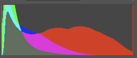
Back on track, how is it that some data creates a far different effect than others? It’s much more than just the data. For example, here are 2 histograms. This is important data about the color information and distribution of pixels in each image.


Their shapes are not that different. The one on the left has more warm dark tones and is darker overall. The one on the right has a lot of bright reds. Both have a red spike at the high end. But these are just 2 sets of data.
Would it make a difference if I told you the left histogram is the Mona Lisa and the right one is a random flower image from my reject bin?
So we cannot take an engineering view of the data to infer the value or user reaction. Our human perception makes all the difference.
More than data
The famous photographer Edward Weston once said: “This then: to photograph a rock, have it look like a rock, but be more than a rock.” It is a little bit of a stretch, but I don’t think it breaks badly to say when we press the shutter, we collect data, but it is more than data.
We could look at the data as an engineer and analyze histograms, tonal distributions, edges, area balances, and 100 other parameters. I know. I have. But my conclusion is that matters little. It gives us ways to describe the superficial data, but it says almost nothing about what the image means to us as humans.
So what?
I think we always have to ask “so what?” when we learn something new. Let me share 2 takeaways I get from this.
The first is that the data doesn’t care. I spent years trying to optimize the perfect histogram, ensuring total, crisp sharpness, capturing and preserving perfect color balance. At this point in my journey I will say that none of that really matters. All that matters is the effect I bring to myself and my viewers. Is it pleasing? Does it make us think? Is there a larger idea behind the surface scene?
The second takeaway is even harder for me to really grasp. It is just data, and the numbers don’t really matter. This means that what the original scene looked like (the captured data) should have little bearing on what we do with it. Process the data as much as necessary to create a great image. I need to stop being limited in my thinking by the reality I started with.
If it was an average, sunny scene but I feel it should be dark and moody, fine. If it was a colorful scene but I feel it should be presented in black & white, fine. Crop it. Add texture. The original data should not limit our artistic interpretation. This is one reason I often find it valuable to let images “age” a bit before I process them. I loose much of the association to the real scene and can take a more artistic view of the result I want.
Today’s image
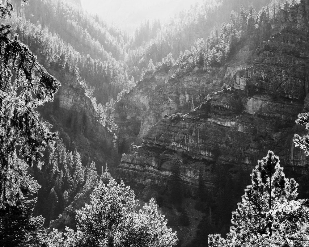
I love this image and this place (Ouray Colorado). The sunset was almost blown out from a haze of wildfire smoke. Contrast was challenging. But I had to get something. It was too beautiful to stand idly by.
Besides B&W conversion and cropping it, the pixels have been bent quite a bit. The image is a couple of years old. I find that every time I go back to it I push it a little more to the extreme. Each time I do, it becomes a little more what I remember of the event. The less I remember the actual original scene, the more I feel free to make it match what I felt.


Leave a Reply