An artists journey

Tag: fine art photography

  • The Color Is…

    The Color Is…

    Color is one of the major considerations in our photo processing. And it can be hard. Have you ever considered how many tools and settings there are to control color in Lightroom and Photoshop?

    But where are you on the color concern spectrum? For you, is color:

    1. Critical. It must exactly match
    2. Important
    3. An annoyance
    4. Just a design variable
    5. Don’t care

    Why do we need to change it?

    Despite all of the great technology we have, color is still an imprecise and slippery thing to deal with. Different camera manufacturers often create their own unique ‘look”. Fuji, for instance, has profiles built in for some of their famous films (remember Velvia?). But because of different technology and processing tradeoffs, there are subtle differences between, say, Nikon and Canon. There are even small variations between samples of the same camera model,

    The color variations are magnified as we move further along the processing chain. What we see is greatly influenced by the decision to shoot RAW or JPEG, and if JPEG, what color balance is chosen. And is our monitor calibrated to ensure it correctly represents the colors in the digital file?

    Finally, when we make a print everything can change drastically. The print is strongly influenced by the paper we choose and the printer’s ink set. Using good profiles for the printer and paper combination helps to produce an output that is “similar” to what we edited on screen, but it will never be the same. Just the move from illuminated pixels in RGB space to reflected light from a paper substrate in CMYK space means they can never be exactly the same. The physics is completely different.

    The variations along the way are the process of color correcting the image.

    Most of us do not see or pay much attention to these differences. The importance to us depends on our application.

    Graffiti abstract ©Ed Schlotzhauer

    Tools

    The color correction tool chain starts back in our camera. Specifically, the color balance setting.

    The color of the light on our scene varies greatly in different conditions. Bright sunlight is completely different from open shade, as is a cloudy, overcast day. Indoors under tungsten or fluorescent lighting and. even LED’s give different color casts.

    Out eye/brain automatically adjusts for most of these differences, but the camera does not. The color balance setting in the camera is a means to dial out the color casts. But this is only useful for JPEG images and the preview we see in camera. Color balance has no effect on RAW images. Those compensations are made in our image editing software.

    My camera stays set to Auto White Balance. I only shoot RAW, so it has little effect on my processing or results.

    Lightroom

    When I say “Lightroom” that is a shorthand for “Lightroom Classic”. That is the only version I care about. But I”m pretty sure everything I say about it applies to both applications. There are differences in color representations in other RAW image processors like Capture One, but I do not have enough experience with them to say much.

    Lightroom is packed full of ways to change the color of our image. In the Develop module you are never far from something that can modify color.

    Some of the controls change color globally, that is, for the whole image. Just scanning down from top to bottom (I think my controls are still in the default order), we start with profile. This can be a simple selection of default balance or you can set any of the many provided color effects, including black & white toning.

    Next there is the white balance adjustment to allow us to adapt the image to a color that should be neutral. Next to that is the color balance selection to partially compensate for lighting conditions.

    Right under them is the Temp and Tint sliders. Vibrance and saturation do not actually alter colors much, but they have a strong effect on the look of colors.

    Then there is the Tone Curve, where we can adjust red, green, and blue channel properties directly, followed by Color Mixer and Color Grading. Finally there is the Calibration group where we can control hue and saturation of each channel.

    All of these are only the control that affect the whole image. We have many of the same controls to perform selective adjust color in regions (like a linear gradient) or spots (e.g the brush tool).

    Illustrating its the journey©Ed Schlotzhauer

    Partly driven by the application

    Hopefully, you get the impression that Lightroom gives us a lot of control of color. It must be important. I won’t even go into Photoshop with its many adjustments. I trust the point is made. This is not a “how to”.

    Color adjustment is a large part of what we may deal with in post processing.

    Maybe.

    It depends on our application and needs.

    If you are doing product photography, the customer is very concerned that the color of their logo or product absolutely matches their specification. Portrait customers have a fairly narrow tolerance for off colors in people’s faces. Or you may have a self-imposed rule that the final color must exactly match the original scene.

    In these cases you are probably using gray cards or Color Checker swatches to ensure you faithfully match the original. You may even be calibrating your camera to minimize discrepancies. You will probably be using many of these Lightroom controls to adjust the colors to balance out shifts or color casts.

    I’m a Fine Art Photographer

    But I’m a Fine Art Photographer. I dislike that term and I’m not completely sure what it means, but I do know that what I create is art. Art is not tied to a real scene. Maybe someday I will get into a discussion on indexicality, but not today. By my definition, anything I want to do as art is acceptable.

    I may not care at all about the color of the original scene. I’m certainly not fanatical about matching it or balancing color casts. My consideration is how the resulting image looks (to me) and what effect it has for the viewers.

    Yet I do use most of the color controls I listed earlier. Except I very rarely use Calibrarion to adjust color, but that’s just me and my thought process. All the other controls, in global and regional and spots, are tools I use frequently.

    Color is a subtle thing. Almost imperceptible shifts can create large perceived changes. It can be tricky, or impossible, to achieve an effect I have in mind. But I try.

    Abstract image with serious gamut problems.©Ed Schlotzhauer

    Not an absolute

    Breaking the assumption that my image must look like the original was difficult for me. Coming from a very technical, engineering background made me think in absolutes. Precision was important. But now that the assumption is broken, it is freeing. The realities I started with no longer hinder my vision (as much).

    Even so, I do not usually create comic book-like pop art. Unless I want to for some reason. But, on the other hand, I do often enjoy making images that are so extreme you will think I modified them too much, even if I did little at all.

    Sometimes color is the subject. Sometimes an image “needs” to be a different color than the original. An extreme use of color modification is black & white. Yes, taking away all color and just leaving tonality is extreme color manipulation.

    In the questions I posed at the start, I’m usually operating at about 4 or 5. It is a tool I can apply to accomplish my vision. Not something I am stuck with because that’s what the original was.

    Great, saturated color©Ed Schlotzhauer

    Do what you need to do

    Color perception is one aspect of a visual image. But it is a powerful one. With our technology, we are blessed with extreme ability to control or modify color. Don’t be afraid to use it creatively.

    Unless you are working in an application that demands absolute fidelity to the original, color becomes just another design element to be used for art.

    Make your art. The color is… what you need it to be.

    Today’s feature image

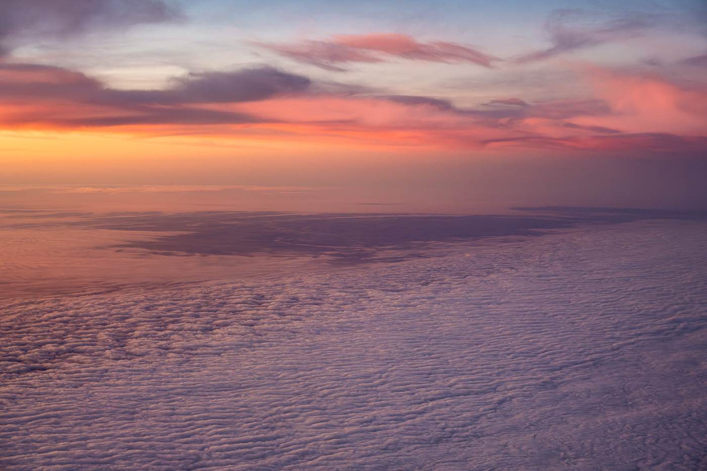
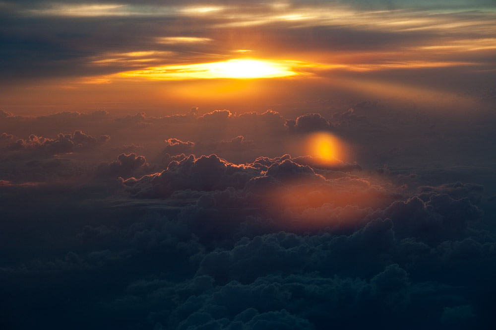
    Is this the “right” color? I don’t know. First, I didn’t have a gray card with me. Second, even if I did, I couldn’t have held it out the window at 40,000 ft. Third and most important, I don’t care.

    This is what I remember seeing at the time. It is the way I chose to make the image look. It is art. I like it like that.

  • What You See Is What You Get

    What You See Is What You Get

    This is a well worn cliché with many meanings. I would like to attach a new one to it. What you see is what you get is also a description of our photography process.

    History

    You can predict that I like to get into the background of things. The phrase seems to have originated in the mid 20th century. It was popularized by Flip Wilson in the 1960’s show “Rowan and Martin’s Laugh In”. Anyone remember that? I have to confess that I do.

    I will talk about meanings of the phrase, but one historical meaning was also special to me. “What you see is what you get” (abbreviated WYSIWYG) became a theme for personal computers back in the 1980’s. Before that, computers were terrible at dealing with fonts and layouts. Along came the Apple Macintosh and things changed radically. Thank you Steve jobs! But that is a topic for another time.

    Conventional meanings

    The normal usage of the phrase implies things are exactly as they appear, simple, no hidden meaning or content, clear.

    For example:

    “On a side note, with Jake, what you see is what you get; he’s always upfront.”

    “In this political climate, it’s refreshing to see a candidate for whom what you see is what you get.”

    “The website builder offers a what you see is what you get editor, making it easier for non-technical users to create professional-looking sites.”

    We all know what we mean when we say the phrase, at least if you speak colloquial English.

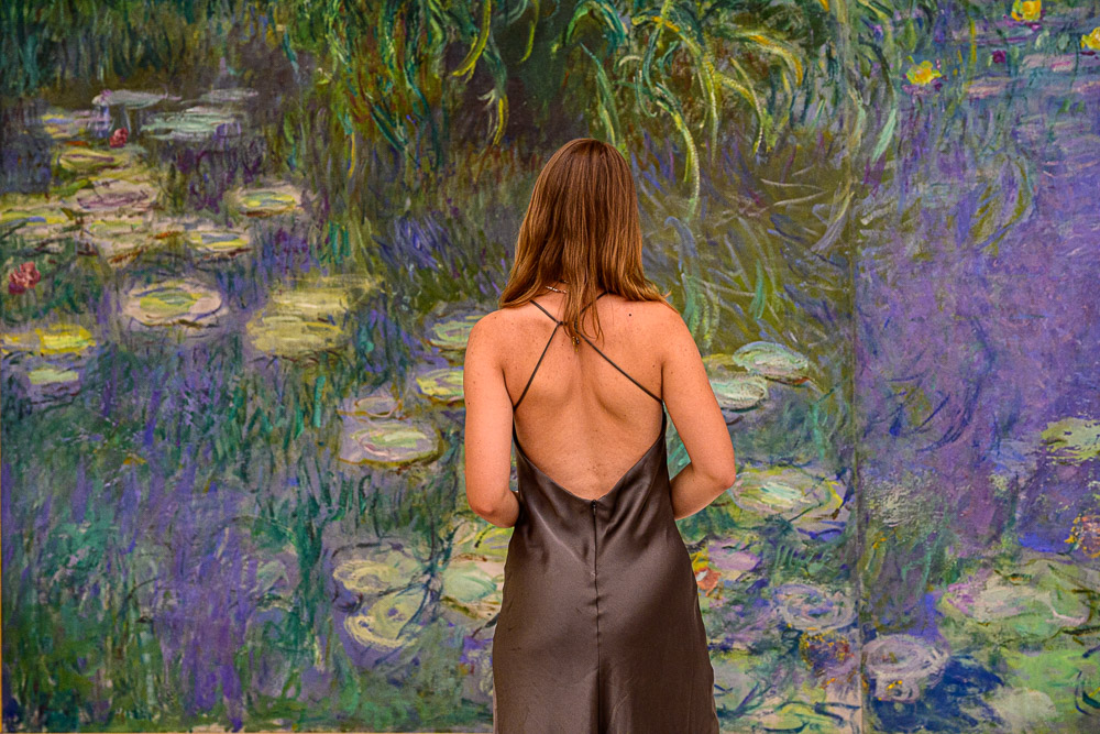
    Looking at a Monet©Ed Schlotzhauer

    In our photography

    I am proposing a new facet for this old phrase. As photographers, we have to see something to photograph it. So, what we see, is what we get.

    That sounds blindingly obvious, but think about it a moment. In today’s world, the ability to notice things is getting to be a rare and precious talent. We live in culture of distraction. Every tech device in our lives is fighting for our attention.

    But you are a photographer. I assume it is different for you. You have developed the skill of noticing things. To do that, you have to look and be aware. In order to even do that, you have to have the discipline to disconnect from most of the distraction that is keeping other people in addiction.

    It seems like it is the goal of people today to have the least contact with the outside world they can. Almost like they want to live in a Matrix-like simulation.

    Distraction

    Next time you walk around in your city pay attention to what the people around you are doing. How many are looking around, seeming to take in what they are seeing? Compared to how many are glued to their phones or isolated with headphones. If they are looking around, is it with their phone camera in front of them to record everything they see so they can post it on social media? Do they have to get a selfie in front of that pretty sight, rather than actually looking at it?

    The goal of most people seems to be to isolate themselves from the world around them. A 24/7 always on stream of TikTok, YouTube, Facebook, music, or movies provides an exciting alternative to the seemingly boring, mundane life and surroundings people have in their daily lives.

    If people are on mass transit, they are plugged in and doing their best to block out the world around them. If they have to walk a few feet from their car, they are already checking email or Facebook. My state even felt the need to make it illegal to as much as pick up a cell phone when we are driving. It was that big of a problem.

    And then there is the self imposed distraction of always being in a hurry. We rush and try to multi-task. Many people now do not even take all of their vacation, because we are too busy and afraid of falling behind. But that puts blinders on us. In our frantic hurry, we do not see much of what is around us.

    I am in no place to give any kind of judgment about people’s desire to block out or deal with the world. Everyone gets to choose their path. That doesn’t make all choices equally beneficial. If we are artists, that puts us in a different context.

    Avalanche©Ed Schlotzhauer

    Mindfulness

    A theme I can’t help coming back to frequently is mindfulness. Not in any kind of Zen practice, with painful poses and mantra chants. I don’t bend that way anymore.

    Like most great ideas, mindfulness is very simple and extremely complicated.

    From the viewpoint of photography, It is simple, because at its core , it is just about being aware of where you are, what is around you, possibilities of interesting colors and patterns and compositions and movement and subjects.

    Just being aware. Training yourself to be in the habit of looking. Turning down the volume of distractions and looking around with an open mind. Being willing to think about things around you. Being willing to slow down some.

    It is complicated, because it is exactly the opposite of what most of the world is trying to get you to do. Instead of closing into your little cocoon you have to open up to experiencing outside stimulus. This means consciously fighting against distraction that are trying to capture you.

    Crazies

    I love a quote from Lee Ann White I found recently. “If you make photographs when no one else does, you get photographs no one else does.” Simple and obvious. I think it was part of what inspired me to describe this idea of what you see is what you get.

    I’m not suggesting taking the idea of being where no one else is to extremes. My friend Dean is an example of doing that. He is full on crazy (IMHO). For example, he goes solo trekking in wilderness areas of the Colorado mountains for days at a time in the worst winter conditions. And seems to enjoy it. And gets unique shots to prove it. That’s extreme even by my standards.

    As a matter of fact, I know a lot of fairly crazy photographers. But that is not a requirement for doing good work.

    This mindfulness I am recommending does not require existential danger or major travel ventures. It just requires us to be aware. To look around and see more than most of the people around you are seeing.

    Old man pushing bicycle up hill in Italy©Ed Schlotzhauer

    Give it a try

    Look at everything you see as a picture. What is the interest here? How would I frame and compose it? What should I do with the lighting? What depth of field should I use? Is there a better viewpoint?

    We can be going through that thought process without even getting out our camera. I hope, though, that it compels you to make the picture. I want you to get so excited about what you are seeing that you have to give it a try.

    Have you ever stopped on the way to work because something caught your eye in a new way? Even after driving the route every day for years, today you saw something different. I have.

    Just 3 days ago I was driving my normal route that I have done for thousands of times and I had to pull off in a cemetery. In the many years I have been by it nearly every day I have stopped less than a dozen times to actually go in and see it. That day was one. It was a bitterly cold day with a beautiful layer of hoar frost covering the trees. It compelled me to turn in. I’m glad I did.

    What you see is what you get

    If we do not see it, we will not photograph it. If we are not mindful and paying attention we will not see it in the first place. Just making the effort to look is a necessary first step. Mindfulness is a habit, a thought process. It is something we can learn through practice.

    Even then we will not get the picture unless we give ourselves permission to stop and take the picture. Without taking the action we will never have it or the joy of the memory. Be one of the few who is paying attention.

    I’ll wave at you when I see you pulled off on the side of the road shooting pictures of something i can’t even see. Looking a little crazy. And happy.

    See it. Do it.

    You see what you think, you see what you feel, you are what you see. 

    If with a camera you can make others see it – that is photography.

    Ernst Haas

    The featured image

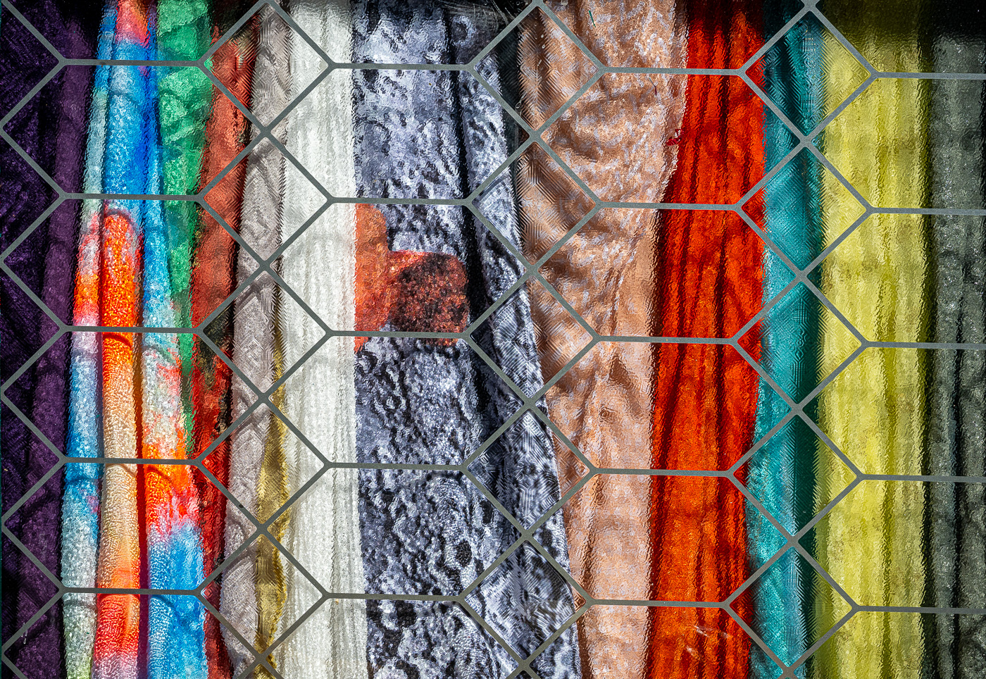
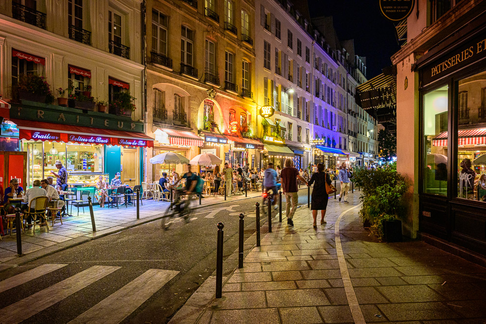
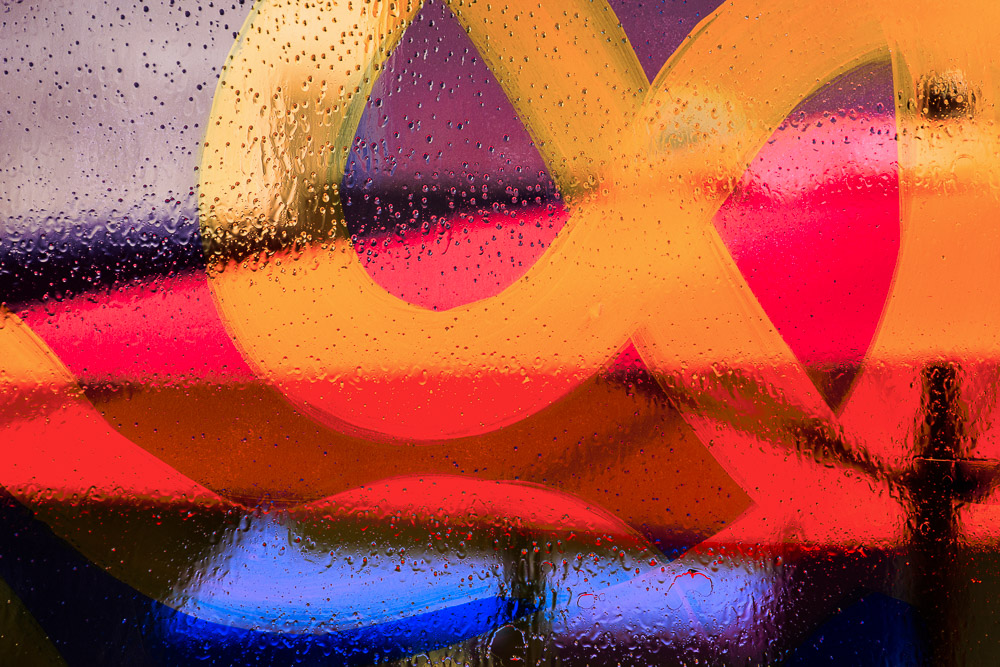
    I thought it would be good to describe the image at the top of this article. It is exactly a “what you see is what you get” as I describe here. My wife and I were staying in a hotel downtown Denver for some reason. Probably a weekend away.

    This was a scene looking right out our balcony. It is not composited or edited other than normal color and sharpness. The reflections were exactly this. I was fascinated and still do not understand how such diverse scenes could be captured on the windows. And I loved the distortions. I’ll take it. I’m glad I looked out and noticed it.

  • Choose Your Style

    Choose Your Style

    Many photographers wonder if they have a style, especially if they are fairly new to the game. Do you ever look at the wonderful work other photographers are publishing and think it would best to choose your style to be like them? Don’t.

    What is considered a style?

    There is no hard and fast rule that defines what a “style” is. To some, it is the type of subjects you shoot. That is, they see little or no difference between style and genre. Here is another list, longer almost to the point of being absurd, but still talking mostly about what the subject is.

    Others refer to photographic style as the effects you use to make your final picture. Our phones have an abundance of them. You can find many sets of “styles” available to purchase for use in LIghtroom Classic or Photoshop. They are mostly shortcuts for making your picture look a lot like another artist’s work.

    More advanced authors extend the concept to include not only what you shoot, but how you shoot it..This is starting to get to the point.

    Refelctions over airport operations©Ed Schlotzhauer

    My view

    When you look at some famous photographer’s work, can you make a good guess who made the image? That is because they have an established and recognizable style.

    In my view, style is not as much about what you shoot as it is about what the final image looks like. This final image is not only a function of what the subject is and how you “treat” it to get the look you want, but how you were thinking about it, and the lens you choose and how you frame and compose and expose it. In other words, your own viewpoint on it.

    You have a point of view, the way you see the world around you that is different from anyone else. This determines your style. It comes naturally.

    That is why, when you see a print of a grand landscape with superb detail and the blue sky printed almost to black, there is a good chance that is Ansel Adams. When you see another black & white image, but blurred in a long time exposure and overall very dark, it may well be a Cole Thompson. Those things are not certain, but they have a defined style.

    Can you copy one?

    One of the ways we learn is to copy. It is instructive, and can be fun, to try on the style of famous artists to see if it “fits” us. We may find bits and pieces that we adopt.

    But most of the time we will decide soon that that was instructive, but I’m done with it. Maybe we’ll go off to copy someone else for a while.

    Ask yourself why you are copying someone else’s style. Is it because you admire their work and want to explore it in more depth? Are you really searching and trying to figure out what your style is? Is it because one is “popular” and you think it will help you to sell more?

    I can’t question your motives, but I can predict that you will eventually give up trying to copy a style and settle down to doing your own work. It is hard to just copy. You are faking it. Besides, in a new situation, how would you copy someone if you haven’t seen any similar work they have done?

    Stylish airport lighting©Ed Schlotzhauer

    How do you develop yours?

    In most cases, you don’t. What you do is shoot a lot. Cartier-Bresson said your first 10,000 photos are the worst. I think one of the things he was telling us is that we have to experiment a lot to find out who we are.

    Yes, we can copy other people’s styles to see if we can learn anything from them. If we are lucky, we might have good mentor to give us honest feedback. But ultimately, it is up to each of us to figure out who we are as artists.

    I believe a style is something we look back on and discover. It is not something we plan to get to someday.

    Look in your image catalog

    How do we know if we have a style and understand what it is? A good start is examining your image catalog. I am using Lightroom terminology, but it applies to whatever sorting and filing system you use.

    I assume you have a system for grading your images. You know which you consider your best. Have you put together portfolios? Small collections of your very best work organized by subject or project or location, for instance. If not, pick out, say, your 50 best images. Be brutal. This is important and you do not have to show them to anyone else.

    Now go through them carefully and examine them from the point of view of what they can tell you about your artistic likes and beliefs. Are most of them landscapes? Are they predominantly square cropped or black & white or low key? Can you see that your favorite pictures are typically shot with a certain lens?

    What about the subject matter? Are your favorites more likely to be a rusty truck than a portrait? Do you favor highly detailed or very simple? Sharp or intentional camera movement (ICM)? Travel locations or mostly close to home?

    There are too many questions to enumerate. The idea is to look at this body of work and figure out who you are as an artist. This is you. This is your style. It certainly does not mean this is all you can do. It is just what you naturally gravitate to.

    Now you can stop trying to be someone else and concentrate on developing yourself.

    Giant flamingos©Ed Schlotzhauer

    Be who you are

    This is a very enlightening exercise. You will probably come away thinking “wow, I have a style!” It can be very hard for us to think about and accept our style. That is just something that other people have. People who are real artists.

    But yes, you do have a style. It is unique to you, so there is no need to try to copy someone else’s. Your point of view and values will come through in your images, if you are being honest with yourself.

    Here is a recent personal example. I was watching a video by a photographer talking about his style. It wasn’t very interesting to me and I was about to turn it off when he said something that caught me. He said he understands his style to be very simple. He is a portrait photographer and he uses simple lighting, plain backgrounds, and basic head shot poses.

    That lit up something in me. I hadn’t considered something like simplicity a dimension of style.

    I did the exercise I recommended above and saw clearly for the first time that I like complexity, detail, extremes of color and contrast and action. That is a common thread through many of my favorite images.

    What does it mean? Nothing in itself. It is just some insight on my work. But I understand myself a little better now. I will be less surprised when I see I am being drawn to these.

    Steam locomotive traction wheels©Ed Schlotzhauer

    Choose your style

    I started with the notion of whether or not we should choose our style. I hope I have established that you don’t really choose your style. Your style chooses you. You can imitate someone else’s style for a while for the education and experience, but ultimately we find ourselves drawn back to what comes naturally to us.

    Don’t fight it. Don’t worry about it. Relax. Be yourself.

    But to be yourself, you have to continually learn and practice and improve. It is a lifelong quest.

  • The Magic of Silhouettes

    The Magic of Silhouettes

    We’re all familiar with silhouettes. Do you ever think about why they are interesting? I believe there is a kind of magic of silhouettes.

    What silhouettes are

    “A silhouette is the image of a person, animal, object or scene represented as a solid shape of a single colour, usually black, with its edges matching the outline of the subject. The interior of a silhouette is featureless, and the silhouette is usually presented on a light background, usually white, or none at all.”

    You are familiar with them. You see them often. A featureless black form in a picture. Have you ever thought how something that shows no detail can be interesting?

    We know from experience that they happen when a foreground object has a bright light behind it. A simple explanation and they are easy to generate, but that by itself does not explain their impact.

    On mountain top looking toward setting sun. Reflecting on life?©Ed Schlotzhauer

    Origin

    I love history and finding out how things came to be. I assumed silhouettes have been an artistic technique for centuries. Not exactly. It mainly dates from the 18th century. Cutting portraits out of black paper became a popular and inexpensive art form. It was especially popular for miniatures, small images on lockets and things like that.

    You can argue the technique was used by Greeks and others as far back as 7 to 8 centuries BC on some of their pottery. Perhaps it is possible to include some even older cave art. But as far as I could find, there was no name given to it back then and the technique seems to have fallen mostly out of practice until the 18th century.

    Here is a piece of nerd interest that will be of absolutely no use to you, but is an intriguing part of our history. The word “silhouette” is not an artistic or technical term. In 1759 Étienne de Silhouette was the French Finance Minister during the Seven Years War. The country’s finances were hard pressed and he had to institute a lot of unpopular austerity measures. So much so that people began to use the term “silhouette” to refer to things done cheaply.

    This was the same time period (18th century) when paper cutouts were becoming popular for portraits and the name transferred and stuck. Silhouettes were an inexpensive art form. It fascinates me that no one remembers Étienne de Silhouette, but we use his name all the time without realizing it.

    Looking through clock, Musee Orsay©Ed Schlotzhauer

    Why are they interesting

    But that still leave open the question of why they are interesting. Just being black does not make it interesting. Being featureless would seem to make them less interesting, not more. Why do they catch our interest?

    They are somewhat different from what we normally see, but that should not in itself be enough to make them special. There are a lot of “gimmick” techniques that photographers and other artists use to try to catch our interest. Generally these fads do not have staying power and fade out as quickly as they appear.

    I believe there is something fundamentally important and intriguing about silhouettes that catches our attention and has lasting power. There seems to be something about them that captures the essence of a subject.

    Less is more

    Less really is more sometimes. This is particularly true in photography, where our super megapixel sensors capture lots of information and detail. We can confuse our viewers with too much detail. I generally love lots of detail, but the subjective experience we want to present is more important than technical details.

    A silhouette is an exercise in simplicity. We remove all information about a subject except its outer form. The way our marvelous brain works, this is usually sufficient for us to recognize the object.

    But even though we recognize it, it is presented in a completely different form. With no interior detail we only have its outline. We are left to guess what is in the big, black, featureless area in the middle of it.

    And we do. We fill in the blanks. Based on our experience, we “know” what is in that shape. But still, the mystery remains and we perceive it different. We see it in a new way.

    It is an exercise in simplicity and minimalization. Absolutely nothing except the information about its shape.

    Similar to black & white

    In some respects silhouettes are related to black & white photographs. They often are presented in black & white. I believe there is a reason for this beyond just the big black area.

    The beauty of black & white is that it removes all color from the image. Color is the most powerful visual sense. We tend to see it first. It can overpower everything else.

    But when the color is removed, we more fully perceive the shapes and tonal relationships that are there. The image is transformed into a different art form, giving us an altered way to see it.

    Silhouettes are like that, but with an emphasis on just the shape of the isolated black forms. The shapes become the subject of the image. There is generally no tonal range in the silhouetted object, just form.

    So, although silhouettes are often made as black & white images, that is not required. It is often preferable to leave the color information in the rest of the image to emphasize the difference of the silhouetted objects and to draw more attention to them.

    Silhouetted tree against glass skyscraper©Ed Schlotzhauer

    The featured image

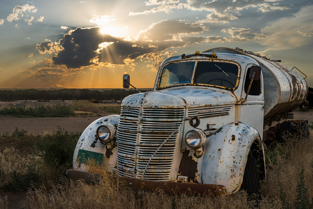
    The image featured at the top of this article illustrates some of these points. This was taken in a field on a tiny, nameless back road in northeast Oklahoma. I doubt if I could find it again.

    I chose to make both the foreground and mid ground black. Everything that is black is featureless black silhouettes. But there is no problem at all knowing what they are. Adding interior detail would not have improved the image. I could argue that it would have weakened it. It is the exterior shapes we see.

    And this is a case where I felt that preserving the color of the background helps set the context and emphasize the shapes of the foreground. I believe the color adds to the mood.

  • Acceptance

    Acceptance

    Some people are detailed planners for a shoot. Some go out with an attitude of acceptance, ready to work with what they find. Which is best?

    Planning can achieve great results

    Some people love planning and are good at it. I will totally admit that there are occasions where it is necessary and appropriate.

    Chris Weston (sorry, this is a subscription site; I asked, but they could not provide a way for me to give you access to this lesson for free) tells of a time on assignment when he had a very special shot in mind. Lions hunting at night under the stars. By planning it out in detail, even sketching the final shot, he knew what lens to use, how many flashes to use and where, where to set up, and what direction to aim the camera to get the milky way positioned as he wanted. It worked and he got his desired shot. But even then it took 6 days. Not because it took many tries to get it, but because he had to wait for the new moon so the stars would be optimum.

    It was a unique and interesting shot. I applaud his persistence and hard work. Yes, and even his planning. But it is not the way i work. I don’t do National Geographic or book assignments where a certain result is needed. I accept the scene I’m given and try to make it the best I can.

    Mountain lake at sunrise©Ed Schlotzhauer

    Not negative

    Acceptance may be a negative word to some people. It could imply a type of fatalism. A form of low standards and values, where you are willing to settle for anything. Like, you are not worthy. Or you are not the kind of person who should expect to receive good things. Or maybe it’s not worth trying for something better. Poor me. Eeyore.

    Don’t go there. I encourage you to take a different meaning. View acceptance as a kind of peace and contentment. In the context of photography, I mean it to be a mindful encounter with our subject or scene. One where we are willing and able to look at it honestly and evaluate it for what it is. Once you accept it, you can more fully see its story. You might discover something unexpected. And you are free to reinterpret it according to the story you want to tell with it. But it is important to get our biases out of the way first.

    Seeing it for what it is releases us from assumptions and expectations that could hold us back. We see the flaws, but also the possibilities.

    Dead tree in snow. Bent, broken, but still trying to stand.©Ed Schlotzhauer

    Acceptance gets more results

    I hear people complaining about not getting the great shot they had planned because conditions were not what they anticipated and planned for. That is sad. I empathize with them, because it has happened to me.

    I sometimes still go out with expectations in mind. That is a trap, but it is natural and I’m not immune. For example, it being winter here as I write this, I went out shooting today with images in mind of nice ice shapes along the river. Well, it snowed a couple of days ago and most of the ice is covered up. And it is warmer today and some of the ice has melted. Not what I had in mind.

    Having a fixed expectation in mind is like a filter. Our mind obediently screens out everything else that is not what we are looking for. So we are disappointed because we did not see any good picture possibilities.

    But there’s a different reaction we can take to a situation like this. We could say to our self “Bummer, the conditions I wanted are not there. But let’s see what is there and what I can do with it.” I believe if we take a mindful attitude we can discover new points of view, even on an iconic scene.

    Accept what you see and make your images to the highest level of quality you know how to do. Compose each frame as if it was the most important image you have ever shot. It might be.

    And peace

    A hidden benefit of having an accepting attitude is that it can bring us peace and joy. Rather than getting frustrated and walking away we can launch into a productive session exploring what we discover. We turn disappointment into joy and contentment. Most likely, we come away with unexpected images we like. Some may even make it into our portfolio.

    Happiness springs from a clear-minded engagement with the present moment

    Gary Buzzard

    Changing our attitude and turning a disappointment into a joy is a good thing. Even if the pictures aren’t great, isn’t the good feeling worth it?

    This is a benefit I don’t hear talked about for mindfulness. When we are mindful, we are looking for the opportunity, the good, the fresh. That is beneficial to our life and attitude.

    And we can get some interesting pictures.

    So is detailed planning or spontaneity best? That’s up to you. It depends on your personality and your needs. But whichever you choose, I recommend keeping a mindful attitude of acceptance. You will enjoy yourself more and discover some new images you did not have in mind.

    An interpretation of my feelings for Trail Ridge Road©Ed Schlotzhauer

    Today’s image

    This is an example of lemons to lemonade. We were on top of Mount Washington. I guess it was fairly typical weather for there. Completely socked in by clouds. So windy we could barely stand up. Not good photography weather.

    We were going to walk the last few feet up to the top, but conditions were so bad that I decided to not even to take my camera. Then I saw this, ran back to the car – still close luckily – got my camera and was only able to get this one shot.

    I don’t know the story. I don’t understand why it is happening. And still, years later, I wonder about it. If you know of a reason to have the dog hung on his back, please let me know. But it is one of those images i remember.

    Side note: after that, I took the camera to the top. The clouds broke for moments and I got some shots I liked. Don’t ever leave your camera behind.