An artists journey

Tag: digital photography

  • Not HDR

    Not HDR

    My last article sang the praises of HDR processing. I don’t want to over sell it. Today I will try to balance it by showing we typically do not need to use HDR.

    The good

    My previous article attempted to show when and why to use HDR. There is a time and place for it. In general, if a histogram shows more than about 7 stops of needed information then I would consider HDR, if the subject and situation allows it.

    The example I used was a scene with the sun visible in the frame but where I also wanted to preserve the deepest shadows. Back in the film days we had to use a split neutral density filter over the lens to try to compress the dynamic range in these situations. Whenever you would have reached for the split ND filter is the time to consider if you can use HDR instead.

    The bad

    But HDR has some problems and limitations. There is the dreaded “HDR look” that most people want to avoid. In addition, there are problems with subject movement and extra processing steps to do.

    When HDR first became available, people tended to go crazy with it. It was almost a symbol of showing off the new technique. The HDR look was over compressed with flat tonality and lack of true whites or blacks. Sure, I could shoot that scene with a 20 stop range and make a print. Too bad it looks weird. It became almost a cliche. Many “serious” photographers shunned it as looking artificial. It got a bad reputation.

    But the problem was how people used it, not the technique itself. Almost any technique can be over used to create unappealing images.

    There is also the problem I mentioned with subject movement. To create a good HDR image there must be very high correlation between the pixels of each exposure bracket. That is, there can’t be significant movement.

    And there is the extra processing. This is not too big of a problem anymore. We can quickly do HDR processing from within Lightroom or Photoshop or your software of choice. It is probably easier now to do it than it was to adjust a split neutral density filter and figure out the exposure.

    Why we don’t usually need it

    Trust your sensor and the processing software on your computer. Modern high-end camera sensors are amazing. They record the greatest dynamic range of information that has ever been possible in photography. I’m sure it will only get better with new generations of equipment.

    My camera records a far greater range of information than it is possible to print. Prints are my gold standard. They are the expected outcome of my work. A surprising fact to many is that, although it is hard to compare because the physics are totally different, the effective dynamic range of print media is around 6 to 8 stops. So making any print has some aspects of dealing with HDR data, since the captured data is probably much greater than the final print.

    OK, so I am shooting a high contrast scene. I am careful to allow a little space on each end of the histogram, so say I am dealing with about 12 stops of range. The reality is that, for most needs, this can be used to make a great print.

    But that 12 stops of data has darks that are down dangerously close to an unacceptable level of noise. And the brights are dangerously close to clipping. Is that imperfection OK?

    How to process extreme ranges

    This is not a tutorial on photographic processing. You can find too many of them on the web. I will just give some suggestions. In Lightroom (Classic – the only version I think is worth using) just the 6 controls in the Tones section of the Basic panel can do wonders. And I seldom use Contrast, so there are really 5 most important ones.

    Use Whites and Blacks to set the overall white and black points as desired. Then I often use Exposure to balance the overall tonal range. Finally I use Highlights and Shadows to fine tune the tones.

    These simple adjustments, along with some tweaks in the Presence section, can do amazing things to “rescue” most images. These are probably an 80% fix for most situations.

    Of course, when I select an image to print, I will spend a lot more time working on it. A lot of work will be done with curves and masking and doing fine adjustments. Sometimes I will send it to Photoshop for very detailed tasks that cannot be done in Lightroom. Editing an image can take many hours. Most of us are pretty obsessive about our work.

    My point here, though, is that most single captures have enough data to make a great print or other final image. Sometimes we just have to work with it a little.

    Maybe you don’t want it

    The look of your final image is an artistic decision. It is not dictated by the “reality” of the original scene. You or I as the artist decide the look we want. What we decide is “right”, at least for us.

    So I may not want to create a perfectly balanced image that retains all the tones and data of the histogram. I may want to crush the blacks to make a moody, low key image. I may want to over brighten the image to make an ethereal scene. It is not written anywhere that the final print must look exactly and faithfully like the original scene.

    This is where artistic intent comes in.

    It is not numbers

    I want to end with the point that we are creating an image, not manipulating numbers. Well, we are manipulating numbers, but that is not what counts. What counts is the look and expressiveness and quality of the finished product.

    Photography is the most technical art, but do not be dictated to by the technology. Do not let someone say you can’t do something because the numbers are wrong. All that counts is the final art you create. Emotional response trumps technical excellence. How does it look to you?
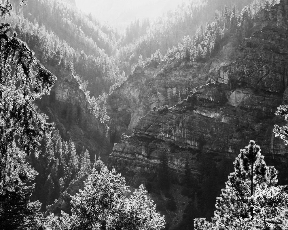
    Example

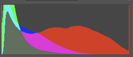
    The image today is a full histogram spread. Single capture. I think this kind of thing comes out OK. What do you think?

  • My Favorite Lens

    My Favorite Lens

    In general, we photographers love our equipment, Especially our lenses. It is not uncommon to have a favorite one. You can always get a discussion/fight started among photographers when you talk about lenses. I would like to discuss what has become my favorite lens.

    Lenses

    The lens is a critically important piece of equipment to photographers. Sensors are improving dramatically and lenses have to improve with them to achieve all the sharpness and resolution the sensor can capture.

    Modern lenses constantly improve in resolution. Look at DxO image tests of current best lenses vs. the best from 20 years ago. Our lenses now enable us to capture more information and be able to produce wall-size prints that are extremely sharp.

    The lens determines the point of view that is captured in our frame. It establishes the field of view, the width of the scene we are capturing. Some of us naturally have a telephoto view. Others have a wide angle view. This refers to the lens choice we tend to select to frame our subjects. This is just personal preference. The lens is a tool to help express our esthetic.

    Many photographers feel they need a whole bag full of lenses of various focal lengths from extreme wide angle to super telephoto, with macro lenses and tilt/shiftes thrown in. Because, you never know what you might find. 🙂 Personally I have simplified my life a lot over time. I generally only carry a 24-70mm and a 70-200mm in my kit. But that is just me and where I am at right now.

    So what we want is a lens or lenses that allow us to capture all the information we want (resolution, sharpness, dynamic range) in the field of view we want. A big ask, but doable.

    Digital workflow

    Most of us are in the digital world now. The digital workflow is quite different from the analog workflow.

    What we call the analog workflow – the film days- involved developers and enlargers and prints and lots of chemicals and time. Personally, these are days I don’t miss. I am a big fan of the power and freedom and flexibility we have now.

    There is a corresponding workflow for digital processing, though. It includes loading images on our computer, viewing them, culling or grading them, processing selects with our software of choice, etc. Each of theses steps is time consuming. Especially since we tend to shoot so many more frames now that they “don’t cost anything”. And each step requires software and considerable training.

    The result, though, is that we spend a lot of time in front of our computer now. We probably spend more time in the digital workflow than we did in the analog workflow.

    My favorite lens

    What does this have to do with a discussion of my favorite lens? Well, in a sense the “lens” I use the most and that has the most impact on my work is my computer monitor.

    This is where I view all my images. Zoomed in to 100% I look at individual pixels. Here is where I crop and color correct and adjust tones and contrast and saturation. This is where I view and edit the image when I convert it to black & white. When I create new images by compositing others together, that is done entirely though the monitor “lens”.

    Yes, all of the things I just said are actually done through specialized software. In my case it is primarily Lightroom Classic and Photoshop. But metaphorically and to me, the monitor is the lens into the process.

    Now days the monitor is where we view everything we do. Regardless of what the original image looked like, what I see in the monitor at the end of the edits is what counts. The result could be a complete re-imagining of the starting image.

    The new primary lens

    I spend more time in front of my monitor than I do outside shooting. More and more it is coming to dominate my workflow. If I lost or broke a lens, that would be terrible, but I could continue doing my art with other lenses with only minor re-adjustments to my vision. I had this experience recently. My 24-70 lens dropped and shattered the polarizer filter. I was up in the mountains and I did not have a filter wrench with me to get the jammed filter off, so I had to switch to using an alternate lens. A little frustrating, but not a big deal.

    But if my computer died, although I could continue shooting, I could not view or process a single image until I fixed it. Eventually things would back up to a critical point and I would have to get the computer back. I also couldn’t select images for galleries or process images for printing. Dead in the water.

    So in a sense, the focal point of the digital workflow is the monitor. That is the new lens I use to view and do most of my work. The monitor is the lens for the increasingly important part of the digital workflow.

    The future

    In the future will this trend increase or will we return to simpler times? What do you think?

    My money would be on the increase of digital processing. We will trend more toward an attitude that the camera and lenses are used to gather raw material, but pictures are actually made in the computer, looking through the monitor. Increasingly, the final image may look less and less like the original capture. Better processing software opens up new possibilities. And viewers are more willing to accept that photography should create something more than a true representation of reality.

    So the next time you are lusting for a wonderful new lens, it might be better to upgrade your monitor instead.

  • Going too far

    Going too far

    We often hear this as a challenge or criticism. “You’re going too far” Meaning, back off. But as an artist, I don’t think I go far enough. I need to push myself to be always going too far. That is how we explore the limits

    Too timid

    I have written about this before, but it is so important I think it deserves a refresh. In a previous article I encouraged us to go “far enough“. But I think now this is too timid an attitude. We should push “it”, whatever it is, too far.

    I know I tend to have too much focus on the actual captured data of the file and what the scene really looked like. Time helps. I tend now to wait to process images until they have aged enough to let me distance myself from the experience of being there.

    But still, I tend to hold back and stay too true to the original. I am learning to push beyond to create something else.

    As a bonus, this short video by Matt Kloskowski might encourage you to think about editing in new ways. He does not talk much about going too far, but he shows an unconventional approach. The kind of thing I am talking about when I recommend pushing beyond the captured data.

    Push it

    I know I’ve said it before, but I find truth in something John Paul Caponigro said “You don’t know you’ve gone far enough until you’ve gone too far.”

    This is something I need to take to heart. The engineer in me tends to make the image look like the literal, original scene. That ends up creating record shots. Sometimes all I need is a record shot, but that is rare. I have to push it more to make the image into art. Into something interesting that goes beyond the original.

    For example, I live in Colorado. If I shoot a beautiful scene in the mountains, so what? Anyone could have stopped there that day and taken the same picture with their cell phone. What sets mine apart? It often will be something more than just the literal scene. It has to rely on my interpretation of what I saw.

    Be decisively indecisive

    So when I suggest going too far, I am not speaking about relationships or physical safety, but my interpretation of the image. I am discovering more and more with time that images can take a great deal of manipulation.

    A raw file from a good camera contains a tremendous amount of data that can be exploited. Editing in Lightroom is completely non-destructive. We can re-edit at will with absolutely no loss. Likewise, although Photoshop is inherently destructive, there are processing techniques that can be used to manipulate images with no damage and with the ability to re-edit in the future. I strongly advise learning and adopting these techniques.

    Yes, I know of good artists who can say they know exactly what they want to do with an image and it is OK to do destructive edits, because they will never change their mind in the future. That is not me. Every time I revisit an image I usually tweak it some. Sometimes a lot.

    Does that mean I am indecisive? Perhaps. I wouldn’t argue the point. I look at it as an evolving artistic judgment. What I see and feel in an image can change over time. So I consciously decide to use techniques to give me the maximum flexibility to change my mind later. Decisively indecisive.

    Don’t worry about breaking it

    Let me use Lightroom (“Classic”, because I consider it the only real Lightroom) as an example. I said that all editing in Lightroom is non-destructive. Do you really understand that?

    Lightroom uses a marvelous design that always preserves the original data unchanged and keeps all edits as a separate set of processing instructions. Don’t believe me? Here is a portion of actual data from the XMP sidecar file of an image I edited today:

    crs:WhiteBalance=”As Shot”
    crs:Temperature=”5650″
    crs:Tint=”-14″
    crs:Exposure2012=”+0.50″
    crs:Contrast2012=”+6″
    crs:Highlights2012=”+19″
    crs:Shadows2012=”0″
    crs:Whites2012=”0″
    crs:Blacks2012=”-12″
    crs:Texture=”0″
    crs:Clarity2012=”+20″
    crs:Dehaze=”0″
    crs:Vibrance=”+5″
    crs:Saturation=”0″

    If you are familiar with Lightroom, you should recognize these adjustments as the contents of the Basic adjustment panel. I’m not sure what the “2012” suffix means on them, but probably a process version. Anyway, this is literal data copied from the XMP file. It is an industry standard format called XML markup. It is just text. If I change a slider, the text value is changed. These text values are read and re-applied when I open the file in Lightroom. The original pixel data is never altered. You cannot destroy the image by editing it in Lightroom.

    What are the limits?

    There are limits, but not absolutes. If we boost the exposure too much, at some point we will introduce an unacceptable amount of noise. If we sharpen too much we will introduce artifacts around edges. We can make such a high contrast image that it cannot reproduce properly on screen or in print. We can increase saturation to the point that it is out of gamut for the screen or print.

    Most of these are sort of a judgment call by the artist of what the acceptable limit is for the intended application.

    But these are just physical limits of what we can do with the tools. The bigger problem, at least for me, is what am I willing to do?

    It’s our mindset we need to break

    I am the one who usually limits the extents of the changes I will make. I am still too much of a left-brained engineer who is constrained by my memory of what the scene actually looked like.

    One way I can tell this is happening is that it is common for me to push an image further every time I revisit it. Upon seeing it again, I think,”that is nice, but I can go further”. And I do. Sometimes the image turns into something different from what I shot. I love it when that happens.

    But it is a constant struggle to give myself permission to do it. I am afraid of going too far.

    Knowing how the tools work and how to non-destructively edit, I should feel free to slam adjustments to the limits just to see what happens. Then back off to the “right” value for the image. I find that the “right” value tends to be higher if I have over-corrected than it is if I come up from the original. I think this is what Mr. Caponigro means when he says “You don’t know you’ve gone far enough until you’ve gone too far.”

    Give yourself the freedom to go too far, than back off as necessary. I will try to do the same.

    Not for everyone

    I know this advice is not for everyone. I still see photographers who say they pride themselves in getting the image “right” in camera and doing minimal editing. That’s their style and their values, so good for them. But if “right” means the closest match possible to the real scene, that seems very limiting. I think we have progressed well beyond the stage of assuming that a photography must be a true representation of reality.

    At least, that is my assumption. I operate from the point of view that I am as free to creatively imagine the contents of my frame as a painter is to create on a blank canvas. Even plein air painters take a lot of liberties with what they choose to include or exclude, what colors to use, etc. Some even use the plein air session as a sketch. Later in the studio they refine and complete it according to their interpretation.

    That is basically what I do. Some images require more interpretation than others, and my tools allow more freedom for manipulation. One reason I think I could never paint is there is no “undo” with paint. 🙂

    Go too far

    So I am discovering that what works for me is to consciously push my adjustments beyond what I first think is right. Yes, it may create a bizarre effect and I have to back it off. But I often find that the new setting I back it off to is more extreme than I thought was correct originally. Seeing the extreme helped me understand a new way to view the image.

    If you do it right, you can’t damage the image. Give yourself permission to experiment.

    Example

    The image with this article is an example. This is the mountains and plains about 5 miles from my home. It seems like every time I go back to the image, I need to tweak it a little. And I always push it a little further. I do not back off of what I already did. I think I am nearly to “far enough”.

  • It’s Just Data

    It’s Just Data

    Digital images are just data, pixels, digital values. Yes, but… That’s like saying paintings are just pigment smeared on canvas. It can become something more.

    It’s data

    Every digital image is data. I won’t go into film. It is the same but different. But a piece of exposed film is just data, too.

    What comes off my sensor is a rectangular array of pixel values, red, green, and blue tuples. Tuple is just a mathematical term for a small set of numbers you keep together and in order. In this case (red value, green value, blue value). This is just numbers. Data.

    When this data is brought into my computer it is still data. The manipulations I do on it in Lightroom and/or Photoshop are mathematical operations. Things computers are good at dealing with. An image may be gigabytes in size, but it is still nothing more than data.

    Data just is. It doesn’t mean anything.

    Interpreted by our minds

    When the data is displayed on screen, I can view it and interpret it as something. This is the key. It means nothing until a human interprets it.

    A particular set of contrasting tones and colors in a region looks like a tree to me. Even if the computer uses an AI classifier to identify it as a tree, that is just a meaningless label to it. The computer does not know what a tree is. An image of a tree cannot invoke memory or symbolism or meaning in the computer. It can in our minds.

    So the data we see on screen, that is just variations of intensity and color, becomes meaningful to us because we are human. The data itself does not encode hope or despair or memories or associations or pain or beauty. That is what we make of the data.

    The pen

    There is an old expression that says “the pen is mightier than the sword.” This is true, but unpack it a little. A literal pen (do you remember what those are?) is not stronger or more forceful that a literal sword. The expression is metaphorical. The force of words conveyed to people’s minds can do more than the threats of swords can.

    This is the case with images. The data making up the image means little. What we interpret from the data when we view it is everything.

    I do not get political in this blog, but from a sociological interest, the protests going on in China (as I write this) are fascinating. Censorship is so strict that the symbol of the protests is a blank piece of paper, representing that they can’t say anything. From an engineering point of view, the amount of “data” in a blank sheet of paper is zero. It is the meaning ascribed to it that makes it powerful. An empty of paper can say volumes.

    What elevates some?

    Back on track, how is it that some data creates a far different effect than others? It’s much more than just the data. For example, here are 2 histograms. This is important data about the color information and distribution of pixels in each image.

    Mona Lisa histogram Random flower image histogram

    Their shapes are not that different. The one on the left has more warm dark tones and is darker overall. The one on the right has a lot of bright reds. Both have a red spike at the high end. But these are just 2 sets of data.

    Would it make a difference if I told you the left histogram is the Mona Lisa and the right one is a random flower image from my reject bin?

    So we cannot take an engineering view of the data to infer the value or user reaction. Our human perception makes all the difference.

    More than data

    The famous photographer Edward Weston once said: “This then: to photograph a rock, have it look like a rock, but be more than a rock.” It is a little bit of a stretch, but I don’t think it breaks badly to say when we press the shutter, we collect data, but it is more than data.

    We could look at the data as an engineer and analyze histograms, tonal distributions, edges, area balances, and 100 other parameters. I know. I have. But my conclusion is that matters little. It gives us ways to describe the superficial data, but it says almost nothing about what the image means to us as humans.

    So what?

    I think we always have to ask “so what?” when we learn something new. Let me share 2 takeaways I get from this.

    The first is that the data doesn’t care. I spent years trying to optimize the perfect histogram, ensuring total, crisp sharpness, capturing and preserving perfect color balance. At this point in my journey I will say that none of that really matters. All that matters is the effect I bring to myself and my viewers. Is it pleasing? Does it make us think? Is there a larger idea behind the surface scene?

    The second takeaway is even harder for me to really grasp. It is just data, and the numbers don’t really matter. This means that what the original scene looked like (the captured data) should have little bearing on what we do with it. Process the data as much as necessary to create a great image. I need to stop being limited in my thinking by the reality I started with.

    If it was an average, sunny scene but I feel it should be dark and moody, fine. If it was a colorful scene but I feel it should be presented in black & white, fine. Crop it. Add texture. The original data should not limit our artistic interpretation. This is one reason I often find it valuable to let images “age” a bit before I process them. I loose much of the association to the real scene and can take a more artistic view of the result I want.

    Today’s image

    I love this image and this place (Ouray Colorado). The sunset was almost blown out from a haze of wildfire smoke. Contrast was challenging. But I had to get something. It was too beautiful to stand idly by.

    Besides B&W conversion and cropping it, the pixels have been bent quite a bit. The image is a couple of years old. I find that every time I go back to it I push it a little more to the extreme. Each time I do, it becomes a little more what I remember of the event. The less I remember the actual original scene, the more I feel free to make it match what I felt.

  • Time Builds Perspective

    Time Builds Perspective

    I find that a distance of time often builds a healthy perspective on my images. Sometimes, when the images are “fresh”, the experience of the capture clouds my judgment. Letting them age can build a clearer judgment of them. They can take on a new life.

    Let go

    I have written that we need to fall in love with our images and capture the emotions we were feeling at the time. That is true, but the experience of the moment is not sufficient to make it worthwhile. I could point to many images in my catalog that bring back great memories. Ones where I felt alive and on fire when I took them.

    They will always be meaningful to me, but that does not make them great images. I have to learn to let go of my emotional attachment to them and look at them with detachment. That is the only way to begin to see if they could bring satisfaction to other people.

    Be analytical

    I have said that we need to balance our emotional side with our analytical side. This is one of those times. Looking at one of my images may bring back a flood of joy or suffering or pain or other feelings. But I must coldly and analytically figure out if I have brought any of that to my viewers.

    Just because it was significant to me does not mean it should be to you. This may be the last picture I took of my father before he died, but that doesn’t make it meaningful to you unless it brings out something significant about the human condition.

    I may have a group of shots I took in 2 feet of snow in white-out conditions where hardly anyone was dumb enough to be out. The images may be beautiful to me and bring back the experience as a pleasant memory, but what can they convey to you?

    If I can’t bridge from personally important to an exciting image from your perspective, it is only a selfie.

    Distance

    One way to be able to see this is to use time as a distance mechanism. I have found myself instinctively doing this a lot, but it was interesting to see it discussed by Alister Benn, CaptureLandscape’s 2020 Photographer of the Year:

    When I turned professional, I suddenly found the time between shooting in the field and getting around to processing was extending from a matter of hours, to months, or even years. I have thousands of images I have never looked at since importing them (apart from rating and deleting any obvious weak ones.)

    Alister Benn – Luminosity & Contrast

    He goes on to describe how this separation helped him by allowing him to view images more objectively. They are distanced from their original meaning. How he perceives and reacts to the image right now is all that matters. Sometimes he looks through old images and “discovers” ones he was cool to at the time that he can now develop into a great image. Seen on its own without the baggage of the emotions of the shoot, it means something new. Distance builds perspective.

    See them for what they are

    Alister asks how, then, does he decide what images to work on? “Simply, I work the ones that speak to me.” Sitting in front of the computer days, or even months after the shoot, they look different. They have different meaning. A meaning may arise independent of the original context.

    He is in a different place – literally and figuratively. He has different feelings and emotions. The images are perceived different. Some become more important. Presumably some become less important. But he is processing them from the point of view of where his head is at the time.

    At the time

    Interestingly, this means that there could be a kind of ebb and flow to our perceptions. At any given time our feelings will be different. We may be happy, sad, melancholy, reflective, hopeful. How we feel at the time determines how we perceive our images and how we process them.

    In a recent article, I suggested an exercise to discover our natural themes: pick your “best” 100 images from your portfolio. Brainstorm descriptive terms. Group those into categories and name them. I also gave the opinion that this was not deterministic, because repeating the exercise at another time could be a little different, because you would pick different images as your “best”.

    I think I was discovering the idea that even our portfolio is not a fixed set. There is not necessarily 20 or 50 or 100 images that is fixed in time that represent me. The members can change, not only as we do new work, but as we change our perspective. Time brings new points of view. Distancing our self from the emotions of when we captured the image changes how we view it. We are always growing and learning.

    It’s actually exciting for me to look back through old images in my catalog. The excitement is when I have one jump out at me and I look at the way I processed it and say “what were you thinking?” Then I re-process it from a different point of view and create a new, different image.

    Example

    The image here is an example of this idea. Every time I come back to it, I see something different. Sometimes I love it, sometimes not as much. It is in or out of my portfolio on any given day. The longer I live with it, the more I like it. I am tending to see more layers and ideas swirling through it. Right now I would say it is a definite “in”. It speaks to me.