
Do you take pictures? Well, of course. We all do. I suggest if we are serious about making art that may not be the best attitude.
Take pictures
It is estimated that about 2 Trillion pictures are taken a year. That is several hundred pictures for every person on the planet. Probably 99.999% of those are shot on cell phones. Nothing wrong with that. Cell phones have gotten amazing. But realistically, most of the shots taken are selfies or predictable tourist pictures. Again, nothing wrong with that. If the picture makes them happy, it is good.
Everybody takes pictures. Do you know anyone who has never taken one? I don’t.
But I am writing to an audience who admires photographic images and probably aspires to make much better ones themselves. What makes a picture good?
There are obvious qualifiers like being sharp, well lit, subject easy to see, things like that. Those are things that, if you do not do them, it probably will make the picture bad (unless you did it deliberately). But, as you have figured out from experience, eliminating the problems does not mean your pictures become “good”.
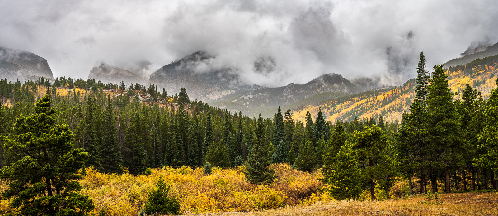 ©Ed Schlotzhauer
Taken by pictures
The concept of being taken by pictures is one I picked up from John Barclay. It resonates with me, because I have seen it working in my art.
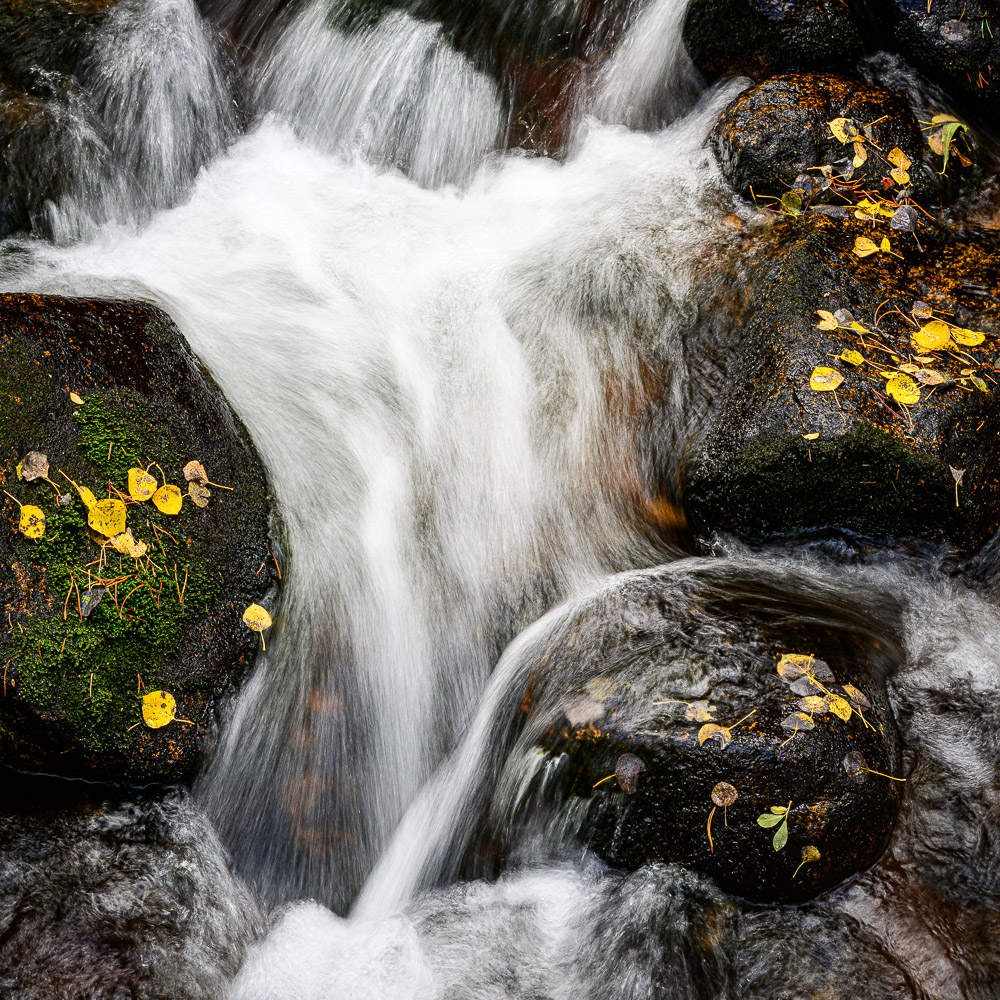
What I have seen in my photo shoots is that sometimes something special happens. We no longer are looking for pictures. We have found a subject or place that captivates us. It releases some kind of creative energy within up. We are not just trying to take a picture, we are trying to capture the magic we are feeling. We have to shoot this. There is no choice not to.
It may be very easy or it may be hard. That is, the scene may present itself to us complete. We have found a treasure. We just have to compose it, set the camera, and take the picture. It is already perfect. Don’t mess it up;
Sometimes it teases us. We know there is something great hiding there, just out of reach. Maybe we have to walk around to look for the right angle. Perhaps it is zooming in on the right piece. Or waiting for the right light, Maybe it is a matter of thinking about it to figure out what is calling to us. Whatever it is, we usually know it when we see it. The inner voice guiding us says “Yes!”. Then we know we have captured the essence we are searching for.
When this happens it is very rewarding. We know we have glimpsed something great and good and we feel like we have captured a view of it.
What is the difference?
The difference is taking a picture vs making art. Taking vs giving.
When you’re at the Eiffel Tower and you think “I like that and I should shoot it”, you probably know how to make a good record of it. You and 50,000 other people that day. When anyone sees it they say “yep, that’s the Eiffel Tower”. No passion. It is just a fact. You might even want to hang a print of it on your wall. But you could get the same thing from any print on demand web site.
But when we are taken by a scene, there is an intensity and passion invoked in us. It is a personal experience. With luck and skill on our part, some of the feeling might be shared by some of our viewers.
We did not take the picture to show it to you. We had to take it for us. It was something we were drawn to. It is like it was a gift given to us.

If it does not captivate you
I use a recent trip to France as an example a lot lately. It is recent and fresh in my mind.
I was unashamedly a tourist. That means I shot a lot of pictures because I felt I needed to record where we were and what we were seeing. Just like everyone else with their smart phones. Even though I was using a nice mirrorless camera, they were still mostly tourist shots.
Some of these are nice. That is, they are sharp, well composed, and show what I want of the scene. I will keep too many of them, but just for my own private memories.
But a few were moments where something spoke to me and drew me into an image. These times were meaningful to me. As far as images go, these were the Wow moments of the trip for me. Whether anyone else ever sees them or appreciates them doesn’t matter. They are special to me. When I go back and look at them I remember the feelings of the moment.
It’s about emotion
A common theme that recurs is that it is about passion, emotion. Did I feel anything deep or special about this, or was it a record shot? Record shots are pretty and a few will go into a slide show or book of the trip.
The really meaningful images weren’t shot to a plan and were not shot primarily to record the event or place. They may be random occurrences. But these are special to me. Times when I was truly engaged and excited by what was there.
If I wasn’t excited about what I saw, why should you be?
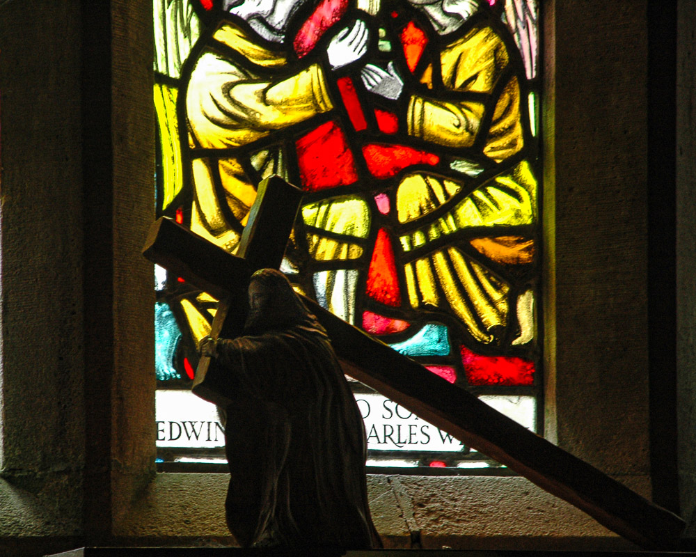
 ©Ed Schlotzhauer
Don’t settle for just taking pictures
So take pictures. But don’t settle for just taking pictures. Let’s turn up our sensitivity to hear when something is calling to us. If we are not actively listening, we will probably miss it. We know something great is there. Now we have to find it. Work the scene. Peal away the clutter. Follow your instinct. Let yourself be taken by pictures. It is worth it.
When we get caught up in a situation like this, it doesn’t really matter if all we have if a cell phone. Use what you have. But follow you passion. Figure out what is really there and get the shot. Take the gift. Appreciate it.
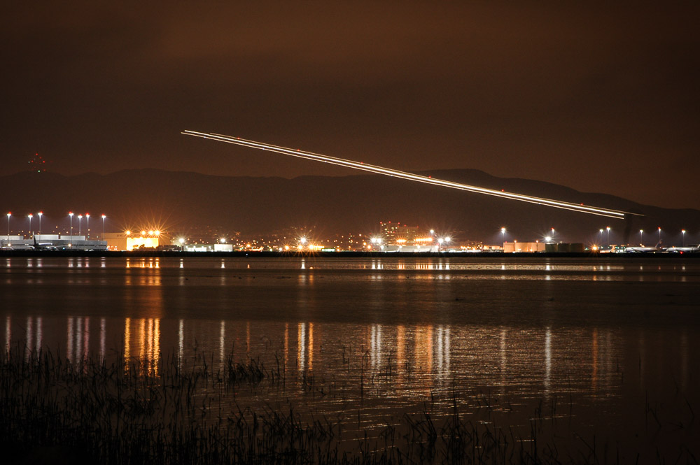
 ©Ed Schlotzhauer
 ©Ed Schlotzhauer
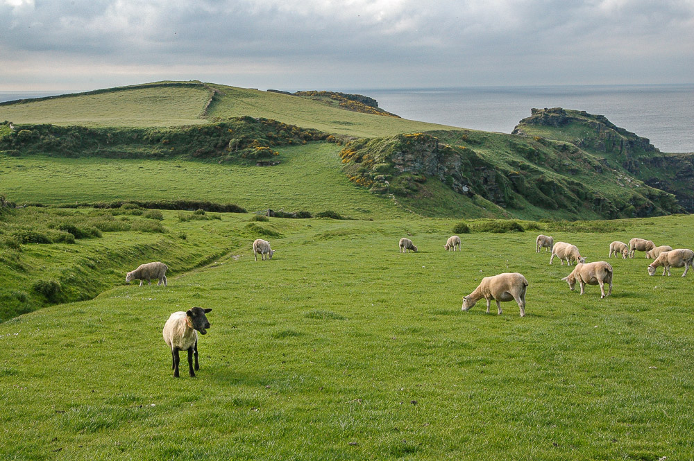 ©Ed Schlotzhauer
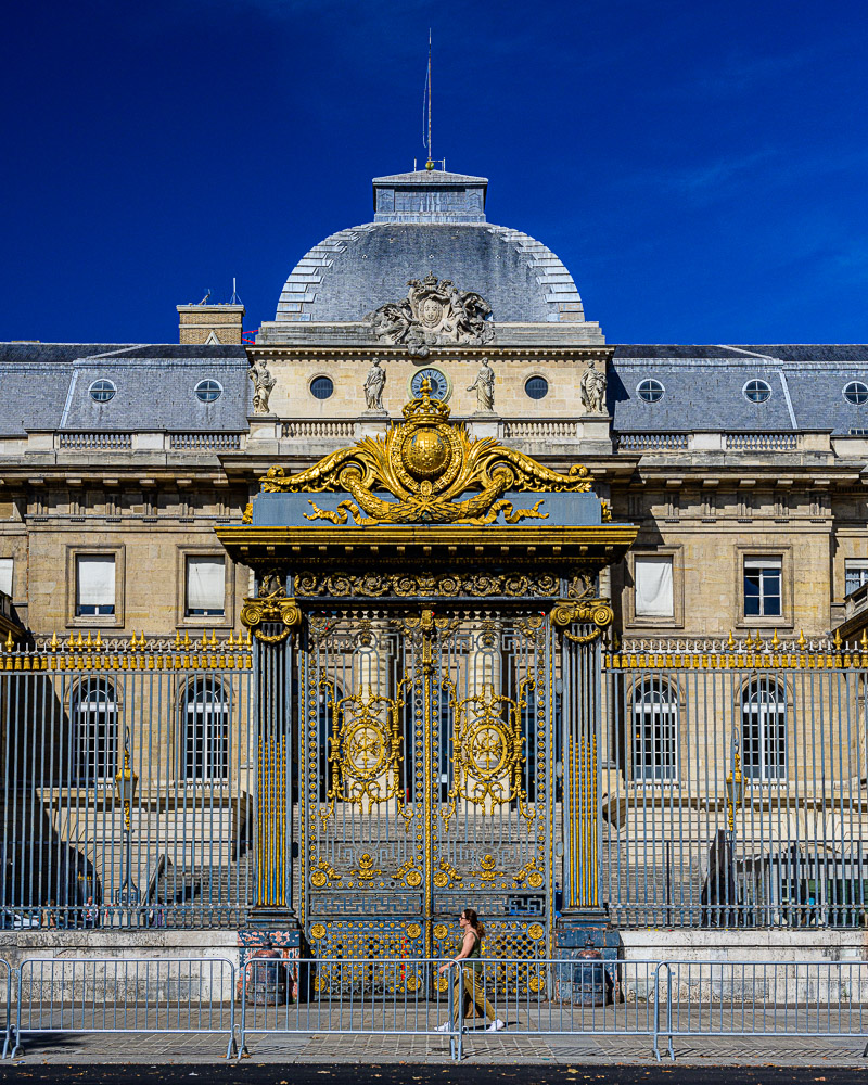
 By DrBob at the English-language Wikipedia, CC BY-SA 3.0, https://commons.wikimedia.org/w/index.php?curid=2065907
 Photography Life: https://photographylife.com/reviews/nikon-z-24-120mm-f-4-s
 ©Ed Schlotzhauer
 ©Ed Schlotzhauer
 ©Ed Schlotzhauer
 ©Ed Schlotzhauer
 ©Ed Schlotzhauer
 ©Ed Schlotzhauer