An artists journey

Category: Mastery

  • It’s Messy

    It’s Messy

    Despite the image some artists try to present, the artistic process is messy. At least, for me. It is not a clear, linear path from inspiration to end result. Sometimes things don’t work. We hit dead ends. We change our minds. Even after arriving at what I thought was the end product, I may decide I don’t like it. When people look at the result, they cannot see the messy way we got there.

    Vague goals

    I can’t speak for other artists, only myself. Most of the time I only have a vague notion of what I intend to achieve when I start an image. Sure, I may have a general idea, or a theme, or I may be thinking of a project I am working on. But that is a kind of an idea, not a plan. It is definitely not precise.

    I hear artists describe having a definite plan from the beginning, with everything sketched out in detail. I sometimes envy them. But most of the time I think that sounds like a boring process. There is no room for inspiration on the spot. When I start pulling a final image together I often let what I see on the screen guide and inspire me to the end. I am glad I work in a medium that is very malleable.

    So I guess I’m a bad artist because I don’t know for sure where I am going when I start a work. Or maybe this is the process that works for me. I like to be flexible and adaptive.

    Evolving ideas

    Another side of my adaptive process is that I am open to exploring new ideas as I go. Ideas tend to build on each other, spawning new ones or modifying what I was thinking. I often end up seeing an image in a completely different way from where I started.

    For this to happen, I have to be open and receptive. Being locked into a rigid plan blocks this exploration and learning. I seldom hesitate to change my vision part way through the process. Even to discard an image because it no longer is shaping up the way I now see it.

    You could argue that I would be more efficient to do my experimenting and work out my vision before starting to refine an image. Perhaps you are right, but that is what I had to do when I was designing major software projects as an Engineer. The reality is that I am too visual to do that now as an artist. I have to see it, then make modifications.

    Mistakes

    I freely admit I make mistakes. I don’t plan them, but I don’t necessarily see them as failures.

    An “oops” is often followed by a “huh, that’s interesting; I wonder if I could use that?” Sometimes a mistake will open up a new view or thought process. It can make me see new possibilities.

    These are often happy accidents. They can lead to a creative new end and maybe even a modification of my “style”. The result of a mistake is often a realization of something I could do but I’ve never thought of it before. It is unlikely the mistake creates a finished work that I love, but it informs a new direction I could explore. It is a growth opportunity.

    Seeing new opportunities

    Opportunity is a key word in this process. My background is a long history of realism. So it can be hard for me to “loosen up” and take an image in an unexpected direction.

    To counter that, I often force myself to spend some time considering unusual processing or unlikely seeming combinations of images. Most of these experiments are failures, in the sense that they seldom make it to the final image. However, they can inform my vision. There may be some aspect of the processing that I like and work in to future images. Or it may encourage me to try something else along the same line that I do end up liking.

    We live in great times for exploration. Our image processing tools are the best anyone has ever had. Our high quality digital images have the most detail and potential for post processing that has ever existed. The barriers to our vision are mostly internal. We just can’t see it or give our self permission to go there.

    Failure to recognize

    Have you ever viewed an image in your editing software and been really undecided about it? It is not what you wanted. Your instinct is to delete it. But something way in the back of your mind says to keep it for a while.

    That happens to me. I have said before there is something cathartic about deleting images I don’t want to have around. But sometimes I need to keep them. To let them age a while. Or maybe to let my subconscious work on them a while.

    Now realistically, most of the time, when I look at them later, I know there wasn’t really anything of interest there. But sometimes… That is the joy of this. Sometimes there is an undiscovered gem. Very rarely I look at one of these saved images and realize my subconscious was trying to show me something I did not perceive at the time. This particular image may not be great, but there is a realization there that can inform my work going forward.

    That is an a-ha moment. A growth opportunity. After I get over beating myself up for not realizing the potential at the time I can add it to my repertoire of situations and patterns to look for. I have grown as an artist. Maybe it can even help me be more receptive while I am shooting.

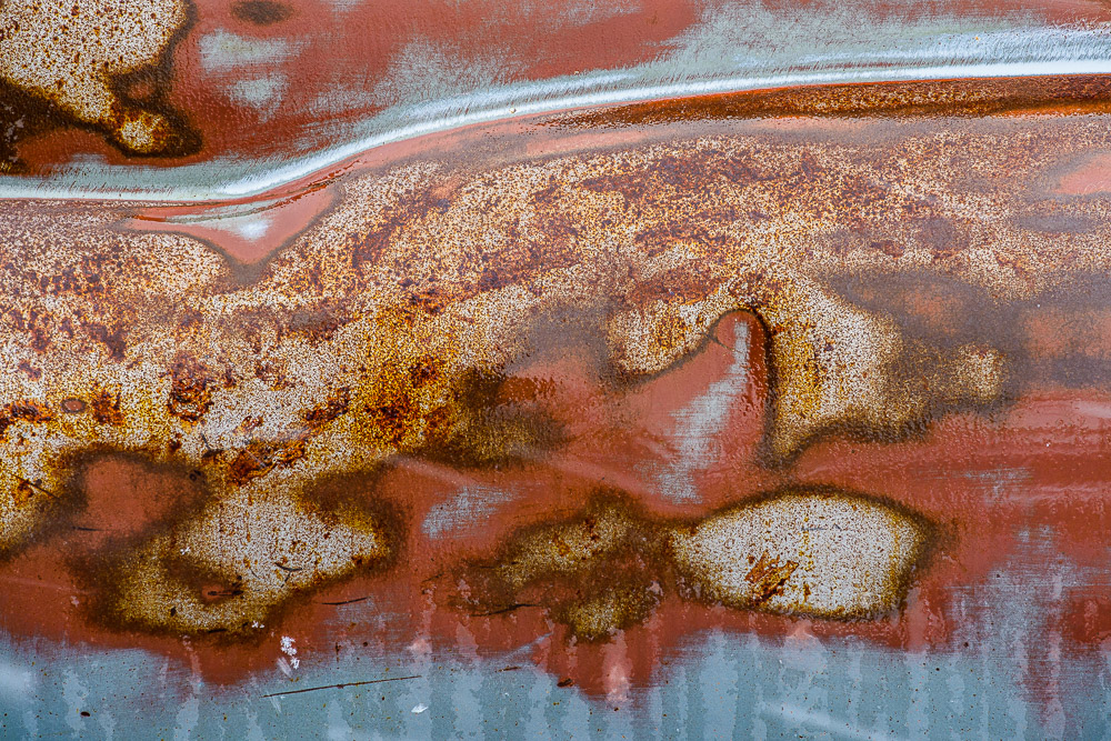
    The image with this article is one of those slow to recognize ones. Look it over and see how many pairs of things you can find. It amazes me. I did not consciously recognize that when I shot it, but I think that is what was drawing me to it.

  • Self-centered

    Self-centered

    If you describe someone as self-centered, that is probably taken as a negative. It often is, but there is another way to see it. If you are a “fine art” artist, I believe you have to be self-centered to really be true to yourself.

    Who do you listen to?

    It’s a problem these days that people are so “connected” to social media that it can be hard to maintain our identity. Is all your work instantly posted, tweeted, shared to “the world”? Do you measure your success by the “likes” or lifts or re-tweets you get?

    This echo chamber of voices can make it hard to listen to your own. If a significant number of your followers don’t like something you post, is it bad? As with any criticism, you have to try to be objective.

    These people giving you feedback – what do they know of your intent, your feelings, the direction you feel your art should go? What do they know about the process you followed to get there?

    Most pictures on the internet don’t get more than 1-2 seconds of attention. When someone hits the “thumbs down”, what does that mean? Is that a well reasoned, critical evaluation based on objective knowledge?

    Likewise, when most people gush over your post and give you glowing praise, what does that mean? Unless they are an artist who takes the time to look more deeply, probably very little. If they follow the praise with “and I will contact you to buy it,” that carries weight.

    Who should you listen to?

    The feedback of random people on the internet probably will not take you to where you need to go as an artist.

    Do you have a small set of trusted friends who will give you reasoned and honest feedback? If so, you are lucky. I desperately wish I did. Try to build such a group. If they really are good friends their honesty will be valuable for you, even when it hurts. If they really are good friends, they will hurt you occasionally.

    Do you work with one or more galleries? Ask them for evaluations, especially of your new work. I haven’t tried it, but I understand portfolio reviews can be good. Your mileage may vary, depending on which ones you choose. I know of successful artists who still go to them for the feedback. Read Cole Thompson’s portfolio review by Mr. X that changed his art.

    Are there artists in your area who you trust? Your style may be totally different and you may not even like what they do, but that is not the point. Can they give you objective and well reasoned feedback? Try to put a group together. I am looking to collect such a group in my area.

    Ultimately, though, it comes down to having to trust your own instinct. You are you. You are the artist. No one else can answer for you or decide what your style or theme or subject is.

    Can you be objective about your own work? Some people can, some can’t. Learn to. Since you are the only one responsible for your work, you have to be able to make your own decisions.

    Unashamed

    Sean Tucker used the term unashamed in a discussion of this problem in his book The Meaning in the Making. I think it is a good word choice. This is where the self-centered aspect comes in. It is understanding who we are and what we are trying to do, regardless of what anyone else thinks. Not arrogance but confidence. We have to realize that only we own our results and are responsible for our decisions.

    Anyone who does anything publicly will be criticized for it. That is true for us when we present our art to the world. A lot of people will hate it. Some will love it. The ones who don’t like it will be quick to tell us what is wrong and how to fix it or why we should quit. As an artist, we must be able to say “thank you for the feedback, but I am going in this other direction.” We have to believe it and in our self.

    Do you believe in you? Are you confident to the point of seeming self-centered? Good. Your opinion of your art is ultimately what matters. That doesn’t mean you will get rich or famous. But you will be at peace with yourself.

  • Black & White – in Color

    Black & White – in Color

    What? Isn’t that contradictory? Isn’t black & white is about the absence of color? I wanted to follow up on a previous article on how we get color information in our digital cameras with a nod to the purity of black and white and emphasize how it is still dependent on color.

    Remove the color filter?

    I indicated before that our sensors are panchromatic – they respond to the full range of visible light. If we want black & white images, shouldn’t we just take the color filter array off and let each photo site respond to just the grey values?

    We could, but most black & white photographers would not be happy with the results. It would be like shooting black & white film. A problem with black and white film is that it eliminates all the information that comes from color. Through interpolation of the Bayer data, we get full data for red, green and blue at each pixel position. If we removed the filter array, we would have only luminosity data. So before even starting, we would be throwing away 2/3 of the data available in our image.

    At that point we would have to resort to placing colored filters over the lens, like black & white shooters of old had to do. They did this to “push” the tonal separation in certain directions for the results they wanted. But this filter is global. It affects the whole image rather than being able to do it selectively as we can with digital processing. And it is an irreversible decision we would have to make while we were shooting. Why go backward?

    What makes a good b&w image?

    Black & white images are a very large and important sub-genre of photography. The styles and results cover a huge range. But I will generalize and say that typically the artists want to achieve a full range of black to white tones in each image with good separation. Think Ansel Adams prints.

    Tones refer to the shades of grey in the resulting print. We do a lot of work to selectively control how these tones relate to each other. Typically we want rich black with a little detail preserved in them, bright whites, also containing a little detail, and a full range of distinct tones in between. These mid-range tones give us all the detail and shading.

    Tone separation

    If one of the goals of black & white photographers is to have high control of the tones, how do we do that? Typically by using the color information. I mentioned putting colored filters over the lens. This was the “way back” solution.

    Landscape photographers like Ansel Adams often used a dark red filter to help get the deep toned skies they were known for. Red blocks blue light, forcing all the blue tones toward black.

    Digital processing gives us far more control and selectivity than the film photographers had. We don’t have to put the filter over the whole lens and try to envision what the result will be. We can wait and do it on our computer where we have more control, immediate previews, and undo. But all this control would be impossible without having a full color image to work with. As a matter of fact, modern b&w processing starts by working on the color image. Initial tone and range corrections are done in color. Good color makes good b&w.

    B&W conversion

    Obviously, at some point the color image has to be “mapped” to b&w. This is called b&w conversion. It can be a complicated process. There are many ways to go about the conversion, and each artist has their own favorites. There is no one size fits all.

    It is possible to just desaturate the image. This uses a fairly dumb algorithm to just remove the color. It is fast and easy, but it is usually about the worst way to make a good b&w image.

    You could use the channels as a source of the conversion. The RGB colors are composed of red, green and blue channels. These can be viewed and manipulated directly in Photoshop. They can often be useful for isolating certain colors to work on. Isolating the red channel would be like putting a strong red filter over the lens.

    Lightroom and Photoshop have built in b&w conversion tools. In LIghtroom, choose the Black & White treatment in the Basic panel of the Develop module. This has an interesting optional set of “treatments” to choose from in the grid control right under it. In Photoshop use the B&W adjustment layer.

    Both of these have the power of allowing color-selective adjustments. This is huge. Tonal relationships can be controlled to a much greater degree than was possible with film. If we want to just make what were the yellow colors brighter, we can do that. Of course, Photoshop allows using multiple layers with masking to exert even more control.

    There are many other techniques, such as channel mixing or gradient maps or plug-ins like Silver Effects to give different and added control. It is actually an embarrassment of riches. This is a great time to be a b&w photographer.

    It starts with color

    What is common to all of this, though, is that it starts from the color information. Color is key to making most great black & white images.

    I sometimes hear a photographer say “that image doesn’t work well in color, convert it to b&w”. Sometimes that works, but I believe it is a bad attitude. B&w is not a means of salvaging mediocre color images. We should select images with a rich spread of tones, great graphic forms, and good color information allowing pleasing tonal separation. Black & white is its own special medium. Remember, though, usually it requires color to work.

  • It’s A Green World

    It’s A Green World

    That’s not an environmental statement. As far as our cameras are concerned, green is the “most important” color. I’ll explain why green is foundational to our photography.

    Bayer filter

    In my previous article I discussed the Bayer Filter and how it allows our digital cameras to reconstruct color. I made a cryptic comment that it was important that there were twice as many green cells as red and blue, but I did not explain. I’ll try to correct that. It is fascinating and highlights some of the brilliance of the Bayer filter design.

    Bryce Bayer’s patent (U.S. Patent No. 3,971,065[6]) in 1976 called the green photosensors luminance-sensitive elements and the red and blue ones chrominance-sensitive elements. He used twice as many green elements as red or blue to mimic the physiology of the human eye. The luminance perception of the human retina uses M and L cone cells combined, during daylight vision, which are most sensitive to green light. ” This is quoted from Wikipedia. Let me try to unpack it a little.

    Color description

    There are several ways to describe color. Some, like the HSV or HSB or Lab models, separate the concepts of luminance and chrominance. Luminance is the tonal variation of a scene, the brightness range from black to white. Hue and saturation define the color value and purity.

    It is all very complicated and, in reality, only interesting to color scientists. I strongly recommend you view this great video that explains how the CIE-1931 diagram was created and what it means. It answered a lot of my questions. As photographers and artists we have to be familiar with some of it. For instance, we have all seen a color wheel like this:

    This is a simplified slice through the HSV space at a constant, maximum lightness. Such a model is useful to us because it shows all colors with their most saturated form at the outer edge and least saturated (white, colorless) in the center.

    Our eyes

    This is nice, but it is all possible colors, not what we really see. As the quote above about Bayer said, the eye is most sensitive to green. Green is right in the middle of the range of light we are sensitive to, the visible spectrum. Here is a plot of our sensitivity to visible color:

    Subjective response of typical eye
    From: https://lightcolourvision.org/wp-content/uploads/09550-0-A-BL-EN-Sensitivity-of-Human-Eye-to-Visible-Light-80.jpg

    It is clear to see, just as Mr. Bayer said, we are most sensitive to green. This is why there are twice as many green cells in the Bayer filter as red and blue. The green is used to measure the luminance, the tone range of the image. This information is critical to deriving the image detail plus the color information through a complex set of transformations.

    Why is is so important to get a good measure of luminance? Because of another interesting property of the eye. We are more sensitive to luminance than color. Luminance gives detail. Think of a black and white picture you like. That image is pure luminance information, no color information at all. Yet we see all the fantastic detail and subtle tones perfectly.

    Color adds a lot of interest to some images, but we can recognize most subjects perfectly well without it. The opposite is not true in general. If you took all the luminance information out of one of your images it is basically unrecognizable.

    Example

    Here is a quick example of a typical outdoor scene here in the Colorado mountains. This is the original image:

    If I convert it to Lab mode and take just the luminance channel (L) we get a black & white version containing all the detail and tone variation that makes it recognizable:

    But now if I copy just the color information (the a and b channels) it is … surreal?:

    Why green?

    I hope I have demonstrated some of the reasoning behind the Bayer filter. It is a key to our ability to capture color information with our cameras.

    The human eye really is most sensitive to green. Having half the color filters in the Bayer filter array as green allows maximum ability to construct the luminance data we are so sensitive to. The magic of the sophisticated built in data processing algorithms let the Raw file converters take all this information and derive the luninance and color information we rely on for our images.

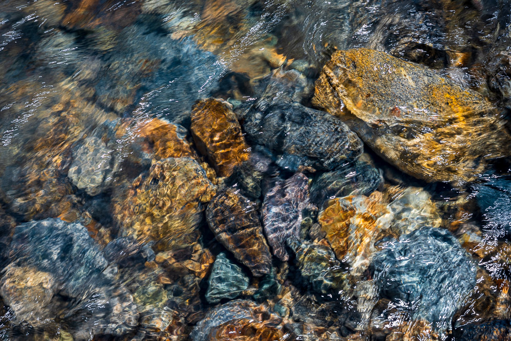
    Does this mean we should shoot more green subjects? No. I don’t. Many on my images have little discernible green in them. Take the image at the top of this article. I love the colors in this mountain stream. I don’t look at it and think “green”. The color range is very full, though.

    As I write this it is the depth of winter here. Much of the shooting I do right now is very monochrome, almost black and white. The Bayer filter is not there to make our images more green. But if you look at your histogram or channels you may be surprised at how much green data is there. Think about it, a black and white image is 33% green.

    Thank you Mr. Bayer and all the scientists and engineers who have done such a great job of perfecting our digital sensing over the decades. You are doing an excellent job!

  • How We Get Color Images

    How We Get Color Images

    Have you ever considered that that great sensor in your camera only sees in black & white? How, then, do we get color images? It turns out that there is some very interesting and complicated Engineering involved behind the scenes. I will try to give an idea of it without getting too technical.

    Sensor

    I have discussed digital camera sensors before. They are marvelous, unbelievably complicated and sophisticated chips. But they are, still, a passive collector of photons (light) that falls on them.

    An individual imaging site is a small area that collects light and turns it into an electrical signal that can be read and stored. The sensor packs an unimaginable number of these sites into a chip. A “full frame” sensor has an imaging area of 24mm x 36mm, approximately 1 inch by 1.5 inch. My sensor divides that area into 47 million image sites, or pixels. It is called “full frame” because that was the historical size of a 35mm film frame.

    But, and this is what most of us miss, the sensor is color blind. It receives and records all frequencies in the visible range. In the film days it would be called panchromatic. That is just a fancy word to say it records in black & white all the tones we typically see across all the colors.

    This would be awesome if we only shot black & white. Most of us would reject that.

    Need to introduce selective color

    So to be able to give us color, the sensor needs to be able to selectively respond to the color ranges we perceive. This is typically Red, Green, and Blue, since these are “primary” colors that can be mixed to create the whole range.

    Several techniques have been proposed and tried. A commercially successful implementation is Sigma’s Foveon design. It basically stacks three sensor chips on top of each other. The layers are designed so that shorter wavelengths (blue) are absorbed by the top layer, medium wavelengths (green) are absorbed by the middle layer, and long wavelengths (red) are absorbed by the bottom layer. A very cleaver idea, but it is expensive to manufacture and has problems with noise.

    Perfect color separation could be achieved using three sensors with a large color filter over each. Unfortunately this requires a very complex and precise arrangement of mirrors or prisms to split the incoming light to the three sensors. In the process, it reduces the amount of light hitting each sensor, causing problems with image capture range and noise. It is also very difficult and expensive to manufacture and requires 3 full size sensors. Since the sensor is usually the most expensive component of a camera, this prices it out of competition.

    Other things have been tried, such as a spinning color wheel over the sensor. If the exposure is captured in sync with the wheel rotation then 3 images could be exposed in rapid sequence giving the 3 colors. Obviously this imposes a lot of limitations on photographers, since the rotation speed has to match the shutter speed. A real problem for very long or very short exposures or moving subjects.

    Bayer filter

    Thankfully, a practical solution was developed by Bryce Bayer of Kodak. It was patented in 1976, but the patent has expired and the design is freely used by almost all camera manufacturers.

    The brilliance of this was to enable color sensing with a single sensor by placing a color filter array (CFA) over the sensor to make each pixel site respond to only one color. You may have seen pictures of it. Here is a representation of the design:

    Bayer Filter Array, from Richard Butler, DPReview Mar 29, 2017

    The gray grid at the bottom represents the sensor. Each cell is a photo site. Directly over the sensor has been placed an array of colored filters. One filter above each photo site. Each filter is either red or green or blue. Note that there are twice as many green filters as either red or blue. This is important.

    But wait, we expect that each pixel in our image contains full RGB color information. With this filter array each pixel only sees one color. How does this work?

    It works through some brilliant Engineering with a bit of magic sprinkled in. Full color information for each pixel is constructed by interpolating based on the colors of surrounding pixels.

    Restore resolution

    Some sophisticated calculations have to be done to calculate the color information for each pixel. This makes each pixel end up with full RGB color values. The process is termed “demosaicking” in tech speak.

    I promised to keep it simple. Here is a very simple illustration. In the figure below, if we wanted to derive a value of green for the cell in the center, labeled 5, we could average the green values of the surrounding cells. So an estimate of the green value for cell red5 is (green2+green6+green8+green4)/4

    From Demosaicking: Color Filter Array Interpolation, IEEE Signal Processing Magazine, January 2005

    This is a very oversimplified description. If you want to get in a little deeper here is an article that talks about some of the considerations without getting too mathematical. Or this one is much deeper but has some good information.

    The real world is much more messy. Many special cases have to be accounted for. For instance, sharp edges have to be dealt with specially to avoid color fringing problems. Many other considerations such as balancing the colors complicate the algorithms. It is very sophisticated. The algorithms have been tweaked for over 40 years since Mr. Bayer invented the technique. They are generally very good now.

    Thank you, Mr. Bayer. It has proven to be a very useful solution to a difficult problem.

    All images interpolated

    I want to emphasize a point that basically ALL images are interpolated to reconstruct what we see as the simple RGB data for each pixel. And this interpolation is only one step in the very complicated data transformation pipeline that gets applied to our images “behind the scenes”. This should take away the argument of some of the extreme purists who say they will do nothing in post processing to “damage” the original pixels or to “create” new ones. There really are no original pixels.

    I understand your point of view. I used to embrace it, to an extent. But get over it. There is no such thing as “pure” data from your sensor, unless maybe you are using a Foveon-based camera. All images are already interpolated to “create” pixel data before you ever get a chance to even view them in your editor. In addition profiles and lens corrections and other transformations are applied,

    Digital imaging is an approximation, an interpretation of the scene the camera was pointed at. The technology has improved to the point that this approximation is quite good. Based on what we have learned, though, we should have a more lenient attitude about post processing the data as much as we feel we need to. It is just data. It is not an image until we say it is, and whatever the data is at that point defines the image.

    The image

    I chose the image at the head of this article to illustrate that the Bayer filter demosaicking and other image processing steps gives us very good results. The image is detailed and with smooth, well defined color variation and good saturation. And this is a 10 year old sensor and technology. Things are even better now. I am happy with our technology and see no reason to not use it to its fullest.

    Feedback?

    I felt a need to balance the more philosophical, artsy topics I have been publishing with something more grounded in technology. Especially as I have advocated that the craft is as important as the creativity. I am very curious to know if this is useful to you and interesting. Is my description too simplified? Please let me know. If it is useful, please refer your friends to it. I would love to feel that I am doing useful things for people. If you have trouble with the comment section you can email me at ed@schlotzcreate.com.