An artists journey

Category: Mastery

  • Unrecognized

    Unrecognized

    Sometimes things are right there staring us in the face. But we don’t or can’t see it. We fail to see what should be obvious. This in an internal problem. We don’t get to blame anyone else. Don’t go through life with unrecognized interest all around.

    Unrecognized artist

    “Unrecognized” is a fairly ambiguous word. Well, not really ambiguous, it is just that it can be applied so many ways. One of the first things that comes to mind when I hear the phrase is my sadness at being an “unrecognized” artist.

    Even though I have sales and good gallery representation and I get exhibited, it feels like nothing. Failure. I seek to be more widely known. A goal is to share my vision with many more people.

    But this aspect of “unrecognized” is not what I am discussing in this article.

    Unrecognized beauty

    Most people I know sort of drift through life in a daze. We follow our normal paths, doing basically the same thing all the time without really seeing things around us.

    If we recognize the rut we are in, we can climb out. At least enough to make a difference. Just deciding that we are going to pay more attention to things around us will go a long way.

    There is beauty all around us, even if you live in a city. Disappointed that you don’t live in Yosemite? Get over it. Learn to appreciate where you are. Even if you are not thrilled with your environment, by learning to look more closely we can usually find things, even little things, to brighten our day. Is there a flower, or a tree, or a pattern of light and shadow on a building that catches your eye? Look at it. Stop and take a moment to appreciate it.

    This will grow a habit of mindfulness. It will help us become more aware of what is there and more grateful of the little scenes that brighten out day, make us feel more alive.

    Unrecognized self

    Many of us, I’m pointing to myself, too, have trouble recognizing where our creative instincts are leading us. We change all the time. It can be hard if we feel like we are starting to be recognized for a certain style or subject. We fear that changing would lose our market. But at least that person is aware of what is going on. Most of us, I feel, one day realize that what we are drawn to is different from what we have been practicing for a long time. This can shake us to our bones. But it can also be refreshing and invigorating to re-align with where our subconscious is directing us.

    I think this quote from a very good photographer from the past, David Vestal. is enlightening.

    As we work, we come to know more and become more patient and less inclined to rush past our own work that we don’t yet recognize. Now I am quicker to see in my own new work the “accidental” good photos that I used to ignore.

    Mr. Vestal points out 3 key things that are common and key to our artistic growth.

    Know more

    As we practice our art we learn. Our technical abilities grow and our creative capabilities are stretched. The more we learn the deeper vocabulary we have to express what we see and feel. We also have more ability to examine our art and critique it.

    If we’re lucky, we even get to a point where we know what we don’t know. But the path of knowing more sometimes means we grow away from the positions we held in the past.

    More patient

    Mr. Vestal describes part of the growth process as becoming more patient. With ourselves. I know for myself, I feel less need now to shoot quantities of images. I used to be in a frenzied rush to capture everything that was the least bit interesting. These days I will usually come back with fewer images. I can see something nice and not feel the need to take a picture. Sometimes it is sufficient to just acknowledge it and appreciate it. I would rather have a few images that excite me rather than a whole pile of “OK” pictures.

    I think this also applies to our results and growth as an artist. Have you ever found yourself trying to “force” a great image. I do. Maybe less than I used to. As I grow I am more interested in trying to see more clearly what is there and understand how I perceive it, what I want to do with it. Sometimes it doesn’t come. Rather than be a big frustration, it is an opportunity to try to figure out why.

    Have you ever come upon what would be one of your “standard” images, one you would always shoot, and said, “no, that doesn’t interest me today”? Something is speaking to you to tell you you have grown to a new position.

    Recognize

    To me, the phrase in his quote “less inclined to rush past our own work that we don’t yet recognize” is brilliant. I sometimes run across something while I am looking for a particular image. Something I didn’t think was very good, but for some reason I kept it. Looking at it some time later I liked it much better. Sometimes I realize that if far more representative of my current vision that things I used to shoot.

    He describes them as accidentally good shots. I believe these accidental shots are sometimes our subconscious trying to show us something we don’t recognize yet. As we grow in our artistic concept, we have to leave the past behind. We become bored with what we used to proudly do. Recognize that feeling. Learn from it. It is time to move on.

    I have described before that I tend to be fairly brutal about culling out bad or uninteresting shots. Sometimes, though, I am compelled to keep an image that I don’t think I like. Sometimes I find, later, that this image is significant to me. It may even be a pivot to a new direction in my journey. I did not recognize it at the time, but I did perceive that there was something there that made me keep the image and come back to it later.

    Be receptive

    I believe we should learn to be more receptive to these signals our subconscious is sending us. The subconscious mind is more powerful than the conscious mind. It understands us better. It is not deluded by ego or financial considerations or social media followers.

    I have heard it said that this message from our subconscious is usually not a light bulb going on, it is more like a tickle on the back of our neck. That little feeling that there is something here we are missing or need to figure out. Maturity is learning to be aware of this hint and follow it to see where it leads us.

    How about you? Have you ever puzzled over an image you couldn’t figure out, only to recognize later that it was a harbinger of a new direction for your creative work? The way to a new creative plateau? Did you trust your instincts and embrace the new direction? What was the result?

    I would like to know! Leave a comment or email me.
  • Out of Gamut

    Out of Gamut

    That seems like a strange thing to say. It’s not a phrase you hear in normal conversation. What can it mean? I have written some about how sensors capture color, but I realize I have not mentioned the gnarly problem of color gamut. Unfortunately, I have been bumping into the problem lately, so I had to re-familiarize myself with it. Some of my new work is seriously out of gamut.

    What does gamut mean

    Most writers avoid this or give overly simplified descriptions. I’m going to treat you as adults, though. If you really are someone who is completely afraid of technology you might want to skip to the end – or ignore the whole subject.

    The concept of gamut is really pretty simple, but you need some specialized knowledge and you have to learn some new things about the world.

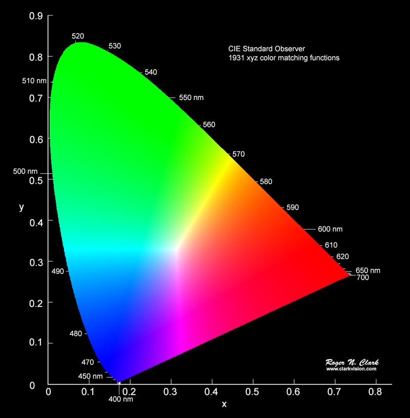
    I have mentioned the CIE-1931 Chromaticity Diagram before. That sounds scary, but you have probably seen the familiar “horseshoe” diagram of colors. I recommend you watch this video to understand how it was derived and what it means. This is the diagram:

    CIE-1931 Chromaticity Diagram

    After a lot of research and a lot of measurement, scientists determined that this represents all possible colors a typical human can see. Just the hue – color – not the brightness.

    Very simply, a gamut is just a representation of what part of this spectrum a particular device can reproduce or capture.

    Show me

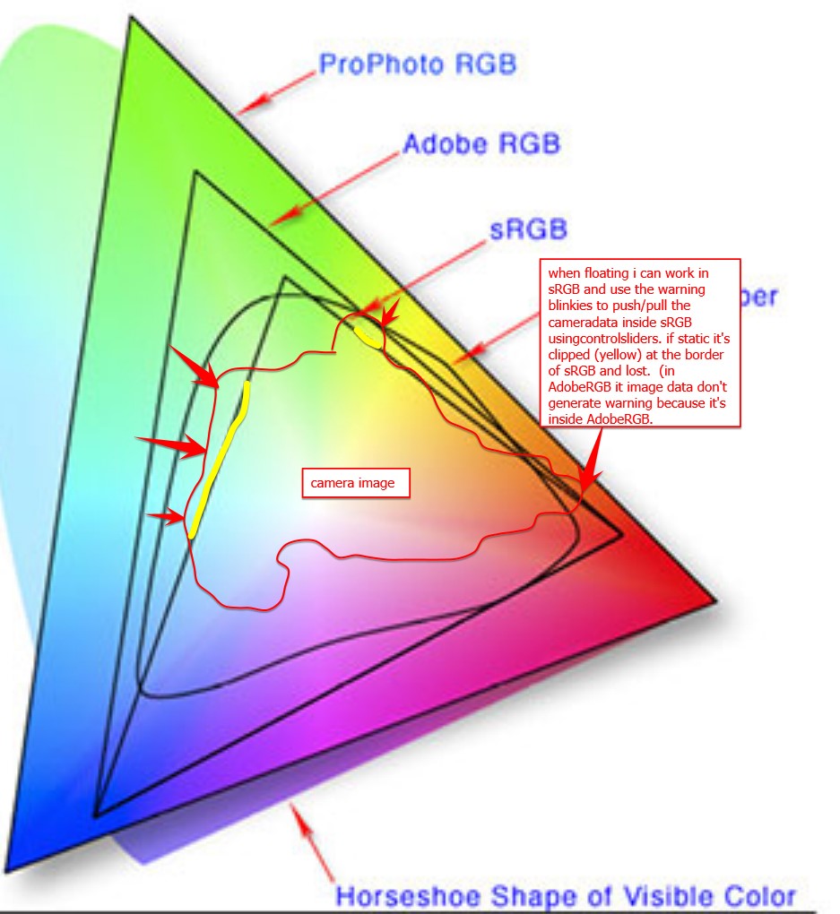
    The next figure shows the horseshoe with some regions overlayed on it.

    Add ProPhoto colour space as a "working color space" - Which feature do you need? - DxO Forums

    There are 3 triangular regions labeled: sRGB, Adobe RGB, and ProPhoto RGB. They are called color spaces. The diagram is indicating all possible colors that each color space can represent. The smallest one, sRGB, is typical of a computer monitor. It is what will be used when you share a jpg image with someone. It is small but “safe”. We lose a lot of possible colors, but everyone sees roughly the same thing on all their monitors.

    Let’s jump to ProPhoto RGB. You can see that it covers the largest part of the horseshoe. In other words, ProPhoto RGB has the largest gamut. It is the best we have for representing image color and most professional photographers use this now. Unless they are doing weddings. That is a different world.

    They’re not ideal?

    Unfortunately, these color spaces are an ideal. The ProPhoto color space is a model for editing images. No actual devices or printers can give us the entire ProPhoto RBG gamut. Not even close. Most can barely do sRGB.

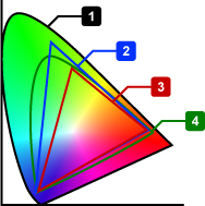
    Here is a diagram of the color space a Canon pro printer can do.

    The small horseshoe, labeled 4, is the printer gamut. It is larger then sRGB (3) and, overall, a lot like AdobeRGB (2). Smaller than ProPhoto RGB, which is not listed here.

    It looks pretty good, and in general it is. I use one of these printers. But look at what it does not do. Most greens and extremes of cyan and blue and purple and red and orange and yellow cannot be printed. Actually, almost no extremely saturated colors can be printed.

    And it is not just printers. Most monitors, even very good ones, are somewhere between sRGB and AdobeRGB spaces. This cannot really be considered a fault of the monitors or printers. The physics and engineering and cost considerations prohibit them from covering the full ideal range.

    Any of these colors that I use in an image, that can’t be created by the device I am using, are referred to as “out of gamut”. Outside of the color space the device can produce. This is what I have been running in to lately.

    What happens

    So what happens when I try to print an image with out of gamut colors? Well, it is not like it blows up or leaves a hole in the page instead of printing anything. Printers and monitors do the best they can. They “remap” the out of gamut colors to the closest they can do. As artists, we have some control over that process, as we will see in the next section.

    But the reality is that these out of gamut colors will lose detail, be washed out and without tonal contrast. When we get to looking at the print, we will say “yech, that is terrible”. Then we need to do something about it.

    What can we do about it

    There are things to do to mitigate the problem. Here is where we need to understand enough about the technology to know what to do.

    First, we have tools to help visualize the problem. Both Lightroom Classic and Photoshop have a Soft Proof view. It will simulate the actual output for a particular printer and paper. You can also view gamut clipping for the monitor. Yes, because of gamut problems you may not be seeing the image’s real color information on your monitor.

    Both Lightroom and Photoshop have versions of saturation adjustments and hue adjustment. These can help bring the out of control colors back into a printable or viewable range. With practice we can learn to tweak these settings to balance what is possible with what we want to see.

    But even if we give up and decide to print images with out of gamut colors, there are options. the print settings have a great feature called “rendering intent”. They are a way to give guidance to the print engine on how we want it to handle these wild colors. Several different rendering intents are available, but the 2 that are most commonly used are Relative and Perceptual.

    Rendering Intents

    I use Perceptual intent most often, at least in situations where the are significant out of gamut colors. Using the Perceptual directive signifies to the print driver that I am willing to give up complete tonal accuracy for a result that “looks right”. The driver is free to “squish” the color and tone range in proportional amounts to scale the whole image into a printable range. I don’t do product photography or portraits, so I am usually not fanatical about absolute accuracy. How they work this magic is usually kept as a trade secret. But secret or not, it often does a respectable job of producing a good output.

    The other common intent is Relative. This basically prints the data without modification, except that it clips out of gamut colors. That sounds severe, but the reality is that most natural scenes will not have any significant gamut problems, so no clipping will occur.

    This is a great intent for most types of scenes, because no tonal compression will take place.

    The answer

    The answer is “your mileage may vary”. Most images of landscapes and people will not have serious out of gamut problems. When you do, this information may help you get the results you want. When you have a problem, turn on the soft proofing and try the Relative and Perceptual rendering intents. Look at the screen to see if one is acceptable. If not, go back and play with saturation and colors .

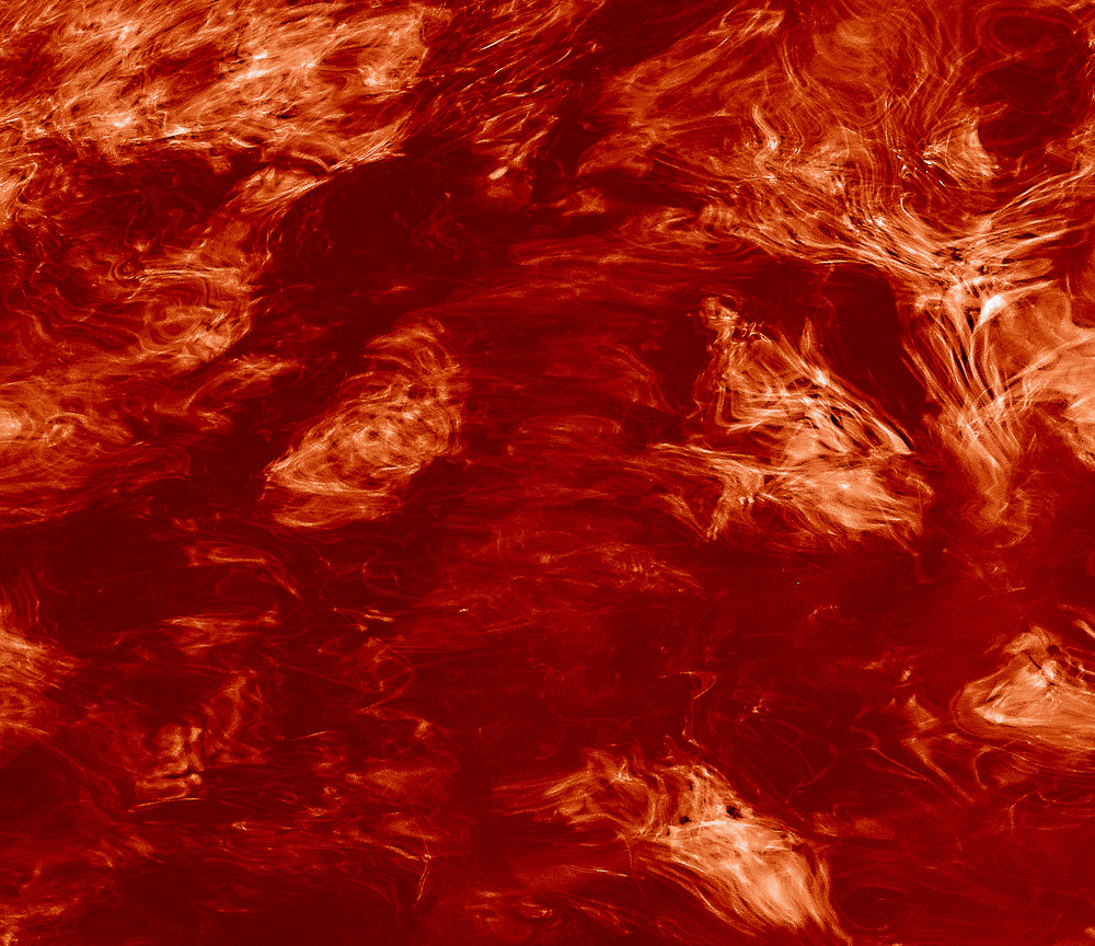
    Why do I have problems? Well, I’m weird. I have been gravitating to extremely vibrant, highly saturated images. I like the look I am trying to get, but it can be hard to get it onto a print. The image at the top of this article is a slice of an image I am working with now. It is seriously out of gamut. I need to work on it a lot more to be able to print it without loss of color detail. Ah, technical limitations.

  • The Making of “Brush Off”

    The Making of “Brush Off”

    It was refreshing for me talking about making a piece of art instead of just discussing process or training. I will do it again. This time it is the making of the piece presented here. It is titled “Brush Off”. It is one of those abstract, “what is it?” pieces that I like to do.

    Context

    If you think this is something very exotic, sorry to disappoint you. As a matter of fact, it is something common and mundane.

    This is the brush going over the top of my car in an automatic car wash. Looking up through the sun roof. Like I said, mundane. Sorry.

    The point, though, is: even something as common as this can be interesting if you look at it the right way. That is a constant theme of my images.

    Technique

    It was not as easy as just pointing the camera up and shooting. If I did that, even scrunching down in the seat, the lens would be almost right against the sun roof glass. That doesn’t work.

    In order to get the glass in focus and sufficient field of view and depth of field to render the brush the way I wanted I had to get the camera a couple of feet away from the glass. After a couple of wasted sessions of trying to juggle a small tripod in place, I gave up on that and placed the camera on the console looking up. That was the solution. As long as I didn’t bump it.

    Unfortunately though, with the camera there I can’t see what is going on. I had to use the Nikon software on my phone to connect to the camera and control it. Again after trial and error I figured out that I had to put it in manual focus and stop transferring captured images to the phone.

    Even so, there is a noticeable lag between triggering a capture from the phone and it actually happening. Probably about 1/2 to 3/4 second. This took practice to get in the rhythm. I had to anticipate when things would be in place and try to lead the event correctly. Lots of trial and error. I ended up throwing a lot of frames away.

    Finishing

    After all that, I wish the image I saw on the computer screen had looked like I visualized. But no. This was a sunny day. There were lots of reflections on the sun roof glass, both from outside and inside. It was worse because I had to abandon my polarizer to get the shutter speed I needed. It was a balancing game to blur the brush just enough to add to the mystery and abstraction without making it just a smear.

    I did the initial exposure balance and crop in Lightroom, as usual. Then in Photoshop it required extensive selective color tonal manipulation to eliminate the reflections. Then there was more tonal corrections, dodge/burn, limited sharpening, etc.

    Mindfulness

    What I want to point out, though, is that the image is not mainly about technique. Behind the “how” is the “why”. I was curious and mindful even while in a car wash. I asked what it would look like looking up through the top during the wash. And I spent the effort to explore it.

    I’m glad I did. I like it. This is one of a series of images I did in the same car wash over many washes. It turned out to be a useful place to ask some “what if” questions and see what happened.

    I encourage you to follow your curiosity. Don’t be afraid of looking foolish. Don’t worry what anyone else thinks. It is your curiosity and vision.

  • Lucky, or Good?

    Lucky, or Good?

    You’ve heard the phrase “it’s better to be lucky than good”. Some people will claim this is terrible advice. But I think there is enough truth in the phrase to merit some thought. Strive to be as good as possible, but welcome and embrace luck when it happens.

    Not the way to plan

    We can’t schedule or control luck. It is an external thing that happens, or it doesn’t. Since we can’t control luck, we better work on the things we can control. This is just pragmatic.

    The context here is art, but it really applies to most areas of our life. Work hard. Develop all the skill you are capable of. It is a life-long quest of continual improvement.

    When we are good at what we do we have more control of the outcomes. Another old saying you’ve heard is “the race doesn’t always go to the swiftest, but that’s the way to bet.” In this case, bet on skill. Our skill is a huge determinant of what we will achieve,

    Art, though, like many important things, is not completely predictable and deterministic. Unexpected or unforeseen things can happen and that can be good.

    Luck happens

    When the unforeseen happens we tend to call it luck. No matter how great our skill or how much we plan, sometimes something happens that just makes us say “wow.”

    If this event takes us away from our desired goal we tend to call it unfortunate – bad luck. If it sparks a new idea or gives a new insight or makes some problems go away we call it good luck.

    In either case this event was unplanned, unexpected, unanticipated. That is part of the beauty of it. Or it can be, depending on what we do with it.

    Be open and receptive

    Luck can be received as a gift. We should be flexible enough to re-evaluate our plans and goals in the moment to consider what we have seen or learned. Psychologically healthy people tend to have an attitude of gratitude. This luck could be pure gold. We should consider ourselves fortunate.

    It can trigger the creation of a great image or even bring us to a new place in our art. Even what we at first consider to be bad luck can have good outcomes. There have been times when I had been working on an image or even a project and a piece of bad luck causes me to reevaluate what I am planning on doing. Sometimes I conclude I was going down a dead end. The bad luck sent me to a different and better place.

    This cannot happen unless we are open. I could not possibly list all the times some lucky accident caused me to change my plan. Or the number of times I have learned something new to eagerly apply in my work.

    This image

    Let me talk a little more about this image than I usually do in these articles. I try to get out all year in all weather. In the winter I try be aware of good ice patterns, because I sometimes like the patterns and textures. Usually, here, there is enough snow to make the ice cloudy and less interesting. Nice, but kind of all the same.

    This day, though, I hit a brief window where the lakes had partially thawed. Then a hard freeze, with no snow, and calm conditions, had led to the formation of beautiful ice crystals. In addition, the edges of the lakes I was at had good rock just under the surface to give more pattern and color.

    I abandoned everything else I was planning to do and nearly froze to death shooting this ice. It was very cold.

    I love this image. It has not been altered substantially. Just some color boost and correction. I haven’t seen these conditions before or since. It was a happy accident – good luck.

    Lucky or good?

    So, is it better to be lucky or good? I will let you answer that for yourself. For me, I believe we need to work very hard on our skill and our vision. We have to be able to produce the work we want to create at the quality level we want. But I also believe we should be receptive to the happy accidents that bring joy and freshness to our life and vision. They seem to go together.

    Maybe Samuel Goldwin was right when he said “The harder I work, the luckier I get.”

  • Polarizing

    Polarizing

    I wish I were talking about the great polarizing filters I routinely have on my lens. But no. We live in highly polarizing times. Just look at almost any political talk, at least here in the United States that I am familiar with. Or any “discussion” of social values, climate control, animal rights, etc. There seems to be a bimodal distribution on all things. That is just a fancy way of saying everyone is to one extreme or the other with few in the middle – we are polarized.

    I actually want to encourage it. Let me explain.

    Emotion

    One of my goals is to create a reaction in you with my images. It doesn’t have to be a strong reaction. I don’t shoot for social causes, so you won’t see starving refugees or sex trafficking or such subjects. Congratulations to those who are drawn to exploring such things, but that is not me.

    Nor do images need to be graphic and depressing to evoke emotion. One of the side effects of the extreme polarization in most things is that promoters of a cause are extremely “serious” about what they are doing. To the point where, if you don’t agree and support them, you are a worthless human being.

    I promise never to deal with you that way. My images look at the world around me, wherever I am. I try to find joy and wonder in even the smallest things. If I can transfer some of that wonder to you, I am successful. We all need more wonder and joy in our lives.

    So one metric I look for is that an image needs to be more than just about something. It needs to make you feel something.

    Boring

    I will express my personal opinion that most photography is boring. Including some of mine. Beautiful sunsets get old quick. Technically perfect images aren’t much use unless the subject or composition is also very strong. And selfies – I won’t even go there.

    I believe an image should move you in some way. Even if it is just to make you stare at it in disbelief or puzzlement. Ideally it should connect with you in some way. Some way that makes you pause and consider it for a while.

    It takes a lot of effort to make an image that is not boring. That is one reason it is fun and creative.

    Conventional

    Another trap is making conventional images. That is, subjects and compositions that we expect, that are similar to what most other people do. This is playing it safe. This is a danger of thinking in terms of social media “likes”.

    Learn the rules, then decide when to break them. You are an artist. There are really no rules. If we apply our creativity we can probably do better than the average and conventional. Try to look at things differently. Maybe a different position or unconventional lens choice. Spend time thinking about what you want to say.

    Being different can easily be abused. I do not care for images that are different in some weird way just for the sake of being different. What makes you think that landscape actually looks better out of focus? Have something to say.

    Wonder

    For me, it comes down to trying to keep a sense of wonder and finding out how to convey that to my viewers. It’s easier said than done. Most of us lose our wonder as we mature. That is unfortunate. We are just getting to a place where we can understand enough of the world to actually wonder at it.

    I understand. I lose my wonder at times and have to re-discover it. Especially now that I am old cynicism seems to wash the color out of everything. I fight it. Sometimes I win. It feels good to really get interested in something.

    Power of art

    I’m a hopeless optimist. I believe art is one of the things that can bring people together. It rises above our polarizing differences. There is not conservative or liberal art. No Blue or Red art. Even if we disagree on many things, we can share enjoyment of an image that speaks to us. We can even share dislike of an image.

    Maybe agreeing on something we both don’t like can start bringing us together.

    Love it or hate it

    That brings me back around to my theme for this article. I want my viewers to feel something when they look at my art. Ideally I would like them to love it. But is they don’t, I would prefer them to hate it than to be indifferent.

    This is my art. I labored over it to present it to you. Being indifferent is the most terrible outcome I can imagine.

    Unlike our divided political climate, I would prefer a polarizing, bimodal response to my art. If you don’t feel anything one way or another I have probably failed. Even if you hate it, perhaps you will at least consider it for a few minutes and decide maybe there is something there to take away.