
There’s nothing new left to photograph
It’s been done! We all know it and feel it. The world is over-photographed. Why bother anymore? Nothing new is left. Should we pack up our gear and stow it in a closet?
Too many photographs
Trillions of photographs are taken every year. Think of that. As many as if every man, woman, and child on the planet takes over 100 pictures a year. Most of them seem to be uploaded to social media.
Every person. you meet is carrying around a good camera – their phone. And they’re not afraid to use it.
How many times have you been enjoying the view at a peaceful overlook, only to have a car skid up and unload a noisy group of parents and kids. The kids are herded in front of you and lined up and forced to smile so they can take a group selfie to show they were there. They may even ask you to take the picture. Then they rush back to their car to get back on their phones.
Probably 99.9999% of this flood of photos are uninteresting selfies or food shots or other things like that that are just “look at me” pictures. Just think of the Exabytes of disk space they are taking up. Yes, this is judgmental on my part, but I am making a point. And I’m talking about uninteresting in an artistic sense.
There is such a glut of pictures that it devalues photography as an art form. Why should I be interested in your photograph? I can take my own. I’ve seen that scene 1000 times. To the point that It’s a yawn.
 ©Ed Schlotzhauer
Everything interesting is shot
Every location on, above, or under the Earth that can be reached without the funding of a major expedition has been shot to death. Even the ones that are ridiculously hard and dangerous to get to have. So, should we give up?
That depends on your goals. Since you are reading this, you probably consider yourself a “creative”. What does that mean to you? Do you define your creativity as photographing a location no one has ever shot before? If so, perhaps you should modify your definition. All the major sights have been photographed.
There are other ways to be creative.
 ©Ed Schlotzhauer
Do something bizarre?
But for many, the perceived need to stand out and be different leads to strange ends. To try to create things no one has ever done sometimes leads to going for shock, or bizarre, or, at the other extreme, deliberate banality. Is this what you want for your art? If so, go for it. You do your art. But ask yourself if that is really you.
Others may go back to film for its nostalgia. Maybe even to other non-traditional technology such as tin type or wet plates. People deliberately leak light onto film, use badly flawed lenses, or develop their film in unusual chemicals. Some use intentional camera motion or deliberate focus problems or other “errors”. Sometimes just for the goal of making something no one else has ever done.
We are led to believe that creative means totally new that no one else has ever seen or done. Perhaps this is an overly strict definition of creativity.
 ©Ed Schlotzhauer
Be you
Artists have always done the same subjects over and over. There are only a limited number of subjects and not that many truly different ways to approach them.
Are you not going to do ponds because Monet has “done” them? Are you not going to do a night sky because Van Gogh was the only one to be able to do that? Da Vinci did the definitive portrait, so no sense going there. Likewise, will you never photograph landscapes because there are no more to do after Ansel Adams finished? Must you forever avoid flowers because O’Keeffe did everything that could be done?
Have all the songs been created? Have all the novels been written?
Of course not. Humans always come up with creative new ways to present things. Therefore, “never been done” is not the strict test of creativity.
Apply your style
If artists do the same subjects over and over, where is the creativity? Isn’t it in the unique perspective of the artist? The new point of view or treatment or interpretation they can bring to it.
If the famous ones can do it, then why can’t we? We are artists, too. Each of us can still do new, fresh, creative work.
Sure, if you park at Tunnel View in Yosemite and put your tripod in the same spot that thousands of others have used and shoot the same wide-angle scene, like everyone else, it is going to be hard to stand out. But look around. There is a nice river there, and beautiful trees. Wildlife is around, flowers, and people doing weird or dumb things. We can direct our creativity in other directions.
We each have our own unique point of view and way of expressing it. Use it. Be intentional. You are drawn to certain things. Recognize that and work it. You do not need to chase the crowd of popularity. It does not matter what “influencers” are promoting.
Say what is in you, about what calls to you, in your own way. Unless you are on a commission, your art should be first for you. If everybody loves your work, but you don’t, isn’t that a failure? If you love your work but no one else seems to, isn’t that still satisfying your need to do art?
By making art, we are trying to express something we feel or perceive. Maybe to other people, but sometimes just to ourselves. That brings a unique perspective to it. If we succeed, it is perceived as different, meaningful. That is creative. No one else has done that the way you do.
 ©Ed Schlotzhauer
Creative, our way
Creativity is not usually something radically new. Sometimes it is an incremental build on the past. It is the little twist that makes it uniquely our own. The little spin on the conventional way it has been done. Sometimes it is spotting what others overlook and treating it as art, not just something on the side of the road.
Be curious. By going through life with a mindful attitude, we can see things other people look past. Our vision usually applies to the unique way we see the same thing other people see, but don’t really see. We will not often see something that no one else in history has ever seen before. The secret is what we bring to the common. Can we make something new out of things everyone else ignores?
Everything has been photographed. But not everything has been seen.
To be a photographer today requires us to see more clearly and think deeper and work harder to separate ourselves from the crowd, but we can do that. We are artists. We have the right to be obsessed and passionate. After all, this is our art.
Follow your enthusiasm … The only quality common to all great artists and creative people is that they are obsessed with their work.
Richard Avedon
Today’s images
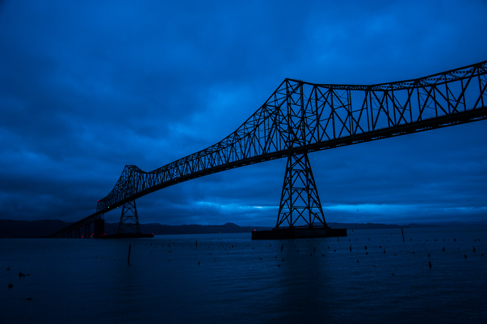
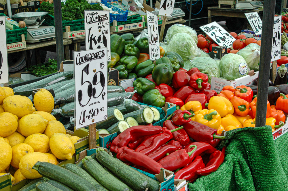
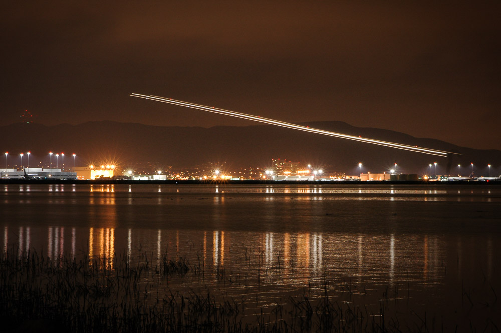
Given what I am talking about, I decided to feature unexpected, hopefully creative images. All are things found in my explores. None are grand landscapes or iconic locations. These are the kind of treasures I like to collect. I hope they are all things you have never seen.

 ©Ed Schlotzhauer
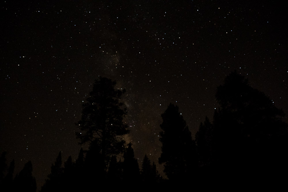 ©Ed Schlotzhauer
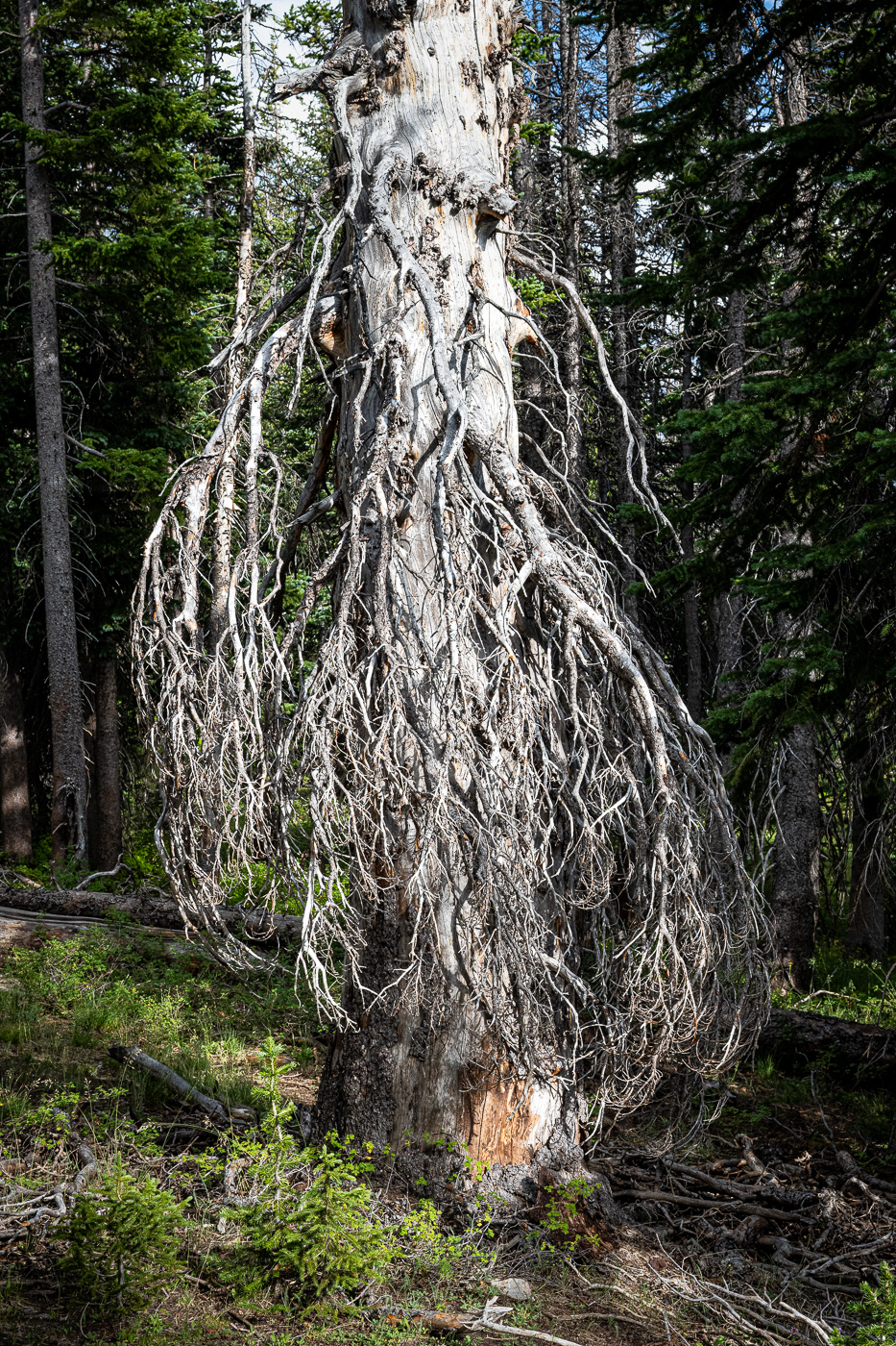 ©Ed Schlotzhauer
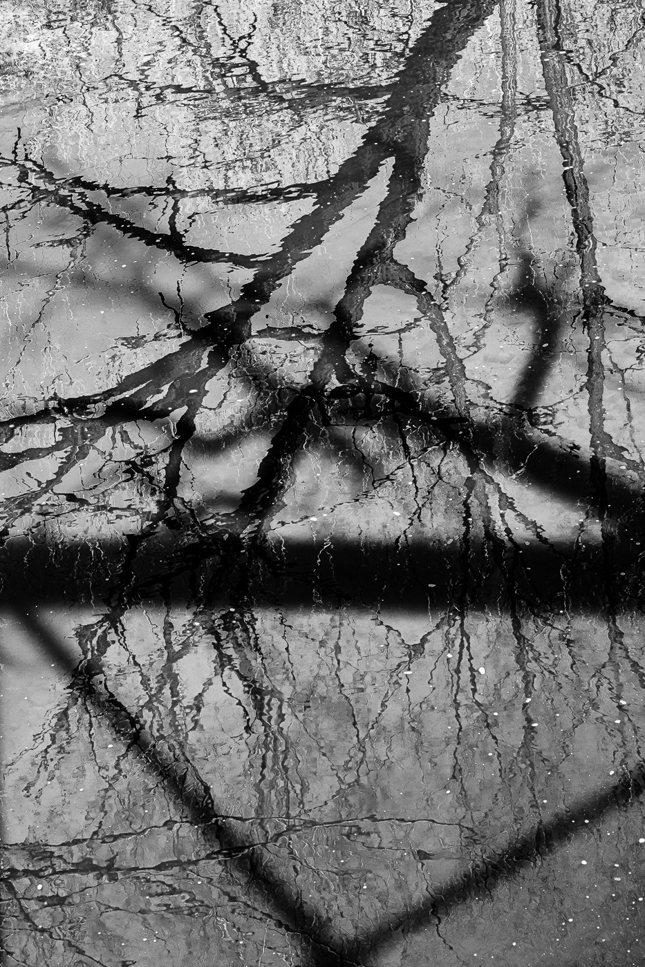 ©Ed Schlotzhauer
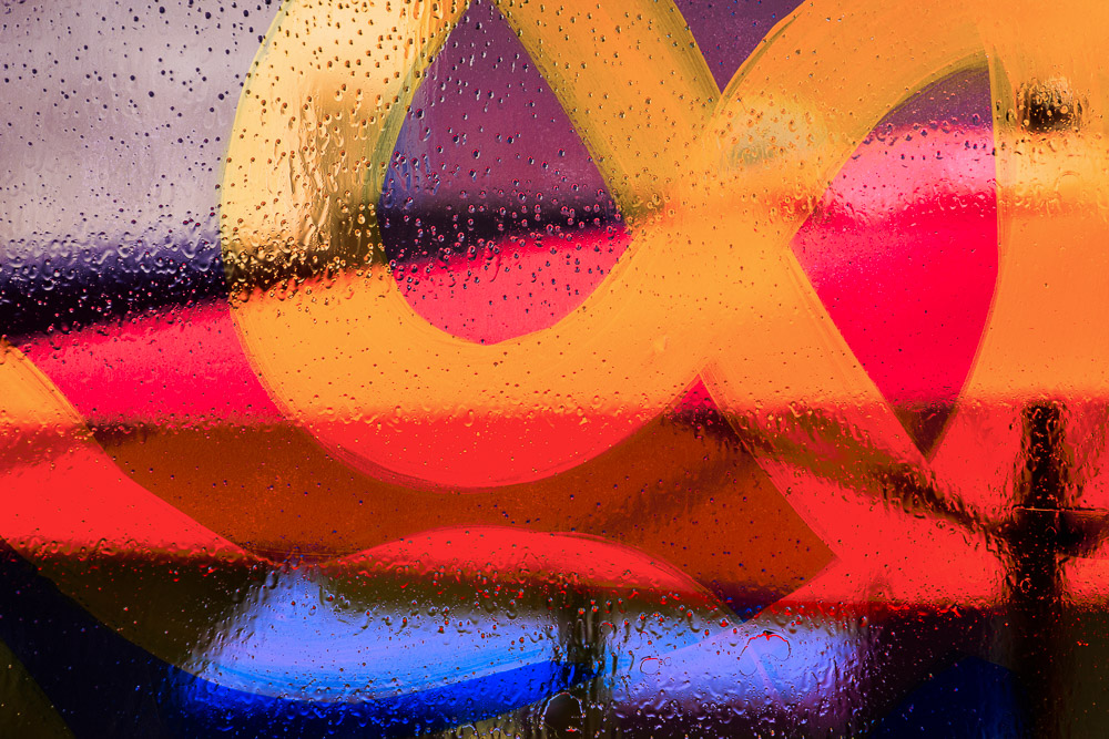 ©Ed Schlotzhauer
 ©Ed Schlotzhauer
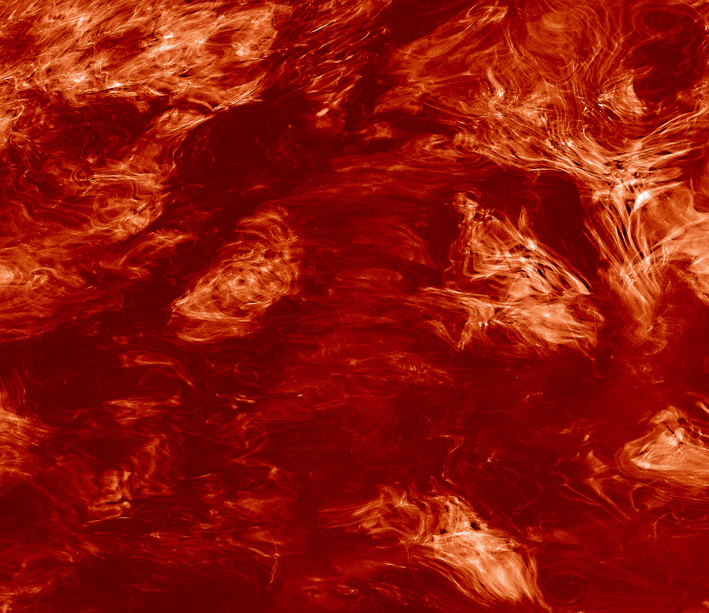 ©Ed Schlotzhauer
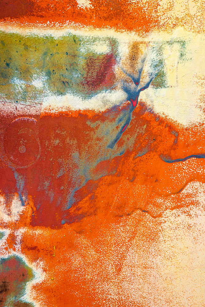 ©Ed Schlotzhauer
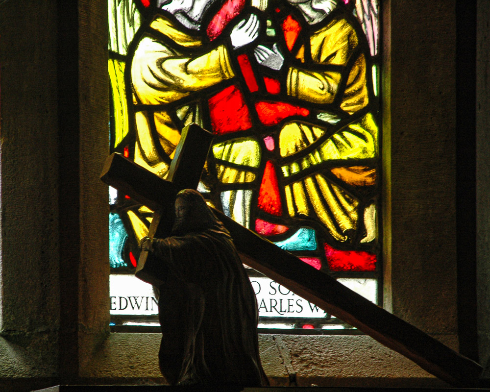
 ©Ed Schlotzhauer
 ©Ed Schlotzhauer
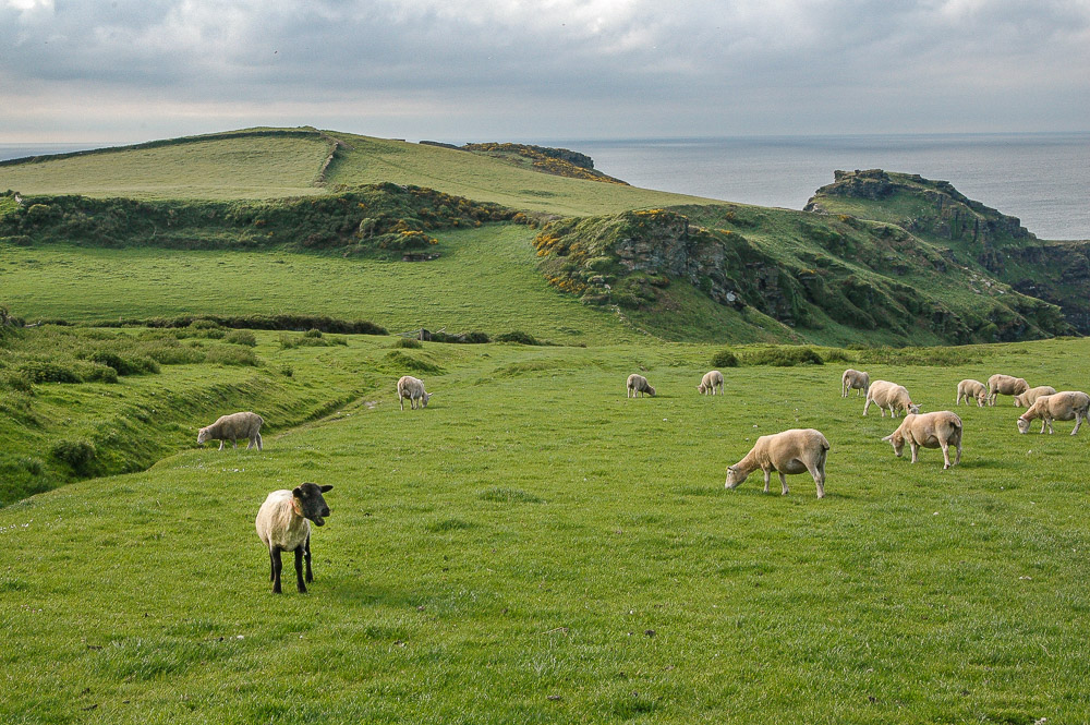 ©Ed Schlotzhauer
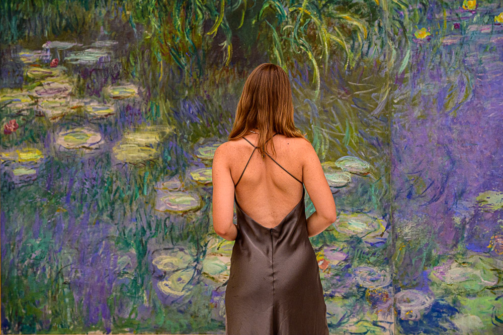
 Tourists queue in front of the Louvre in Paris in 2017. The museum shut down for one day earlier this year after employees walked out due to overcrowding (Credit: Getty Images)
 ©Ed Schlotzhauer
 ©Ed Schlotzhauer
 ©Ed Schlotzhauer