That seems like a strange thing to say. It’s not a phrase you hear in normal conversation. What can it mean? I have written some about how sensors capture color, but I realize I have not mentioned the gnarly problem of color gamut. Unfortunately, I have been bumping into the problem lately, so I had to re-familiarize myself with it. Some of my new work is seriously out of gamut.
What does gamut mean
Most writers avoid this or give overly simplified descriptions. I’m going to treat you as adults, though. If you really are someone who is completely afraid of technology you might want to skip to the end – or ignore the whole subject.
The concept of gamut is really pretty simple, but you need some specialized knowledge and you have to learn some new things about the world.
I have mentioned the CIE-1931 Chromaticity Diagram before. That sounds scary, but you have probably seen the familiar “horseshoe” diagram of colors. I recommend you watch this video to understand how it was derived and what it means. This is the diagram:
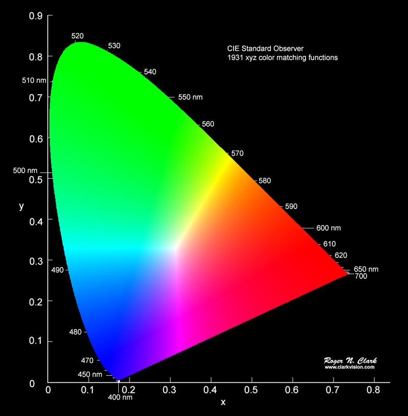
After a lot of research and a lot of measurement, scientists determined that this represents all possible colors a typical human can see. Just the hue – color – not the brightness.
Very simply, a gamut is just a representation of what part of this spectrum a particular device can reproduce or capture.
Show me
The next figure shows the horseshoe with some regions overlayed on it.
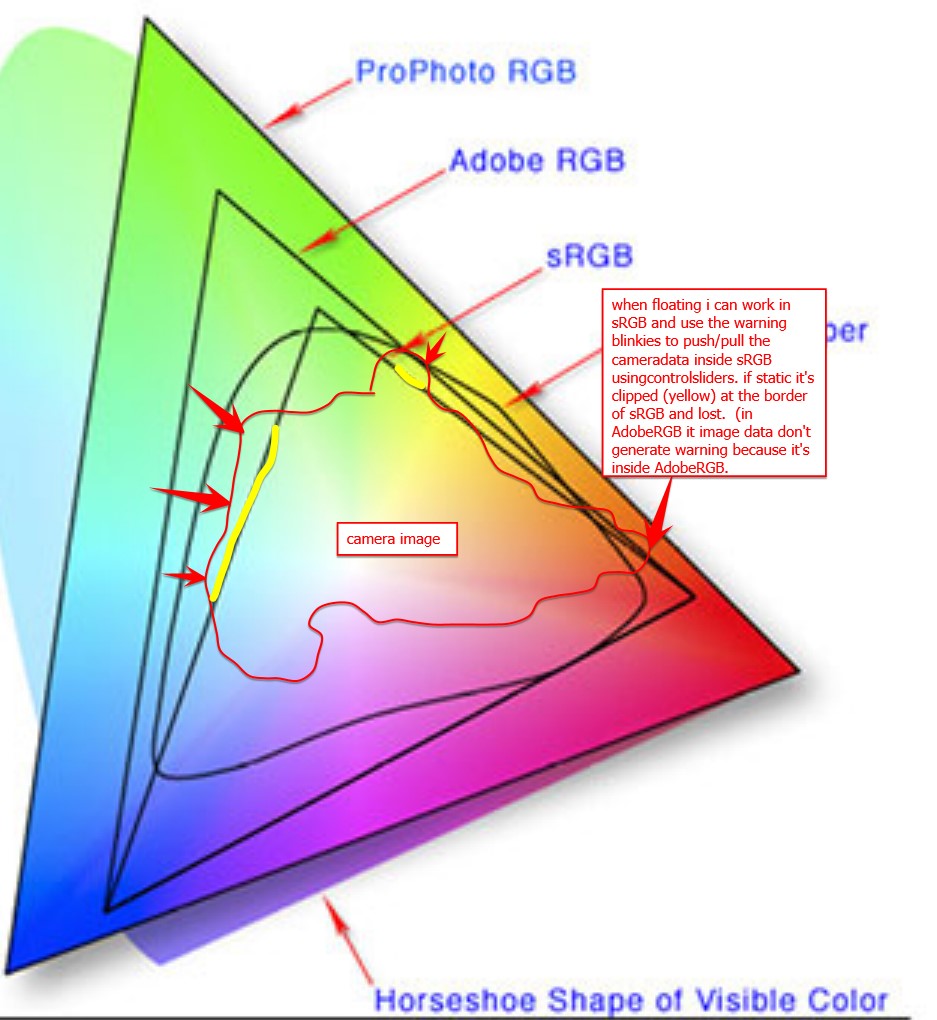
There are 3 triangular regions labeled: sRGB, Adobe RGB, and ProPhoto RGB. They are called color spaces. The diagram is indicating all possible colors that each color space can represent. The smallest one, sRGB, is typical of a computer monitor. It is what will be used when you share a jpg image with someone. It is small but “safe”. We lose a lot of possible colors, but everyone sees roughly the same thing on all their monitors.
Let’s jump to ProPhoto RGB. You can see that it covers the largest part of the horseshoe. In other words, ProPhoto RGB has the largest gamut. It is the best we have for representing image color and most professional photographers use this now. Unless they are doing weddings. That is a different world.
They’re not ideal?
Unfortunately, these color spaces are an ideal. The ProPhoto color space is a model for editing images. No actual devices or printers can give us the entire ProPhoto RBG gamut. Not even close. Most can barely do sRGB.
Here is a diagram of the color space a Canon pro printer can do.
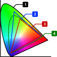
The small horseshoe, labeled 4, is the printer gamut. It is larger then sRGB (3) and, overall, a lot like AdobeRGB (2). Smaller than ProPhoto RGB, which is not listed here.
It looks pretty good, and in general it is. I use one of these printers. But look at what it does not do. Most greens and extremes of cyan and blue and purple and red and orange and yellow cannot be printed. Actually, almost no extremely saturated colors can be printed.
And it is not just printers. Most monitors, even very good ones, are somewhere between sRGB and AdobeRGB spaces. This cannot really be considered a fault of the monitors or printers. The physics and engineering and cost considerations prohibit them from covering the full ideal range.
Any of these colors that I use in an image, that can’t be created by the device I am using, are referred to as “out of gamut”. Outside of the color space the device can produce. This is what I have been running in to lately.
What happens
So what happens when I try to print an image with out of gamut colors? Well, it is not like it blows up or leaves a hole in the page instead of printing anything. Printers and monitors do the best they can. They “remap” the out of gamut colors to the closest they can do. As artists, we have some control over that process, as we will see in the next section.
But the reality is that these out of gamut colors will lose detail, be washed out and without tonal contrast. When we get to looking at the print, we will say “yech, that is terrible”. Then we need to do something about it.
What can we do about it
There are things to do to mitigate the problem. Here is where we need to understand enough about the technology to know what to do.
First, we have tools to help visualize the problem. Both Lightroom Classic and Photoshop have a Soft Proof view. It will simulate the actual output for a particular printer and paper. You can also view gamut clipping for the monitor. Yes, because of gamut problems you may not be seeing the image’s real color information on your monitor.
Both Lightroom and Photoshop have versions of saturation adjustments and hue adjustment. These can help bring the out of control colors back into a printable or viewable range. With practice we can learn to tweak these settings to balance what is possible with what we want to see.
But even if we give up and decide to print images with out of gamut colors, there are options. the print settings have a great feature called “rendering intent”. They are a way to give guidance to the print engine on how we want it to handle these wild colors. Several different rendering intents are available, but the 2 that are most commonly used are Relative and Perceptual.
Rendering Intents
I use Perceptual intent most often, at least in situations where the are significant out of gamut colors. Using the Perceptual directive signifies to the print driver that I am willing to give up complete tonal accuracy for a result that “looks right”. The driver is free to “squish” the color and tone range in proportional amounts to scale the whole image into a printable range. I don’t do product photography or portraits, so I am usually not fanatical about absolute accuracy. How they work this magic is usually kept as a trade secret. But secret or not, it often does a respectable job of producing a good output.
The other common intent is Relative. This basically prints the data without modification, except that it clips out of gamut colors. That sounds severe, but the reality is that most natural scenes will not have any significant gamut problems, so no clipping will occur.
This is a great intent for most types of scenes, because no tonal compression will take place.
The answer
The answer is “your mileage may vary”. Most images of landscapes and people will not have serious out of gamut problems. When you do, this information may help you get the results you want. When you have a problem, turn on the soft proofing and try the Relative and Perceptual rendering intents. Look at the screen to see if one is acceptable. If not, go back and play with saturation and colors .
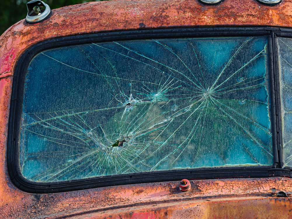
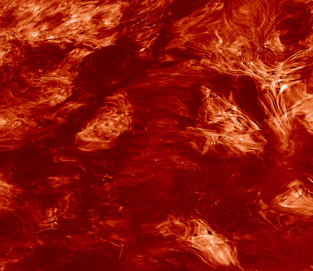
Why do I have problems? Well, I’m weird. I have been gravitating to extremely vibrant, highly saturated images. I like the look I am trying to get, but it can be hard to get it onto a print. The image at the top of this article is a slice of an image I am working with now. It is seriously out of gamut. I need to work on it a lot more to be able to print it without loss of color detail. Ah, technical limitations.