I recently got an email with this subject line. Really. And it was from a high profile photographer who frequents the internet. I won’t name names. It made me think, though, about boring photos. What to do with them? How to improve them? We all take boring photos on occasion. Should we upgrade them?
What to do with a boring photo?
My first reaction is to say throw them away. Or don’t take them in the first place. It seems a waste of time to spend a lot of effort working on a boring photo. It is a waste of resources in some ways to even keep them, because they are choking your catalog and disk, filling up your backups, and just creating clutter.
A little further down I talk some about when and why you might want to shoot boring photos, but for here I question your intent. If you are a regular reader of this blog you probably have more than a passing interest in taking photos. Hopefully you have progressed to the point where you seldom make bad images. At least, you know how to do better.
When I am editing a shoot on the computer – never in camera – I sometimes am almost yelling to myself “Boring! Boring! Boring!” Usually I throw almost all of that set away. Yes, I know photographers who say they keep everything, but that seems silly to me. It ascribes too much valuable to a collection of pixels that doesn’t do anything for me. Save yourself a lot of useless future work and throw it away now.
Once in a lifetime images
But what about that once in a lifetime trip or a one of a kind event? Sorry. I’ve been there, too. Maybe I was so excited that I didn’t get the camera settings right. Maybe in my haste the shutter speed was too slow and everything was blurry.
Keeping some bad photos of that special trip to Paris is fine, for your memories only. Working on a few of them to try to make them better is a good idea because they are personal to you. Never think you can show them to anyone else outside your family. And never try to enter them in a portfolio submission. Be realistic. If they are not good, they are not good. Only show your best.
The only major exception I can think of only applies if you are a photojournalist. A key shot of an important event can be perfectly acceptable and publishable even if it is flawed technically. In this case it’s the subject that is important.
I’m not being judgmental. Your mileage may vary. Set your own standards.
Why shoot boring photos?
Circling back to the idea of shooting boring photos, why did you do it in the first place? You know how to do better. Why not always try to take exceptional photos?
I’m not saying you need to interrupt the family trip and spend 3 hours “working a scene” with tripod and a selection of lenses, waiting for the right light. That would be rude unless you have a very understanding family and a flexible schedule. No, but you can apply what you know of composition and lighting quickly in most situations.
You know, the basic stuff that makes a huge difference: look for a good vantage point, try a step to the left or right to see if that improves the composition, think leading lines, contrast, pattern and repetition, foreground/background, nail the exposure. I’m sure this is familiar to you. Learn to do it fast and automatically when you need to. Applying decent workmanship to a photo when you are taking it can improve a lot of them.
I wouldn’t presume to tell you to never shoot a photo if it is boring. Doing that is your decision and there are times it is valuable to you. Just make sure it is a conscious decision. That is, don’t be surprised when you look at the photo and find it is boring. Know when you took it that it will be boring and do it anyway if it is valuable to you.
One compelling reason why I sometimes shoot boring photos is when I am experimenting. When I am trying new techniques or styles the results may not be exciting at first. I do this a lot. This is that area where I knew I was taking a chance, and if they came our boring, well, I can still evaluate the results of the technique I was trying. One way of another, I learned something. I’ll improve it next time. I wouldn’t do the experiment where I was very concerned about getting a lot of keepers.
When to keep boring photos
I freely admit I keep some boring photos. I even intentionally make some. Usually this is to use parts of them as raw material for compositing or texture or skies. Not every image needs to be great and complete in itself.
Compositing is a creative and fun exercise. It is interesting to build a new image from pieces of others. It is a new way of thinking. To do it, you need a good library of “parts”. This is challenging and needs some time to build.
Building your library is not an excuse to keep bad images, though. When you want to composite images together, each part must be strong enough to carry its weight in the resulting image. Say you want to “mine” a photo for its sky. The sky has to be large enough, the right perspective, the right lighting, exposed the same way, and sharp enough to be included with the other pieces. That is a reason to rescue a boring photo, if the part you want to use for something else is not boring.
The other reason I routinely keep them is for my memories. But I hide them. That is, I do not show them or kid myself they will ever be anything other than a boring photo.
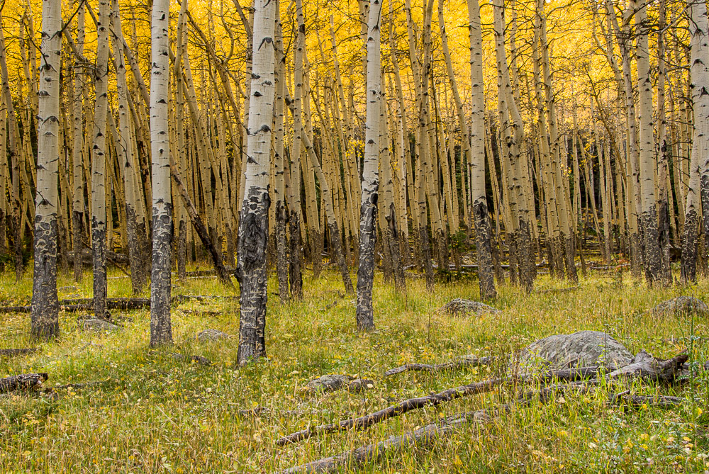
Sometimes, rarely, I am undecided about a set of images. I may keep them and let them age. Later on, maybe weeks or even months later, I may find there was something there calling softly to me that should be explored. Usually not, and I throw them away. 🙂 The image with this article is one of those exceptions. Something told me I should keep it, although I didn’t know why. Years later I noticed the rock and fallen trees in the foreground looks like a dead horse. That was the interest that didn’t register with me consciously. I like it now.
If it comes out boring
Despite your best efforts, sometimes you find you have shot a batch of boring photos. It is a learning opportunity. Evaluate why. What were you thinking when you shot them? Is this the result you anticipated? You were excited when you took then, why did they come out boring?
This batch probably cannot be salvaged, but maybe you can avoid repeating the experience in the future.
So boring photos? Don’t do it. Learn to do better. You should seldom shoot boring images unless you have a well reasoned need to. Make your compositions and camera handling smooth and automatic so your photos will improve. Don’t give in to wishful thinking – bad photos are bad. Don’t waste too much time trying to polish them. It will be disappointing.