
I believe one of the things we develop as we mature as photographers is confidence. Not arrogance, but certainty in who we are and what we want to do.
Introvert
I’m an introvert. I suspect many of you are, too. Introversion seems to be strong in artists. After all, what we do is not really about social events or winning contests or getting to praise ourselves. If you seek those things, you are probably an extrovert and you do art for entirely different reasons than I do.
As an introvert, you wouldn’t think at first that confidence is one of the traits I would claim. But confidence comes from competence. We know we can do what we need to do. We know what we like and when we find it, we are confident we can deal with it well.
 ©Ed Schlotzhauer
Arrogance
This is not arrogance. Arrogance gets into hubris and self-importance. Confidence is the simple assurance that I can do it. Now, the “it” may be different for different people. For me, it is that I know that when I see a scene I want, I can photograph it in a way that will make an image I will be proud of. That does not mean I know how to make that image well known and sought after in galleries. That is a whole different skill set.
But our confidence is arrogance if we believe we are too good to learn how to improve. We should always listen to criticism. And be our own worst critic. Learning and practicing and trying to improve are part of our life-long growth.
Confidence also lets me stay away from things I know I would not like or would be bad at. For example, if, for some strange reason, you came and asked me to shoot a wedding, I would turn you down. Even if the money is great, I know from experience that I would hate it. I do not enjoy the pressure of a bride’s expectations and performing to someone else’s shot list. And I really do not enjoy trying to pose people and make them seem like they’re having fun.
But if you want me for a second shooter to get candid shots, we might do a deal. I love shooting spontaneous moments, and I’m often pleased with the results. Studying people and anticipating a good moment is fun for me.
 ©Ed Schlotzhauer
Not technical skill
The confidence I am talking about is not mainly in the technical side of photography. I have done photography for many years, and I am introspective enough to learn from my mistakes. Technical skill should be a given for a serious photographer.
You won’t find me “chimping” a lot, checking the back of the camera to see if I got the shot. I may check to verify I nailed the focus and placed moving elements in the right position or got the right blur if it is a slow shutter speed. But the technology of making a properly exposed image is rather straightforward.
I urge you to practice to the point where you are confident in your ability to get what you visualize. It makes me wonder when I hear photographers asking a workshop leader or another photographer what exposure they used. That is basic craftsmanship that we must put in the reps to learn.
Besides, our cameras do a wonderful job of helping us out. With great auto focus, including eye tracking, with powerful computers analyzing the overall exposure, even giving us real-time histograms, with constantly improving sensors with great dynamic range, it gets easier all the time. I remember when shooting film, there was always the fear of not exposing correctly. Now, with digital systems, our technical confidence should be high.
 ©Ed Schlotzhauer
Vision
Our vision shapes our work, and it is unique to each of us. Confidence bolsters our creativity. We see connections and possibilities. Scenes are recognized intuitively as aligning with our vision. Our confidence encourages our creativity to express new insights, because we know we can do that new thing we have never tried.
We are self-assured to go for it, to stretch for that artistic vision just out of reach.
And even if we could not quite reach far enough this time, we know we did the right thing by trying and next time we will be even better equipped to succeed. Our confidence is built by failure, because each failure brings us closer to our goal.
We take in information, blend it in our brains, and a random spark ignites some sort of alchemy. Whole new things emerge. We’re almost spectators in the process. But confidence tells us what is happening, that we have seen it before, and we will go with it to see where it leads us. Confidently.
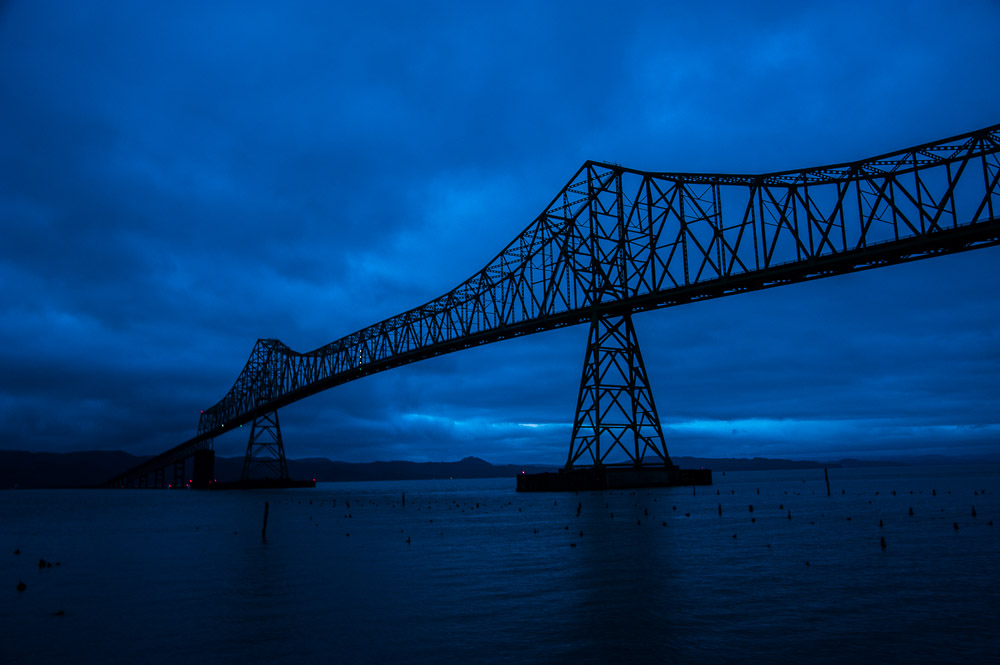
 ©Ed Schlotzhauer
Independence
Despite its potential for good, more often social media is a force for conformity. When we are unsure of ourselves and rely on likes or comments for feedback on our worth, we are channeled to do work like everything else we see there.
The “same as everybody else” images get likes. But the fresh, possibly genre-bending new things are voted down. Until a well-known influencer picks it up and starts promoting it. Then, suddenly, everyone is doing it.
Our confidence in our own vision and ability should help us break out of this stifling cycle. If you’re out shooting with 10 other photographers and you see something they ignore, will you shoot it? I hope so. That is confidence in yourself.
Confidence helps give us independence. We do not have to follow what someone else thinks. We do not have to do work that is mostly like what an “authority” thinks is good.
It is a wonderful freedom to set our own standards and select our own subjects and treatments. This allows us to make the art we can bring to the world, not someone else’s.
Color outside the lines
So confidently color outside the lines. Or inside, if that is what you prefer. Or don’t do that paint-by-numbers sheet at all. Go find your own blank frame to fill in.
Outside, inside, saturated or black & white, tack sharp or blurred, rule of thirds or not, shoot at the golden hour or at noon. Find what you are called to do right now and confidently do it.
No one can tell you what you must like. No one can tell you what picture you must make. That should come solely from within you. Have confidence in yur vision and ability.

 ©Ed Schlotzhauer
 ©Ed Schlotzhauer
 ©Ed Schlotzhauer
 ©Ed Schlotzhauer
 ©Ed Schlotzhauer
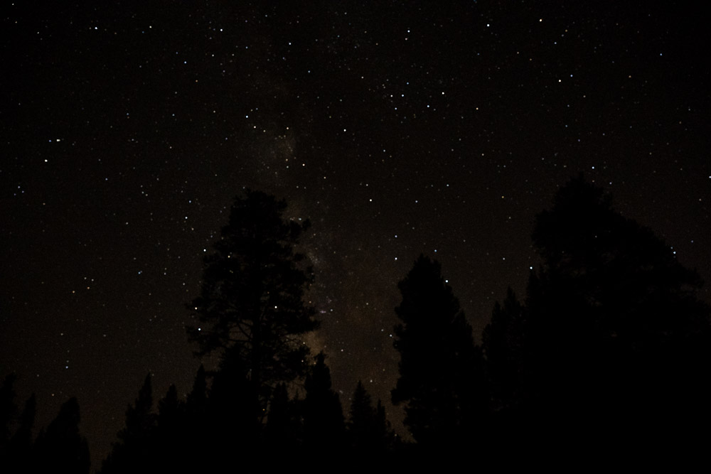 ©Ed Schlotzhauer
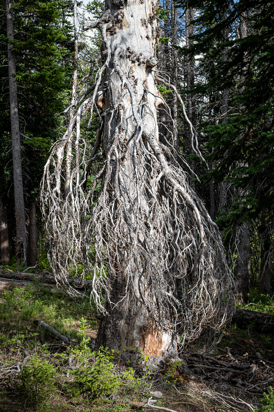 ©Ed Schlotzhauer
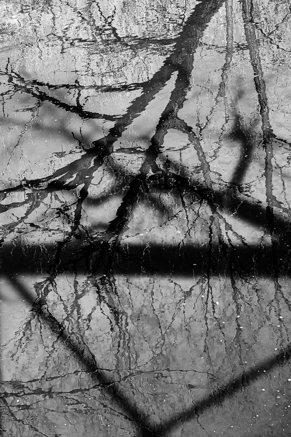 ©Ed Schlotzhauer
 ©Ed Schlotzhauer
 ©Ed Schlotzhauer
 ©Ed Schlotzhauer
 ©Ed Schlotzhauer
 ©Ed Schlotzhauer
 ©Ed Schlotzhauer
 ©Ed Schlotzhauer