Every image has a context, the setting or framework or circumstances where it was created. Sometimes we try to tell the context to our viewers. But really, aren’t most images viewed out of context?
The setting
Every traditional photographic image has a context. It was created someplace, about someone or something, for some purpose. That is an inescapable reality. Photography records the world around us. But how important is it for an artist to bring the context to the viewer?
If I am showing you street photography, it might help to tell you the country I’m in. That may help frame the culture, architecture, people we’re seeing. But, say I’m shooting in the USA for an American audience. Does it really matter if it is in New York City, or Cincinnati, or Seattle, or Dallas? You look at the image and try to read the subject and deduce what the scene means to you.
Context in this case is supplied from a shared cultural experience. We all know enough of what it is like in a large American city to understand the image.
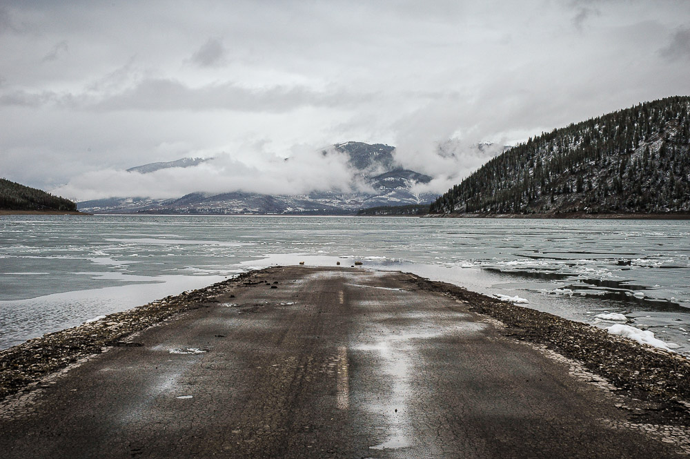
Or for a landscape, if it is an interesting picture, does it really matter if it is the Colorado mountains instead of the Sierras, or the Maine coast as opposed to the Oregon coast? The impact of the picture is what intrigues us.
The story
And about story, we are told repeatedly that we must tell a story in an image or a project. I struggle with this. Somewhere I missed the training to understand this. Or I read too much into what “story” means.
One legacy of growing up as an Engineer is I start out thinking fairly literally about a proposition. To me a story has character development, conflict, and resolution. What writers call the story arc.
Personally, I don’t think many images tell much of a story unless they are about people. Even then, when we see a person we are compelled to figure out or create a story to explain what we see them doing, or their expression, or gesture. Regardless of the artist’s intent.
But I seldom present images of people. To me, a landscape or an old rusty truck or an abstract motion blur doesn’t tell a story. If it does, the story would be something like “pretty” or “gritty” or “interesting shapes”. Is that actually a story? That seems weak.
My inclination is to say most images do not, by themselves, tell a story. But they might provide enough structure for the viewer to invoke whatever memories or meanings they want. To create a story for themselves.
Do we have to supply the story?
As artists, we often feel compelled to write the story and present it to our viewer to help understand the image. Or, more likely, a gallery requires us to do it. Sometimes that is successful. If they actually take the time to read it. Maybe for a photo project people will read the artist statement summarizing the intent of the project. Maybe.
Even if viewers read a title, they tend to make up their own story about what the image is. Is that bad? I don’t think so. It is their story. If they are happy with it, great. I sometimes ask viewers to tell me what they are thinking when they see one of my images. Often I am surprised. Sometimes they are far off of what I saw and felt or what the image is actually “about”. Their story may be completely outside the context of the “real” image. But they are not wrong, because this is what they experienced. I believe the best art leaves room for varying interpretation.
I know that a well written story sometimes adds a lot of context to an image. But part of me thinks a strong image should stand on its own. If I have to explain it, it is lacking impact. A type of exception I often see is a project like Cole Thompson’s Ghosts of Auschwitz. His images are strong and impactful by themselves, but a few words taking you to the context of where they were taken and what he was feeling makes it a deeper experience.
Maybe the story is already there
What I’m about to say goes against all the conventional wisdom we normally hear. Maybe we do not write the story. Perhaps, in general, the scene is already telling its story. We see it, recognize it, frame and compose it, and try to help it tell its story in the best way we can. But it is its story, not ours. Maybe we give ourselves too much credit.
If this is true, maybe we are documenters more than creators. This aligns with an interesting statement Ben Willmore makes when he says that in composing a scene we should reduce the negatives and enhance the positives. Doing that does not really change the story. Maybe we can slant the story some and write some of our own vision into it.
I am not minimizing the creativity and skill needed to make a good image. Not at all. I know it is exceptionally hard and I wrestle with it every day. I’m just suggesting that maybe we are not actually writing the story. Rather, we are helping our subject tell its own story. Maybe our job sometimes is to recognize the story that is already there and help to bring it to life.
In isolation
This idea carries over into viewing an image. When we view an image in a gallery or on the wall or online, we are typically seeing it in isolation. A gallery may provide a title and perhaps even a short statement posted on the wall next to the image. People may or may not read it.
Does that matter? Once an image is printed and hanging on a wall, it is complete in itself. When someone looks at it, their appraisal or appreciation of it does not need to be tied to my knowledge of the context or its meaning to me. The image tells its own story, or it does not.
I actually love to provide an image that raises more questions than it gives answers. It would be a joy to me for someone to buy it and hang it on their wall at home and pause over it every time they see it. For them to feel free to create varying stories to fit it. When they are showing it to friends I want then to say “today I see…”.
When they buy the print I could give them a written description of what it is, the context where it was created, and what it meant to me. But then it is all my story. Isn’t that taking away some of their joy and creativity in participating in the art?
An image exists
So if we typically see images by themselves, that means when a viewer takes the time to look at it, the print has to be strong enough to “tell it’s own story”. Or at least to tell a story to them. It must be able to communicate something meaningful to the viewer. Perhaps its job is to connect to memories or to raise interesting questions that make people want to live with it.
If we have to use words to complete the image, maybe it is not strong enough. The words can supplement the effect, but they should not be required to make us see it as a good image.
Context could be important, but usually we should not push it too hard. As artists, we should not be so arrogant as to believe the viewers will or should internalize the context and meaning we intended. Part of their appreciation can be to make their own stories. As an artist I have created this image, but I have to send it our on its own to make its place in the world.
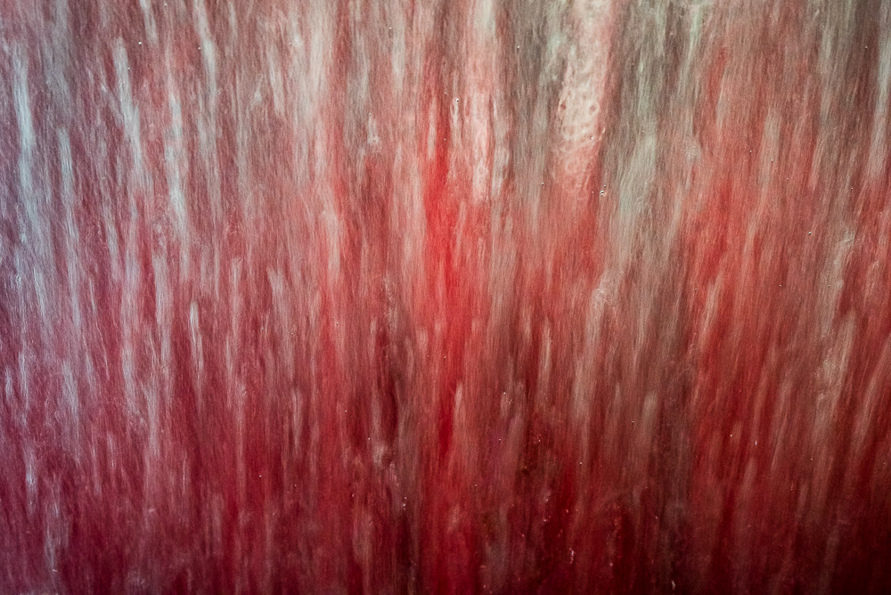
Today’s image
To me, this image has a lot of story. But who wrote the story? Not really me. I saw it, and stopped and took the time to frame it and compose it and narrow in to what I thought the story was. Then I edited it some, not altering any important components.
I can’t honestly say “look at this great story I told”. No, I found a story already existing and tried to put a little of my touch on it to bring it to you.
Would knowing the context make this a better story? Or would it interfere with you discovering your own story?