
In my last post, I made the point that photography is all about technology. This time I argue that photography is art. The technology is just a tool.
I do not consider this at all inconsistent.
Photography is more technical
I hope I made the point in my previous post that photography is based on technology. This seems a clear truth. But all art is.
Have you ever been through the process of creating a bronze sculpture? Wow. It is fascinating. And complex. Most of the technology is “old” by our current view, but it is there in depth.
And painting is heavily based on materials research and technology improvements. Finding or creating, purifying and blending pigments is a specialized technology. The manufacture and treatment of substrates to paint on has improved greatly over the years. Even a seemingly little thing like oil paints becoming available in tubes changed a lot of the practice of the art. Renoir once said “Without paint in tubes there would have been… nothing of what the journalists were later to call Impressionists.”
But although all art is based on technology to some degree, photography is one of the most extreme. And it is strongly reliant on what we think of a “modern” technology, which makes it more visible to us.
 ©Ed Schlotzhauer
Technology serves art
I ended the previous article with a strong suggestion that technology needs to serve our needs, not the other way around. Photography is art that uses technology. Technology does not – or at least should not – make art.
We sometimes loose sight of that. Using the technology can become an overriding concern. I really like the old saying “When you’re up to your neck in alligators, it is easy to forget that the goal was to drain the swamp.”
Wrestling with all that equipment can occasionally become so intense a focus on its own that we forget the goal of what we are trying to do.
But we have to overcome that. Technology is just a tool to use to create our art.
Technology cannot make creative decisions
Art is a work of human creativity. It involves novelty and non-obvious expression. Novelty and expression must come from a personal, human point of view. Technology cannot do that.
I believe one reason photography is sometimes looked down on by more “serious” artists is that it seems too easy. It appears to be mechanically done. They will say “You just walked up to that tree, pointed your camera, and made a picture. There is no art in that.”
If that is what we did, maybe they have a good argument.
But if we did bring novelty and non-obvious expression, isn’t that art? Just as much as any other art form? Did the camera make the picture or was it the decisions the photographer made that created it?
 ©Ed Schlotzhauer
My camera makes some important technical decisions for me and with my permission. For instance, I usually shoot in aperture priority mode. I select the aperture and the camera chooses a good shutter speed for the combination of aperture and ISO sensitivity I am using. Even so, I often override its choice by using exposure compensation. So which one of us made the picture?
I did. It was made by my direction. Saying otherwise would be like arguing that you didn’t actually drive to work today because your car’s computers controlled everything. No, I do not understand the details of the design of my car, but I know how to direct it to do what I want.
We produce art
The artist makes the decision of where to view the scene, what to frame, the perspective, the lighting, the exposure, the “moment”. All of it works to capture the feeling or emotion in the photographer’s mind.
Once all the relevant decisions are make, it is up to the technology to do its part to support the creative decisions. I have never let my camera decide, on its on, to take a picture.
This becomes more of an issue as AI intrudes on art. But perfect AI – which we are far from – could only ever create images with a bland sameness. Decent representations, but not creative or exceptional.
New art, good art, will only be created by humans. And only by humans who overcome the seduction of technology for its own sake. Who, rather, apply their creativity to showing us new things, new points of view, new applications of techniques. Humans can show us what they felt.
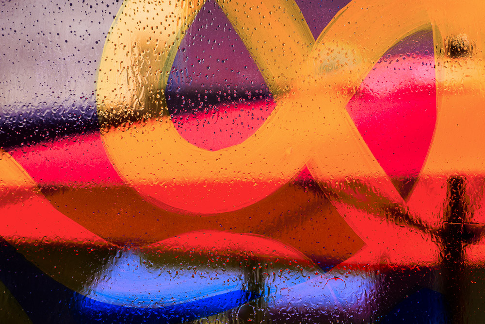
 ©Ed Schlotzhauer
Rise above
Billions of people carry decent cameras with them every day. They take trillions of images every year. That does not destroy photography. If anything, it helps people to recognize what is exceptional.
Great images, ones that are novel and creative and emotive and well executed, rise above the noise of the average. They obviously were not created by technology, even if they were created with technology. In a world where all images are good, the exceptional still stands out.
As artists with a camera, we must always realize that we are responsible for all creative decisions in our image, from the conceptualization to the final print. We are responsible for the entire frame and everything that appears there. And we have an increasing responsibility to more forcefully apply our innate creativity and point of view to our images. If for no other reason than to prove we are human.
We learn. We improve. Our vision changes and grows. Our ability is refined with study and practice. But it is only through showing our humanity that we become artists instead of people who take pictures.
Technology is good. It can help us make art. Do not confuse technology with art.

 ©Ed Schlotzhauer
 ©Ed Schlotzhauer
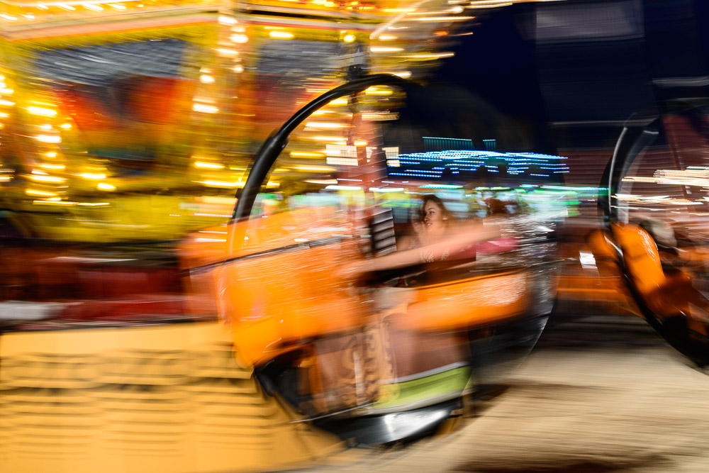 ©Ed Schlotzhauer
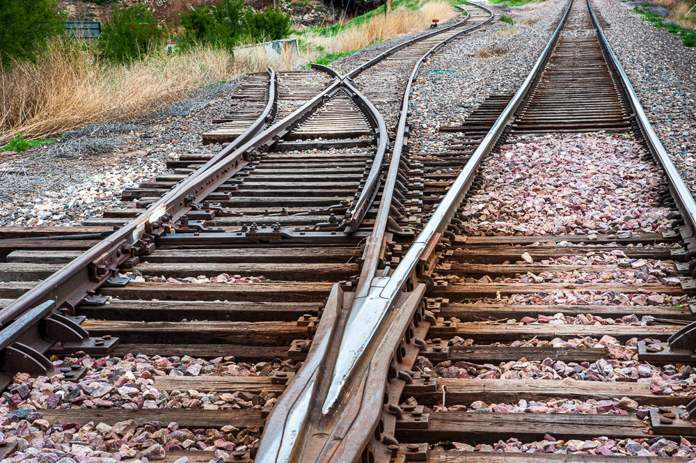 ©Ed Schlotzhauer
 ©Ed Schlotzhauer
 ©Ed Schlotzhauer
 ©Ed Schlotzhauer
 ©Ed Schlotzhauer
 ©Ed Schlotzhauer
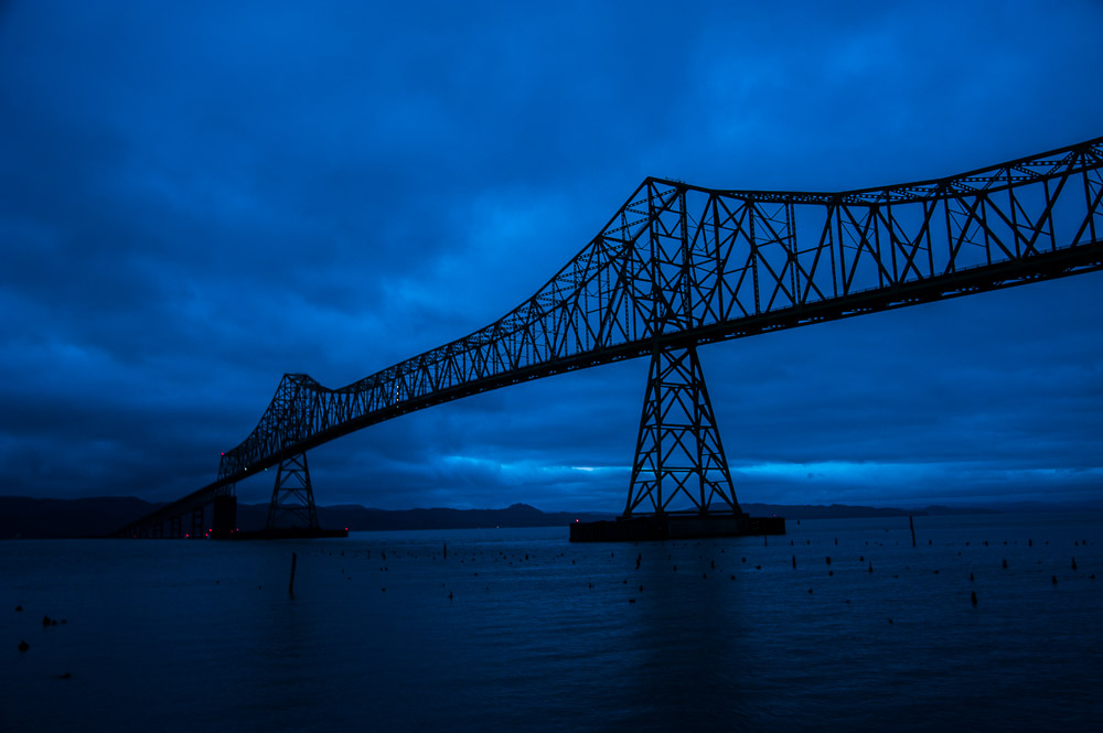 ©Ed Schlotzhauer
 ©Ed Schlotzhauer
 ©Ed Schlotzhauer
 ©Ed Schlotzhauer
 ©Ed Schlotzhauer