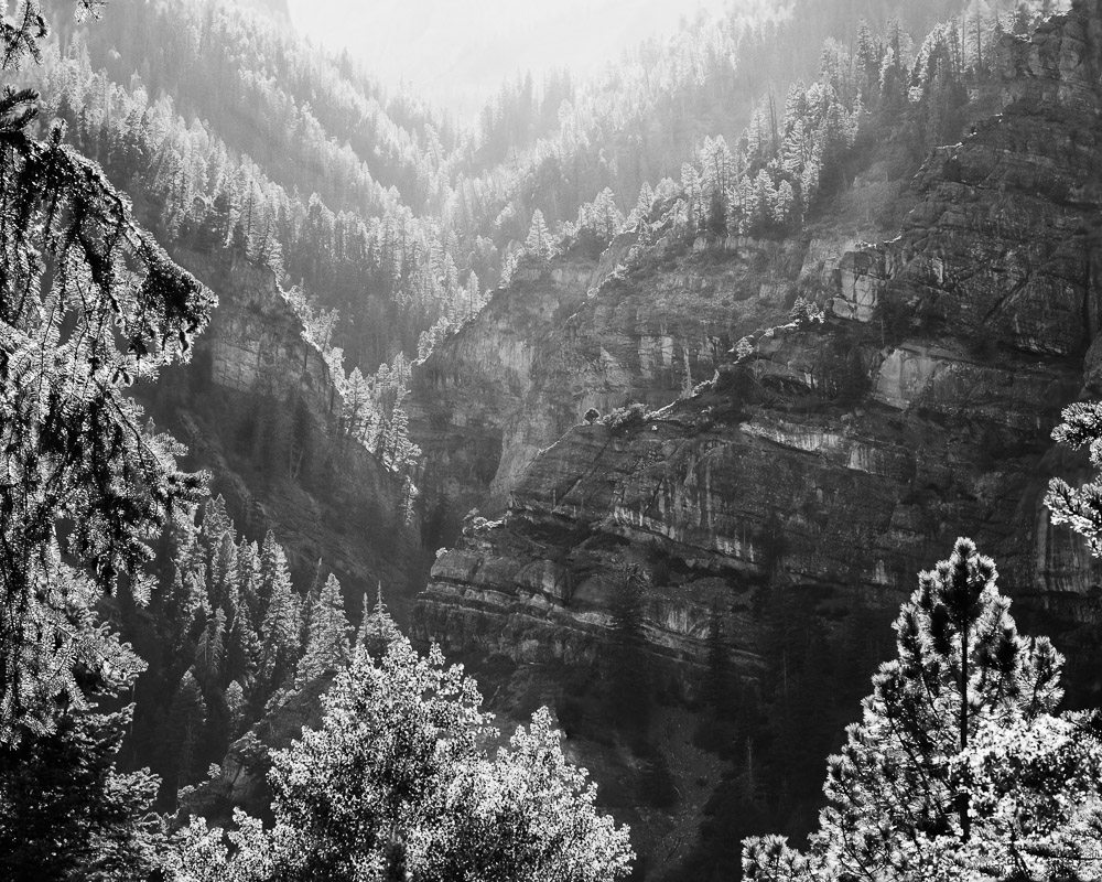
At the beginning of a new year, I guess it is natural to reflect back on the one that just ended. To remember our successes and analyze our failures. Reflecting on the past puts us in touch with the flow of time.
A calendar page
Most of us have just “put up a new calendar” – does anyone (except my wife) still use paper calendars? Regardless, the metaphor holds. It is a new year, untracked, fresh with possibility.
For some reason, the act of starting a new year causes us to spend a little time reflecting on the year that has just ended. This can be painful, because most of us did not accomplish all our goals or live up to our dreams. But it is also useful and necessary.
The process of considering what we wanted to accomplish in the past year and making plans for the coming year is very useful. It helps focus our minds on our goals. Without it, we would tend to drift along year to year never going anywhere. Because the reality is, to accomplish our goals requires intense focus and detailed plans to get there.
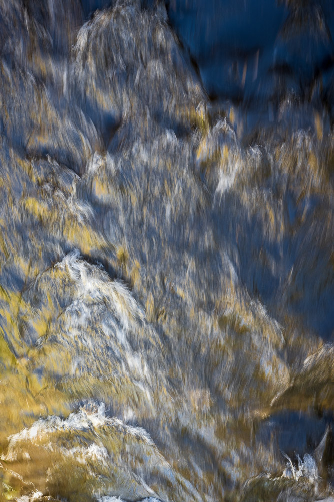
Limited resource
Time is a reality none of us can escape. We travel along in the stream of time and have no choice but to flow with it. The amount of time we have is unknown, but is ultimately limited.
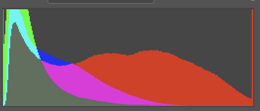
Let’s put some hypothetical numbers to it. There are 8760 hours in a year (ignoring leap years and leap seconds 🙂 ). Sleeping 8 hours a day, as you should, takes away 2920 hours a year. I assume here you work a “normal” job to support your art habit. So that is 8 hours a day for 50 weeks a year, totalling 2000 hours.
What’s left is 3840 hours, But wait. We can’t use all that. This is ALL the time left over. There is cooking and cleaning and home repair and mowing the yard and picking up the kids and family activities and being with friends and watching TV and … For most people, all of this is used up each year. Our lives are busy and we can’t figure out where the time goes.
But let’s say you are very committed and disciplined and you save 1000 hours a year for creating, producing, and marketing your art. That doesn’t sound like much, but that is 1/2 of a full time job – basically 4 hours a day 5 days a week devoted to your art. Do you set that much aside for something so important to you?
The point is that our time is a limited resource. Every moment we can set aside to spend on our art is precious. We should be disciplined and mindful of what we do. Isn’t this more important to you than following your favorite TV show?
The dream life
Are you living your dream life? Did you know that many people envy you?
People in general look at artists through a romantic lens. It is a life that seems desirable to them, as they go though their day-to-day lives, all the same, no time to do what they think they want to do. The artist seems to have a life of creativity and independence.
Now, you know that is a skewed view. You know that the artistic life is difficult. We deal with rejection all the time. Disappointment is routine. And yet we must push on and rely on our creativity driven by our will power to carry us through. We have to be tough and resilient.
But use this year end time to step back and see it from a larger perspective. Maybe they’re right. Unlike most people, we get to use our creativity. We create things that other people appreciate and probably can’t do. Most people don’t think they are creative and they envy other people who are openly and consistently artistic. To them, what we do is almost magic and must be highly rewarding.
They are right. It is rewarding. We love to exercise and display our creativity. While most people are too afraid or timid to do it, we proclaim our self as an artist. Isn’t that a dream life? Try to look at it the way non-artists do.
New Year’s Resolutions
So here we are now at the start of a new year and it is traditional to make New Year’s Resolutions. I would say, don’t bother. They are ineffective. A resolution is just a suggestion, really a wish. You are just telling yourself “I wish I would do this, but I don’t really hold myself responsible to do it”. Most are totally broken and discarded within a month.
Either commit as a definite goal with plans and determination to make it happen, or don’t bother. Being an artist is hard. You won’t get there by just wishing it would happen. We have to believe in our self and push through the hard times.
How are you going to direct your creativity this year?
Looking back, what have you done well this past year that needs to be built on? What did not work and needs to be changed? Many dream of doing the things you do. Few follow through and actually believe in themselves enough to do it. There is an old saying “whether you think you can or you think you can’t, you are probably right.” What do you think?
Those 1000 or so hours we have to devote to our art are precious and valuable. Do you hunger enough to do it? Do you believe you have a gift that needs to be used? Are you willing to put in the hard work? To deal with the rejection and criticism? Are you willing to persevere when people tell you you aren’t good enough?
Don’t have a New Year’s Resolution. Instead be resolute. Nothing but yourself and your fears and doubts can keep you from using your talent and living the artistic life.
Believe in the worth of your talent. Make a plan and believe in yourself. Don’t look back.