Is reality objective? Is there one reality that we all share? Do our perceptions and experiences and values form a reality for us? How do we know?
Objective reality
Is there an objective reality? Sorry to disappoint you, but I will leave most of this discussion to the philosophers. I have know some of them and listened to them discuss this, and I know I cannot follow the twists of their arguments. It’s above my pay grade as some would say.
I believe most of us wish for an objective truth. It would seem like it would make this chaotic and confusing world make more sense. While I can’t help much with arguments for objectivity, I can give some perspective against it.
It’s personal
Even though there may ultimately be a “true” reality, doesn’t it seem like we each perceive our own version of it? Why else could we have a society so polarized? In America these days, if an event happens about half the people see it one way and the other half see it the opposite way.
Are half the people at any time totally foolish? More likely nearly all of us are wrong. We have lost sight of the societal norms we used to share. When we collectively believed in certain rights and wrongs, in shared goals, in expectations of behavior, it was much easier to share a common view. To see roughly the same reality.
I cannot solve this problem and it would be foolish to waste effort here trying. My point being that each person’s reality seems to be based on their values and perceptions, on their beliefs, and on who they listen to and talk to.
Do we form it?
I think I can safely say we form our own reality to a large degree. The conclusions we come to may be false. There may be objective reality we completely miss. But our own reality is what we perceive. The way we choose to react to what happens to us.
There is an old story, completely made up I”m sure, about a psychologist studying kids to understand their perceptions. They made 2 identical rooms piled high with horse manure. One boy was put in each one with a shovel. In the first one, the boy cleared out a little space and sat down and did nothing. When they interviewed him and asked him why he did that, he said the place was filthy and smelly and there was nothing of interest there and he couldn’t wait to get out. But they found the other boy gleefully digging through the piles of manure and throwing it all over. When they asked him why he was having so much fun he said with all this manure , there must be a pony around.
Reality is based on perception and our choices of what to believe. Each of us can look at the same facts and perceive a different reality. We do it every day without even realizing it.
There are, of course, limits to this. Objective reality often intrudes on us. You may truly believe you can levitate, so you step off a cliff to prove it. Objective reality wins.
Just because we believe something strongly does not necessarily make it true. Even so, it could form our personal reality. At least until objective reality crushes us.
Seeing through our own lens
But this isn’t a blog about philosophy. It is about art. Where does that come in to this discussion?
I have touched on this before, but I believe a photographer can either think they are capturing and presenting objective reality or they can realize they have a subjective viewpoint.
I know I have been on both sides of this dilemma. Way back as a young photographer and engineer, I thought the goal was to be impartial and objective. Being an engineer pushed me strongly toward the objective side. “Pure” photography. Think Mr. Spock.
Now I realize it is almost impossible to be truly objective. Even if I attempt to present a scene “just the way it is”, I am making subjective decisions of framing and composition and lighting and timing. These selectively view only parts of the scene and strongly influence the perception of the viewer. Any scene I photograph is influenced by my point of view and feelings.
As I push further and further into fine art, I realize strongly that my point of view and subjective judgement are a primary component of the image. It is the reason for the image. One of the mantras is “is the image I made the same as what anyone else there at the time would have made?” If it is, then why did I bother? I am not adding anything. I am not sharing my experience or my perception.
A work of art which isn’t based on feeling isn’t art at all.
Paul Cézanne
Photography as seeking reality
But let me come back for a moment to the perception of reality in a photograph. I think this is a trap most people fall into because we don’t really examine our perceptions.
I believe most people consider a photograph to be reality for 2 reasons. First, they know the sensor records the live scene it was exposed to, so therefore this must be real. But second and more subtle, I believe most people are wishing for truth.
We want confirmation that there is truth and absolutes, even if we do not really know what they are. So we invest photographs as a symbol of truth.
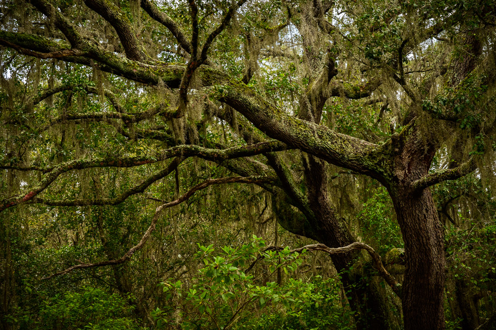
This is one reason why people love pictures of beautiful landscapes, sunsets, waterfalls, forests, etc. It is a reality to grab onto. We wish it to be real, so we believe it. We want truth.
I confess that I love to take these beautiful pictures, too. It is good for the soul sometimes. Please take pictures of beauty when you find it. But remind yourself it is a subjective view of reality.
Whose reality?
So do not be too quick to accept a picture as truth, an objective reality. It can be beautiful. We may love to hang it on our wall and look at it every day, but it does not necessarily represent reality.
The reality we see is the artist’s reality. It is the sum of their perceptions and feelings and values. Do not lose sight of the fact that, if you were standing next to them at that time, you might have perceived something different. You might have pointed your camera in a different direction or framed it different. Your reality could differ from this other artist.
A photograph is reality, but it is the artist’s reality.
No great artist ever sees things as they really are. If he did, then he would cease to be an artist.
Oscar Wilde