An artists journey

Blog

  • Slow Editing

    Slow Editing

    What’s your rush? Personally, I find my editing process is improved by what I term slow editing. I let images age for a while before making final decisions.

    What’s the rush?

    I see a lot of photographers who seem to be tied to daily production quotas. After being out shooting all day, at night they feel compelled to edit the day’s shoot and post some to social media.

    I don’t. If that is your need, I can sort of understand, but I don’t agree with you. It is a much better use of my time to go out and have a relaxing dinner with my wife. Later that evening I may sample a few images – in camera only – just to make sure I am getting reasonable results and there are no technical problems. After all, it is too late to do anything about the day’s shoot at that point.

    Sidewalk cafe, Paris©Ed Schlotzhauer

    As a matter of fact, I no longer even backup my memory cards while I’m traveling. I seldom bring a computer anymore, so I don’t and can’t do any processing. This is part of my newfound minimalist attitude for photography. More on that later. It’s not the subject today.

    My point is that I am not pressured to rush updates out to anyone on any schedule except my own.

    Aging helps

    More and more, I find that aging helps the quality of my curation process. That is, if I edit immediately, I don’t make the best decisions. Now I usually deliberately build a lot of delay into my process. This is what I mean by slow editing.

    Why would I slow it down intentionally? I find that time helps me distance myself from the emotions of the moment when I took the image. These emotions can often promote a picture to prominence it does not deserve because of what I felt. Time helps the emotions to subside. I can look at the images with cool objectivity. Well, I can do better. Can we ever truly be objective about our own work?

    There is a double standard that we must apply to our work. I believe that emotion is a key part of making a great image. If we did not feel something special, how can we bring an excellent image to our viewer?

    But during editing, emotion is a hindrance. We have to be brutally objective. We may have loved the moment and captured something that is extremely important to us. But if it is not as sharp as necessary and well composed and well lit, and if it did not capture a moment that shows other people what we felt, it is no good except for our private collection.

    Time helps me get the emotional distance I need to realistically cull out images I love. It’s still painful, but a lot easier.

    Editing takes time

    I find editing to be a very time intensive process. Maybe I do not have a good process. Or maybe I am just inefficient. Or maybe this is just what I must do. But that is where I am. My process works for me.

    I have seen people who are able to burn through a large shoot in minutes. Never spending more than about a second on any one before flagging it as thumbs up or thumbs down. That usually does not work for me.

    Couple in love©Ed Schlotzhauer

    Here is an example of my high-level editing workflow: First, let it sit for a while. One to 2 weeks is usually a minimum. Longer if possible. Then make a pass through marking obvious rejects and doing some quick editing on some of the ones kept, making sure they have a good chance to turn out well. I seldom spend more than 2 minutes editing an image at this point and I do it in Lightroom Classic.

    At this point I have probably eliminated 1/2 of the original images. My next pass is “housekeeping”. I make sure the keepers are tagged with location metadata and some preliminary keywords.

    Slowing down even more

    The next pass, when I get around to it, is a “grading” scan. At this point I allow myself to assign 1 to 3 stars to each. My informal scale means 1 is worth saving, 2 if better than average, and 3 is a possible winner – but it still needs more work.

    In another pass I concentrate a lot on the 1’s. These are sort of on the edge. I ask myself if any should be promoted to 2 or should they be eliminated. Quite a few may change. It is always my goal to try to eliminate when I can. I used to keep almost everything thinking I might need them someday. I don’t.

    Now I go back and look just at the 2 or higher rated images. What other editing needs to be done? This can get very time consuming, with edits in Lightroom and/or Photoshop taking hours in some cases. Ones I feel very good about at this point might get promoted to 4 stars. A very few rare ones maybe to 5. I do more keywording on the best ones.

    But here one of the weird twists of my editing comes in. In reality, stars mainly mark how I feel about the image. Not how highly I rate it. The real rating comes as I sort them into collections.

    By this point I have rigorously shredded and thrashed the image set. I am now ready to file the survivors into permanent storage locations and gather some into collections. At this point a lot of the survivors are tagged for copyrighting. Fewer are “promoted” into my quality hierarchy.

    This promotion process is lengthy and takes several passes. I currently have 6 levels of quality. It may take months and many reviews for an image to rise to the top collection.

    Menu on the mirror©Ed Schlotzhauer

    A recent example

    As I write this I am about a month past an excellent trip to the south of France. Awesome; do it if you get the chance.

    Over the trip I shot about 4000 images. I loaded them in my computer immediately on getting home, but waited 2 weeks before even looking at them seriously. After another 2 weeks I am about halfway through the first pass, eliminating a lot and doing some preliminary edits on the ones not immediately rejected. I figure it will be at least another month before I have my final picks. Even then all the editing will not be competed.

    Yes, I am very slow. It takes me forever to get through a large edit like this. But when I get done, I can be confident that the higher rated ones are decent to show people without embarrassment. I know that the only low ranked ones I need keep are for some textures and backgrounds. I never go back through the low ranked ones to select images for a show or project unless I need a filler to tell a story. That doesn’t stop me from keeping a few of them “just in case”. Emotional attachment leaks in. But they are filed separately.

    Reimes Cathedral©Ed Schlotzhauer

    My experience

    I am being candid about the workflow I have evolved to. This is slow editing in the extreme. All I can say is that it works for me. This is true of any workflow, no matter how famous (or unknown) the instructor is who is recommending it. Your workflow is highly idiosyncratic. Experiment to try alternatives, then do what works for you no matter what anyone else says

    As I am going through these images from France, I find that I am disappointed with a lot of them. Just tourist shots. Of course, I was a tourist. But some, a few, capture my feeling and interpretation of a place or event. Those are a joy to find.

    I have to let the emotion of the experience drain off to make good judgments about my images. This takes time. Luckily for me, I do not have to be on anyone else’s schedule. I’ll get there when I get there.

    Today’s images

    All the images in this article were shot in France on previous trips. After all, I haven’t finished this year’s edits yet.

  • Why Do We See 255 Everywhere?

    Why Do We See 255 Everywhere?

    Do you ever wonder about the magic number 255 you see all over Photoshop and even in Lightroom Classic if you look? It seems like 255 pops up everywhere. Why is that? It is a strange number to choose.

    It’s just a number

    First let me say that now, 255 is just a number without meaning. It is the number chosen to represent the maximum value of a channel or color. Something must be used to represent the maximum value. Looking back, 100 (as in 100%) would have probably made more sense. But we have 255, for reasons I will explain.

    Think of it like Fahrenheit and Centigrade scales. The boiling point of water is 212 in Fahrenheit and 100 in Centigrade. Either way, it represents the same thing, the boiling point of water. That does not change no matter how the number is represented.

    So, when you see 255 just read it as the maximum value of that thing. If that is the level you wish to understand, this would be a good point to stop reading this article. 🙂

    Personally, I hope you continue. Understanding some of the history and details of our tools can only help improve our craft.

    Roots in binary

    Before we go deeper, I need to justify where the number 255 comes from. It is rooted in binary coding. It is not a random, arbitrary number.

    Please pardon me for going full on Geek here. I so seldom get to use my training that it is fun to do sometimes. A very, very brief background: when computers were being developed, it was found to be simpler and more reliable to create circuits that were either on or off, no in between states. This was called a bit. A piece of data that was either off or on, noted as 0 or 1. An advantage of this seemingly silly decision is that the bits could be made very small and can be operated on very fast.

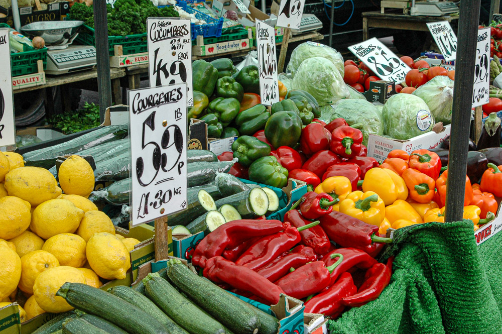
    Dev on market©Ed Schlotzhauer

    A single bit by itself isn’t very valuable. To represent realistic information and do calculations, bits were grouped together in larger units. The next widely used unit was 8 bits. This came to be called a “byte”. Eight bits is a byte – Geek humor.

    It turns out that 8 bits is enough to start holding useful information. For instance, it will hold 1 character. It can code all the upper- and lower-case letters, punctuation, and some special symbols. At least in English. And we will see that it holds a useful amount of image data.

    Let me give a very simple description of digital value coding using just 3 bits:

    This table shows all possible combinations of 3 bits. Each combination of the 3 on/off values represents a value. The encoded values range from 0 to 7.

    Going back to the byte, the 8 bits encode 256 values, 0 to 255. This is the origin of the magic 255. It is just the largest value that can be represented by 8 bits.

    History of Photoshop

    It is hard to think that there was a “before Photoshop”. Thomas Knoll needed ways of doing analysis on images for his PhD thesis. In those days, nothing was available, so he taught himself programming and developed a library of operations. Here is an interesting interview with Thomas.

    His brother John worked for Industrial Light and Magic. He saw applications for image processing in some things they were doing, so he encouraged Thomas to enhance his library. Eventually they decided to try to make it a product. Adobe was interested. It is amazing how things come to be.

    In the days when the library, later Photoshop, was developed, the state of the art of image representation was to code each pixel as 3 8-bit values. One byte each for red, green, and blue. Each color had the value range 0 to 255. This number scheme became baked into Photoshop and leaked out as a standard metaphor of the user interface. This tends to happen when engineers or scientists develop user interfaces.

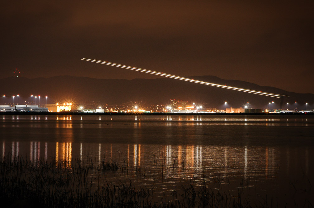
    Airplane taking off. A short project.©Ed Schlotzhauer

    Today’s data

    Early digital cameras shot 8-bit images. Today, though, images and Photoshop have grown well beyond that. As an example, my Nikon Z7 II captures 14-bit data. Each red, green and blue channel is 14 bits. That is 16384 values per channel instead of 256. Some other cameras have even more bit depth.

    Photoshop allows us to select if we will treat our files as 8 bit or 16 bit or 32 bit data. With all these variables it could impose a huge burden on the user to deal with the actual value range of the data he is editing. Some of these numbers get to be staggering and difficult to work with (for 32-bit data each channel has 4,294,967,296 values). Adobe chose to keep the maximum number we see at 255. In effect, it became an arbitrary measuring scale we work with across the apps.

    By the way Lightroom uses 32-bit data internally. You do not get a choice. But even in Lightroom (Classic at least) the 255 illusion peaks through in one place. Look at the Tone Curve tool. The scale is 0 to 255.

    Still, it’s just a number

    Like 212 Fahrenheit or 100 Centigrade, it is just an arbitrary number to represent the same thing, the boiling point of water. Adobe has kept that historical number 255 and given it the implied meaning of “maximum”. It no longer has a tie to the actual size of the data we are editing.

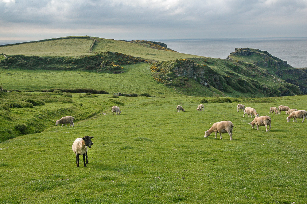
    Lone, dissenting, different sheep©Ed Schlotzhauer

    They have done us a service in this. It saved us a lot of mental complexity when we are editing. But a simplification comes with some challenges. People tend to forget why the simplification was made. Even that one was made at all.

    When you are using your editing tools, just accept 255 as meaning “maximum”. Do not forget and think that your data only goes to 255. Or that it has somehow discarded all those other wonderful bits our modern cameras give us. When someone tells you that white is 255/255/255 and seem to think that is the actual value of their data, remember that is just numbers on a scale. Smile to yourself, knowing you probably understand it at a deeper level than they do.

    I don’t have many images in my catalog that are actually 8-bit data. I am very glad the technology has moved on in wonderful ways. And I am grateful for the simplified scale that normalizes what I see when I am working with all this data. Thank you, Adobe. This is something you did right. It doesn’t matter what the number is, something had to be defined as a convenient value for “maximum”.

    Today’s image

    The image at the head of this article is, in actual fact, made of 8-bit data. It is a 6 MPixel 8-bit jpg file. All the data values are really 0 to 255 per channel. Back in 2006 that was about the best I could do with the camera I had. It’s not terrible. I like the image, but I wish I could shoot it again with a modern camera.

    As a matter of fact, all the images in this article are 8 bits. I wanted to emphasize that it was a very workable system. These are fairly representative of what Thomas Knoll designed Photoshop around.

    Side note

    Unlike at the time when Photoshop was developed, in today’s digital systems we seldom worry much about a few bytes. Every time I press the shutter on my camera it writes about 50 million bytes to my memory card. If I take that file into Photoshop and bring it back as a TIFF, it grows to more like 500 million bytes. That’s why I must have a lot of memory in my computer and many terabytes of storage.

    I mentioned that digital bits could be made very small and fast. As an example, Apple’s M5 processor, the current chip model as of this writing, has 28 billion transistors on the basic, “low performance” version. And it is clocking (operating on) those bits at around 3 GHz (3 thousand million operations per second). That is hard to comprehend. It certainly wasn’t anticipated when Thomas Knoll developed Photoshop.

  • Being a Tourist

    Being a Tourist

    Yeah, we’re highly trained and experienced photographers who always take “serious” photographs (whatever those are). But do you ever find yourself being a tourist? I recommend it as a balance to our vision.

    Tourist

    Tourism is huge business. Especially after Covid restrictions people seem to be in a frenzy of wanting to travel. So much so that it has become a problem for popular areas. And many people are just rotten and inconsiderate tourists. Don’t be a bad tourist. I am not discussing any of these issues. Just the subjective point of view of a tourist.

    Tourists queue in front of the Louvre in Paris in 2017. The museum shut down for one day earlier this year after employees walked out due to overcrowding (Credit: Getty Images)

    I have written before about how I like to travel. This is a different take on it.

    The desire for travel and tourism seems to be inherent in most of us. It is a longing to explore and experience new and different things.I liked this definition of what a tourist is:

    In simple terms, a tourist is an individual who embarks on a journey to explore new places, experience different cultures, and seek relaxation or adventure. They are the adventurers, the beachcombers, the culture enthusiasts, and the thrill-seekers. They are the ones who venture beyond their everyday lives to discover the wonders that the world has to offer.

    As a photographer

    All of those things can be true of a tourist, but a photographer may have additional objectives. I realize that many people on vacation only want to take selfies and classic tourist shots of iconic places. Nothing wrong with that if it is what gives you pleasure. But I am discounting it here, because I have additional goals and, if you are reading this, I figure you do too.

    Pinocchio?©Ed Schlotzhauer

    Whether traveling or being in my home area, I want to shoot images that reflect my vision. That bring a unique and different perspective on what I am seeing. This can be a challenge as a tourist. We are in unfamiliar territory seeing new sights with perhaps a tight schedule or even the dreaded “group tours” to deal with.

    If we are traveling to a distant location for vacation, we probably cannot justify taking all the gear we would like to have. We may have language and transportation challenges to overcome. And we may not be in full control of our schedule.

    Ultimately, unless you are one of the fortunate ones who can plan a multiple week stay in one location, we are under real or perceived time pressure. I hope you do not plan one of those “6 countries in 5 days” trips. But even with a more leisurely schedule, we know we have places to go and things to see in the time we have.

    This means we do not usually have the luxury of settling in and getting to know an area. To find the rhythms and pace of the place. To learn to see beyond the superficial. We are a tourist.

    Out of control

    In effect, this renders us out of control. We have to live with the schedule and the travel arrangements and the lighting and the weather and whatever other conditions you encounter. Usually we cannot say “I will come back tomorrow to get a better shot”. Tomorrow we are likely to be someplace else.

    Color spill©Ed Schlotzhauer

    And in this situation it is very hard to have a feel for what is good. Everything is different from our normal experience. Wow, what a great street scene we think. But in reality it is mediocre at best. If we looked around or spent much more time we could do much better. But we don’t know because we do not know what to expect and what is good and bad and we are pressed for time.

    We know that if we could control the circumstances better we could make better images. But we usually can’t do that.

    If you are a control-oriented person, this will be extremely frustrating. I am not a controlling person, I tend to take things as they come, but it can still be quite annoying even to me.

    Out of your comfort zone

    Being a tourist in an unfamiliar area puts us out of our comfort zone. Everything is new and calling to us to be photographed. It is hard to take more than standard tourist shots, because we do not have time to think much about each subject. We may not have the chance to walk around it to view it from different viewpoints or contemplate it at leisure before having to rush off to the next sight. And we seldom have the chance to compare it to other similar scenes to find the best one.

    Dealing with this and making shots we will be happy with when we get home takes a lot of discipline. We have to learn to be flexible and able to respond to circumstances instead of carefully planning and controlling our shoots.

    Strategies

    I have informally developed some strategies I use to try to survive in these situations. Let me cover it with disclaimers: these kind of work for me; no guarantee they will be right for you. As always, these are descriptive, not prescriptive. I do not believe in dictating a methodology to anyone.

    Refreshing glass of cider©Ed Schlotzhauer

    When you are a tourist, everything is interesting. Go ahead and shoot that tourist shot. You will want it for the memory. Now that that is out of the way, pause and look for the more interesting thing. That may be a detail of the main subject. It may be something totally different if you turn around and look. If you are on a dreaded group tour, spend time scanning for interesting shots while the guide is describing the current historical monument.

    I try to go with some project ideas in mind. This helps to channel my thoughts away from just the tourist views to some themes I will be paying attention to. On a recent trip to France my themes I tried to keep in mind were: antiquity, Joie de vivre, trees, devoted to God, and think B&W. It is not that I was actively working on these project ideas. Just that they gave me a framework for considering the sights I encountered. I find doing this gives me more focus and helps me avoid running off randomly in all directions.

    And I try to get into a kind of flow state. I am unlikely to truly achieve flow, but I can approximate is by being tuned in to what is happening around me. The goal is a heightened sense of awareness. In this mode I recognize a possible shot more quickly and can be ready to react to it. I want to be shooting instinctively for fast moving situations and more meditatively when possible.

    Being mindful

    I know it doesn’t sound like it from what I said above, but I think the thing that helps is to be very mindful. Experience openly and freely, but keep the analysis running in the background. Take it all in but be very conscious of how you are reacting to it. Quickly reinterpret what you are seeing through your own vision filter.

    Remember, as a tourist you are breaking out of the ordinary. Use that you your advantage. Shake up your habits.

    We all tend to form habits. Talking about photography, John Szarkowski referred to this as “habitual seeing” . Being a tourist everything is fresh and new. It is a great chance to break some habits and see things in a new way, flex your mental muscles. Try to bring this new found ability to see back as one of the important souvenirs of the trip.

    In the definition I gave of a tourist above, one of the key words to me is “experience”. If we are mindful and actively trying to capture that experience we are more likely to get some images that represent how we felt and experienced the trip.

    If it fails

    Keep in mind I am suggesting that you be experimenting on what may be a big expensive trip. When you are trying something new, you may get worse results, not better. No guarantees.

    My argument is: that’s OK. You’re not going on a National Geographic assignment where you are contractually obligated to bring back certain results. This is our art. We should always be experimenting. If you are disappointed with some of your results but you come back a better artist, isn’t that a win? It is for me. The experience is more important that the product we bring back. However, in my case, my wife is there beside me taking all the conventional selfies and tourist shots on her phone. So they will be there if I want to see them. 🙂

    These shots of mine are all “tourist” images from a trip to France. Hopefully they are not just standard boring travel shots.

  • En Plein Air

    En Plein Air

    This is a big buzz with my colleagues who manually put pigment on a substrate (e.g. they paint). There is an aura that makes it something exotic about creating “en plein air”. Actually, plein air is what I do, too.

    Plein air

    In itself, plein air art is not a new concept, or even an artistic concept. It has been done commonly by painters since the 1800’s.

    It is sometimes spoken like an advanced technical term. Something your have to be an insider to truly appreciate. But it is just an everyday French phrase. I have been studying French recently (another story) and was surprised to find this in normal use. It literally means “plain air”, or outdoors. Nothing fancy or hidden there. If you go to a “plein air” concert it just means you are going to an outdoor concert.

    Silhouetted tree at sunset©Ed Schlotzhauer

    In painting

    So if you are a painter and you gather up all your stuff and take it outside to paint scenes from nature or whatever is in front of you, you are painting “en plein air”. Does that make it different or special? Maybe. Monet thought so. I”ll talk about that in a minute.

    But to give the painters credit, it required some technical and workflow innovations for this to happen. We forget history sometimes.

    It used to be (pre-1800) that artists had to find or buy their own pigments. Then they had to purify them and laboriously grind them into an extremely fine powder and mix them in a binder, usually a type of oil. By the way, you know those beautiful warm, rust toned palettes favored by Renaissance artists in Italy? Ochre pigment was a common, naturally occurring mineral there. Coincidence?

    But then, sometime in the early 1800’s, the technology for producing and selling pigments already ground and mixed and in tubes was developed. This allowed the artists two things: first, they could get any colors they wanted. But second, and more important for this discussion, it became much easier to take your oils with you. As the desire to move about grew, enterprising vendors also developed smaller, portable easels and pre-stretched prepared canvases. Artists were not tethered to a studio nearly so much.

    Now artists could pack their gear into a relatively small bundle and go where they wanted. One of the places they moved was outside.

    Monet

    I find I use Monet as an example a lot. I like his work, but another thing is that he was an innovator and revolutionary. He fought the entrenched art establishment and helped establish a whole new style. Something photography is still struggling to some extent to do.

    Monet was one of the early practitioners of the plein air movement. One of the motivations of the whole Impressionist movement was his and others desire to paint outdoor scenes in the light of the moment. As Guy Tal put it in his marvelous book The Interior Landscape, (I get no incentives for promoting it) “Monet famously credited the success of his work to the emotions he felt when working out in nature … As Monet himself put it, ‘My only merit lies in having painted directly in front of nature, seeking to render my impressions of the most fleeting effects.’ “

    Working outside and observing fleeting effects. That’s what I like to do, too!

    Moving clouds, moving lights©Ed Schlotzhauer

    I work outdoors

    The same impulse motivates me, even though the technology I use is very different. I find and capture my images almost exclusively outdoors. Shooting in a studio does not motivate me.

    Seeing things most other people do not see excites me. Finding those things, even if they are little, seemingly insignificant things, that I can show you in a new way gives me joy. Especially if I can show you something and you share my joy and excitement.

    I admit I do not have the patience for painting. It’s too slow for me. Spending a few hours or days capturing a scene would be so frustrating to me that I would quickly give up. Seeing something, visualizing what this could be and what to do with it is hard and takes lots of experience. That is one of the fun and creative parts of photography to me. And it is fast enough to not bog me down or interrupt my creative flow. The process of capturing and producing the artifact doesn’t need to be so difficult.

    Other than post processing work on my computer, my images come from outdoors, en plain air.

    A new genre?

    Have I created a new genre of art? Should I trademark the term “plein air photography”? Sign up for my workshop!

    Well, I probably can’t do that. Photography has always been strongly associated with the outdoors. I think the first surviving photograph was an outdoor scene. Admittedly early photographs were outdoors because that’s where a good light source was available. Flash had not yet been invented. Even when it first was, it was difficult and dangerous to use (and smoky).

    But those are technical considerations. The fact remains that photography has always had a strong connection to the outdoors. Especially for crazy people like me who photograph outside year around in a place like Colorado.

    Snow, wind, cold - all the ingredients for a great photo shoot.©Ed Schlotzhauer

    It’s the outdoors that motivates me. I’m a hunter. That’s where I find most of my prey. And my inspiration. It is not an uncommon obsession. Look at publications like Luminous Landscape, Nature Photographer’s Network, Outdoor Photographer magazine and many others.

    To the painters, if working outside motivates you, excellent. We share a common bond. I hope the outdoors inspires us both to do our best work. But working outdoors is not a new concept or unique to painting. Plein air just means “outside”.

    I’ll be looking for you outside. But we will just pass each other. I’ll be moving about a lot discovering and shooting a lot of things while you are painting. Not to say one is better or worse, just very different art forms. Both en plein air. Let’s wave to each other.

  • The Magic of the Lens

    The Magic of the Lens

    Do you ever stop to think about your lenses, besides wanting a shinny new one? There is a magic of the lens that we seldom consider and perhaps do not even understand.

    Many constraints

    My perception is colored by my background as an engineer. I see a modern lens as serving so many constraints that it is a wonder they do the job as well as they do. We expect high resolving power and “good” bokah. It needs to have a good zoom range but be small. It must be weather sealed and rugged, but inexpensive. And, of course, issues like low chromatic aberration and great edge to edge sharpness and low distortion and minimal light falloff (vignetting) and minimum flare are all givens. Oh and blazing fast auto focus, too.

    The poor lens designers are in a tight place. Luckily for them computer design tools have advanced greatly. Also, new materials are available to help overcome some of the design problems of the past.

    Still though, we ask a lot of a professional grade lens. Probably more than we realize.

    Simple lens

    We have an idea in mind of how a lens works. You probably did an experiment in High School Physics with a simple lens. Then you took it out and fried some ants.

    What we normally picture is a biconvex lens. Don’t let a fancy word scare you. That just means both sides are thicker in the middle than on the edge. Like this:

    By DrBob at the English-language Wikipedia, CC BY-SA 3.0, https://commons.wikimedia.org/w/index.php?curid=2065907

    The rays (red lines) illustrate how the lens focuses on a point. That focusing is what images the outside world sharply onto our sensor.

    This is true. It works. But nothing in life is simple anymore.

    Reality

    The reality is that, because of our high expectations and the piles of constraints to satisfy, real lens design has to be much more complex.

    I am going to use the Nikon Z 24-120 f/4 zoom as an example. For two reasons: it is a representative high quality modern design, and I like it – a lot. It is my go-to lens for everyday use.

    Lens design has gone far beyond the “simple” lens pictured above. Here is a cutaway of the Nikon lens:

    Photography Life: https://photographylife.com/reviews/nikon-z-24-120mm-f-4-s

    We can see that it has many lens elements (a word for a piece of glass in a lens) – 16 of them to be exact. Few of them are simple biconvex elements. Some of them are exotic glass. Things like high refractive index (they bend light more sharply than regular glass) or other properties. Some are aspherical. This means they are quite complex designs to achieve specific results. These are hard to design and manufacture. Usually they are necessary to correct for effects of other things and make the resulting image better.

    Zoom

    Let’s look at a few specific features. This lens has a 5x zoom range, from 24mm to 120mm. Now you would think that, for the lens to zoom 5x, it would have to get 5 times longer. This would be true for a straightforward design.

    However, us users of the lens would not like that. It would have to be very big and bulky to do that. And it would be awkward when zoomed all the way out. It would be long and off balance the camera.

    But complex design magic and some of those special lens elements allow them to shortcut physics. it zooms over the 5x range while only extending to less than twice it’s collapsed length. Amazing and very welcome.

    Reflections

    The real world is not a well behaved bundle of parallel rays coming into the lens, like in the simple lens picture above. Light is coming from everywhere. Most of it is what we want to end up on the sensor. But a lot isn’t. Light coming in from a sharp angle tends to “bounce around” inside the lens and cause a lowering of contrast. Kind of a fog look.

    Modern lenses have special coatings on the glass and use some of the special types of glass i mentioned to fight this. These go a long way to canceling the reflections.

    It used to be that shooting in the direction of a very bright source, like the sun would always cause unwanted internal reflections that degrade the image. Now it is amazing how little that happens. I really only worry about that if the sun is directly or nearly directly in view.

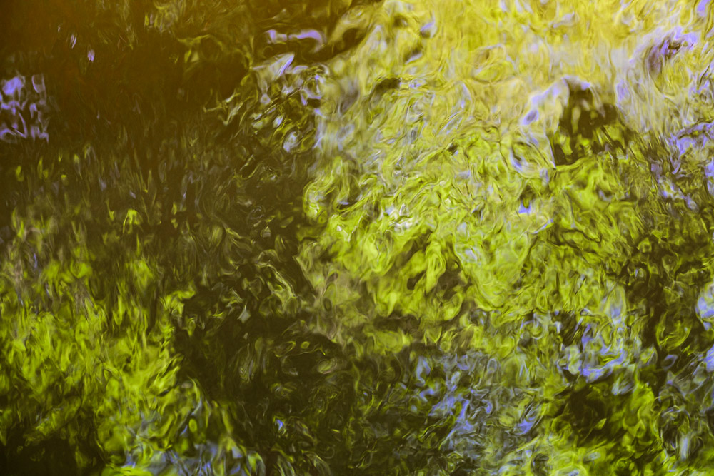
    Abstract study in texture and shape©Ed Schlotzhauer

    Chromatic aberration

    Chromatic aberration is something we seldom consider, except when we are getting down to the last details of a final print. One of the nasty realities of physics is that each “color” of light is a different frequency. The amount of “bend” the lens gives to light is dependent on the color (frequency) of the light. This means not all the colors focus at the same point. That’s bad.

    Have you every looked very closely at magnified blowup of a sharp edge in one of your photos? Especially if it is in a high contrast lighting situation. You may see a slight fringe of green or purple around the edge. This is called chromatic aberration. Not all the colors focusing together.

    One of the purposes of the exotic glass and all the elements in modern lenses is to minimize this. They do a pretty good job.

    But they are not perfect. Luckily it is a simple check box in Lightroom Classic to have the software automatically remove chromatic aberration.

    Other considerations

    If you ever carry a camera around all day you learn to appreciate light weight. Lens designers would like to design their lenses with a very sturdy metal shell and structure. But we would not like to carry that. Modern plastics and design techniques have allowed the designers to create our lenses at a more user friendly weight while still being sturdy enough to hold up to hard use. Thank you.

    Did you know that some lenses make the light come into the sensor is a certain direction to make the sensor receive the photons better? Did you know that most of our zoom lenses, especially, have quite a bit of distortion and vignetting and resolution falloff at the edges? Those are some of the things that are part of the tradeoffs. But one reason they are traded off is there’s a bit of perceptual and software slight of hand.

    First, we don’t notice it much. Really. We are not as sensitive to it as you would think. Unless you spend your time photographing test charts. Second, many of us set Lightroom Classic to look at the model of the lens and automatically apply a “correction” to the image we see. Adobe has a database of lenses with mathematical models to correct their distortions. This is a good thing.

    As a matter of fact, Nikon has a special deal with Adobe such that the great Z 24-70 f/2.8 lens is automatically corrected in Lightroom Classic, whether or not the user selects that. It is impossible to defeat it. Hardware and software are joining in a symbiotic relationship. Making an image is a blend of both and it will only increase with time.

    Almost everything done to solve one problem creates another. This is why designs are so complex and expensive. Everything is a tradeoff. It is all a question of how good can we make this property while not letting that other one get worse than a certain level.

    Example black & white image©Ed Schlotzhauer

    Magic

    I am in awe of these brilliant designers. They achieve beautiful balance. Like I said, I regularly use this example lens I have talked about and I am generally very happy with it. But let me emphasize that pure, unexcelled technical perfection is not usually my goal. A lens like this is “good enough” for 99.9% of my needs.

    For me, as a user, I take the camera out and start using it. What I see and feel is more important than technology. Sometimes, though, my engineer nature kicks in and makes me marvel at the complexity. But really, I shoot and expect my great gear to capture what I want. And it usually does. Marvelous.

    The magic of the. lens. Like most good magic, how it works is invisible to us. But occasionally stop to consider how lucky we are and what an incredible piece of technology we have attached to our camera body.

    Feature image

    The image at the top was shot with this Nikon Z 24-120mm f/4 zoom lens I have been using as an example. This is the Hotel de Ville in Paris – their Town Hall. You can’t really tell in this small jpg, but I am completely happy with the capabilities of this lens. If the opportunity arose I am sure I could make a very good 60″ print of this. Here is a section of it zoomed to 100%.

    100% section, ©Ed Schlotzhauer

    Let me assure you that I am not affiliated with or sponsored by Nikon. I am just using this nice lens that I use frequently as a representative example of what a modern zoom lens is and is capable of doing.