In a previous article I talked about the “bloat” that happens when we edit in Photoshop. Is there anything we can do about it? Should we be concerned about limiting file size?
RAW vs Tiff
RAW files are fundamentally different from Photoshop files. A RAW file captures and preserves the data directly from the camera sensor. This data still contains the artifacts from the Bayer filter technology, that is, each pixel represents 1 value of red, green, or blue. Data in this form cannot be shown on your computer monitor until it is processed and expanded by a RAW converter like Lightroom Classic.
It is very important to realize that this data is unaltered, no matter what fancy processing you do in your RAW editor. The adjustments you make are kept as a collection of “processing instructions”. These are applied in real time whenever you view your RAW file.
Because of this design, Lightroom can only change the look of pixels. It cannot in any way add or remove or alter individual pixels. No matter what it looks like on screen.
For instance, even if you use the Healing tool to completely remove a person or object from the picture, the original data is always still there. What it saves is instructions telling it what region to select and what region to copy from. This processing is applied, again, each time you view the image in the editor. Actually, it usually just keeps an edited preview of the image to show quickly, but that is getting too deep.
Photoshop manipulates pixels
Photoshop, though, is the heavy duty pixel pusher. It has no moral imperative to prevent you from doing anything to image data. You can freely add or remove or alter or stretch or shrink or copy over anything. Unless you take steps to edit non-destructively (more on that later), you can remove something from the image by simply copying other pixels over the area you want to remove. The original data is permanently gone. Photoshop doesn’t care.
To do this level of manipulation requires Photoshop to expand the original RAW data to a pixel structure. The pixel data has 3 values, red, green, and blue, for each pixel and each of the values is probably 16 bits if you are editing in one of the “safer” color spaces. I recommend it. This expansion automatically makes Photoshop’s file size at least 3 times larger than the RAW file.
Once the file has been expanded to pixels and edited, there is no going back. It cannot be reprocessed back into a RAW file. You can’t put the genie back into the bottle.
Even RAW files can get big
I am presenting this in a rather black & white (metaphorically) contrast. RAW file editing is no longer immune from growing quite large. The “culprit” is masks.
It used to be that RAW processing was rather coarse and simple. If I adjusted the exposure of the image it applied to the entire image. And the processing instruction was small and simple. This is the literal data that is saved for that adjustment:
crs:Exposure2012=”+0.65″
Don’t worry about the exact meaning of all of it, That is for the Engineers. The point is that only these literal 24 characters are stored to change the exposure of the entire image.
But then the designers at Adobe and others created very useful and necessary magic. We can mask areas and selectively adjust them! This is an awesome and very welcome change. It pushes back the boundary where we have to go to Photoshop to finish our files. These masks and edits are stored as text with the other processing instructions. As you might guess, it can get large.
After doing a lot of masking and editing I have seen some of these “sidecar” files grow into 10 megabytes or more. So if my original RAW file is 50 MBytes and the editing instructions add another 20 MBytes, that is quite a lot bigger. Still nothing like going to Photoshop, but I needed to point out that RAW processing is not entirely free.
Non-destructive editing
Please give me a moment to plug a non-destructive editing style in Photoshop. Photoshop can do amazing and totally un-undoable things. I know that I often change my mind or have new insights about an image after it ages a while. So weeks of months or more after an initial edit, I may look at an image again and see a different direction to be taken. If the Photoshop edit has gone down a path of no return, this can be hard.
Sure, I could go all the way back to the original RAW file and start over, but this is usually not what I want to do. I don’t want to repeat the hours of detailed work I already did. Typically there was a branch, a fork in the road while I was editing. I chose one path and later I decide I would like to explore the other one.
With discipline, Photoshop edits can be almost totally non-destructive. This means you can undo any decision later. Or perhaps strengthen or reduce the effects of an edit.
Probably 2 techniques serve for about 80% of the goal of non-destructive editing. The first is to use a new blank layer for pixel changing edits. So if I want to remove an element from the image, I will typically create a blank layer, then use stamp or move to overlay changes onto the image. the original information is still there is I later want to expose it or do a better job of removing it.
The second powerful technique is adjustment layers. Use adjustment layers rather than doing adjustment directly to the image layers. This allows the adjustments to be changed in the future. It also allows for masking to limit the effects to selected areas.
Steps to limit Photoshop file size
It is a tradeoff: do all your processing in Lightroom or go into Photoshop. Adobe and others are constantly pushing out the boundary by giving us more and more power and capability in our RAW editors. This is very welcome.
But there comes a point when we may have to do things Lightroom cannot do. There are things we can do to limit the overall Photoshop growth to the minimum, about 3 times the original RAW size. Basically, these destroy the non-destructive edits I recommended before. So all of those edit layers can be flattened down before saving the file.
This commits the edits permanently. They can’t be undone in the future. But the file size will be smaller. And rasterizing smart layers will save a lot of space. Also making changes permanent.
If it sounds like I am negative on doing this, I am. Once I invest a lot of time editing an image in Photoshop it becomes the “master” image. I usually want to keep the freedom to change my mind.
Why bother?
Maybe it’s the wrong attitude, but I try to act as if the file size does not matter. A large file is just a price to pay for the ability to craft an image I am pleased with. Disks are relatively cheap.
It’s a pain when I out grow the 4GByte limit for Tiff files and have to go to a .psb file. Lightroom does a bad job of the user experience. But I put up with it because I want to hold all that work in an editable state.
So officially my attitude is “why bother?”. Don’t sweat the file size growth. You went to Photoshop for a reason. Use it. Do your work. Files get large, It’s just a cost of doing business.
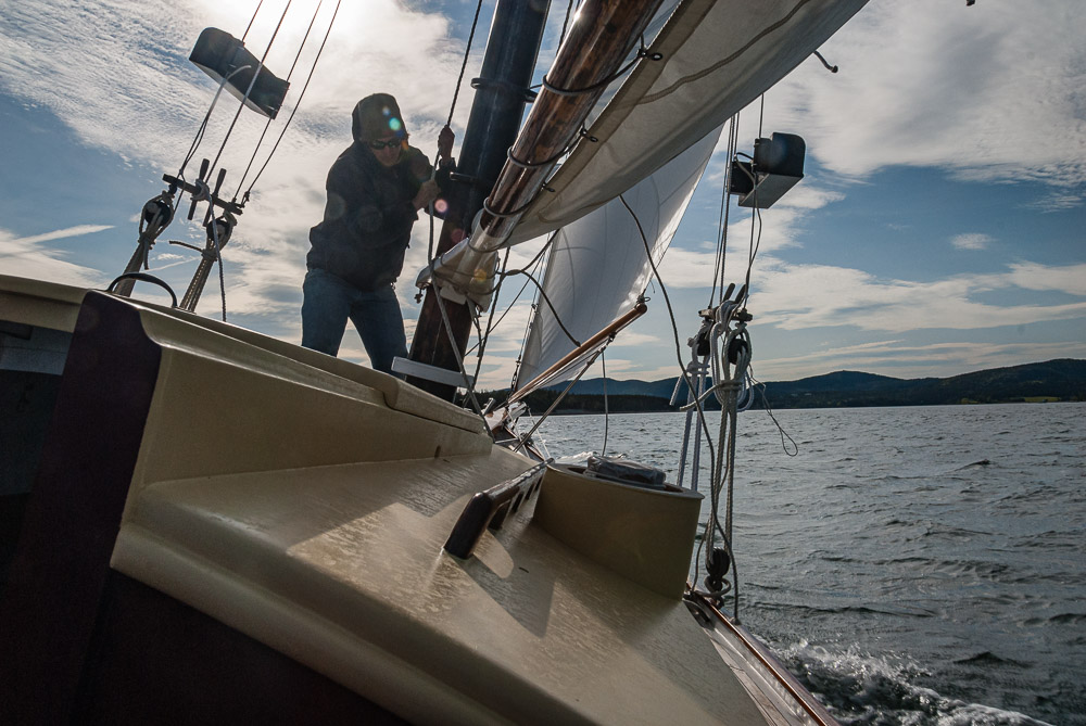
Today’s image
This is an example of a very simple looking file that grew dramatically. The final Photoshop file is 22 times larger than the edited RAW file!. From 61.5 MBytes to 1.34 GBytes. It sure doesn’t look that complex. It was necessary and I would still do it the same way again.