How did it get to where we think we are supposed to know everything? Why is it wrong to say “I don’t know“? I think it would be horrible to believe I knew everything. Where would be the opportunity for discovery? To be able to let my curiosity run free? I am quick to tell anyone I don’t know, if I don’t.
Fallacy of certainty
Believing we have to know everything is a trap. It will doom us to failure and disappointment. I would say there are 3 general classes of knowledge:
- Our values.
- The things we interact with on a regular basis.
- Everything else “out there”.
As a person you have to know your values. Those things you will not bend. At what point will you fight for what you believe? These are the bedrock principles we build our lives on.
In the next circle, we all do our jobs and use a lot of technology every the day. We probably drive a car or use a computer for various tasks or bank or shop online. It is important to being able to function in society that we understand enough about these things to be able to use them. That doesn’t mean we have to have a deep understanding. I was an engineer in the technology/computer industry for a career, and I absolutely know I do not fully understand all aspects of everything I use. In most cases it is OK to just understand enough to efficiently get the task done and minimize surprises. Maybe just to know enough to know how to not be stupid.
Then there is everything else. The world is so big and interconnected and complex that no one knows how or why most of it works. I don’t understand micro or macro economics, and I’m not sure anyone else does, either. NFTs still seems like a Ponzi scheme to me. I don’t understand why people become zombies when they enter politics. Why do bad things happen to good people? I don’t know and I will never figure it all out. Nor do I have to.
No one knows even most of everything
We listen to the talking heads on the news spouting meaningless information with full confidence. We know they are probably wrong, but they speak with authority. Therefore, we distrust ourselves. And after a while we realize they don’t know anything, either. When neither side of the debate or the “experts” can be trusted, we tend to check out, become cynical and angry. Don’t forget, though, that they have an off button.
There is a saying called Sturgeon’s Law that says “90% of everything is crap”. I have my own corollary to that: Sturgeon was an optimist.
If most of the information you get is bad, what do you do? Hopefully you start to trust yourself. Learn to research things that are important to you. Research means even listening to people whose opinions you don’t like. You can’t just listen to your favorite guru who says things you like to hear. Make your own decisions. Build enough knowledge to trust your instincts and decisions. Don’t believe anything you hear until you check it out.
Curiosity
Too much ranting about heavy stuff. Let’s talk about art!
After a long time of working up to being an artist, I have concluded that I have to follow my curiosity and trust my instincts. Sounds simple, but it is sometimes hard.
I have spent time at times doing things in a way that they would be accepted by other people. It wasn’t entirely wasted, but is seemed kind of phony, and it was. I realized I was making someone else’s art. I don’t do that now.
But do we follow the fashion of the day? Do whatever we have to do to be accepted by the ones who style themselves as the opinion leaders? Who anointed them with this divine authority? They are just people with opinions.
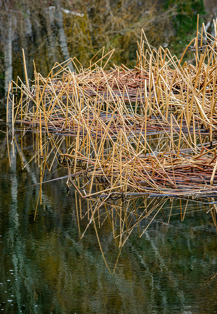
I find that most of my best work happens when my inspiration is to ask “what if?” or when I say “I have never seen this like this before”. And do something with it.
Adventure
Do you lead a boring, monotonous life? Or is every day a new adventure? Much of the choice is ours. It depends on our attitude.
I believe that artists have the opportunity to lead lives of adventure and excitement and personal growth all the time. Even if we never leave our town.
Adventure is exploring and finding new things that excite us. We don’t have to go to exotic locations to find that. Our point of view determines our adventure.
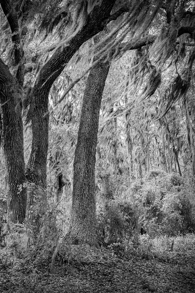
Nearly every day I go walking in the areas around my studio. I always take my camera. It is covering the same ground. Occasionally I create a new route, but there are only so many variations. Sometimes I get bored with it. But I am coming to realize that when I am bored I am not letting my curiosity roam free. If my attitude is better I am likely to discover new things or appreciate something for the first time. The same with driving through Kansas. It can be a nice adventure.
Artists are on a journey of discovery
As artists, we should be explorers. Not discovering unknown lands, but finding new things about ourselves and the world we live in. These discoveries could be as close as our back yard.
To do that, we need to be always asking questions: What is this? What else is it? Can I see it different? What if this was combined with that? What if …?
At the root, all of these questions are based on the assumption that I don’t know – but I will explore it to see where I can take it. Not knowing is fundamental to being creative. When we don’t know, it should excite and inspire us.
Forget about the rest of the world that is pressing in and telling us what we should see and believe. We are capable of deciding for our self. Being an artist means being comfortable with high levels of ambiguity. And the accompanying joy of finding new answers or showing the world something they have never seen.
Be yourself. Trust yourself.