
Color is one of the major considerations in our photo processing. And it can be hard. Have you ever considered how many tools and settings there are to control color in Lightroom and Photoshop?
But where are you on the color concern spectrum? For you, is color:
- Critical. It must exactly match
- Important
- An annoyance
- Just a design variable
- Don’t care
Why do we need to change it?
Despite all of the great technology we have, color is still an imprecise and slippery thing to deal with. Different camera manufacturers often create their own unique ‘look”. Fuji, for instance, has profiles built in for some of their famous films (remember Velvia?). But because of different technology and processing tradeoffs, there are subtle differences between, say, Nikon and Canon. There are even small variations between samples of the same camera model,
The color variations are magnified as we move further along the processing chain. What we see is greatly influenced by the decision to shoot RAW or JPEG, and if JPEG, what color balance is chosen. And is our monitor calibrated to ensure it correctly represents the colors in the digital file?
Finally, when we make a print everything can change drastically. The print is strongly influenced by the paper we choose and the printer’s ink set. Using good profiles for the printer and paper combination helps to produce an output that is “similar” to what we edited on screen, but it will never be the same. Just the move from illuminated pixels in RGB space to reflected light from a paper substrate in CMYK space means they can never be exactly the same. The physics is completely different.
The variations along the way are the process of color correcting the image.
Most of us do not see or pay much attention to these differences. The importance to us depends on our application.
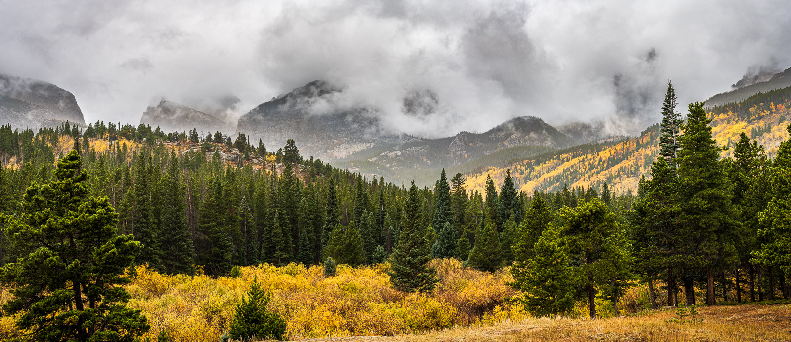
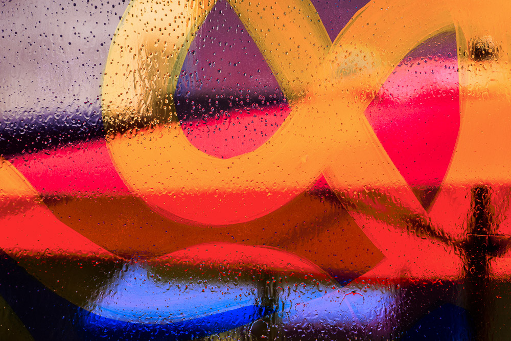 ©Ed Schlotzhauer
Tools
The color correction tool chain starts back in our camera. Specifically, the color balance setting.
The color of the light on our scene varies greatly in different conditions. Bright sunlight is completely different from open shade, as is a cloudy, overcast day. Indoors under tungsten or fluorescent lighting and. even LED’s give different color casts.
Out eye/brain automatically adjusts for most of these differences, but the camera does not. The color balance setting in the camera is a means to dial out the color casts. But this is only useful for JPEG images and the preview we see in camera. Color balance has no effect on RAW images. Those compensations are made in our image editing software.
My camera stays set to Auto White Balance. I only shoot RAW, so it has little effect on my processing or results.
Lightroom
When I say “Lightroom” that is a shorthand for “Lightroom Classic”. That is the only version I care about. But I”m pretty sure everything I say about it applies to both applications. There are differences in color representations in other RAW image processors like Capture One, but I do not have enough experience with them to say much.
Lightroom is packed full of ways to change the color of our image. In the Develop module you are never far from something that can modify color.
Some of the controls change color globally, that is, for the whole image. Just scanning down from top to bottom (I think my controls are still in the default order), we start with profile. This can be a simple selection of default balance or you can set any of the many provided color effects, including black & white toning.
Next there is the white balance adjustment to allow us to adapt the image to a color that should be neutral. Next to that is the color balance selection to partially compensate for lighting conditions.
Right under them is the Temp and Tint sliders. Vibrance and saturation do not actually alter colors much, but they have a strong effect on the look of colors.
Then there is the Tone Curve, where we can adjust red, green, and blue channel properties directly, followed by Color Mixer and Color Grading. Finally there is the Calibration group where we can control hue and saturation of each channel.
All of these are only the control that affect the whole image. We have many of the same controls to perform selective adjust color in regions (like a linear gradient) or spots (e.g the brush tool).
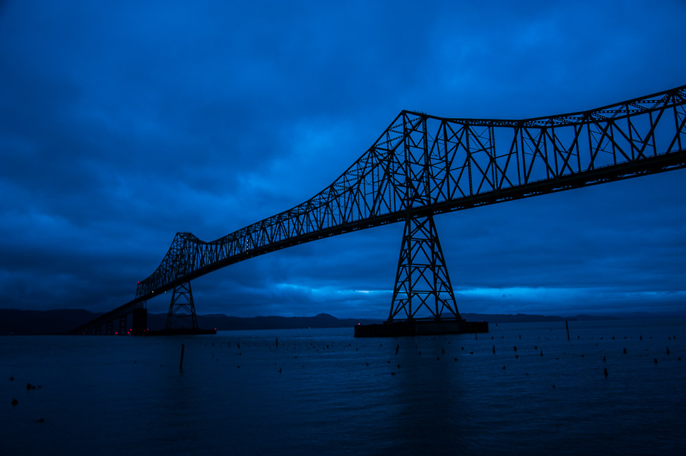 ©Ed Schlotzhauer
Partly driven by the application
Hopefully, you get the impression that Lightroom gives us a lot of control of color. It must be important. I won’t even go into Photoshop with its many adjustments. I trust the point is made. This is not a “how to”.
Color adjustment is a large part of what we may deal with in post processing.
Maybe.
It depends on our application and needs.
If you are doing product photography, the customer is very concerned that the color of their logo or product absolutely matches their specification. Portrait customers have a fairly narrow tolerance for off colors in people’s faces. Or you may have a self-imposed rule that the final color must exactly match the original scene.
In these cases you are probably using gray cards or Color Checker swatches to ensure you faithfully match the original. You may even be calibrating your camera to minimize discrepancies. You will probably be using many of these Lightroom controls to adjust the colors to balance out shifts or color casts.
I’m a Fine Art Photographer
But I’m a Fine Art Photographer. I dislike that term and I’m not completely sure what it means, but I do know that what I create is art. Art is not tied to a real scene. Maybe someday I will get into a discussion on indexicality, but not today. By my definition, anything I want to do as art is acceptable.
I may not care at all about the color of the original scene. I’m certainly not fanatical about matching it or balancing color casts. My consideration is how the resulting image looks (to me) and what effect it has for the viewers.
Yet I do use most of the color controls I listed earlier. Except I very rarely use Calibrarion to adjust color, but that’s just me and my thought process. All the other controls, in global and regional and spots, are tools I use frequently.
Color is a subtle thing. Almost imperceptible shifts can create large perceived changes. It can be tricky, or impossible, to achieve an effect I have in mind. But I try.
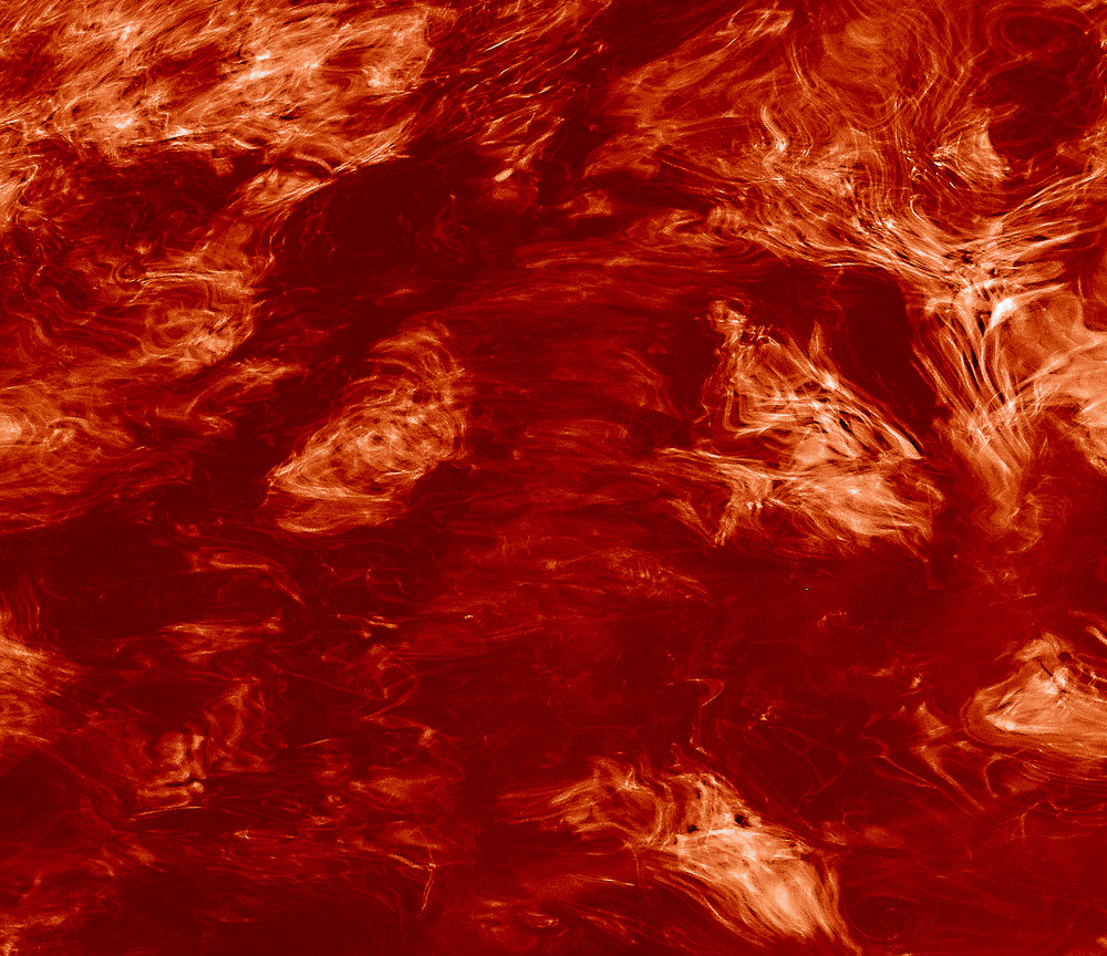 ©Ed Schlotzhauer
Not an absolute
Breaking the assumption that my image must look like the original was difficult for me. Coming from a very technical, engineering background made me think in absolutes. Precision was important. But now that the assumption is broken, it is freeing. The realities I started with no longer hinder my vision (as much).
Even so, I do not usually create comic book-like pop art. Unless I want to for some reason. But, on the other hand, I do often enjoy making images that are so extreme you will think I modified them too much, even if I did little at all.
Sometimes color is the subject. Sometimes an image “needs” to be a different color than the original. An extreme use of color modification is black & white. Yes, taking away all color and just leaving tonality is extreme color manipulation.
In the questions I posed at the start, I’m usually operating at about 4 or 5. It is a tool I can apply to accomplish my vision. Not something I am stuck with because that’s what the original was.
 ©Ed Schlotzhauer
Do what you need to do
Color perception is one aspect of a visual image. But it is a powerful one. With our technology, we are blessed with extreme ability to control or modify color. Don’t be afraid to use it creatively.
Unless you are working in an application that demands absolute fidelity to the original, color becomes just another design element to be used for art.
Make your art. The color is… what you need it to be.
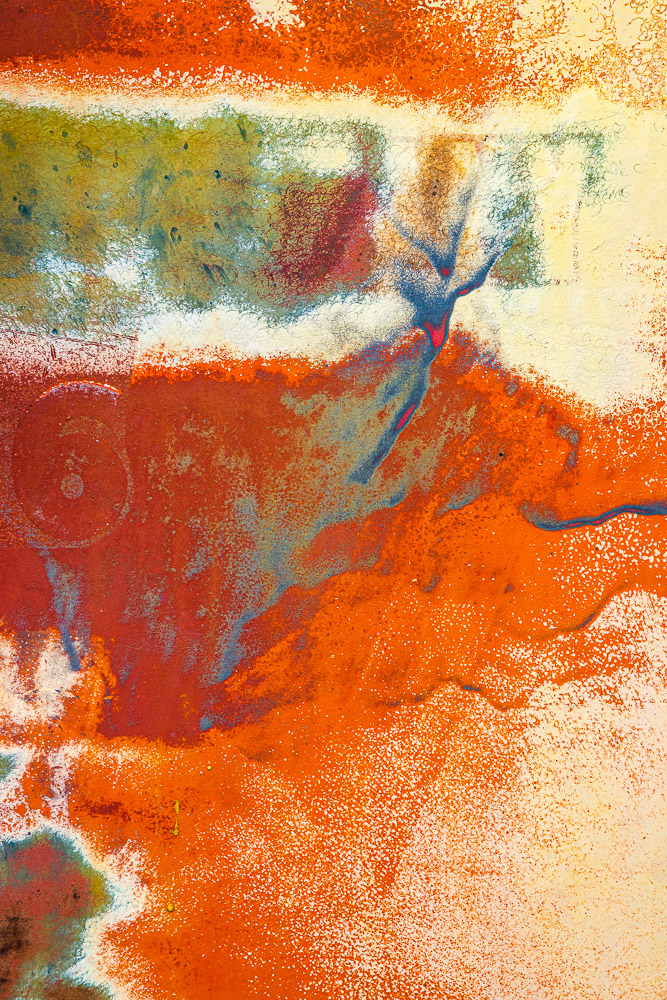
Today’s feature image
Is this the “right” color? I don’t know. First, I didn’t have a gray card with me. Second, even if I did, I couldn’t have held it out the window at 40,000 ft. Third and most important, I don’t care.
This is what I remember seeing at the time. It is the way I chose to make the image look. It is art. I like it like that.

 ©Ed Schlotzhauer
 ©Ed Schlotzhauer

 ©Ed Schlotzhauer
 ©Ed Schlotzhauer
 ©Ed Schlotzhauer
 ©Ed Schlotzhauer
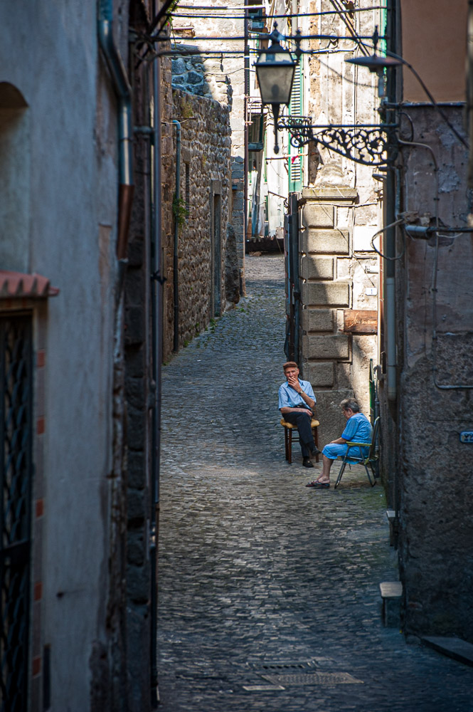
 ©Ed Schlotzhauer
 ©Ed Schlotzhauer