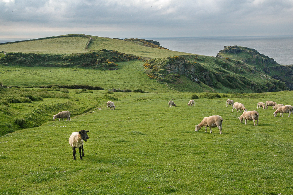
An artists journey

Blog

  • Keywording

    Keywording

    Keywording is a pretty mundane subject. But I recommend not ignoring it. It is valuable to you and good discipline. I have tried to ignore keywords at times but I have always changed my mind.

    What

    The photo filing software you use probably has provisions for adding keywords to your images. It probably also has ways to add a lot of other meta data, like location or client or your copyright information. Use this other information, too. I use Lightroom Classic for my organization and keywording.

    Keywords are simply arbitrary tags that add words or phrases to help you locate or identify your image later. This is important, the keywords are completely chosen by you and for your use, unless you work for an organization that enforces standardized keywords. I will assume here that that does not apply to you.

    So they are only meant to be useful information for you. They may tag location or subject or color or mood or anything that seems relevant to you. You can add as many keywords to an image as you want. Perhaps there is an upper limit, but I have never found it or read about it. Again, let me emphasize that you decide what they are.

    Why

    Why go to this trouble? Because one of the problems with digital images is that we tend to collect a lot of them. And since they are “hidden” on your computer and not nice physical prints you can flip through, you need extra help finding things. Someday you will want to find a particular image or images of a certain subject or those pictures of a red cardinal in a winter snowstorm you took a few years ago. Keywords are one of the means of locating or grouping your pictures.

    One of the challenges of keywording is to Goldilocks it: not too much, not too little, but just right. How do you know what is just right? That’s the challenge. Partly it has to be sort of backward looking. That is, when you find you can use your keywords to locate the images you want and it did not seem too much trouble to have added them, it may be just right. Sorry, not a really helpful description. The trouble is, your mileage may vary.

    Strategy

    Most photographers eventually determine a strategy for keywording that works for them. I have seen people who do a lot of wildlife photography who tag images with the common and scientific name of their subjects. That is too much work for me. Since I don’t shoot much wildlife I may only tag the occasional one with “elk”, or “deer”, or “pronghorn”. Or a very generic thing like “bird”.

    Works for me. Would not work for some people I know. Choose an approach that is right for your needs.

    There are places on the internet where you can find lists of keywords. I have looked at some of them, but they tend to be too detailed for me. Plus, since I did not create them, I have trouble thinking of the words the author chose. So I make up my own keywords as needed. A quick export of my keywords shows that I have nearly 2200 unique keywords in my main catalog. I am completely sure many people have far more.

    For the most part, I use keywords to identify subjects, attributes of the image, and “housekeeping” information.

    Example

    Let me give a simple example. This is a somewhat randomly chosen image that seemed fairly typical of my keywording.

    Sunset, wide open spaces

    This image has 14 keywords currently. For the subject ones, it is identified as a cabin on the eastern plains of Colorado with interesting clouds. For the attributes that seemed important to me, it is a landscape, it is abandoned, it is made of wood, a sunset image, taken in summer, and showing an expanse of distance.

    The potentially most interesting are what I term housekeeping keywords. I use these to track important information that often has nothing directly to do with the image. An example for this one is that it is copyrighted. Yes, all of my images are copyrighted technically at the moment I take them, but this extra level signifies that the image has been filed and accepted for copyright by the United States Copyright Office. In addition it has keywords indicating the copyright registration number and date of grant. Other example housekeeping tags are that it is in my Select5 group, one of my highest ratings, and it is used in this blog.

    Why do it this way? Because I developed a system over time that works for me and is based on real needs that needed to be solved. I do not claim it is the only way to do things or that it is the best way. It is just the workflow I use. I encourage you to also adapt your tools and process to meet your needs rather than bending your needs to match the tools, or what someone has told you you should do – including me.

    Worth it?

    It is solely up to you to decide if it is worth it to you. It is to me. I often do searches to locate a particular image or a certain type of scene. The more identifying information I have, up to a point, the better. I also use smart collections sometimes to group together all images of a certain criteria. For example, I mentioned using a keyword for my selection level. I have smart collections that will show me, for instance, everything at select level 3 that has not yet been evaluated for possible promotion to level 4. This is a key part of my workflow.

    I always keep in mind what I termed the Goldilock effect. If my keywords are not adding value for me I will modify or abandon the process.

    These are your images and your process. Do what works best for you. But it is good discipline to enforce on yourself. I can say that if you go a long time ignoring something like keywording and decide later you should do it, it is a lot of boring work for a while.

    The tradeoff for me is that keywords are valuable for my work and useful for my processes. I will put in the effort to do it. Taking a little time to think about an image from several aspects like subject and attributes and housekeeping has benefits for me. It is one of the steps that ensures I am curating my valuable assets rather than just accumulating a big bag of pictures.

    Postscript

    A growing trend is software that attempts to analyze your images and automatically generate keywords. One new one I’ve seen is Excire. Another system I have seen described is fotoKeyword Harvester. I’m sure there are more. Lightroom itself agressively tries to get me to let it scan to identify people. It’s little brother, now named just “Lightroom” also automatically tries to keyword images. All this comes with the increasing penetration of so called AI technology.

    I don’t use these tools. As a matter of fact, I don’t trust them. All that I’ve seen will suck your images into “the cloud” for analysis. I have no sure way of knowing what will happen to them then. I am very protective of my rights and possession of my images.

    Yes, I may be a Luddite, but it is not entirely out of ignorance. I am a Software Architect who had done AI work and even developed practical applications based on some of its research. I have some idea of the downsides of using it.

    Besides, as I indicated above, my system is based on a network of keywords I have grown organically over a long time. I am not interested in some software system deciding to re-describe and re-interpret my image data.

    So for the foreseeable future, I will continue doing my keywording manually.

  • Themes

    Themes

    I have come to realize I am attracted to certain themes in my art. Before I fall off into art-speak, what I mean by a theme is just the simple dictionary definition: “a subject or topic of discourse or of artistic representation”. In other words, what subjects do we chose for our art. Themes tend to be bigger than a subject. A theme may tie several seemingly separate subjects together.

    Think about artists you admire. Do you also picture the typical types of works they do? Ansel Adams – grand black and white landscapes of the west. Georgia O’Keeffe – modernistic flowers. Monet – impressionistic rivers and ponds in northern France. John Paul Caponigro – abstract and ethereal seascapes and landscapes. They tend to go together in our minds because we know they very often do these subjects.

    Chicken or egg?

    Do artists pursue themes because that is what they like or do they pick something to get known for? Kind of a trick question. It doesn’t have to be just one or the other. Sometimes themes choose artists. Sometimes artists choose themes.

    What is available to us often has a huge impact on our themes. Ansel Adams lived in California. Yosemite and the Sierra Nevadas were his back yard. John Paul Caponigro lives in Maine. Seascapes are common to him. Monet lived along the Seine River. He painted what was around him. This is quite common. We tend to grow to love what we see most. I live in Colorado, right on the dividing line between the mountains and the arid plains. Both are beautiful to me. I see them every day. The more I see them the more I resonate with them.

    Some artists deliberately choose themes or subjects to become known for. They want a “signature”. Joel Grimes is well knows for his commercial work and stark, gritty treatment. Some people become famous portrait artists or wedding photographers. In general these are things they have consciously decided to build their career around.

    I won’t claim there is a right or wrong. If you pick a certain subject matter to build your career and reputation on, I hope you really love it. Otherwise you could be like these old rock bands still touring around whose audience only wants to hear their hits from 40 years ago. It would get very frustrating to me.

    I am a searcher and explorer. Themes are less conscious for me. Looking back through my portfolio I can detect a few. The ones I have detected make it less surprising now for me when I find myself drawn to them. I recognize it and have come to expect it. That doesn’t mean I am not open to new things, just that I can see larger patterns in my work.

    Very personal

    Themes or typical subjects tend to be personally meaningful in some way to the artist. It is hard to keep on doing art you don’t care for. That is probably one reason we have themes. The subjects we are drawn to are somehow meaningful to us so we keep coming back to them.

    I don’t want to go too deep on the need for meaning. Our themes do not have to align with deeply meaningful social or environmental causes for them to be meaningful. If they are meaningful for us, that is sufficient.

    I used Georgia O’Keeffe as an example earlier. Her mentor and, later, husband Alfred Stieglitz promoted the idea that her flower pictures had deep sexual significance. It helped build her reputation in the modern art world of the time. She later vigorously denied this was true. She maintained it was only the form and color that was important to her.

    Maybe meaning is a very nebulous and personal thing. What is meaningful to me may not be to you. And vice versa. Or you may see meaning I didn’t when I made the image. I have never thought that pictures have significant meaning in themselves. The themes I discover in my work have meaning to me, but I do not try to force it on you. Maybe on the rare times I try to express my feelings in words the viewer may occasionally get a glimpse of the meaning there is to me. But I do not expect you to get one of my images and hang it on your wall unless you like it as an image and maybe, there is something there that is meaningful to you.

    Consistent over long times

    Themes tend to be a persistent feature of an artist. We are drawn to certain subjects. Maybe we understand there is a theme there that we are pursuing. But regardless, we keep coming back to certain things.

    Our themes can fade with time and be replaced with new themes. We all grow and change our values and interests. This tends to be a slow process, but it happens for most of us. I hate to try to quantize it, but I would guess that when we find we are interested in a theme it will stick with us for a few years. Sometimes, for our whole life.

    Unifying themes

    Sometimes we find that several seemingly disparate subjects that interest us are really part of a unifying theme. This is a wonderful realization, because it unites large parts of our work and brings a new meaning, or realization to us to understand why we are drawn to it.

    Let me give a personal example. I am drawn to old things that are worn and aged, but only certain ones. Some old things excite me and many are of no interest. Old rusted cars, abandoned buildings, old machinery, these have always been interesting subjects to me. As I’ve gotten older I have discovered the Japanese term wabi-sabi. I realized I was embracing the philosophy before I ever heard it expressed. It has become a unifying theme for many of the subjects of interest to me.

    It is apparently impossible to succinctly and even correctly translate wabi-sabi to English. There are too many subtleties in the Japanese meanings. Some day I will attempt to write a better blog on it.

    Here is one very compact description of wabi-sabi: “‘Wabi’ expresses the part of simplicity, impermanence, flaws, and imperfection. On the contrary, ‘Sabi’ displays and expresses the effect that time has on a substance or any object. Together ‘wabi-sabi’ embraces the idea of aesthetic appreciation of aging, flaws, and the beauty of the effects of time and imperfections. The two separate parts when put together, complete each other.”

    I discovered that I am drawn to flaws and imperfections and the beauty of aging and the effects of time, especially of things that are bravely standing against time. This theme unites my collection of old rusty cars, broken down buildings, and broken flawed objects. I was happy to be able to wrap a higher vision around my old rusty things.

    It makes us different

    Our affinity for themes is one reason we can go out with a group of other photographers and still come back with our own unique images. We each have a different viewpoint. We are drawn to different aspects of a scene. Even if we shoot the “same” scene, we probably each have our unique viewpoint. This causes us to frame it differently, isolate a different part, emphasize different things.

    Or, for some of us, even turn away from the classic landmark and shoot a different direction entirely.

    Our themes help unify our images. They give a meaning and long term point of view to our portfolio. In another sense, our themes are an indication of our values and world view. What we are drawn to shoot are often things that are meaningful to us because of the themes we embrace. We still shoot other things, but something keeps drawing us in certain directions…

    This image

    The image with this blog was taken in Blaine Washington. It is on the seacoast right at the border with Canada. It is a lovely small town. I was across the harbor. There were good views all around of the harbor and the sea, but I was fixated on this great old boat. Rusty fittings, deteriorating paint, obviously it had seen better days. But it was still standing against the elements. That is encouraging. For me, a perfect wabi-sabi moment.

  • A Private Journey

    A Private Journey

    Being an artist is a private journey, but one the viewers are invited to participate in. I don’t collaborate or take votes to guide my journey. It is just me. It is intensely private.

    Private

    I have to make my own way in the world. As such, I am stuck in my own head. Creativity has to somehow spring up from within. Being an artist is lonely. LIke a writer, there are those terrifying times when you are facing a blank page (or empty frame) and you have to create something. No one else can do it for me.

    Not everyone agrees with this approach. Some people, especially if they are young and just learning, want to run in a crowd. They have to immediately post every image to social media to get feedback. To me this is a form of insecurity. My values and style is deeply ingrained and I do not seek immediate validation from the internet. But that is just me.

    What works for me is to explore, to be receptive to what I encounter. I seldom have a detailed plan for what I want to shoot. Rather, I turn myself loose and let myself be drawn to scenes that interest me. It doesn’t always work, but that is what inspires me. The word that keeps coming up is”me”. Not in an egotistical way, but in the sense that I am the only one who can take this journey. If it wasn’t me it would be someone else’s art.

    I also find, and this is just me, that when I put pressure on myself to “have” to come up with something creative the results may be good but they are seldom great. But when I let go and just react and experience then creativity can flow. Understanding this about myself has let me keep my art constantly being a joy.

    A journey

    Virtually all my subjects are collected outdoors. It is extremely rare for me to set up a controlled indoor shoot. So a shoot for me involves movement. I have to leave my studio and get out in the field where my subjects are.

    This is a joy for me. I am an explorer. It is hard to pass a road I haven’t seen the end of. As an example, just a couple of days ago I was exploring up along the border of Wyoming. I went down an obscure dirt road I knew was a dead end, but I had never been down it. It was great! I loved the sights, the remote wildness, the windswept barrenness, the newness. It was fresh. Something I had not seen before. It energized me. Even if none of the images make it into my portfolio, it was well worth it for me personally.

    But a journey doesn’t have to be far. I do a lot of shooting while walking around within a mile or 2 of my studio. Journeying is an attitude. A sense of exploring and investigating. It is sometimes difficult to feel a sense of discovery in an area I have been over and over so many times. But that is part of the game. It is a mental discipline. If I can find new and fresh sights in a familiar area then it is even easier to get inspired in an interesting new place.

    Viewers

    It is true that my art makes me happy. If I never showed it to anyone I would still have the joy of creation and discovery that would compel me to make it.

    But artists are also somewhat egotistical. We feel we have something worthwhile to share with other people. I hope those who see my work enjoy it and can share in the sense of wonder and amazement I felt while making it. I’ll be honest, I also hope you decide to buy some of my prints for your walls. The money is nice, but even more is the knowledge that this had an impact on you and that it will now continue to influence you. We all would like to leave a legacy.

    I know your time is valuable and increasingly scarce. I seek to make art that is captivating enough for you to give me some of your time to view it and think about it. I hope my art will awaken some new thoughts and feelings that will make your day better, to refresh and renew you. I like to feel that some of my pieces on your wall will have a long term benefit as you see them every day.

    Internal and external

    My art is a private creation of my own mind and energy. I do not collaborate with others or shoot assignments. What energizes me is exploring and finding wonder in the everyday sights around us. I may work a project or a theme at times, but mostly I let myself be drawn to whatever is exciting me at the moment. I am very much in the moment when I am creating, even when working at the computer.

    Even though my art and my process is intensely private and personal, I also have the viewer in mind. I am constantly reaching for something creative and fresh to share with my you. If you give me some of your time and attention I want to give back. I hope I can succeed with you. It is my private journey but I want to share it with you.

    Go to my web site at photos.schlotzcreate.com to view a little of my work and let me know if any of it resonates with you. Please join me in my private journey. I welcome your feedback.

  • JPG vs. Raw

    JPG vs. Raw

    It seems like deciding on jpg vs. raw formats for our images is a problem for some photographers. I’m not sure why. Maybe it is lack of knowledge or maybe because it is sometimes discussed in almost mythological terms. Jpg and raw are just 2 ways of saving our images. Each is good for some things but there are tradeoffs to consider. It is just technology, not magic.

    Image formats

    When you take an image on your digital camera, each manufacturer has their own proprietary magic they do on the bits coming off the sensor. This lets them tune their image to meet their goals. If you shot the same scene with different cameras you would notice subtle differences – slight color balance differences, slight variations is tonal contrast, different handling of shadows and highlights, etc. These are usually small, but they give a camera it’s unique character.

    But we need to consume these pixels in our image processing software. So there needs to be standardized ways of storing the images and reading them in our computer. These are file formats. There are 2 main choices.

    Jpg is an industry standard format. The format is very widely understood and used. All images, once converted to jpg, are compatible.

    What we call raw files are really proprietary file formats created by different camera manufacturers. Image processing software, like Adobe Lightroom, has taken the responsibility to be able to read the files written by virtually all camera manufacturers. For instance, I shoot Nikon, so the images LIghtroom reads and handles have the “.nef” extension. Lightroom knows how to interpret this and convert it to editable pixels.

    The key thing here is that these raw files all contain roughly the same information, but are not directly compatible. Thankfully our software handles the differences gracefully.

    Technical details – jpg

    The term jpg, more precisely “jpeg” is derived from a standard created by the Joint Photographic Experts Group. The name jpg is an abbreviated acronym.

    The problem was that digital files are very large, this made them consume lots of disk space back when disks were small. It also used up lots of bandwidth transmitting them back when internet was slow and much more expensive (anyone remember dial up modems?).

    The jpg standard is based on some brilliant insights on human perception to allow encoding image files so they look good but are much smaller. The underlying principle is that humans are more sensitive to variations of tone (luminance) than they are to color (chrominance). The jpg processing reduces the luminance information and greatly reduces the chrominace data to acheive reductions of about 10x typically.

    In general, transforming an image to jpg is a multi step process. It involves a transformation where the luminance and chrominance information is separated. Then the chrominance information is downsampled, or reduced. Then there is a grouping of data into blocks and a process called discrete cosine transform is applied to the data blocks. This transformed information is quantitized and encoded. Finally the data is written out in a defined format as a jpg file. It is not at all necessary to know these details, just that the data in a jpg file is far removed from the original pixels that came from the camera.

    It is a lossy compression technique. Yes, it throws away a lot of data. This is one of the big tradeoff points of jpg. But a fringe benefit is that the image is made to look “nice”. The result is pleasing to most people without further processing

    Technical details – raw

    These files are called “raw” because they contain minimally processed data from the camera sensor. They are absolutely not ready to be viewed or processed. Some people describe it as a digital negative. Conceptually this is pretty good way to help us think about it, but it is not a valid description. The data is not negative and it is not viewable. It might be better to think of it as exposed but unprocessed film.

    To follow this metaphor, a raw image processor like Lightroom “develops” the image and makes it viewable and editable.

    Why raw? It captures and beings into the computer all the data that the camera sensor was able to record. It has the full range of color and tones. Nothing has been eliminated yet.

    In addition, the raw format has not had any lossy compression applied. Nothing is thrown away or reduced. Because of these things an image from a raw file requires manual editing to complete it. Sometimes a lot of editing.

    Tradeoffs

    So jpg is made small as possible and generally nice looking as soon as you see it. You can immediately look at it or send it to someone or post it to your social media. Yes, some information has been intentionally eliminated, but that is not important to most people. If you don’t notice it then it must not matter.

    On the other hand, if you want to make a large print of a jpg you may see noisy patterns that are euphemistically called “artifacts”. This might be mitigated with clever software, but your mileage may vary.

    And there is an editing danger you need to be aware of: every time you save a jpg file it goes through the transform process to reduce data. So every time you edit it and save it you lose information and introduce more artifacts. If you want to edit a jpg always save the edited file in a lossless format, like psd or tif.

    The raw files are usually very large. On my current main camera a typical raw file is 50-70 MBytes. A high quality jpg of the same resolution is around 4-5 MBytes. So, 10 to 1 or greater differential. And the raw files require an investment of time and training and tools to process them into a respectable state.

    But, and this makes up for everything, the raw file preserves every bit of information that we can wring out of the sensor. A modern sensor is marvelous and enables very aggressive processing. The raw format contains the full resolution of the pixels. It is not limited to 8 bit data like jpg. I often do things with the image data that I could not have envisioned when I took the original photo.

    Different needs

    When would you want to use one vs. the other? Well, if I was shooting a wedding I would probably use jpg. Say I come away with 3000 images. I would want to be able to scan through and see good views of all of them so I can quickly pick the 100-200 best to share with the client. If I did my job well the images should not need much editing. I would not have time to process this many raw files.

    Also, if I am shooting snaps of my family that is a time for jpgs. And if I was on vacation and just shooting travel photos for memories that is good jpg territory. I guess if my memory card was nearly full and I didn’t have a spare I might switch to jpg to keep shooting a few more frames. I try to prevent that from happening.

    For me, any other time requires raw files. It is my go-to choice. I know I want to process the images heavily. I am not afraid of the techniques. Given the choice I will always want to retain the maximum information and resolution possible. This given me the flexibility to make massive changes or change my mind and go back to re-process the image for a different look

    I tried to present a very neutral view of the tradeoffs of the 2 formats. I can sympathize that the choice is hard for some people. For me, it is straightforward. Use jpg if I am taking shots of people and I am confident it will need little processing. Otherwise, definitely raw.

    The image with this article is a jpg. It looks fine for this application.

  • Look Sharp

    Look Sharp

    No, I’m not giving advice on fashion trends. You probably wouldn’t want to follow my lead. But I can talk some about image sharpness. Photographers often obsess over getting the sharpest possible image. Today I want to give an overview of the factors that make an image look sharp and some that make it not sharp.

    Sharpness chain

    I described the transforms in the image capture process as the sharpness chain. Physically and logically there are several components that light has to go through before we have an image on our screen to view and edit. In may be more precise to describe this as the “unsharpness” chain, because unfortunately, every step along the way degrades the image to some extent.

    Digital camera loss of sharpness chain

    The original image is, by definition, “perfect” since it is the original. The light then goes through a filter (if you use one, I usually do), the lens itself, the Bayer filter to do color separation, the sensor chip, various processing stages in the camera hardware, and the raw conversion. I include the raw conversion here because the image is not editable until this has been done. There is no gain at each of these stages. This means that each stage degrades the image.

    This is not to be discouraging. Modern cameras and lenses are fantastic. “Fantastic” means they degrade the image less than ever before in history. This is not a bad state of affairs. If you are using excellent equipment all along the chain you can achieve some great theoretical results.

    Focus

    Oops, I said theoretical results. What I mean is that under perfect conditions the camera system can produce excellent results. But we may not always apply the best techniques when we are using the equipment. There are many things we can do to make the image sharpness worse.

    Focus, for instance. My eyes are getting old and weak. I usually rely on the camera auto focus system. And these do a great job now. But did I move the camera after focusing? Did I focus on the right part of the composition? Is the light level bright enough to allow the camera to work properly? Was it properly locked down on a good tripod to keep things rigid?

    Motion

    Another problem is camera shake. Pixels in modern sensors are so tiny that very little motion can smear light over several pixel sites. Yes, my camera has internal image stabilization, but this does not entirely compensate for bad technique.

    Way back in the film days we used a rule of thumb of 1 over the film speed to estimate the minimum shutter speed. That is, if using 200 ISO we should be able to shoot at 1/200 of a second and be able to maintain adequate sharpness. Sensors are so fine pitched now that I think the rule should be around 2-3X the ISO to be conservative. So at ISO 200 I should probably shoot at 1/400 to 1/800 second handheld to get good results. Best to always use a sturdy tripod.

    Another common problem is subject motion. This is when the subject is moving relative to the frame during the time the shutter is open. If the subject is moving “enough” you end up with a blurry streak. If this was not the intent you were after, it is an error caused by bad technique. You have to get the shutter speed up enough to “freeze” the subject.

    It is an internal fight with me to make myself raise the ISO speed enough to get the shutter speed I need. I have years of history that images were too noisy unless I stay down around 100 ISO. But with modern cameras it is much less of a problem. My default ISO is usually 400 now. I know that I can go to 3200 and still get good results in many situations. I just have to make myself do it. When I don’t I often get blurry images.

    Diffraction

    One of the things we worry about a lot is depth of field (DOF). This is sort of an illusory concept. It is an attempt to quantize how much of the area from foreground to background is in focus. The reality is only a very small slice is actually in focus. But DOF describes how much is in “acceptable” focus. But acceptable varies with taste and application. There is no official definition of DOF.

    One way we try to cheat the system is to stop the lens down more to increase DOF. It sort of works. It seems to work. But it is not free. Going to a 2 stop higher f-stop number, like f/16 instead of f/8 means that you are letting in 1/4 the light (it’s logarithmic). It also means you are incurring diffraction effects.

    Diffraction is a complex phenomenon. I will just say that at physically smaller apertures (say f/16 and smaller) the perceived sharpness of your image decreases. So don’t just automatically slam your aperture to f/32 to always maximize DOF. It has downsides. Most lenses have a “sweet spot” around 2-3 stops down from the widest aperture. If you have a great f/2.8 lens it probably has optimum sharpness at around f/5.6 to f/8.

    Diffraction is a real phenomenon of physics and I see it all the time. Don’t let me scare you, though. It is one of the tradeoffs. As an experiment sometime put your rig on a tripod and shoot a spread of the same scene at, say, f/5.6, f/8, f/11, f/16, and f/22. Don’t change the focus point. When you examine the images on your computer at at least 1 to 1 size you will see a fall off of sharpness at f/16 and smaller. On the other hand, the perceived DOF increases at the smaller apertures.

    Trading off DOF and diffraction effects is just one of those balances that photographers have to be able to make automatically. It’s all an artistic judgment. No right or wrong.

    Sharpening

    Regardless of how good or bad your equipment and technique is, at the end of this chain you are now in your computer looking at the image. What can you do?

    First off, expect your image to look blurry when you first view it. What?? I paid thousands for this equipment and it makes blurry images? Yes. if you shoot raw images (always shoot raw unless you have a very good and specific reason not to), almost no processing has been done on it when you first see it on screen.

    All those steps in the sharpness chain guarantee that is seems less sharp to you than you expect. Don’t worry. If you have done your job well you have good data to work with. We can do wonders to increase the perception of sharpness.

    It is the “edges” in your image, the transitions from darker to lighter, that give the perception of sharpness. We have many tools and techniques these days to increase the contrast of these edges.

    Lightroom tools

    If you work in Lightroom, as I do, (or Camera Raw, the equivalent) the Presence section has 2 magic tools: Texture and Clarity. Clarity is a bigger hammer. It increases edge contrast overall. It can really make an image seem to pop.

    Texture is fairly new. It is kind of like Clarity, but gentler and more selective. Increasing Texture concentrates on mid range edges. That is, it ignores the most contrast and least contrast edges and enhances the middle ones. This is a subtle and more fine-grained control. It is a welcome addition to the tool kit.

    Then for finishing an image there are the traditional Sharpening controls in the Detail section. This lets us tune the overall effect by controlling the amount, radius, and detail of the sharpening while being able to use the mask control to adjust the area it is applied to.

    These Lightroom controls are often all that is required to achieve great perceived sharpness. The more I learn the more I am able to completely finish many images using only Lightroom.

    Photoshop tools

    Your workflow or preferences or image needs may take you to Photoshop, the traditional big gun for image processing. There are several tools and techniques that can be used to increase perceived sharpness.

    My go-to tool for Photoshop sharpening is the Smart Sharpen filter. This gives marvelous results and lots of control. It even effectively lets us use Blend-If to selectively fade the sharpening application to highlights and shadows. It is a great tool. And yes, you can go crazy and make the image look horrible, too.

    Another traditional filter is Unsharp Mask. I won’t try to explain why blurring can cause the image to look sharper. It is one of the great mysteries of photography. Maybe a future article. Anyway, this is a software simulation of a technique used by film people to increase sharpness of their prints. It works well. It has somewhat less control than Smart Sharpen, but it is good.

    Then there is the HIgh Pass filter. You almost have to be an engineer to understand the concept, but basically it increases the contrast of the tones at edges to make the image look sharper. It is a very old tool, but it works great for some things.

    There are many possibilities in Photoshop, but I will stop with the Sharpen tool. It is a tool, not a filter. It is brushed on. This lets you brush a sharpening effect very selectively where you want it. It works, but be careful. It is a destructive tool.

    Perception is reality

    There are many options to use and most of them can be combined in various ways to meet your needs. But in the discussion, I kept talking about the “perceived” sharpness. This is the reality of our imaging world. All those stages in the sharpness chain lose quality. The operations we can do in software can make our image look very good. But all these tools we use are trying to simulate what the original scene or our creative vision looked like. All operate on the principle of enhancing edges to make the image look sharper.

    These operations do not actually make the image sharp. They make it appear sharp to the viewer. Maybe it is too fine a distinction. For most of us, all we care about is that it looks good.

    If an image is actually out of focus or blurred badly from camera shake or subject motion we cannot make it perfect. Yes, AI is getting better all the time, but it can’t really make something out of nothing.

    The good news is that these days we have excellent tools for controlling perceived sharpness and making our images almost as sharp looking as we wish.