The Magic of the Frame – 2

Sailboat in Maine. Illustrates how framing makes the image more dynamic.

All 2 dimensional art exists within a frame. It is a constraint imposed on us. It can also be beneficial, because it requires choices. This is the magic of the frame. This article is an expansion on a discussion of the frame I did several years ago.

Finite

I do 2 dimensional art. Most paintings or photographs are. But besides being flat, 2 dimensional works are also bounded. They cannot extend to infinity, although they may capture images of near infinity.

So a print may be 20×30 inches, or maybe 6×9 feet, but there is a limit. A print of a landscape scene is not the size of the original scene.

And because the print is bounded, there are edges. The edges create the frame, or more precisely the bounding rectangle of the image. I am assuming rectangular prints for the discussion. So in simple physical terms, the frame is the box that encloses the print.

Why rectangular?

Most paintings and photographs, and therefore their frames, are traditionally rectangular. Have you wondered why? And why and how a round lens makes a rectangular image?

I have looked into this and have found technical reasons and pragmatic reasons, but no real answer. Lenses are round for a good reason – they are easier to make and making them rectangular would introduce lots of distortion. The lens throws a circular image on the focal plane of the camera. The the light that falls outside of the sensor is cropped. We never see those parts.

Sensors are rectangular for technical and pragmatic reasons. Sensors are very large silicon chips made by normal semiconductor processes. Rectangular chips pack efficiently on a wafer. If they were, say, round, there would be lots of wasted space between chips. Since they are very expensive to make, the manufacturers are anxious to minimize costs. Also, digital cameras mimicked film cameras which exposed rectangular patches on film. Again for efficiency to maximize the film use.

And finally we expect prints and images to be rectangular. It is the convention developed over centuries of painting. And it is less expensive to make and frame rectangular prints and canvases.

So rectangular prints are conventional and the path of least resistance.

A window

The frame, though, is much more than the constraint of the shape of the sensor or print. Something magical happens when we look through the viewfinder or crop our image in our processing software.

What we see through the viewfinder becomes our window onto the world. This window in where we pour much of our creativity. As we move and zoom and continue to examine our subject through this window we decide how we want to present it. What is important to bring out. What should be excluded.

We may realize the interest is not the whole scene, but only certain parts of it., and they should be presented from a certain point of view. So we adjust our window and keep searching for the magic.

After all, if we are an artist we want to bring something to our viewers that is more than just what anyone would have shot if they walked up on the scene. We bring our own interpretation. Part of this is what we chose to have in our window.

Composition

Over the centuries many “rules” of composition have been formed. I put it in quotes because there are no real rules. The “rules” are observations of patterns that have been found to be generally pleasing to viewers.

It was very interesting to me to realize that most of these “rules” are relative to the frame. Let’s take a look at a few.

The rule of thirds helps to increase dynamic tension by placing the subject along the intersection points of dividing the window into 3 groups horizontally and 3 groups vertically. This is totally relative to the frame.

Along with that is the oft quoted “do not put the subject in the center” – of the frame.

The horizon should be level – relative to the frame.

Diagonals can add a lot of interest to many compositions. The diagonals exist because of their relation to the frame.

Leading lines are often recommended. They help encourage the viewer’s eye to lead from the frame to the subject and keep them exploring.

We need to be careful to not have distracting elements at the edges of the frame.

Unless it is really your intent, we must be careful to not cut the subject off at the edge of the frame.

This could go on a long time. Go examine your favorite composition rules and see if they are not mostly describing relationships to the frame.

Artist’s judgement

So really, at one level, the work of an artist is to arrange the elements within the frame in the most pleasing or impactful way. This is the magic of the frame. It is the canvas where we compose. It is the crucible where our creativity is tested.

Since the camera sensor captures everything in the frame, it is not only critical to arrange the elements as we wish, but it may be as important to know what to exclude. That is one of the tricks of photography. What is in view of the sensor will be in our image unless we consciously figure out how to eliminate it.

I think Henri Cartier-Bresson had great insight when he said “A photograph is neither taken nor seized by force. It offers itself up.” There are amazing scenes all around us. We have to see them then be able to compose them to create a great image.

Much of the artistry is in working the frame: figuring out what is significant and how to present it within the frame. It is the stage where we work our magic. The frame is more important in our work than we usually express. This is what, to me, is the magic of the frame.

This image

This illustrates framing. The diagonals and leading lines make it much more dynamic. I was intentional about what to include and exclude and how to frame it. At least, as much as I could on a tossing sailboat in a strong wind.

Directing the Eye

A lovely cascade in the mountains. But with a hidden figure.

Directing the eye is a hot topic with photographers and workshop leaders. Even some psychology researchers. It involves understanding the psychology of how viewers look at an image and techniques to encourage them to look at it the way we want.

Psychology

There are certain principles of perception that seem to have a lot of agreement. By understanding the principles, we can use them as tools to increase the probability that people will spend the time to look at our images.

Understand that these are characteristics common to a lot of people, not hard and fast rules. 2 + 2 = 4 is a rule. Not every individual in every situation follows a principle like “the eye is drawn to the brightest region”. Usually, but not always. So while learning and applying these understandings we increase the chance of people relating to our work, we can’t guarantee it.

Brightness and contrast

We are drawn to bright areas and we are drawn to areas of high contrast. Use this to draw people to the area of your image you are particularly interested in them seeing.

Since we tend to look more at light areas and less at dark ones, that is why vignetting is commonly used to “push” the eye away from the edges of an image and into the interior.

The lighting wasn’t right to give the effect you wanted at capture time? So what? That is what post-processing is for. Don’t be afraid to change the lighting and contrasts for the effect you want. If you do it skillfully, no one will know. If you don’t… well, it’s a learning experience.

Color and saturation

Color also effects how we look at an image. Highly saturated colors attract us. Even normally saturated colors are seen differently. Warm tones seem to advance. Cool tones seem to recede. Placing warm tones next to cool tones gives a subtle 3D effect. This is why at concerts or plays you often see warm light on one side of a performer and cool light on the other. It gives them more shape.

Spots of color attract the eye, too. If a scene has fairly even pastel or monochrome tones with a few small areas of a brighter color, we are drawn to those colorful areas.

Lines

Our eye is a marvelous pattern matching engine. We try to make connections whenever we can. Check out Gestalt Psychology for much more information. So lines, especially diagonal ones, tend to lead the eye to find something interesting the line is leading to. We are actually disappointed when we are fooled and the line didn’t mean anything.

Wide angle lenses are sometimes used to accentuate this effect by exaggerating diagonal lines and bending them. It is difficult to shoot some scenes wide without introducing diagonals. Make sure to not disappoint the viewer. Provide a target to reward them for following the diagonal.

Faces and words

Human figures, especially faces have a high visual weight. We are designed to recognize faces and we have a high interest in them. If there is a face, or part of a face, or even an eye in an image that will be one of the first things a viewer is drawn to. A face trumps most other elements of a picture.

Likewise with words. We recognize words as information. We’re conditioned to read them. I think it is fascinating that we are drawn to them even if we do not understand the language. Besides, by it’s nature, characters making up words are fairly sharp edged and high contrast. We have already seen that viewers are drawn to high contrast areas.

Since faces and words are so powerful, we have to be careful with them. Having a person walking through the background or a sign off to the side can destroy your composition intent. Or they can make it if you use them well. The point is, you have to be very aware of them and what they will do to your image.

Depth of Field

A simple attention focusing technique is to use a shallow depth of field ( a small aperture number such as f/2.8). We are drawn to sharp areas and tend to ignore blurry ones. A shallow depth of field tells the viewer to pay attention to the slice of the image that is sharp.

This is a excellent trick to eliminate the complexity of busy scenes.

Techniques

These eye catching techniques are means we can use to help make the viewer look at our image the way we want. Many photographers seem to obsess about eye paths through an image.

Eye tracking studies have been done, where subjects are instrumented with devices that can determine what their eyes are looking at at any moment. These studies produce maps, sometimes called “heat maps’, of the viewing patterns.

This used to be done a lot for web sites. After all, companies spend a lot of money producing their sites and they want to know if customers are seeing what they want them to see. Eye tracking has also been used to instrument image viewing. Researchers are interested in the order in which viewers see things, what they spend the most time on, and what path they use to scan over the image. Much of the information I presented above comes from studies like these.

This says that techniques can be used to direct viewers to parts of the image we want them to see. Maybe we can even encourage them to scan the image in a certain order.

Why direct the eye?

We’ve looked at some of the principles and techniques that can be used to direct viewer’s eyes. But why are some of us keen to do this? There must be a reason.

A photograph captures everything in the field of view of the camera when the frame was exposed. This can lead to a complex, even chaotic image. There can be many things competing for the viewer’s attention.

Sometimes the photographer feels the need to help out by saying “here is what I want you to pay the most attention to.” Eye directing techniques are good for this. This is a good use of the techniques.

Something else I see, though, I feel is unfortunate. We live in a short attention span world and we tend to accept that as a universal truth. It is said that people only glance at an image for less than a second online, unless it really grabs them. So photographers think they better use all the tricks they can to let their potential viewers grasp the image in 1 second.

Therefore there is a belief by many that we must make our images absolutely clear and unambiguous and immediately graspable. After all, if we only have 1 second, we better package the information clearly. Maybe that is the case if your world revolves around the ephemeral whims of social media.

I fear this makes images shallow and boring and is a self fulfilling prophecy. Images have less depth so viewers dismiss them more quickly.

Introducing mystery

I follow a different path. Most of my work is intended to be viewed as prints. The relationship between prints and the viewer is a little different. If someone is walking through a gallery viewing prints, they are likely to spend a little more time contemplating each one.

While I occasionally do work that is very clear and unambiguous, even minimalist, I often do the opposite. Sometimes I enjoy presenting images that are rich in content, that I want viewers to spend time looking at and discovering new things.

I occasionally even misdirect attention from a subtle interest I hope the viewer discovers. Not to be mean or devious, but to reward viewers, to give them a joy of discovery for exploring more carefully.

The image with this post is an extreme example. The eye is immediately drawn to the lower left side. That is where the brightest area is and the presence of the high contrast branch silhouette insures it. There is interest there and I hope people like it. But after you’ve explored that and you follow the cascade up to the top right corner you might discover there is a plaintive, maybe melancholy figure under the water. It is not a face, but you see it as a face. There is a moment of recognition that reignites interest and it raises questions, I hope.

What do you think?

The Making of “Nothing Is Quite What It Seems”

surreal landscape

Today I’m going to discuss the making of this image. I created this abstract image titled “Nothing Is Quite What It Seems” from disparate elements put together to achieve the surreal landscape effect I wanted.

But as the title suggests, nothing is what it seems to be.

Base, Idea

When i saw the thing creating the basic silhouette shapes I knew it needed to be a scene of dead trees in a barren landscape. In reality, though, these shapes are actually cracks in ice on a frozen lake in Colorado.

I framed the scene up to isolate these 2 cracks that looked the most to me like dead trees. The “brush” in the foreground is the near edge of the ice, looking through to some rocks close under the surface.

The processing required some touch-up editing and some dodge and burn and contrast enhancement. There was a little hue-saturation enhancement to bring out more of the yellow rocks.

All of this was done as a smart object in Photoshop. Because I wanted to keep my options open I use smart objects a lot. They give me the freedom to come back and continue editing later. I don’t like to commit permanent changes.

Texture

With the basic form set, I started building texture. Tone adjustments in the smart object of the base layer helped. Bringing up the contrast brought forward more of the texture of the ice. This is the dimples and spots all over the image.

To abstract it a little more I used the oil paint filter in Photoshop to soften the edges and give it a more painterly and abstract look.

Color treatment

I knew I wanted to change the color palette and make it look like it could be in an abandoned homestead on the Colorado plains. But I also wanted to layer on more interesting texture. After trying many overlays I settled on a beautiful rusty truck panel. The image I used is part of a 1948 Coleman Truck. Pretty rare, and it was aging beautifully.

The truck had large rust patterns and also areas of old yellow and green paint. Using this to establish the colors across the image worked for me. This truck overlay is also handled as a smart object. Careful blending achieved the look I wanted without it looking like a rusty truck.

Finishing

The final polishing and tweaking takes a lot of time, even though it doesn’t make sweeping changes. As we used to say in software development, the first 90% of the project takes 100% of the schedule. The last 10% takes the other 100% of the schedule.

There was final dodging and burning to do, bits of masking and retouching. Of course, there was a little bit of final color tweaking to my satisfaction. One of the reasons I use a flexible workflow is that I am prone to tweak things after I have looked at them a while.

Process

A comment on my workflow. Although this is a fairly complex image, nothing is permanently locked down or committed. While writing this I was able to open up all the layers and smart objects and see everything about how they were processed. I could still go in and change or modify anything in the image. And I did make some tweaks. I told you I can’t leave images alone.

And as a very experienced Photoshop user I know new tools will be developed and I will learn new ways of doing things. These will lead to new ways to process images that I will want to take advantage of in the future.

This is the way I choose to work this way on most of my images. It doesn’t take longer and it preserves total flexibility. I need that. I change my mind often!

Summary

I like the finished image. It seems to be a surreal Colorado landscape of dead trees, but it contains no trees or plains or anything else that it appears to be. It is truly not quite what it seems. Is this more interesting than a straight shot of the ice?

Lightroom and Photoshop are powerful and addictive tools. Know when to use them and know when to stop. Otherwise you may never stop. It’s a great time to be doing imaging.

Beautiful Chaos

Mountain stream, s-curve, texture

I am thinking about some words by William Neill in his book Light on the Landscape, combined with an old country song by Diamond Rio named Beautiful Mess. I’m referring to the visual chaos of the normal world around us. Managing this chaos is one of the great challenges and rewards of outdoor photography.

Visual chaos

Alas, the world outside is a chaotic place visually. Things just aren’t naturally arranged to make it convenient for us poor outdoor photographers. Plants are in the way. Trees aren’t in the right place for the best design. Rivers bend the wrong way. Clouds are too much or not enough or arranged wrong. Weather doesn’t cooperate. Sigh.

I say that facetiously, of course. That chaos and the difficulty of making something pleasing out of a cluttered scene is one of the unique and challenging parts of photography. If it was too easy it would be difficult to create outstanding images.
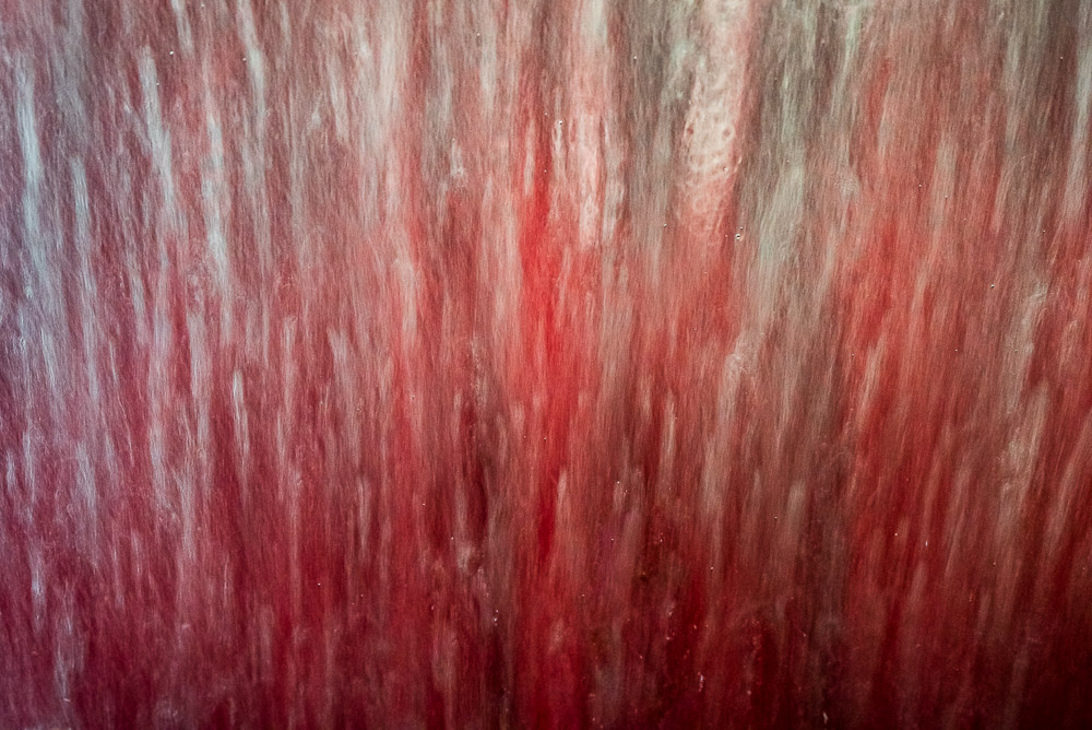
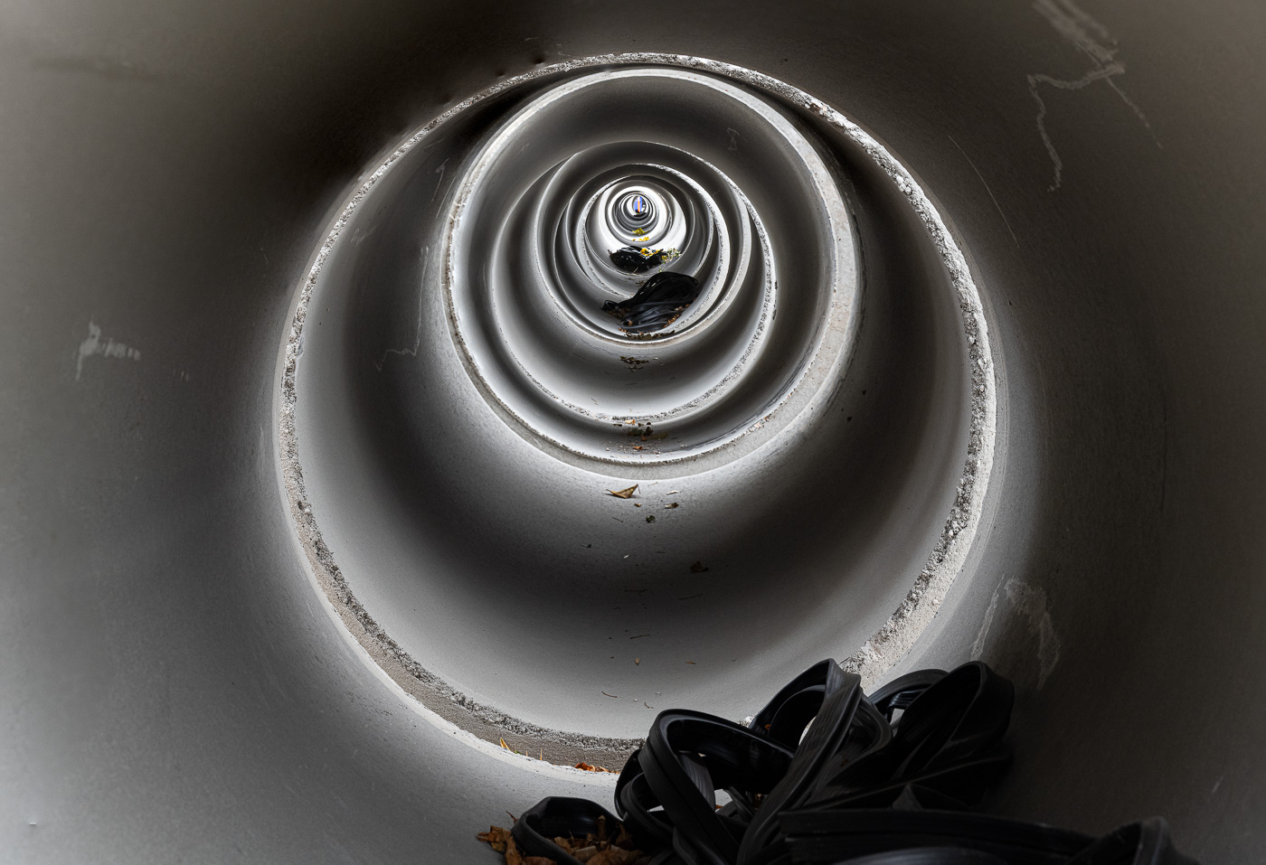
Bringing order

I love this challenge. The inner designer in me rises to it. It is a very satisfying mental exercise to try to mold a chaotic scene into a clean and appealing image. This is one of the defining characteristics of photography. Painters start with a blank canvas and selectively add only the elements they want for their scene. But photographers must start with an existing, disordered scene and simplify it.

We have many techniques to apply to do this. Lens selection will widen or narrow our field of view. We can change our point of view to include significant parts or exclude distracting elements. Selective focus can emphasize the areas of attention. Exposure can be used to darken or blow out parts of the frame where you don’t want any detail. Long exposure can change moving elements into a different graphical design. These and other techniques give us great control over the arrangements of the parts.
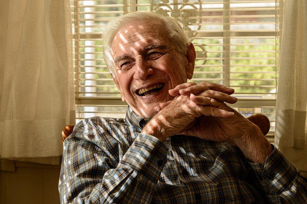
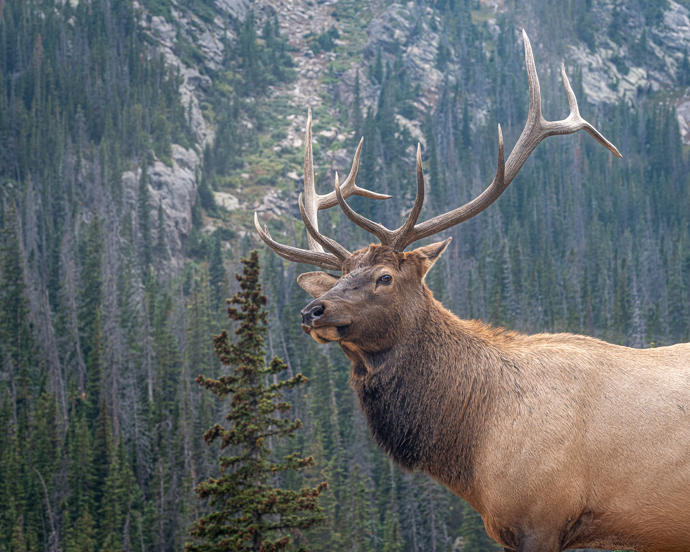
But above all, it is a design challenge. We have to decide what is key to the scene and how to emphasize that and minimize distractions. Is it the S curve of a river or the graphical arrangement of branches? Is it the forms or the leading lines that draw the eye a certain way? Most scenes can be arranged to bring an interesting view. Some more than others, but most can be improved.
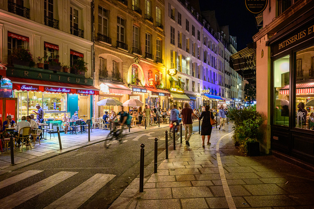
Refine

Following on from a previous post, we need to very consciously work to refine our design after we set it up. This is a weakness of mine that I plan to improve. I have long training in composition. When I walk up to a scene I tend to do a tremendous amount of subconscious evaluation to select a composition. My natural tendency is to set up and shoot what I visualized as I came on the scene and stop without taking it further.

But I know that many designs can be enhanced by exploring variations. I will try to discipline myself to do this more diligently. Move – left, right, up, down – look for improvements in the composition with slight shifts. Look closely at the entire frame to make sure there are no distracting elements that could be eliminated by in-camera techniques. Walk more to see if a more dramatic change of viewpoint could help.

Most of all, I need to make sure I look and think. What I have is good, but can I make it better?
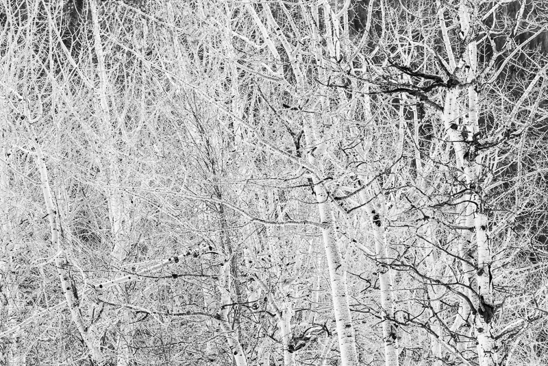
Don’t over analyze

A caution, though. Don’t over analyze the situation. Design and creation should be an act of joy. When you are learning new techniques it is normal to have to concentrate a lot on what you are doing. But try to get to the point where it flows naturally. To where you move with it and follow your instincts. Trust your instincts.

Shooting in the outdoors should be energizing. We should feel excited about what we are seeing and capturing. Don’t let the joy get sucked out for you. Creativity is exciting and invigorating. Most of us aren’t going to get rich at this. We should at least have fun and feel satisfied.

This is a journey of discovery. Enjoy the journey and have fun!

Note on the image

The image in this article is personally satisfying to me. It is a location that brings me joy and that i return to as often as possible. Despite wading through mud, swatting mosquitoes and trying not to slip in and get swept downstream, I loved the scene. I did follow my advice in 2 significant ways: I worked it until I got to a composition I loved, and I had a great time.

I hope you will find scenes that bring you such joy.

Move

Carefully composed plains shot

No, I am not suggesting you should uproot and relocate. Or join the great resignation and quit your job. These can be beneficial at times, but it’s not what I am talking about. I’m simply saying that art is a physical process. We need to move freely when we are are exploring for images.

Taking root

Certain of the images I shoot require a tripod for rock solid sharpness. I actually like this, because it brings a discipline to the process. There is a trap many of us fall into, though.

When we set the tripod down it’s like it takes root. We’ve gone to the trouble of setting it up, leveling it, composing a shot, and we tend to not move it. It creates inertia. But perhaps that first place we put it was not the optimum location. We need to tell ourselves there is a better placement and we need to find it.

Use your feet

When finding the right angle for a shot…’Move your ass’.” – Jay Maisel

Photography is a physical activity. At least for the type of outdoor photography I do. I walk. I stop and frame up a scene and take a picture. At this point, though, do I go on or explore options? Either answer is right depending on the situation. But are you confident enough in your compositional prowess that you know you got the best shot of the scene?

I have learned the hard way that many scenes can be improved by “working” them some. Take some more time. Move. Try another angle. Get higher or lower. Take a few steps to the side to eliminate a distracting background. Wait a minute for the light to improve.

In other words, once I have the shot, I need to look for ways to improve it. Most often, this involves moving, walking, squatting, thinking. One of the great technical advancements of digital photography is that we can see our image immediately. We can examine it and critique it to see how it could be improved. Do it if you have the time and opportunity.

I tend to quote the great Jay Maisel a lot. He is very quotable. Here is one that elaborates some on this idea:

“You find that you have to do many things, more than just lift up the camera and shoot, and so you get involved in it in a very physical way. You may find that the picture you want to do can only be made from a certain place, and you’re not there, so you have to physically go there. And that participation may spur you on to work harder on the thing, . . . because in the physical change of position you start seeing a whole different relationship.” – Jay Maisel

Try variations

A great scene often has the opportunity to explore variations. Change the crop. Go in for closer detail. Vary the exposure. Look for an angle that shows better shape or lighting or gets rid of distractions. Moving even a step or 2 can make a large change. Out constant attitude should be, “yes, that’s good; how can I make it better?”.

Again, an advantage we have with digital imaging is that shooting these variations costs us almost nothing. Yes, we have to edit them, but the reality is, that is an embarrassment of riches. We might end up with 10 great images of the scene to choose from. It can be hard to pick the best.

Moving is an attitude

This sounds weird. Moving is an attitude? What I mean is that we should always be ready to explore chances of improvement of a shot. Don’t let our tripod get rooted. Have the flexibility to let ourselves try a different angle. That often involves physical movement.

I believe I have missed many great opportunities by shooting the first composition I saw. I now try to make myself explore variations and be willing to move. One of the great influences in framing a scene is the position you shoot from. And as Jay said, moving and trying new ideas gives us a new perspective on the scene.