I have written about using the frame to our advantage. But it is important to also be aware of what is happening outside the frame.
The frame
The frame is one of the most powerful drivers in photography. We need to learn to use it, to compose within it, and, as I said, to dance with it.
An image can only be what is in the frame. That is all our viewers can see.
But I don’t want to leave the impression that nothing else is important. As artists and people, we also must be aware of what is happening outside the frame. We often can use it to our advantage. The image is finalized within the frame, but it often depends on a larger area.

Context
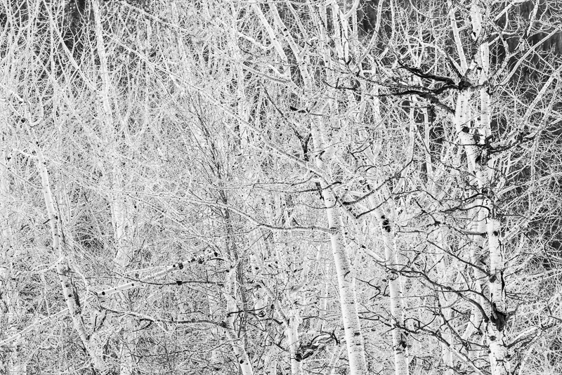
Every image has context. We may isolate an image to reduce the specific context and make it more universal. But context is there, and it is important.
The scene we photographed was part of a context. The context gave locale and meaning to the scene. We must be aware of that and decide how to use it.
Sometimes we use part of a scene to represent something more universal. A shot of half dome in Yosemite is a shot of half dome. It is so unique and recognizable that that is all it will be. But a picture of a mountain cascade can represent the idea of mountain cascades almost anywhere in the world. Depends on your intent.
Do you want to represent this specific scene or are you making a statement about things like this in general? Part of that is managing the context.
 ©Ed Schlotzhauer
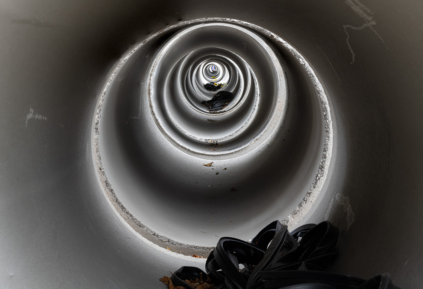
Action path
Sometimes action is happening out of the frame that is significant to the composition we are trying to make. If we are shooting sports, we could set up the desired shot with the background or lighting we want and wait for the runner (or bicyclist or race car or football player or whatever) to move into the position we anticipate. For this to succeed, we must be very aware of the action that is happening. And we must be familiar enough with the activity to expect to be able to predict the path of the action.
I have heard many street photographers talk about setting up the shot they want then wait until someone moves into the perfect position. That takes anticipation and awareness of the movement of others around us. And an understanding of the paths people are likely to take within a scene.
And patience.
 ©Ed Schlotzhauer
Danger
Let’s not overlook that there are potential dangers outside the frame that we need to be aware of.
Say I am concentrating on setting up a landscape scene. I am completely focused on the viewfinder as I perfect the composition and decide on exposure. But if a mountain lion is stalking me, I need to know about that. The reality is that it is unlikely, but it is part of the awareness I need to maintain.
A more realistic example is a street photographer. Is the location safe? Am I annoying people and starting to attract unwanted and potentially dangerous attention?
Or take a sports photographer. They must stay aware of the action happening on the field or the track. There is a normal flow to sports action that allows us to anticipate situations. But there are those rare and exciting moments where something unexpected breaks and we must be ready. Maybe a pass interception in a football game, maybe a runner missing a hurdle and falling, maybe race cars crashing. The breaking action could lead to the signature picture of the event, or it could be dangerous to the photographer. Or both.
This is generally called situational awareness. It is important for keeping us safe and it is useful for making better pictures.

Interacting outside the frame
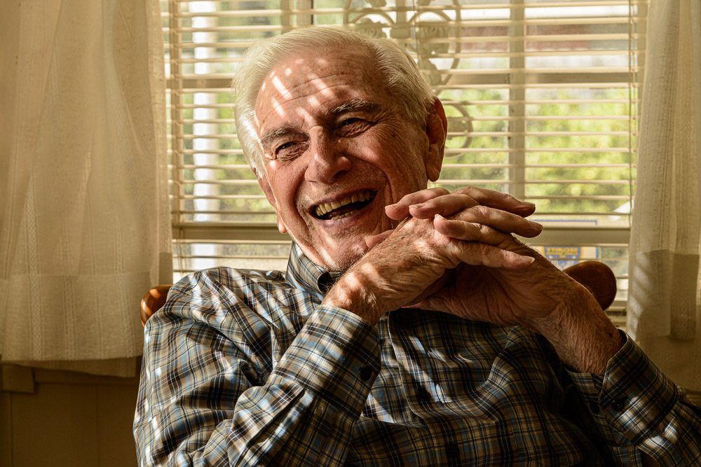
I said that a viewer can only see what is withing the frame. That’s literally true, but not the end of the story. Some creative photographers have subjects deliberately looking out of the frame. As viewers, we know from experience that they are interested in or interacting with something unseen. That can bring a heightened engagement. It arouses our curiosity about what is going on.
Our subject could be staring intently at something out of the frame. A quarterback could be passing the ball to an unseen receiver. An archer could be at full draw, ready to release the arrow. But at what?
These are examples of action outside the frame influencing what is going on within the frame. It makes the viewer guess what is happening.
 ©Ed Schlotzhauer
Better images
Many images happen in a context. Understanding the context and working with it instead of against it often leads to better pictures. We create the image within the frame, but events or context outside the frame can strongly influence what we do.
Action happens and moves into our frame. Often that is what we desire. We must anticipate and plan for that action and be aware of it happening.
We must also maintain situational awareness of what. is happening outside the frame. This helps to keep us safe. If we get run over by a truck, we will probably stop making creative new pictures.
These ideas only discuss the physical situation when we are shooting. Many, many other things outside the frame influence us. Our attitude, how we feel, our knowledge, our curiosity, and our life experiences all impact us.
It is hard to overstate the importance of the frame, but the frame is not the universe of everything significant to a photographer. There is a world outside the frame that impacts the world inside the frame. We must balance them.
 ©Ed Schlotzhauer
 ©Ed Schlotzhauer
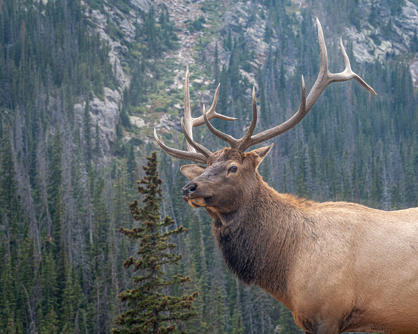 ©Ed Schlotzhauer
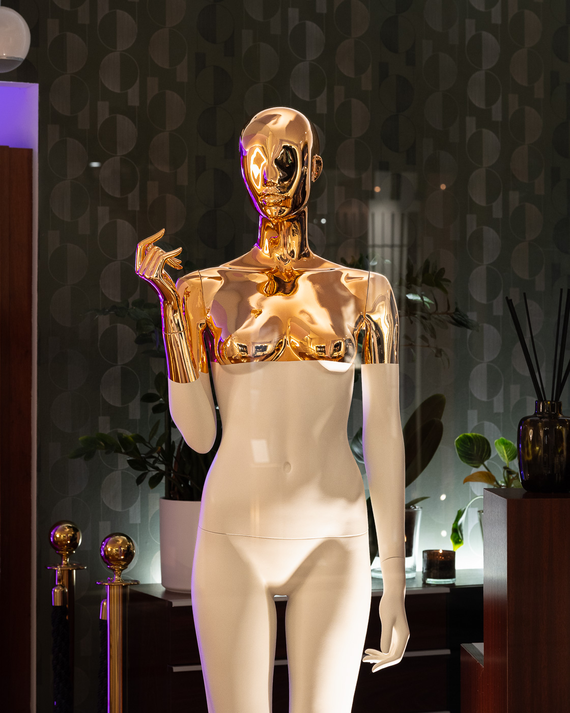 ©Ed Schlotzhauer