An artists journey

Blog

  • Raw Material

    Raw Material

    I have come to consider many of the images I shoot to be raw material. They don’t become a finished picture until I have worked the raw material in post processing.

    Bits

    Today’s cameras are great generators of data. Every time I press the shutter I am sending around 50-60 MBytes of data to my memory card. And that is using a compressed RAW format.

    A funny thing happens, though. The more data there is, the less the importance of each bit. For instance, even though my camera has great metering and a live histogram, I may shoot several frames of the same subject. This will allow for minimizing motion or camera shake. Or, if I am intentionally moving the camera (intentional camera motion) I will shoot many frames to up my chance of getting a keeper.

    I never would have been so “wasteful” with film. It was too expensive. But digital images seem free. The perceived value of any frame is smaller.

    But a side effect of this commodity view leads to a different relationship with the image data. It is no longer necessarily a “picture” as an indivisible unit. It is data. I feel more free to repurpose any of the picture data for other uses.

    Repurposing

    So now I have new ways to look at an image. Maybe I like its texture and want to apply it to another image. Maybe there are one or more elements in the picture that I think would be good included in another image. There could be a form structure that could be used to build another image.

    I have moved from a “take it or leave it” judgement of an image as a whole to a sense of “parting out” a picture to harvest the good parts. That is so much easier now than it ever was in the past. The tools are there, it is a matter of adjusting the mindset.

    Post processing

    In today’s world, post processing is where a lot of the magic happens. Photoshop and Lightroom and some of the other editing programs have developed marvelous feature sets. They can handle large files and 16 bit depth and work comfortably in good image spaces like ProPhotoRGB, Photoshop is the choice (IMHO) for heavy duty pixel pushing.

    It is almost (not quite) true that is you can think it, you can do it. The tools are not perfect, but they are so good that, for the most part, they stay out of the way and let us create fluently with them.

    A lot of us have come to believe that a picture does not become a picture until we have spent some serious time in post processing. There is no reason anymore to be limited to what we originally captured, unless it turned out to be exactly what we want.

    Vision

    We artists are no longer “stuck” with what we captured at the moment we pressed the shutter. We have huge latitude for changing the look, the content, the color, and the whole feeling of the image.

    Some people are threatened by this, but I see it as an opportunity to realize my vision. There are few excuses any more. Photography is very different from painting, but we have one new similarity: if we can think it we can create it.

    Emotion

    To bring you a good image, I have to show not only what I saw but how I felt about it. Revealing the emotion behind it is easier now. Because we do not have to take the original bits of the image as fixed and unchangeable, we can add or subtract as necessary to achieve the effect we desire.

    This can be a very freeing and empowering realization. Those of us who have done photography for a long time have to re-learn how to approach image making. We have to give ourselves permission to do any amount of modification, even to the point of completely creating a new work out of raw material from others. But it gives us a medium for expressing ourselves more fully.

    This image

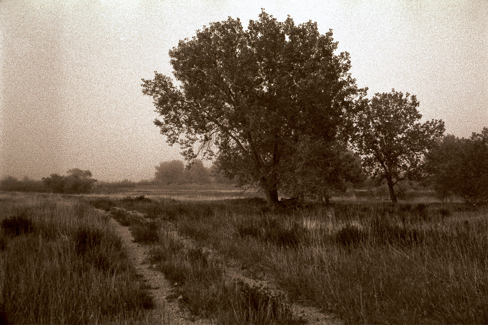
    The image with this article is an example. That is not what the original scene looked like. No in-camera technique could have given the resulting image. A lot of Photoshop time was spent in blurring the image except for the evergreens. It is not what I saw when I was there. I did not even envision this at the time. I spent time thinking about surreal variations and eventually visualized this.

    Dishonest?

    This is not dishonest. It is the same thing as a painter painting in what he likes and leaving out what he doesn’t like. The end result is art, not documentation.

    Art is neither honest or dishonest. It is art. It means what the viewer takes it to mean. We are long past the time when we assume a photograph is “truth”. We should assume that every image is altered, composited, tweaked, and blended. That’s not just OK, it is healthy.

  • Evolution of an Image

    Evolution of an Image

    Not all images follow the same life cycle. Sometimes it is pretty straightforward. See a scene; click; some post processing; done. Other times the path is winding, even circular. It is impossible for an image to be ready for a final print right out of the camera. Sometimes that shows an evolution of the artists perception of an image.

    Of something

    A lot of very good pictures are simply images of something. We find a lovely or interesting scene and we take a picture. Yes, we work the scene, find a good position to make a good composition. Wait for great light. Then make the shot.

    It represents something real and concrete. It is what it is. There is nothing abstract or surreal about it. No hidden meaning. As I write this I am on a trip going through a part of the country that has lots of beautiful trees. I am shooting a lot of pictures of trees. Just because I like them. And they’re all around.

    Most of these images, though, are ending up being just pictures of trees or fields. That doesn’t mean I don’t like them, but they are straight forward record shots of a scene I saw. It is the rare one that seems to actually have something deeper to offer.

    About something

    A goal is to bring something more than just a “here is what I saw”. I hope to occasionally make a statement or observation that will be helpful or insightful. Hopefully, I can bring you something more than just a pretty picture. I can only reveal to you what I emotionally reacted to at the time. It is up to me to react to the scene and be able to bring some of that to you.

    This is a wide grey area. One person’s “depth” may be another person’s “duh”. My perception of the significance of something may be different from yours. All I can do is to say what I think. I cannot control how you receive it.

    And the degree of depth or insight will vary all over the place. An image may have insight on something of human nature, or it may be humorous, or it may be ironic, or it may make a statement about the march of time or environmental issues. Good images do not have to be deeply serious. Few of mine are heavy commentary on social issues. My reaction to the world is governed more by joy and gratitude.

    So when you see my images, assume they probably have some insight I have perceived about the scene or subject. It may not be dark and depressing, but that does not take away from my intent to say something.

    A life of its own

    Sometimes, though, an image takes on another direction, a new life. I occasionally recognize that the original image is not complete or fully formed. It may need to be combined with other images or heavily worked to change it into something different.

    Take the image with this article for example. It started out a fairly interesting shot out of a favorite restaurant window. This particular window had 100+ year old glass that was wavy and distorted. Blurred in the background were some downtown buildings, trees, awnings, etc. I liked the scene and shot it repeatedly until I captured the impression I wanted (many lunches there!).

    But I was not happy with it as it was. It was an abstract view of downtown, but it was too abstract to be an effective representation of a downtown street, but not abstract enough to become something completely different and interesting in it’s own right. So I decided to go much further.

    Ah, the joys of Photoshop. It is fun to play sometimes. I added textures and played with colors and saturation and hues. Some overlay patterns gave it more definition and shape. Pretty soon it had nothing to do with the downtown scene I originally liked. If you sat where I shot the picture and looked out the same window, you would not recognize it.

    The image now has a life of its own, completely independent of the original scene. I like it. It is a fun creative exercise. But I have to find the right base images to work with. And I have to form a vision of where I want to go. Only a few images are good subjects for such a treatment.

    It means what it means

    Coming to this point requires me to address the question of what does an image “mean”? Can a picture have a meaning? Does it have to?

    There seems to be at least 2 opposing groups. Some say a picture is worthless unless it means something. The other says very few pictures can have an actual meaning, except for some photojournalism. As in most things in life, I range somewhere in the middle. Generally I say don’t take yourself so serious. A good picture can just be a nice, pleasing picture. If I have the opportunity to make images with meaning I usually will, but I don’t want the meaning to get in the way of the quality of the image.

    I get frustrated with people who are so sincere and focused on something that is important to them that they feel everyone must share their angst. Lighten up. First make art.

    I do make images with meaning, especially if I am shooting a project that is fairly serious. When I have the filter of a project in mind my focus tends to narrow to the subject. But unless it is a particularly dark and depressing subject, I want to concentrate first on making art. I tend to avoid the really dark and depressing projects. That is just not me and I don’t think they would make your life better.

    Summary

    The vast majority of the billions of photographs shot each year are record shots of something. They serve to capture a memory or mark an occasion. This was their intent and the work for that.

    A small percentage of photos and paintings go further and reveal something interesting. Maybe it is a new insight on a subject. Maybe it is just the artist’s emotional reaction at the time. But we look at them and often agree that they bring something deeper than just a snapshot.

    Or sometimes a picture becomes a thing in itself. Not a representation or even an interpretation. It just exists as a new creation. A lot of abstract and surreal art is like this.

    In my case, I am a lens-based artist. That means I start from something concrete – an image – rather than a blank canvas. Sometimes as I live with an image and think about what it could be, I morph it into something new. That is the case for the image with this article.

    I’m not saying this is a desired evolutionary path for an artist or that some steps are better than others. But artists tend to evolve their skills and viewpoints as they mature. I have observed myself moving through a progression. More and more of the images I like are abstract.

  • Unrecognized

    Unrecognized

    Sometimes things are right there staring us in the face. But we don’t or can’t see it. We fail to see what should be obvious. This in an internal problem. We don’t get to blame anyone else. Don’t go through life with unrecognized interest all around.

    Unrecognized artist

    “Unrecognized” is a fairly ambiguous word. Well, not really ambiguous, it is just that it can be applied so many ways. One of the first things that comes to mind when I hear the phrase is my sadness at being an “unrecognized” artist.

    Even though I have sales and good gallery representation and I get exhibited, it feels like nothing. Failure. I seek to be more widely known. A goal is to share my vision with many more people.

    But this aspect of “unrecognized” is not what I am discussing in this article.

    Unrecognized beauty

    Most people I know sort of drift through life in a daze. We follow our normal paths, doing basically the same thing all the time without really seeing things around us.

    If we recognize the rut we are in, we can climb out. At least enough to make a difference. Just deciding that we are going to pay more attention to things around us will go a long way.

    There is beauty all around us, even if you live in a city. Disappointed that you don’t live in Yosemite? Get over it. Learn to appreciate where you are. Even if you are not thrilled with your environment, by learning to look more closely we can usually find things, even little things, to brighten our day. Is there a flower, or a tree, or a pattern of light and shadow on a building that catches your eye? Look at it. Stop and take a moment to appreciate it.

    This will grow a habit of mindfulness. It will help us become more aware of what is there and more grateful of the little scenes that brighten out day, make us feel more alive.

    Unrecognized self

    Many of us, I’m pointing to myself, too, have trouble recognizing where our creative instincts are leading us. We change all the time. It can be hard if we feel like we are starting to be recognized for a certain style or subject. We fear that changing would lose our market. But at least that person is aware of what is going on. Most of us, I feel, one day realize that what we are drawn to is different from what we have been practicing for a long time. This can shake us to our bones. But it can also be refreshing and invigorating to re-align with where our subconscious is directing us.

    I think this quote from a very good photographer from the past, David Vestal. is enlightening.

    As we work, we come to know more and become more patient and less inclined to rush past our own work that we don’t yet recognize. Now I am quicker to see in my own new work the “accidental” good photos that I used to ignore.

    Mr. Vestal points out 3 key things that are common and key to our artistic growth.

    Know more

    As we practice our art we learn. Our technical abilities grow and our creative capabilities are stretched. The more we learn the deeper vocabulary we have to express what we see and feel. We also have more ability to examine our art and critique it.

    If we’re lucky, we even get to a point where we know what we don’t know. But the path of knowing more sometimes means we grow away from the positions we held in the past.

    More patient

    Mr. Vestal describes part of the growth process as becoming more patient. With ourselves. I know for myself, I feel less need now to shoot quantities of images. I used to be in a frenzied rush to capture everything that was the least bit interesting. These days I will usually come back with fewer images. I can see something nice and not feel the need to take a picture. Sometimes it is sufficient to just acknowledge it and appreciate it. I would rather have a few images that excite me rather than a whole pile of “OK” pictures.

    I think this also applies to our results and growth as an artist. Have you ever found yourself trying to “force” a great image. I do. Maybe less than I used to. As I grow I am more interested in trying to see more clearly what is there and understand how I perceive it, what I want to do with it. Sometimes it doesn’t come. Rather than be a big frustration, it is an opportunity to try to figure out why.

    Have you ever come upon what would be one of your “standard” images, one you would always shoot, and said, “no, that doesn’t interest me today”? Something is speaking to you to tell you you have grown to a new position.

    Recognize

    To me, the phrase in his quote “less inclined to rush past our own work that we don’t yet recognize” is brilliant. I sometimes run across something while I am looking for a particular image. Something I didn’t think was very good, but for some reason I kept it. Looking at it some time later I liked it much better. Sometimes I realize that if far more representative of my current vision that things I used to shoot.

    He describes them as accidentally good shots. I believe these accidental shots are sometimes our subconscious trying to show us something we don’t recognize yet. As we grow in our artistic concept, we have to leave the past behind. We become bored with what we used to proudly do. Recognize that feeling. Learn from it. It is time to move on.

    I have described before that I tend to be fairly brutal about culling out bad or uninteresting shots. Sometimes, though, I am compelled to keep an image that I don’t think I like. Sometimes I find, later, that this image is significant to me. It may even be a pivot to a new direction in my journey. I did not recognize it at the time, but I did perceive that there was something there that made me keep the image and come back to it later.

    Be receptive

    I believe we should learn to be more receptive to these signals our subconscious is sending us. The subconscious mind is more powerful than the conscious mind. It understands us better. It is not deluded by ego or financial considerations or social media followers.

    I have heard it said that this message from our subconscious is usually not a light bulb going on, it is more like a tickle on the back of our neck. That little feeling that there is something here we are missing or need to figure out. Maturity is learning to be aware of this hint and follow it to see where it leads us.

    How about you? Have you ever puzzled over an image you couldn’t figure out, only to recognize later that it was a harbinger of a new direction for your creative work? The way to a new creative plateau? Did you trust your instincts and embrace the new direction? What was the result?

    I would like to know! Leave a comment or email me.

  • Blessing of Technology

    Blessing of Technology

    I admit to starting to become a Luddite in some ways. I spent a long career developing and working with advanced technology, but I am starting to object to its misuse, especially by giant corporations and the government who spy and track and infringe our rights. But on the other hand, I occasionally step back and look at where technology has taken the art of photography and have to say “wow”. We live in the best of times for digital imaging. Technology can also be a blessing.

    Old books

    I think what precipitated this is that I have been going back re-reading my library of photography books. Many of these are by well-known experts of their day. It has been an amazing realization that many of the images in some of them would not be exceptional or even noticed today. And in some, the author’s discussion of the images was mostly about exposure and technical problems. Exposure used to be an overriding concern. We have come a very long way.

    In particular, I based this on going back over the following books. This is just a fraction of my library that I have looked at recently.

    • The Fine Print, by Fred Picker, 1975
    • Taking Great Photographs, by John Hedgecoe, 1983
    • The Photograph: Composition and Color Design, by Harald Mante, 2010
    • Learning to See Creatively, by Bryan Peterson, 1988
    • Photography of Natural Things, by Freeman Patterson, 1982
    • The Making of Landscape Photographs, by Charlie Waite, 1992

    Film

    Most of these books were based on film photography. It amazes me the degree of technical sophistication and planning that was required. For instance, in The Fine Print, most of the discussion about each image was about the film choice, adjusting the camera tilt/shift settings, exposure considerations, development chemistry, and printing tricks.

    Do you remember reciprocity failure and how to compensate for exposure degradation on long exposures? Do you know exposure chemistries and how to push process a negative to increase contrast? How about dodging and burning during printing? Or making an unsharp mask?

    I skipped this whole generation by shooting slide film during those days. This complex process of color or black & white developing and printing was not for me. And I’m an Engineer. I generally like complexity.

    I would say that many of the results I notice in these old books are “thoughtful”. They have to be. It was generally a slow process. It could take an hour to set up for a shot and determine the exposure and anticipate the printing that would have to be done.

    I am very thankful I was able to skip this. I am able to be much more spontaneous and intuitive in my shooting. My standards have become very different.

    Early digital

    Did you know Kodak invented digital photography? I bet they wish they didn’t. It put them out of business.

    The first prototype in 1975 was an 8 pound monster the size of a toaster. It took 23 seconds to record a blurry black & white image that had to be read by a separate, larger box.

    But unfortunately, for them, Kodak suffered the classic problem of large corporations with entrenched technology: they did not aggressively pursue the new technology for fear of cannibalizing their existing products. They could not convince management that they are going to be cannibalized, and they would be better off doing it themselves. This has put a lot of companies out of business. Who is your buggy whip provider?

    Many years of technology improvements and innovation were required before we got an actual digital camera, the Dycam Model 1 in 1990. The first practical digital camera, in my opinion, was the Nikon N8008s in 1992. It had a whopping 1.5 million pixels and could do color!

    Collecting pixels is not much benefit unless we can do something with them. Adobe Photoshop 1.0 was released in 1990 on the new Macintosh computer from Apple. Hard to believe there was a time before Photoshop. Or Apple 🙂

    Engineering improvements

    As a note on something I have observed over a long career: don’t underestimate the power of engineering. The early digital components were just toys, but they gave a hint of what was possible. Most people dismissed them as impractical, predicting they would never be at parity with film. Now even the most die hard film enthusiasts would be hard pressed to make a good argument that film is better.

    Engineers and scientists and manufacturers and marketers can do amazing things when there is a market to support them.

    An anecdote will illustrate. A friend of mine at HP developed the ink jet printer technology. It was black and white and pretty crude and slow. Not too long after the first one was made, he told me that someday I would take an 8×10 print out of one of these printers, in full color, and it would look every bit as good as a Kodak print. I politely told him he was crazy. But now, here in my studio, I have a 17″x22″ ink jet printer that makes color and black & white prints far better than commercial prints of a few years ago. Much larger printers exist, too. It stretches belief.

    State of the art

    Look at where we are now (mid 2022 when this was written). I shoot a 47MPix mirrorless camera. The lenses have better optical properties than ever before. They support the full resolving power of the camera sensor.

    I can shoot great quality at much higher ISO speeds than has ever been possible.

    This camera has abandoned the optical viewfinder and has gone to a marvelous little video display instead. It shows a wealth of information that photographers in the 1990s and before would never have dreamed of. Or I could chose to see the information on the camera back instead.

    Since the camera is mirrorless, the sensor is live all the time, continually measuring exposure across the entire frame. No more 18% gray reflected light meter to interpret. And this exposure information is real time displayed for me as a live histogram, focus tracking, etc. Whatever I choose to see.

    Exposure is a minor consideration most of the time. I am usually in Aperture Priority mode and the camera’s internal computers do a wonderful job of accurately determining exposure from the data it can see from the whole sensor. Plus I have the histogram to look at to check for abnormal conditions. And the sensor has such an exceptional dynamic range (range of light capture ability from darkest tones, to brightest) that even if I miss the exposure by a stop or 2, I probably have sufficient data to correct it in the computer. Besides, I can immediately review any image to double-check it.

    An embarrassment of riches

    I am almost embarrassed to have all this power at hand. Compared to image making of a few years ago it is like going from Morse Code to an iPhone.

    I don’t worry much about exposure now. I can see what I am about to capture. Even before shooting I know from the histogram that it will be well exposed. I can immediately review any images to verify them. No doubts. No anxiously waiting for the developed film to come back to see if I got the shot.

    This technology frees me from most of the mundane technical concerns and lets me concentrate on composition and creativity. The resolution and tonal detail in my images is the best in history. The computer processing power and tools are the best in history. Printing or display of images has never been better. The ability to transfer even huge files anywhere in the world in seconds is amazing and unprecedented.

    Thank you, technology! It is a golden age of imaging. We have a blessing of technology.

  • Out of Gamut

    Out of Gamut

    That seems like a strange thing to say. It’s not a phrase you hear in normal conversation. What can it mean? I have written some about how sensors capture color, but I realize I have not mentioned the gnarly problem of color gamut. Unfortunately, I have been bumping into the problem lately, so I had to re-familiarize myself with it. Some of my new work is seriously out of gamut.

    What does gamut mean

    Most writers avoid this or give overly simplified descriptions. I’m going to treat you as adults, though. If you really are someone who is completely afraid of technology you might want to skip to the end – or ignore the whole subject.

    The concept of gamut is really pretty simple, but you need some specialized knowledge and you have to learn some new things about the world.

    I have mentioned the CIE-1931 Chromaticity Diagram before. That sounds scary, but you have probably seen the familiar “horseshoe” diagram of colors. I recommend you watch this video to understand how it was derived and what it means. This is the diagram:

    CIE-1931 Chromaticity Diagram

    After a lot of research and a lot of measurement, scientists determined that this represents all possible colors a typical human can see. Just the hue – color – not the brightness.

    Very simply, a gamut is just a representation of what part of this spectrum a particular device can reproduce or capture.

    Show me

    The next figure shows the horseshoe with some regions overlayed on it.

    Add ProPhoto colour space as a "working color space" - Which feature do you need? - DxO Forums

    There are 3 triangular regions labeled: sRGB, Adobe RGB, and ProPhoto RGB. They are called color spaces. The diagram is indicating all possible colors that each color space can represent. The smallest one, sRGB, is typical of a computer monitor. It is what will be used when you share a jpg image with someone. It is small but “safe”. We lose a lot of possible colors, but everyone sees roughly the same thing on all their monitors.

    Let’s jump to ProPhoto RGB. You can see that it covers the largest part of the horseshoe. In other words, ProPhoto RGB has the largest gamut. It is the best we have for representing image color and most professional photographers use this now. Unless they are doing weddings. That is a different world.

    They’re not ideal?

    Unfortunately, these color spaces are an ideal. The ProPhoto color space is a model for editing images. No actual devices or printers can give us the entire ProPhoto RBG gamut. Not even close. Most can barely do sRGB.

    Here is a diagram of the color space a Canon pro printer can do.

    The small horseshoe, labeled 4, is the printer gamut. It is larger then sRGB (3) and, overall, a lot like AdobeRGB (2). Smaller than ProPhoto RGB, which is not listed here.

    It looks pretty good, and in general it is. I use one of these printers. But look at what it does not do. Most greens and extremes of cyan and blue and purple and red and orange and yellow cannot be printed. Actually, almost no extremely saturated colors can be printed.

    And it is not just printers. Most monitors, even very good ones, are somewhere between sRGB and AdobeRGB spaces. This cannot really be considered a fault of the monitors or printers. The physics and engineering and cost considerations prohibit them from covering the full ideal range.

    Any of these colors that I use in an image, that can’t be created by the device I am using, are referred to as “out of gamut”. Outside of the color space the device can produce. This is what I have been running in to lately.

    What happens

    So what happens when I try to print an image with out of gamut colors? Well, it is not like it blows up or leaves a hole in the page instead of printing anything. Printers and monitors do the best they can. They “remap” the out of gamut colors to the closest they can do. As artists, we have some control over that process, as we will see in the next section.

    But the reality is that these out of gamut colors will lose detail, be washed out and without tonal contrast. When we get to looking at the print, we will say “yech, that is terrible”. Then we need to do something about it.

    What can we do about it

    There are things to do to mitigate the problem. Here is where we need to understand enough about the technology to know what to do.

    First, we have tools to help visualize the problem. Both Lightroom Classic and Photoshop have a Soft Proof view. It will simulate the actual output for a particular printer and paper. You can also view gamut clipping for the monitor. Yes, because of gamut problems you may not be seeing the image’s real color information on your monitor.

    Both Lightroom and Photoshop have versions of saturation adjustments and hue adjustment. These can help bring the out of control colors back into a printable or viewable range. With practice we can learn to tweak these settings to balance what is possible with what we want to see.

    But even if we give up and decide to print images with out of gamut colors, there are options. the print settings have a great feature called “rendering intent”. They are a way to give guidance to the print engine on how we want it to handle these wild colors. Several different rendering intents are available, but the 2 that are most commonly used are Relative and Perceptual.

    Rendering Intents

    I use Perceptual intent most often, at least in situations where the are significant out of gamut colors. Using the Perceptual directive signifies to the print driver that I am willing to give up complete tonal accuracy for a result that “looks right”. The driver is free to “squish” the color and tone range in proportional amounts to scale the whole image into a printable range. I don’t do product photography or portraits, so I am usually not fanatical about absolute accuracy. How they work this magic is usually kept as a trade secret. But secret or not, it often does a respectable job of producing a good output.

    The other common intent is Relative. This basically prints the data without modification, except that it clips out of gamut colors. That sounds severe, but the reality is that most natural scenes will not have any significant gamut problems, so no clipping will occur.

    This is a great intent for most types of scenes, because no tonal compression will take place.

    The answer

    The answer is “your mileage may vary”. Most images of landscapes and people will not have serious out of gamut problems. When you do, this information may help you get the results you want. When you have a problem, turn on the soft proofing and try the Relative and Perceptual rendering intents. Look at the screen to see if one is acceptable. If not, go back and play with saturation and colors .

    Why do I have problems? Well, I’m weird. I have been gravitating to extremely vibrant, highly saturated images. I like the look I am trying to get, but it can be hard to get it onto a print. The image at the top of this article is a slice of an image I am working with now. It is seriously out of gamut. I need to work on it a lot more to be able to print it without loss of color detail. Ah, technical limitations.