Black & White – in Color

Forest in Florida. Good b&w application.

What? Isn’t that contradictory? Isn’t black & white is about the absence of color? I wanted to follow up on a previous article on how we get color information in our digital cameras with a nod to the purity of black and white and emphasize how it is still dependent on color.

Remove the color filter?

I indicated before that our sensors are panchromatic – they respond to the full range of visible light. If we want black & white images, shouldn’t we just take the color filter array off and let each photo site respond to just the grey values?

We could, but most black & white photographers would not be happy with the results. It would be like shooting black & white film. A problem with black and white film is that it eliminates all the information that comes from color. Through interpolation of the Bayer data, we get full data for red, green and blue at each pixel position. If we removed the filter array, we would have only luminosity data. So before even starting, we would be throwing away 2/3 of the data available in our image.

At that point we would have to resort to placing colored filters over the lens, like black & white shooters of old had to do. They did this to “push” the tonal separation in certain directions for the results they wanted. But this filter is global. It affects the whole image rather than being able to do it selectively as we can with digital processing. And it is an irreversible decision we would have to make while we were shooting. Why go backward?

What makes a good b&w image?

Black & white images are a very large and important sub-genre of photography. The styles and results cover a huge range. But I will generalize and say that typically the artists want to achieve a full range of black to white tones in each image with good separation. Think Ansel Adams prints.

Tones refer to the shades of grey in the resulting print. We do a lot of work to selectively control how these tones relate to each other. Typically we want rich black with a little detail preserved in them, bright whites, also containing a little detail, and a full range of distinct tones in between. These mid-range tones give us all the detail and shading.

Tone separation

If one of the goals of black & white photographers is to have high control of the tones, how do we do that? Typically by using the color information. I mentioned putting colored filters over the lens. This was the “way back” solution.

Landscape photographers like Ansel Adams often used a dark red filter to help get the deep toned skies they were known for. Red blocks blue light, forcing all the blue tones toward black.

Digital processing gives us far more control and selectivity than the film photographers had. We don’t have to put the filter over the whole lens and try to envision what the result will be. We can wait and do it on our computer where we have more control, immediate previews, and undo. But all this control would be impossible without having a full color image to work with. As a matter of fact, modern b&w processing starts by working on the color image. Initial tone and range corrections are done in color. Good color makes good b&w.

B&W conversion

Obviously, at some point the color image has to be “mapped” to b&w. This is called b&w conversion. It can be a complicated process. There are many ways to go about the conversion, and each artist has their own favorites. There is no one size fits all.

It is possible to just desaturate the image. This uses a fairly dumb algorithm to just remove the color. It is fast and easy, but it is usually about the worst way to make a good b&w image.

You could use the channels as a source of the conversion. The RGB colors are composed of red, green and blue channels. These can be viewed and manipulated directly in Photoshop. They can often be useful for isolating certain colors to work on. Isolating the red channel would be like putting a strong red filter over the lens.

Lightroom and Photoshop have built in b&w conversion tools. In LIghtroom, choose the Black & White treatment in the Basic panel of the Develop module. This has an interesting optional set of “treatments” to choose from in the grid control right under it. In Photoshop use the B&W adjustment layer.

Both of these have the power of allowing color-selective adjustments. This is huge. Tonal relationships can be controlled to a much greater degree than was possible with film. If we want to just make what were the yellow colors brighter, we can do that. Of course, Photoshop allows using multiple layers with masking to exert even more control.

There are many other techniques, such as channel mixing or gradient maps or plug-ins like Silver Effects to give different and added control. It is actually an embarrassment of riches. This is a great time to be a b&w photographer.

It starts with color

What is common to all of this, though, is that it starts from the color information. Color is key to making most great black & white images.

I sometimes hear a photographer say “that image doesn’t work well in color, convert it to b&w”. Sometimes that works, but I believe it is a bad attitude. B&w is not a means of salvaging mediocre color images. We should select images with a rich spread of tones, great graphic forms, and good color information allowing pleasing tonal separation. Black & white is its own special medium. Remember, though, usually it requires color to work.

It’s A Green World

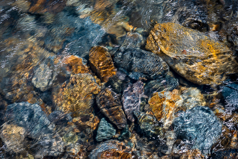
Colorful mountain stream. It uses a full spectrum of color.

That’s not an environmental statement. As far as our cameras are concerned, green is the “most important” color. I’ll explain why green is foundational to our photography.

Bayer filter

In my previous article I discussed the Bayer Filter and how it allows our digital cameras to reconstruct color. I made a cryptic comment that it was important that there were twice as many green cells as red and blue, but I did not explain. I’ll try to correct that. It is fascinating and highlights some of the brilliance of the Bayer filter design.

Bryce Bayer’s patent (U.S. Patent No. 3,971,065[6]) in 1976 called the green photosensors luminance-sensitive elements and the red and blue ones chrominance-sensitive elements. He used twice as many green elements as red or blue to mimic the physiology of the human eye. The luminance perception of the human retina uses M and L cone cells combined, during daylight vision, which are most sensitive to green light. ” This is quoted from Wikipedia. Let me try to unpack it a little.

Color description

There are several ways to describe color. Some, like the HSV or HSB or Lab models, separate the concepts of luminance and chrominance. Luminance is the tonal variation of a scene, the brightness range from black to white. Hue and saturation define the color value and purity.

It is all very complicated and, in reality, only interesting to color scientists. I strongly recommend you view this great video that explains how the CIE-1931 diagram was created and what it means. It answered a lot of my questions. As photographers and artists we have to be familiar with some of it. For instance, we have all seen a color wheel like this:

This is a simplified slice through the HSV space at a constant, maximum lightness. Such a model is useful to us because it shows all colors with their most saturated form at the outer edge and least saturated (white, colorless) in the center.

Our eyes

This is nice, but it is all possible colors, not what we really see. As the quote above about Bayer said, the eye is most sensitive to green. Green is right in the middle of the range of light we are sensitive to, the visible spectrum. Here is a plot of our sensitivity to visible color:

Subjective response of typical eye
From: https://lightcolourvision.org/wp-content/uploads/09550-0-A-BL-EN-Sensitivity-of-Human-Eye-to-Visible-Light-80.jpg

It is clear to see, just as Mr. Bayer said, we are most sensitive to green. This is why there are twice as many green cells in the Bayer filter as red and blue. The green is used to measure the luminance, the tone range of the image. This information is critical to deriving the image detail plus the color information through a complex set of transformations.

Why is is so important to get a good measure of luminance? Because of another interesting property of the eye. We are more sensitive to luminance than color. Luminance gives detail. Think of a black and white picture you like. That image is pure luminance information, no color information at all. Yet we see all the fantastic detail and subtle tones perfectly.

Color adds a lot of interest to some images, but we can recognize most subjects perfectly well without it. The opposite is not true in general. If you took all the luminance information out of one of your images it is basically unrecognizable.

Example

Here is a quick example of a typical outdoor scene here in the Colorado mountains. This is the original image:

If I convert it to Lab mode and take just the luminance channel (L) we get a black & white version containing all the detail and tone variation that makes it recognizable:

But now if I copy just the color information (the a and b channels) it is … surreal?:

Why green?

I hope I have demonstrated some of the reasoning behind the Bayer filter. It is a key to our ability to capture color information with our cameras.

The human eye really is most sensitive to green. Having half the color filters in the Bayer filter array as green allows maximum ability to construct the luminance data we are so sensitive to. The magic of the sophisticated built in data processing algorithms let the Raw file converters take all this information and derive the luninance and color information we rely on for our images.

Does this mean we should shoot more green subjects? No. I don’t. Many on my images have little discernible green in them. Take the image at the top of this article. I love the colors in this mountain stream. I don’t look at it and think “green”. The color range is very full, though.

As I write this it is the depth of winter here. Much of the shooting I do right now is very monochrome, almost black and white. The Bayer filter is not there to make our images more green. But if you look at your histogram or channels you may be surprised at how much green data is there. Think about it, a black and white image is 33% green.

Thank you Mr. Bayer and all the scientists and engineers who have done such a great job of perfecting our digital sensing over the decades. You are doing an excellent job!

What Is Color?

Great, saturated color

This is a fascinating question to me. Most of us do not stop to even ask the question, but it strongly influences much of what we do as photographers. So what is color? Is it the wavelengths of electromagnetic radiation? Is it just a property of the way surfaces reflect light? Or is it simply the response of our eyes to the impinging radiation? Or is it something more subjective?

Technical Details

Let me hurry through the technical details. Apparently few people care about actual technology.

Electromagnetic radiation is the way signals propagate through space. It is the mechanism of everything from radio through X-rays and gamma rays, including what we know of as the visible spectrum. For the really hard core, what we consider “light” is radiation in the range of 380 nm through 760 nm. This chart does a good job of visualizing this.

The rods and cones in our eyes are sensitive to these wavelengths of radiation that we call light. This provides the sensation of light and color that we perceive. Our window on the world is based on these hidden gems.

I go into this detail to make the point that light is not a “thing”. It is simply our response to a small range of electromagnetic waves. This is significant because much of what you will read about light in art is very “fluffy”. It supposedly has hidden meanings and deep psychological responses. Maybe it does. But don’t forget that it is basically a simple sensory perception. We each respond to color mostly the same, but a little differently. We are human, not a calibrated scientific instrument.

Perception

These rods and cones give us incredible perception of color and light. The very best digital sensors made cannot see the range of lightness values the human eye can resolve. The very best digital sensor cannot distinguish the range of colors the human eye can sense.

Digital images are represented as a grid of pixels. Each pixel contains 3 pieces of data, values for red, green, and blue. A very good sensor, mapped into a wide color space like ProPhotoRGB, can use 16 bits for each of these values. That gives 65535 steps for each color. This is only an approximation to what our eyes can do.

Because our eyes are so much better then the sensors, we sometimes have to exaggerate the image data we are working with in order to simulate what we remember seeing. Basically, we often have to trick the eye into believing there is more data there. That is because the eye can perceive more than what we can capture. It is also because the sensor is completely objective. It does not know what we feel when we see the image.

Objective or Subjective?

Color has to be objective. It also has to be subjective. Confusing? Yes, but most of the talk about color is.

I’m a professional print maker. As such, my work has to be reproducible. My computer is well corrected to ensure that the colors I see when I am editing are reasonably close to the “actual” colors of the original subject. Through a little more magic, my prints use color profiles for my printer/ink/paper type to make sure that what I print is as close as possible to what I saw on my computer.

This is objective use of color. It has known, fixed values and it can be reproduced over and over again. It may suck some of the life and spontaneity out of the process, but it is necessary to produce professional results.

Subjectively, though, things get interesting. Who says that color has to stay just like the “real” world it was taken from. As an artist, I am free to do anything I want to create a result I want. If I want a world of purple bananas and red oceans that is a valid choice for me. No one can say that is not right because the real world did not look like that. So to an artist, color is a choice, not a limitation or a fixed property.

Our incredible post-production tools allow amazing enhancement of – or damage to – our images.

Interpretation

Now, to get real, my world does not usually include purple bananas. But there is a big overlay between the objective and subjective worlds. Images that come out of the camera as RAW files are flat and dull and lifeless. They contain all of the data the sensor recorded, but not what I remember. I work many of my images to create the impression of color that struck me at the time I took the picture.

I would call this interpretation. I am selectively enhancing or changing the colors to recreate the impression I saw (or wanted to see). A color purist might see this as wrong, since I am changing the tonal structure of the image to reduce or exaggerate colors or contrasts. I am not a purist.

There is an irony here that is not lost on me – my systems are set up to deal with color very accurately, but then I sometimes alter the color drastically. What can I say? It’s art, not engineering.

Symbolism

The discussion would not be complete without touching on the mystical area of color symbolism. People can get worked up over this: no, that can’t be red because that would mean anger; no that can’t be white because that means death, etc. Some of these considerations are reasonable for some applications. If you’re an advertiser, you want to avoid chasing customers away.

But is color symbolism a real thing? Yes… but. A lot of it is cultural. And opinion. Colors seem to have different significance in different parts of the world. One representation of this is the Lüscher color test. It attemped to codify the symbolism of colors, at least to the western eye. Given that it varies for different people, it does not seem that the symbolism is a significant tool to use when creating art.

A small example of cultural differences: in the western world that I’m familiar with, financial reports mark upward trends in green and downward ones in red. In China, Japan, South Korea and Taiwan they are reversed. That is, red marks an uptrend and green marks a downtrend. A very simple thing but it can lead to a lot of confusion if you go “out of culture”. I am trained, in this context, to perceive green as positive and red as negative.

Emotion

Color does touch us on an emotional level. Not everyone reacts the same, but there are patterns and generalities.

It is known that certain colors produce rather similar reactions in people. Blues tend to be calming. Reds tend to increase energy. Yellow tends to cheer people up. So if I was creating an image where I wanted to create a calming mood, I would use a palate of blue and green. If I wanted to be bold and attention getting I would selects strong red and orange hues. This is not relying on the symbolism of colors, as far as meaning, but on general reactions across populations.

Like smell, color invokes a response in people. It is another tool that artists need to be familiar with and be able to use to their advantage. It can require a lifetime of study and practice.

What is color?

Coming back to the original question. Can we say what color is?

Not satisfactorily in a short blog. Color is electromagnetic radiation in a certain range. It is definite ranges of data represented by red, green, and blue values (in photography). Color is a property that invokes an emotional and/or a cultural response. It is so subtle and well measured by the human eye that we cannot yet capture it precisely in imaging or print all the eye can see.

In short, color is part of the magic we live with all the time and that we artists work with in various ways to create our art. Understanding the technology does not really help us understand “color”. Neither does treating it as a mystical spell. It is this wonderful stuff we perceive because we are human.

Even if I spend hours agonizing over mapping color tones and micro-adjustments of hue or saturation, that does not mean you have to know that in order to appreciate the image.

Enjoy! Don’t over-think it!