An artists journey

Tag: art

  • The Magic of the Lens

    The Magic of the Lens

    Do you ever stop to think about your lenses, besides wanting a shinny new one? There is a magic of the lens that we seldom consider and perhaps do not even understand.

    Many constraints

    My perception is colored by my background as an engineer. I see a modern lens as serving so many constraints that it is a wonder they do the job as well as they do. We expect high resolving power and “good” bokah. It needs to have a good zoom range but be small. It must be weather sealed and rugged, but inexpensive. And, of course, issues like low chromatic aberration and great edge to edge sharpness and low distortion and minimal light falloff (vignetting) and minimum flare are all givens. Oh and blazing fast auto focus, too.

    The poor lens designers are in a tight place. Luckily for them computer design tools have advanced greatly. Also, new materials are available to help overcome some of the design problems of the past.

    Still though, we ask a lot of a professional grade lens. Probably more than we realize.

    Simple lens

    We have an idea in mind of how a lens works. You probably did an experiment in High School Physics with a simple lens. Then you took it out and fried some ants.

    What we normally picture is a biconvex lens. Don’t let a fancy word scare you. That just means both sides are thicker in the middle than on the edge. Like this:

    By DrBob at the English-language Wikipedia, CC BY-SA 3.0, https://commons.wikimedia.org/w/index.php?curid=2065907

    The rays (red lines) illustrate how the lens focuses on a point. That focusing is what images the outside world sharply onto our sensor.

    This is true. It works. But nothing in life is simple anymore.

    Reality

    The reality is that, because of our high expectations and the piles of constraints to satisfy, real lens design has to be much more complex.

    I am going to use the Nikon Z 24-120 f/4 zoom as an example. For two reasons: it is a representative high quality modern design, and I like it – a lot. It is my go-to lens for everyday use.

    Lens design has gone far beyond the “simple” lens pictured above. Here is a cutaway of the Nikon lens:

    Photography Life: https://photographylife.com/reviews/nikon-z-24-120mm-f-4-s

    We can see that it has many lens elements (a word for a piece of glass in a lens) – 16 of them to be exact. Few of them are simple biconvex elements. Some of them are exotic glass. Things like high refractive index (they bend light more sharply than regular glass) or other properties. Some are aspherical. This means they are quite complex designs to achieve specific results. These are hard to design and manufacture. Usually they are necessary to correct for effects of other things and make the resulting image better.

    Zoom

    Let’s look at a few specific features. This lens has a 5x zoom range, from 24mm to 120mm. Now you would think that, for the lens to zoom 5x, it would have to get 5 times longer. This would be true for a straightforward design.

    However, us users of the lens would not like that. It would have to be very big and bulky to do that. And it would be awkward when zoomed all the way out. It would be long and off balance the camera.

    But complex design magic and some of those special lens elements allow them to shortcut physics. it zooms over the 5x range while only extending to less than twice it’s collapsed length. Amazing and very welcome.

    Reflections

    The real world is not a well behaved bundle of parallel rays coming into the lens, like in the simple lens picture above. Light is coming from everywhere. Most of it is what we want to end up on the sensor. But a lot isn’t. Light coming in from a sharp angle tends to “bounce around” inside the lens and cause a lowering of contrast. Kind of a fog look.

    Modern lenses have special coatings on the glass and use some of the special types of glass i mentioned to fight this. These go a long way to canceling the reflections.

    It used to be that shooting in the direction of a very bright source, like the sun would always cause unwanted internal reflections that degrade the image. Now it is amazing how little that happens. I really only worry about that if the sun is directly or nearly directly in view.

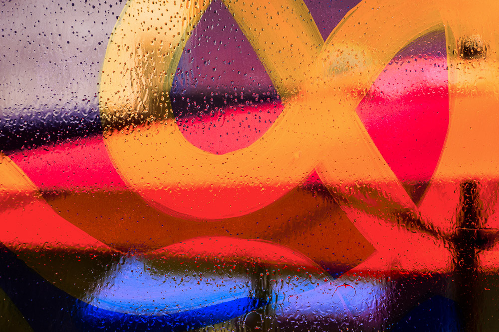
    Abstract study in texture and shape©Ed Schlotzhauer

    Chromatic aberration

    Chromatic aberration is something we seldom consider, except when we are getting down to the last details of a final print. One of the nasty realities of physics is that each “color” of light is a different frequency. The amount of “bend” the lens gives to light is dependent on the color (frequency) of the light. This means not all the colors focus at the same point. That’s bad.

    Have you every looked very closely at magnified blowup of a sharp edge in one of your photos? Especially if it is in a high contrast lighting situation. You may see a slight fringe of green or purple around the edge. This is called chromatic aberration. Not all the colors focusing together.

    One of the purposes of the exotic glass and all the elements in modern lenses is to minimize this. They do a pretty good job.

    But they are not perfect. Luckily it is a simple check box in Lightroom Classic to have the software automatically remove chromatic aberration.

    Other considerations

    If you ever carry a camera around all day you learn to appreciate light weight. Lens designers would like to design their lenses with a very sturdy metal shell and structure. But we would not like to carry that. Modern plastics and design techniques have allowed the designers to create our lenses at a more user friendly weight while still being sturdy enough to hold up to hard use. Thank you.

    Did you know that some lenses make the light come into the sensor is a certain direction to make the sensor receive the photons better? Did you know that most of our zoom lenses, especially, have quite a bit of distortion and vignetting and resolution falloff at the edges? Those are some of the things that are part of the tradeoffs. But one reason they are traded off is there’s a bit of perceptual and software slight of hand.

    First, we don’t notice it much. Really. We are not as sensitive to it as you would think. Unless you spend your time photographing test charts. Second, many of us set Lightroom Classic to look at the model of the lens and automatically apply a “correction” to the image we see. Adobe has a database of lenses with mathematical models to correct their distortions. This is a good thing.

    As a matter of fact, Nikon has a special deal with Adobe such that the great Z 24-70 f/2.8 lens is automatically corrected in Lightroom Classic, whether or not the user selects that. It is impossible to defeat it. Hardware and software are joining in a symbiotic relationship. Making an image is a blend of both and it will only increase with time.

    Almost everything done to solve one problem creates another. This is why designs are so complex and expensive. Everything is a tradeoff. It is all a question of how good can we make this property while not letting that other one get worse than a certain level.

    Example black & white image©Ed Schlotzhauer

    Magic

    I am in awe of these brilliant designers. They achieve beautiful balance. Like I said, I regularly use this example lens I have talked about and I am generally very happy with it. But let me emphasize that pure, unexcelled technical perfection is not usually my goal. A lens like this is “good enough” for 99.9% of my needs.

    For me, as a user, I take the camera out and start using it. What I see and feel is more important than technology. Sometimes, though, my engineer nature kicks in and makes me marvel at the complexity. But really, I shoot and expect my great gear to capture what I want. And it usually does. Marvelous.

    The magic of the. lens. Like most good magic, how it works is invisible to us. But occasionally stop to consider how lucky we are and what an incredible piece of technology we have attached to our camera body.

    Feature image

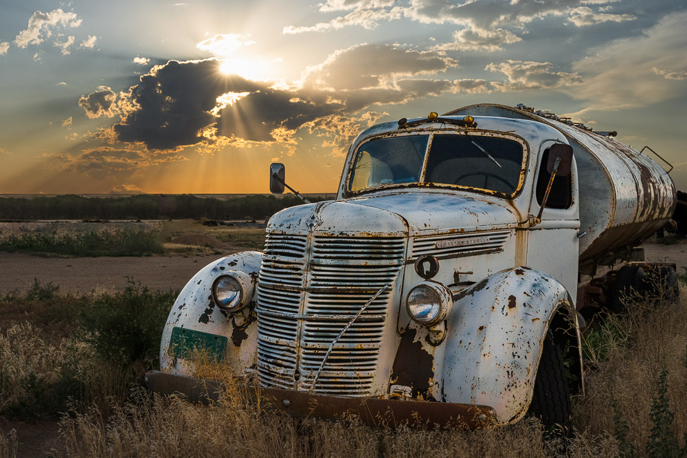
    The image at the top was shot with this Nikon Z 24-120mm f/4 zoom lens I have been using as an example. This is the Hotel de Ville in Paris – their Town Hall. You can’t really tell in this small jpg, but I am completely happy with the capabilities of this lens. If the opportunity arose I am sure I could make a very good 60″ print of this. Here is a section of it zoomed to 100%.

    100% section, ©Ed Schlotzhauer

    Let me assure you that I am not affiliated with or sponsored by Nikon. I am just using this nice lens that I use frequently as a representative example of what a modern zoom lens is and is capable of doing.

  • Have an Opinion

    Have an Opinion

    I spent most of my photographic career just recording scenes. But now I think you probably won’t make a compelling image unless you have an opinion and express it in your art.

    Just the facts

    I started mostly focusing on just the facts. My goal was literal representation of scenes. I wanted to capture what was actually there, with no interpretation. I regret that.

    Being an engineer didn’t help. It is very easy to get caught up in technical details of resolution and depth of field. My excuse is that I grew up in Texas and moved to Colorado in my early 20’s. The mountains were new to me and I wanted to record everything I could. I was basically running around saying “Wow, look at this! I never knew this existed!”.

    If I had an opinion about it, it was something like awe and excitement about the new landscape. I took a lot of accurate, factual representational pictures back then, but very few are in any of my current collections. Beautiful images some of them, but little depth. Not compelling.

    Is it interesting?©Ed Schlotzhauer

    What makes it special?

    What makes an image special or worth lingering over? That is a hard question. Great photographers have been wrestling with that for 150 years. Painters have been agonizing over it for hundreds of years. There are no rules or definitive answers (despite all the rubbish you may find on the internet).

    I am not in a position to give you a definitive answer either. If I could it would make my art a lot easier to do.

    I think we can agree that some images jump out at us or hold us to linger over them. If we can agree on that then we can agree that there must be some quality or qualities that distinguish one from others.

    It could simply be the composition or lighting or the precision of the execution or the decisive moment or something in the scene that grabs our interest. Maybe some combination of all of that.

    I am drawn to believe it is all that but more. We see far too many well executed images of beautiful scenes that seem soulless, flat, uninspired. So there must be an unidentified quality that some get but others do not.

    It is probably oversimplified, but I speculate that part of it could simply be whether the photographer was excited about it. We tend to be drawn to excitement in others. When someone is telling us a story that happened to them, their excitement has a lot to do with our engagement. If it is just a “I went to the grocery store and got some oranges”, well, we quickly drift away. But if it is “I went to the grocery store and the most amazing thing happened…” then, if they can keep the story going, we will follow.

    Could it be that simple with our pictures?

    Express yourself

    I said when I started my photography I believed mainly in literal representation. It seemed wrong to try to project my feelings or opinion on them. Now I think I was totally wrong. That is why most of those early images were completely forgetable. I wasn’t truly being authentic because I was keeping my feelings to myself.

    One thing the great and very quotable Jay Maisel said was “What you’re shooting at doesn’t matter, the real question is: ‘Does it give you joy?’”.

    Now I believe that unless I am feeling something strong, it is useless to press the shutter. I want to believe that my excitement will carry through in some of my images. The good ones.

    Another quote that guides me is “if it doesn’t excite you, why should it excite anyone else?” I think that is a Jay Maisel too, but I can’t find it. If not, maybe I’ll claim it. 🙂 Either way, I believe it. Why should you care about any of my images unless they came from something inside of me? Not just pressing the shutter button and capturing what is there.

    So it is not enough for me to just capture an image of something. I want you to know what I was feeling, how I perceived it. I may have loved it or hated it, but you be able to sense it and participate in it.

    It is not only OK for me to express my feelings, I think it is completely necessary to make something good.

    Curious reflections in a shop window©Ed Schlotzhauer

    Nobody has to agree

    But there is a dark side to human nature: when we express our feelings, some people will not agree. I know now that that is fine. When I took the attitude that everybody does not have to like what I did, it was tremendously liberating.

    So now when someone says “I like that” or “I don’t like that” I basically ignore the comment. It is no use to me without more discussion. Actually, if someone does not like a picture I love to get into a conversation with them to find our why they felt that way. I will not change my image and I do not try to change their mind, but I am always curious about the reasons for negative reactions.

    One of my goals is to create a reaction in you. I’m generally a positive and upbeat person and that is more often the type of reaction I aim for. But I would rather cause you to hate my work than to be indifferent to it. If you are indifferent I failed to move you at all.

    I encourage you to fall in love with your subjects. Or find the subjects that revolt you and you want to have changed. Either way, feel something. Strongly. Your audience needs it and deserves it.

    Today’s image

    This was a quick “grab” shot, but that was because I did not want to disturb or upset the guy looking at me. I was more shy then. This has a lot of feeling for me. I was suffering and I’m sure they were, too. It was in a village in central Italy and it was about 100°F that afternoon. We were dying and the only people stupid enough to be out sightseeing. This old couple seemed to have found a relatively shady spot in the narrow street. Hopefully with some breeze. I’m sure that other neighbors would soon gather for their daily ritual.

    I fell in love with the area and the way of life. They seemed to have contentment in their circumstances and the pace and traditions of their life. I came away with great respect for them. I wish I would have visited with this gentleman, but the heat was about to take me down and I don’t speak Italian. I’m pretty sure he did not speak English. So I let it go be. I’m sorry for that.

  • Don’t Show It All

    Don’t Show It All

    Not like that. This is a follow up to my last post on portfolio selection. A simple, overarching principle to keep in mind is: don’t show it all, or even most of it. Actually, not very much of it.

    We’re proud of our work

    A blessing and curse of digital photography is that we now shoot thousands of images. Of course, we’re pretty good, too. Everybody should like to see 500 pictures of my cat. After all, they are all different poses. And that big trip we enjoyed so much, here are the very best 900 pictures from that great trip to France. They’re all worth seeing.

    We fall in love with our own pictures. This is a fact of life. Each one is special because it was exciting, memorable, unique for us. We remember what we experienced at the time. It makes it significant to us. To us, each one of those 900 pictures from France is worth showing to other people.

    And when we are too attached to our pictures we tend to overlook problems that are obvious and distracting to others. The telephone pole growing out or your kid’s head is not seen. After all, it is a really cute expression. And we overlook all those people in the foreground of the beautiful picture of Chambord. Just look at how spectacular that Chateau is. It is too easy to convince our self that that tilted horizon is not a problem, or the poor composition, or the bad color balance.

    But we have to be adult. Part of that means being very aware of the actual quality of our work and of what is appropriate for the situation. And in most situations, less is more.

    Other people generally don’t care

    I don’t want to pour cold water on your enthusiasm, but other people are not excited about what you have. That is a hard reality you have to learn.

    They weren’t there. They did not experience what you did. None of these images have the same meaning or impact for them. It wasn’t their vacation, or their family, or their cat. Call up your pictures of France and hand the phone to someone to page through. If they are good friends, they will fake interest and flip through a lot of them. But even they will probably not look at any image for more than 1-2 seconds.

    When they look at your pictures, they don’t see it the same way you did. They can’t and never will. Understanding this is a key to getting our images viewed by other people.

    It gets much more challenging when we are wanting strangers to view our work. They do not know us, they were not there when the image was taken, it may not be anything they are interested in. But here, look at my pictures. Thanks, but I’ll pass.

    Photographing a true icon - The Eiffel Tower©Ed Schlotzhauer

    Context is key

    The context where we are and where and when we are presenting our images makes a huge difference. Is it to friends or strangers? Is it one-on-one or a public venue? What is drawing people to pay attention to your photos?

    Pushing pictures on social media is a main venue for many of us. The audience is friendly if it is our network. They will politely scan through a few of the pictures. A few of the viewers may even give us a thumbs up to make us feel good. But did they actually see them or care? We can’t tell. And we won’t know.

    And how often have we been cornered by friends who have “a few” pictures to show us? They hand us their phone, sure we will love the 50 pictures they took of the great sunset last night. It is one of those “just shoot me” moments. But if they are a friend, we have to be polite. Back in the film days it was a common joke theme to go over to a friends house only to have them get out the slide projector to show “a few” pictures of their trip. After the first few hundred we want to fake a heart attack to get away.

    Up to here we are only bothering captive audiences. We can get away with little editing and selection. It will make us look foolish, but our friends will forgive us – eventually.

    But perhaps we decide we’re pretty good and book a booth in an art fair. Now the audience has no connection to us and no inherent reason to look at what we have. We will get a glance as they walk by. People will only pause to give a second look if we present something that captures their attention. They will only come in to look more closely if we show them something exceptional.

    Now take it to the big leagues. We get an opportunity to show our portfolio to an art director or gallery manager. That is a tough audience. These are professional art viewers. They look at huge numbers of pictures and it is their job to reject almost everything. What are you showing that will capture their attention? It better not be 100 of your best cat pictures.

    How many?

    How many images are in a portfolio? There is no hard rule for this. It depends on what the portfolio is for.

    Peter Eastway, the publisher of Better Photography Magazine, has a nice little ebook titled “Creating a Portfolio“. It is worth reading if you can get a copy. He tries to address this and many other considerations of putting together a portfolio.

    In his Australian humor, he says “The number of photographs in a perfect album is 12. Or sometimes 8. Or maybe 24.” In other words, it depends. No rules. But the number is probably much lower than you thought, and whatever you put in needs to be the best. No filler. Nothing that’s there because you want to show some variety to widen the interest.

    Peter gives an interesting test. He says do not put an image in your portfolio unless you think you will still be proud of it in 12 months time. That is significant to me. I often am enthusiastic about an image, only to find I cool off toward it with time. My filtering process has built in delays. It take months for me to elevate an image to “one of the best” status. I do that intentionally to let the initial enthusiasm be replaced with a more objective evaluation.

    In general, between 12 and 20 for any collection of images in a project or portfolio works for me. I would feel free to violate my own rule if I were doing a documentary or a book. Or for a multi-year project that had significant importance to me. But I would have to make a very conscious exception.

    More than a rock - seeing it different.©Ed Schlotzhauer

    Less is more

    I advocate that we take a mindful “less is more” attitude. Always take out images until it hurts. Then take our a lot more.

    Remember, your audience has a short attention span compared to your view of your portfolio. Any weak image will loose their interest. They may even abandon looking at that point. I have heard it said that you will be judged by the weakest image in your portfolio. I believe it. It is human nature to find the worst as a way to critique the whole.

    I consider building a portfolio kind of like an athletic contest. Teams have to compete in and survive multiple rounds of playoffs to be chosen the champion. Hopefully the best emerge. Same with our images. It is a brutal, hand to hand contest.

    If you are evaluating coolly and objectively, every one removed makes the remaining set stronger. Remember, when you remove one, you are not saying you don’t like it or it is a bad image. You are just acknowledging that it does not hold up against the competition of the rest of the group. That is good. But hard.

    It is very hard for me. If I want to select a project with max 20 images, I may pull at least 60-80 very good candidates. Doing the first cut is only a little painful. Maybe that gets me down to 50. I try to toughen up and go slashing again. Now maybe I have 35 left. OK, I swallow hard and cut some more and get it down to 30. Still a long way from 20.

    The trouble now is that I really love every one of the 30 candidates that remain. The pain of eliminating any of then is extreme. Remind myself over and over that taking one out is not saying I don’t like it. It would be a lot easier to relent and let myself use all 30.

    You would think it would get easier now. After all, I think all of them are great. But the reality is that there is a rank order to be discovered. Some are better than the others. That is what I still have to resolve. Eventually I get there. It is painful and lengthy. But a funny thing happens. I love the set that survives, and forget about the pain of the ones that didn’t make it.

    The optimum number to show people is fewer than you think. When we learn that we don’t have to show it all, we can build stronger portfolios.

    If you’re not your own severest critic, you are your own worst enemy.

    Jay Maisel

  • The Hardest Part

    The Hardest Part

    I have figured out what I consider the hardest part of photography. Excluding Marketing. It is selecting a portfolio.

    Pick a few

    It’s a common situation. Perhaps I am entering a selection for a gallery competition. Maybe a client has requested a few choices for a job. It could be just needing to pick some images for this blog post. Whatever the reason, I am faced with the problem of selecting a small set of images for a certain use.

    Oh sure, I have the images that would work. It’s not like I”m not happy with my choices. The problem is selecting only a few.

    I’m calling what I am doing here making a portfolio. That is not precisely correct. Formally, a portfolio is a collection of images designed for presentation to an audience. Often one-on-one. However, the process is substantially the same for that and the situations I described. So I will not distinguish them.

    Embarrassment of riches

    Please don’t take it as bragging, but I have lots of images that I like. I have been at it a long time. Lots as in many thousands. That’s just the ones I promote to my top level selection category. A lot of others in my catalog would be useful for certain applications.

    Yes, I have a disciplined filing system. Everything is culled through multiple levels of selection. I find it is hard to pick the ones I like best from a shoot, so my process is oriented around rejecting the ones that are not as good. I don’t know why, but it is easier for me to say “I don’t like that one as well” than to say “I like that one best.” That is repeated through multiple levels. I apply more stringent criteria at each level.

    Giant bear peeking into an urban building©Ed Schlotzhauer

    Most of my images are filed geographically and I have an extensive keyword system for tagging all sorts of information. And I use it.

    All this should make it easy to find just what I want. You would think, but no. It is easier in that I am only wading through thousands, not hundreds of thousands of images to pick. But that’s not even the most difficult part.

    No guidance

    We are awash in training material to help us become better photographers. Some if it is actually good. There are thousands of hours of videos on camera operation and composition and visual design. Many more on techniques in the field and techniques for post processing. And gear guides are limitless. As are books to supplement the videos. All of this can help boost our knowledge and improve our technique.

    But when it comes to pulling together a portfolio, the advice is: it’s hard, keep editing, get it down to a few great images.

    Thanks, but that is not really helpful. Well, it is helpful to find out that I should expect it to be hard and I have to do it myself. But where is the video that shows me to pick this image instead of that one?

    Should a choose a tight theme with carefully coordinated image selections, as for a project? Or would it be best to present a range of subjects and styles to show the breadth of my work? Would it help to research the curator of the exhibit to try to guess what they would like? Why would this image work better than that one?

    I feel kind of left hanging out there.

    I’m on my own

    That’s the point and the conclusion. We are on our own. We have to be grown ups and make responsible decisions. That is no fun. It is downright hard. That’s why, to me, this is the hardest part.

    Very abstract created image. Representa the evolution of an image.©Ed Schlotzhauer

    So a typical scenario is that I have to select, say, 4 images for a gallery. Open theme. I’m on my own. No guidance. It is very easy to go through my catalog and pull 50 images that I would like to submit. Another pass or two might get it down to 30 images. Then it gets harder and harder as I push on. I love every one of these images. Eliminating one seems like I am abandoning it. I know that’s not the case, but the feeling is there.

    It is sometimes easier if I set it aside for a few days to let the emotions settle down. Then I do my best imitation of being coldly realistic to screen out some more. But what seems to happen is that I get down to, say, 8 images. I can only have 4. That final cut is extremely painful.

    i envy people who have a colleague or mentor they can work with to advise the process. I don’t. The decisions have to be made by me with no help. I have an awesome wife, but she isn’t an artist and cannot help with this.

    Well, I get there. It is painful. I come away with sadness because I had to eliminate some of my favorites in the final mix. That disappears with time, though. After a few days I can look at the final set and be proud of them.

    Overthinking it

    A reality is that I tend to overthink it. What I know is that the images I pull are all very good. And I know, and have demonstrated to myself often, that, with a set of excellent images, every time you eliminate one, you make the overall set stronger. That is, if you make intelligent choices. I try to remind myself of great advice I got one time that you will be judged by the worst image you show.

    So why do I agonize over it so much? It’s not like I throw a great image away if I remove it from the set.

    I think there are two problems. First is that I love these images and feel bad about taking one out, because I’m emotionally attached to it. I can live with that. But the second and bigger problem is, how do I know I have made the best choice?

    Self doubt

    That is the core of the problem. There is no guidance. I am on my own. There are much bigger and more important choices in life that are like this. Who to marry, what career to pursue, where to live, what investments to make, etc. We must use our judgment to make the decision. It hurts. We want someone to look over our shoulder and tell us we did the right thing. Unfortunately, being an adult doesn’t work like that.

    Picking some images for a use is way down in importance from those big life events. Why is it so painful then? I think it is the same fear of failure and the consequences. But I try to be realistic.

    So I try to convince myself that the final set I choose will be excellent. Even though I feel like I am in the spotlight and I am being examined to see if I am worthy, I know that if I do the best I can, that will be good enough. And if not, well, nobody dies.

    I tell myself that, but it doesn’t feel like it when I am in the pain of the process.

    All parts of the photographic process are interesting and challenging. All are subjective, But there seems to be a lot of help to be had in all phases of it up until the final image selection.

    Resources

    There actually are a couple of resources I have found to help give some education in this. Unfortunately they are not freely available. Peter Eastway, editor of Better Photography magazine, has written an excellent ebook on creating a portfolio. As it says, it is specifically oriented to putting together a portfolio or exhibit. But it still gives a lot of good insights.

    Creating a Portfolio might be available at www.betterphotographyeducation.com without a subscription. If not, it is an excellent publication and you will enjoy it. 🙂

    Another option that I have found out is not paywalled is a three part series of newsletters in the Paper Arts Collective newsletter. This is a hidden gem of a publication. The series I’m referring to was titled Evolution of a Small Project, and it traced the decisions and selection process he went through to put together an exhibit. If you do prints then you should check out Paper Arts Collective.

    But I come back to my original problem. It is hard, no one can really help you, you have to make hard choices yourself based on your judgment and artistic vision. And you have to have confidence in your decisions. To me, it is the hardest part.

  • Out of Focus

    Out of Focus

    A few months ago I wrote about being in focus, both technically and mentally. I want to go a little deeper into how technical focus happens in modern cameras and an an experience I had recently where what I did was out of focus.

    What is focus

    Technically, focus is simple when the lens is adjusted so that the part of the subject you are most interested in is sharply defined. Your lens has a focus ring to use to manually focus. Most of us probably use the camera’s built in auto focus capability. This is much more precise than my old eyes. And a lot faster than most of us can do manually.

    Focusing physically moves one or more of the lens elements inside the lens barrel. This is required to adjust the focus point.

    I will let you argue whether focus is an absolute, precise point or just an acceptable range. I will just say that I am swinging away from being adamant about absolute technical perfection and leaning more toward artistic judgement and intent. Set your own values you will live by.

    Whether we manual focus or use auto focus, we observe in the viewfinder the image moving from a fuzzy blob a crisp, detailed representation of the scene before us. Unless we have a very old piece of technology in our camera with something called a split image viewfinder. I had this in my first SLR. It was magic and awesome for most of the subjects I shot.

    The split image viewfinder showed the image sharp regardless of focus. The image was divided into 2 pieces in the central circle. The pieces were offset from each other when out of focus. Use the focus ring to bring the 2 halves into alignment and the image was sharply focused. Magic. Enough trivia, though.

    Little did I know this was a type of and precursor to what we now call phase detection auto focus. Let’s get a little deeper into the technology.

    How does it work?

    Auto focus in a DSLR or mirrorless camera is complex and requires many precise components. But it works so well now that we tend to take it for granted.

    There are 2 basic technologies in modern cameras. The older one is called contrast detection and the newer and better one is called phase detection.

    I have written on histograms, a subject I consider vitally important to photography. Histograms and their interpretation are the basis of contrast detection auto focus. It is brilliantly simple in concept and in process as what we do when we are manually focusing.

    If an image in the viewfinder is out of focus, the pixels are blurred together. Kind of like looking through a fog. A result is that in the histogram, the values are clustered in the center. This is an indication of low contrast. But when an image is sharp, there is a wider range of brighter and darker pixels. This illustrates it:

    From https://digital-photography.com/camera/autofocus-how-it-works.php

    Focus process

    So conceptually, the system moves the focus a little and measures again to see if the histogram got more narrow (more out of focus) or wider (sharper) . If it got more in focus, continue moving that direction and measuring until the peak contrast if found, But if it got more out of focus, move the focus the other direction and continue the process. It is a hunting process to find the optimum focus point. Just like we do to manually focus.

    Unfortunately, this process is slow. It can take seconds to arrive at the focus. This is why phase detection auto focus came to prominence.

    In phase detection auto focus, some of the light coming through the lens is split off to a separate sensor. Like the split image viewfinder I mentioned above, it is further split into two paths. Through some brilliant engineering, they can determine in one measurement how far off focus is and in what direction. The focus moves there quickly. Note that in mirrorless cameras all the light goes directly to the sensor, so these auto focus sensors are built directly into the sensor.

    I said that phase detection is “better” than contrast detection. That is true as far as being very fast. Actually, contrast detection can achieve more precise focus. There is a kind of system called hybrid the combines the strengths of both. I will not discuss that or go into the bewildering variety of focus areas or focus modes.

    Out of focus

    This is all great as far as technology goes. It works quite well in the cases it is designed for. We are lucky to have it.

    But all of these systems rely on the sensor having enough light to see some contrast. It doesn’t work in the dark. Yes, there is another variation on auto focus that is called active auto focus. It shoots a red beam from the camera to illuminate the focus area. This has a very short range and does not help the scenario I’m about to describe.

    Recently I was in Rocky Mountain National Park, over on the west slope where there is little light. It was full dark on a moonless night. The mountains all around provided lovely silhouettes. The stars were astonishing. Beautiful. I had to stop and get some star images.

    A trailhead parking lot provided a great and convenient place to set up – wondering if those occasional sounds I heard in the dark were bears. I guess not. It was perfect. Except. There was not enough contrast to focus, even at 6400 ISO. And the viewfinder image was too noisy to be useful for manual focus. I did not have a powerful enough flashlight to cast enough light on the nearest object, over 100 yards away, to allow the focus system to work.

    Adding to the problem, the lens I brought on this outing did not have a focus scale (a curse of modern zoom lens design). Normally, in low light, I switch to manual focus and set the lens to infinity for a scene like this. I guessed, but missed badly for a big section of the images. They were uselessly out of focus. I am ashamed to show an example, but like this:

    A blurry night shot©Ed Schlotzhauer

    Experience is a great teacher

    I write frequently advocating that we study our technology to become expert with it. And to practice, practice, practice to know how to use our gear, even in the dark. I failed. I encountered too much dark and a lens I had never tried to use in low light. The combination tripped me up. I am ashamed to admit I did not follow my own advice well enough.

    But every failure is a learning opportunity, right? It can be a great motivator and reinforcer. I did some research and discovered a “hidden feature” I never knew my camera had. It should save me the next time I do this.

    My Nikon camera has a setting I had never paid any attention to called “Save focus position”. When On (the default) it remembers the focus position of the current lens when the camera is turned off and restores it on wake up. But when Off – this is the brilliant part – it sets the lens to infinity on wake up. Now I will have a known infinity focus setting, even in total darkness! This setting is now in my menu shortcuts so I can access it quickly.

    I would never have learned about this feature if I had not failed so spectacularly. Experience really is a great teacher.

    So dig into those obscure settings you never bother with. There sometimes is gold there.

    Keep learning and failing!

    The featured image

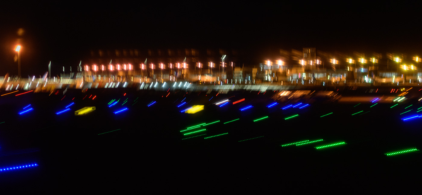
    That night’s shooting was not all bad. I nailed the focus on this star shot. It was purely of the stars and had no foreground. This foreground has been substituted from another blurry image that night (actually, redrawn by hand).

    This is artistic expression rather than literal reality. I do that a lot. As photography progresses and matures, I believe that is more and more the norm.